The Swami
Thu Sep 21, 2017 12:51 am
ref: http://www.fontplay.com/freephotos/imag ... o-1071.jpg
Yup; still having some fun with Salience's Voronoi stipper in combo with dynamic source masks.
Yup; still having some fun with Salience's Voronoi stipper in combo with dynamic source masks.
Re: The Swami
Thu Sep 21, 2017 1:36 am
Great voronoi images at the moment lylejk!
Re: The Swami
Thu Sep 21, 2017 5:46 am
Thanks, Skinnyhouse.
Re: The Swami
Thu Sep 21, 2017 6:09 am
I like this too, there are infinite findings to do. Thank you for sharing your experiments. 
Re: The Swami
Thu Sep 21, 2017 6:41 am
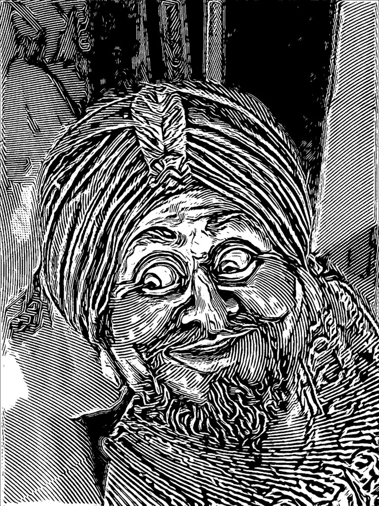
Why not an engraved version using the dynamic source mask. I did re-apply the regular background since the swirling wasn't to my liking.
https://www.flickr.com/photos/34520999@ ... 3/sizes/o/
https://www.flickr.com/photos/34520999@ ... 3/sizes/o/
Re: The Swami
Thu Sep 21, 2017 8:48 am
Amazing work! I really wish I knew how you are doing these. For some reason I just don't understand.
Re: The Swami
Thu Sep 21, 2017 2:03 pm
Again, I used G'MIC's Euclidean to Polar (default settings) followed by a modified version of Halftone shapes (circle preset; I modified this preset to allow me to go down to a radius of 5 since 10 is just too low of a resolution; actually chose a radius of 6 for this result). I then to the inverse (Polar to Euclidean) operation and ran G'MIC's Pen preset to turn the halftone dots into lines.
Re: The Swami
Fri Sep 22, 2017 10:26 am
Cool one Lyle 
Re: The Swami
Fri Sep 22, 2017 11:52 am
Here is my experimentation on what you've listed, with minor differences.
I hope you don't mind that I used the Swami image.
I hope you don't mind that I used the Swami image.
Re: The Swami
Fri Sep 22, 2017 9:59 pm
Thanks for the comments, Sallyanne. Nice coloring work, Greg.
Re: The Swami
Sat Sep 23, 2017 1:19 pm
Thank You Lyle, I couldn't have done it without your ideas!
Re: The Swami
Sun Sep 24, 2017 7:34 am
I call this one, "A View Above the Swami's Plantation" lol
ref: http://www.fontplay.com/freephotos/imag ... o-1071.jpg
ref: http://www.fontplay.com/freephotos/imag ... o-1071.jpg
Re: The Swami
Sun Sep 24, 2017 1:47 pm
Sweet!
Re: The Swami
Sun Sep 24, 2017 10:44 pm
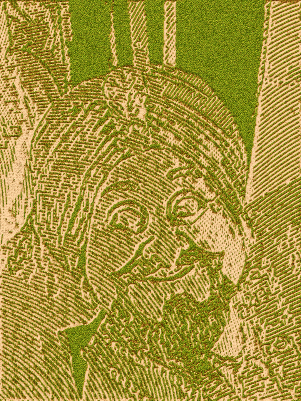
Still experimenting. This time I just used good ol' Whirl and Pinch (distort/recover) and another with opposite direction (and only ran G'MIC's Pen on one of the layers set to darken) for this result. I did Grain Merge that layer with the original and then ran G'MIC's Stamp preset for the final result.
Re: The Swami
Sun Sep 24, 2017 11:14 pm
This last one is really very nice, I like it.
Re: The Swami
Sun Sep 24, 2017 11:28 pm
Thanks, Diego. If you can figure out a way to smooth out the dither dots, you can possibly just use GIMP's Distort>Newsprint preset instead of G'MIC.
Re: The Swami
Mon Sep 25, 2017 4:29 pm
Beautifully done! I love the detail and contrast.
Re: The Swami
Tue Sep 26, 2017 12:09 am
Thanks, Greg.
Re: The Swami
Tue Sep 26, 2017 4:23 am
I love the last one. It looks kind of like a print from an engraving, or the kind of pen and ink illustrations you used to get in childrens books.
Re: The Swami
Tue Sep 26, 2017 6:42 am
Thanks, Erisian. Still an experiment in process. Not like seams created in a majority of renders using the technique that I've been using at this time. May have to try some other methods, but only if I have some time. Way too busy today (to include working my part-time job; just finished my 40 hour full time weekend shift last night). Anyway, you all have a great day.