GIMP Chat
http://gimpchat.com/

My latest contribution for a friend
http://gimpchat.com/viewtopic.php?f=11&t=20091
Page 1 of 1

Author:  sallyanne [ Thu Aug 25, 2022 7:46 am ]
Post subject:  My latest contribution for a friend

Image

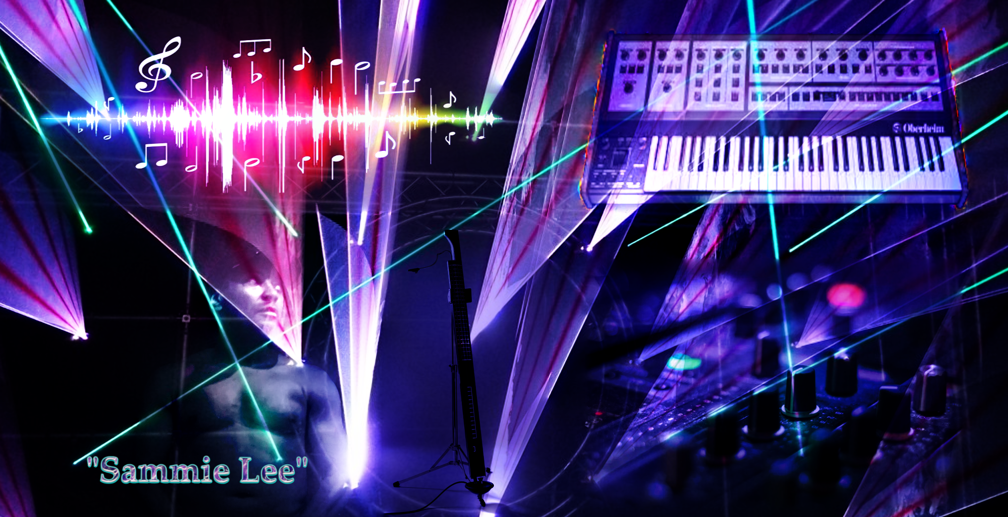
Did this n the last 24 hours for a friend's music business - for marketing. No, I didn't get paid for it, I do all my work voluntarily.
I used 5 layers and the background layer twice.
1 background layer with 5 on top - after arranging them, I used the filter blend seamlessly in GMIC.
After, I put the duplicate background on top and gave it some transparency. Last of all I added a name with the text tool and layer effects.
All the pics, except the photo are creative commons

Author:  Wallace [ Thu Aug 25, 2022 6:20 pm ]
Post subject:  Re: My latest contribution for a friend

sallyanne wrote:
Image
Did this n the last 24 hours for a friend's music business - for marketing. No, I didn't get paid for it, I do all my work voluntarily.
I used 5 layers and the background layer twice.
1 background layer with 5 on top - after arranging them, I used the filter blend seamlessly in GMIC.
After, I put the duplicate background on top and gave it some transparency. Last of all I added a name with the text tool and layer effects.
All the pics, except the photo are creative commons
Nice work Sallyanne.
:paint
I hope the image was gleefully accepted by your friend.

Author:  Pocholo [ Thu Aug 25, 2022 6:42 pm ]
Post subject:  Re: My latest contribution for a friend

Nicely don Sallyanne! Good work. :clap

Author:  sallyanne [ Thu Aug 25, 2022 7:50 pm ]
Post subject:  Re: My latest contribution for a friend

Thank you guys
@Wallace, yes he loved it. (Said my work is professional looking but I think he is probably biased)
I did 2 renditions originally and this was the eighth one as we decided to take and add to it.

Author:  Pat625 [ Thu Aug 25, 2022 10:35 pm ]
Post subject:  Re: My latest contribution for a friend

I think your work is fascinating! You are very talented.

Author:  Issabella [ Fri Aug 26, 2022 1:23 am ]
Post subject:  Re: My latest contribution for a friend

Congrats! Sallyanne. Not only it's professional looking, but your creativity and your idea processing and final reult is awesome. Excellent job! :clap

Author:  MareroQ [ Fri Aug 26, 2022 1:34 am ]
Post subject:  Re: My latest contribution for a friend

:clap
Sorry, this part doesn't look right to me (almost like cutting off the head?).

Attachments:
SammieL.png
SammieL.png [ 301.25 KiB | Viewed 634 times ]

Author:  sallyanne [ Fri Aug 26, 2022 3:11 am ]
Post subject:  Re: My latest contribution for a friend

That's fine MareroQ. I might pass this on. Thanks for the feedback.
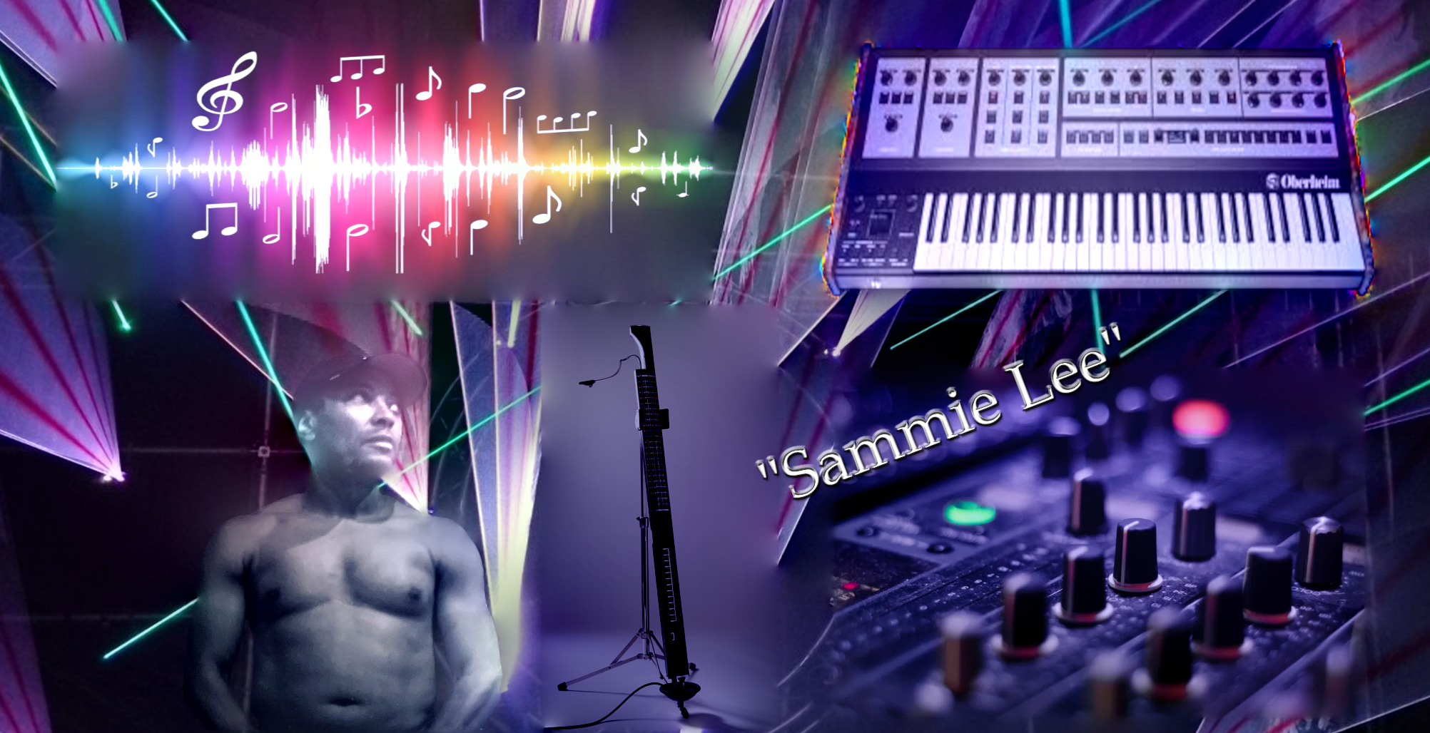
This was it before I overlaid the background on top and changed the font and position.
Image

Author:  MareroQ [ Fri Aug 26, 2022 3:23 am ]
Post subject:  Re: My latest contribution for a friend

Hi Sallyanne. :guitrock
This version is much better for me (but all in the eye of the viewer .. :geekon )

Author:  sallyanne [ Fri Aug 26, 2022 4:22 am ]
Post subject:  Re: My latest contribution for a friend

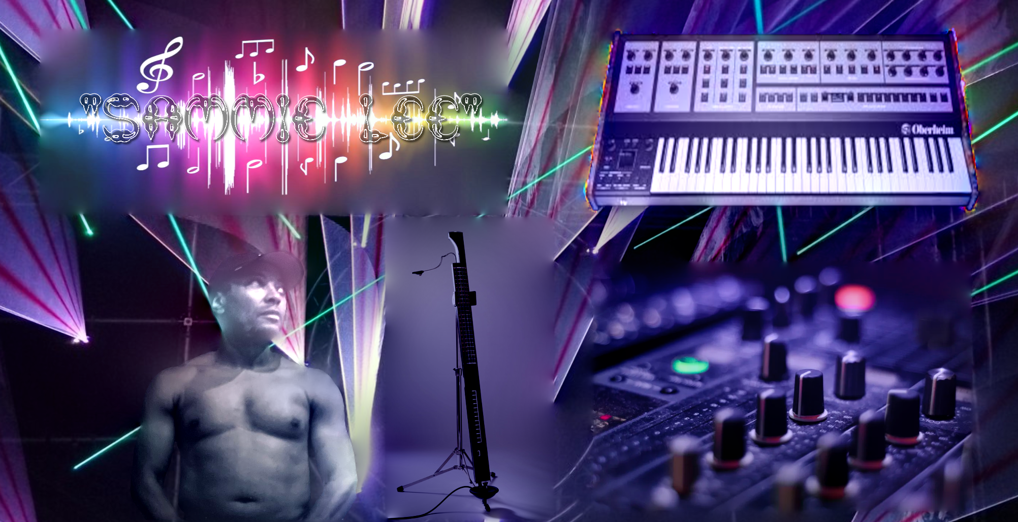
Updated it again.
How's this?
He want's his name in the sound waves in capital letters and a groovy font. I don't have very many groovy fonts that are easily readable.
Image

Author:  PixLab [ Fri Aug 26, 2022 4:30 am ]
Post subject:  Re: My latest contribution for a friend

sallyanne wrote:
Updated it again.
How's this?
He want's his name in the sound waves in capital letters and a groovy font. I don't have very many groovy fonts that are easily readable.
Image


Um, no not for me, your last one looks too much patched, the head is better, though
Image

Author:  sallyanne [ Fri Aug 26, 2022 5:40 am ]
Post subject:  Re: My latest contribution for a friend

Thanks Patrice, I might have to work on the original - good thing I kept the xcf. He don't like the 'claws font' either

Author:  rich2005 [ Fri Aug 26, 2022 5:59 am ]
Post subject:  Re: My latest contribution for a friend

sallyanne wrote:
.... He don't like the 'claws font' either


Chase him off to a fonts site and let him choose his own ;)
Something from here perhaps: https://www.abstractfonts.com/tags/spiky

Edit: ...maybe with a 'hard' drop shadow

Attachment:
text.jpg
text.jpg [ 59.99 KiB | Viewed 541 times ]

Author:  sallyanne [ Fri Aug 26, 2022 6:10 am ]
Post subject:  Re: My latest contribution for a friend

Funny you said that rich. I did another techno one and he said he can't see the difference ;) .
It was really different. OK I am going with my original MareroQ but I took the pink line off his cheek.

Author:  PixLab [ Fri Aug 26, 2022 6:50 am ]
Post subject:  Re: My latest contribution for a friend

If you can do the first one (nicely blended) with the head of the last one and find a way to blend the writing with the music waves, your friend should be happy :coolthup
If I may suggest a slight, may be "Filters / Distorts / Wind.." on the writing/text just to "blend" a bit more with the sound's waves (but it's about taste ;) )
Image

Author:  sallyanne [ Fri Aug 26, 2022 7:15 am ]
Post subject:  Re: My latest contribution for a friend

Wondered about white with a drop shadow . Thank you Pix I'll have a go at that in a minute

Author:  sallyanne [ Fri Aug 26, 2022 9:03 am ]
Post subject:  Re: My latest contribution for a friend

We finally chose a white font made with squares (DatCub) with a black rectangular background just behind the name - opacity right down.

Author:  gasMask [ Fri Aug 26, 2022 9:15 am ]
Post subject:  Re: My latest contribution for a friend

Sally, I hope you don't mind if throw in my two cents. There's a lot going on in the image. IMHO, I would center Sammy's image, making him the center of focus. I would also soften some of the edges from the lights projections using a blur or a blend mode, or even use them as a means to cast light on another part of the composition, such as the synth.

Author:  sallyanne [ Fri Aug 26, 2022 9:38 pm ]
Post subject:  Re: My latest contribution for a friend

gasMask wrote:
Sally, I hope you don't mind if throw in my two cents. There's a lot going on in the image. IMHO, I would center Sammy's image, making him the center of focus. I would also soften some of the edges from the lights projections using a blur or a blend mode, or even use them as a means to cast light on another part of the composition, such as the synth.

No I do not mind at all. First one I did he was in the middle, I thought the same as you. He didn't like being too bold. Prefers being faded out to the background. I guess part still shows ;)

Page 1 of 1 All times are UTC - 5 hours [ DST ]
Powered by phpBB © 2000, 2002, 2005, 2007 phpBB Group
http://www.phpbb.com/