paynekj wrote:
I think it looks really good, but you've irked me by using the words "real life optics behavior"
My problem is that your distortion due to magnification is not correct compared to the real world:
Kevin
I agree with what you said, Kevin. And it's just one of many flaws in this work.
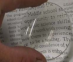
By 'real life optic behavior' I was only referring to offsetting text line relative to X-axis as it is shown in the first image in YAFU's post (thank you, YAFU!), not the whole distortion. For any point below the horizontal line drawn through the lens' center the text line is curved upward and vice versa.
By and large, I just don't have enough skill to reproduce the real life distortion. I had 3 versions, done with Map Object, Curve Bend and Cage transform Tool. Didn't like any of those. Ended up with just increasing text size and applying lens distortion plugin. It's not correct, but looks better.
On a side note, optical distortion due to magnification depends on few factors. Magnification power, lens diameter and curvature, focal length and vintage point. You change any of those factors and the picture is going to change too. Source of light could also be a factor, at some point I was even thinking of reproducing fringes due to chromatic aberration. But that would have been an overkill.