Wtg Erisian.
 Keep them coming!
| GIMP Chat http://gimpchat.com/ |
|
| Erisian's sketch book http://gimpchat.com/viewtopic.php?f=11&t=12901 |
Page 3 of 4 |
| Author: | sallyanne [ Sat Mar 19, 2016 6:52 am ] |
| Post subject: | Re: Erisian's sketch book |
Wtg Erisian. Keep them coming!
|
|
| Author: | Meemaw [ Sat Mar 19, 2016 3:01 pm ] |
| Post subject: | Re: Erisian's sketch book |
Wow! Some scary and some weird, but all excellent!!!! |
|
| Author: | Artloader [ Sat Mar 19, 2016 4:31 pm ] |
| Post subject: | Re: Erisian's sketch book |
Some nice designs there on post #39 Erisian |
|
| Author: | Erisian [ Sun Mar 20, 2016 8:49 am ] |
| Post subject: | Re: Erisian's sketch book |
steven8 wrote: Excellent modelling, atmosphere and depth Erisian. Thank you sallyanne wrote: Wtg Erisian. Keep them coming!Thanks - I certainly will! Meemaw wrote: Wow! Some scary and some weird, but all excellent!!!!:D Thank you. Because I start without any set ideas, it's easier to create strange stuff. I just let my imagination go wild. Artloader wrote: Some nice designs there on post #39 Erisian He's a favourite of mine too. Thank you. |
|
| Author: | Mokonafan [ Sat Apr 09, 2016 12:25 am ] |
| Post subject: | Re: Erisian's sketch book |
Face angles are good. The more rendered one they eyes aren't evenly drawn, but it's a sketch so it's no biggy. I wish I was good with contrast like you are. D: |
|
| Author: | Erisian [ Sun Apr 10, 2016 1:48 pm ] |
| Post subject: | Re: Erisian's sketch book |
Thanks Moko. I find it easier to get contrast by establishing values in greyscale first, then adding colour before doing detailed painting. I start with a mid value then add darks and lights, then the darkest shadows and highlights. I try to keep to about five or six main values with the darkest and lightest being around 10 to 15 from the extremes. Of course, this won't help you with your paints and pencils sadly! |
|
| Author: | Mokonafan [ Sun Apr 10, 2016 6:58 pm ] |
| Post subject: | Re: Erisian's sketch book |
Erisian wrote: Thanks Moko. I find it easier to get contrast by establishing values in greyscale first, then adding colour before doing detailed painting. I start with a mid value then add darks and lights, then the darkest shadows and highlights. I try to keep to about five or six main values with the darkest and lightest being around 10 to 15 from the extremes. Of course, this won't help you with your paints and pencils sadly! I see. I've noticed that lots of people do the greyscale thing. I don't know how people can do it without going mad! I must try this once and see if I like it, it just sounds so drab not having color the whole time!! Gives a good result though. 
|
|
| Author: | steven8 [ Sun Apr 10, 2016 7:27 pm ] |
| Post subject: | Re: Erisian's sketch book |
Mokonafan wrote: Erisian wrote: Thanks Moko. I find it easier to get contrast by establishing values in greyscale first, then adding colour before doing detailed painting. I start with a mid value then add darks and lights, then the darkest shadows and highlights. I try to keep to about five or six main values with the darkest and lightest being around 10 to 15 from the extremes. Of course, this won't help you with your paints and pencils sadly! I see. I've noticed that lots of people do the greyscale thing. I don't know how people can do it without going mad! I must try this once and see if I like it, it just sounds so drab not having color the whole time!! Gives a good result though. It's called Underpainting: In art, an underpainting is an initial layer of paint applied to a ground, which serves as a base for subsequent layers of paint. Underpaintings are often monochromatic and help to define colour values for later painting. It's one of the cornerstones of classic painting technique. |
|
| Author: | Erisian [ Sun Nov 19, 2017 5:54 pm ] |
| Post subject: | Re: Erisian's sketch book |
She didn't know that fairies existed! 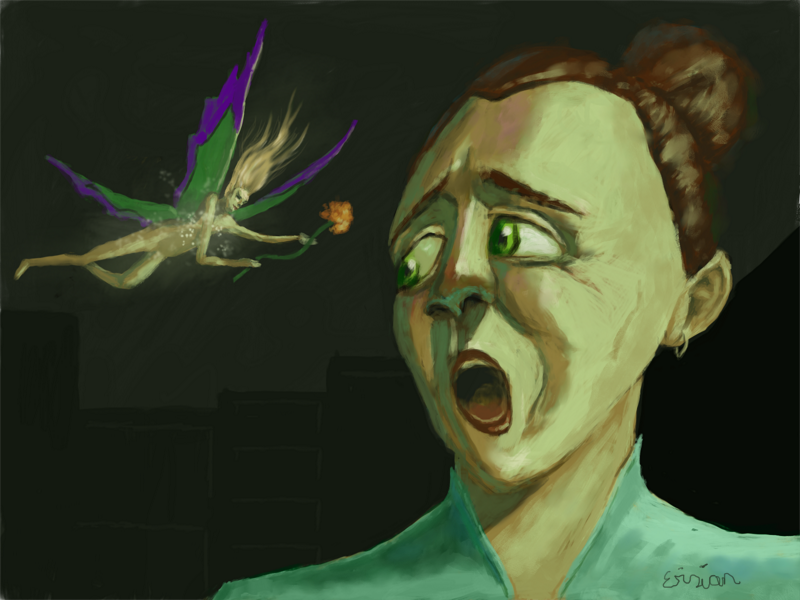
|
|
| Author: | molly [ Sun Nov 19, 2017 6:44 pm ] |
| Post subject: | Re: Erisian's sketch book |
Your work is coming along great Eris , you are very good with your shading . Must be the company you keep... lol Hi AnMal. |
|
| Author: | sallyanne [ Sun Nov 19, 2017 11:43 pm ] |
| Post subject: | Re: Erisian's sketch book |
Shock horror on her face 
|
|
| Author: | Erisian [ Mon Nov 20, 2017 6:12 am ] |
| Post subject: | Re: Erisian's sketch book |
molly wrote: Your work is coming along great Eris , you are very good with your shading . Must be the company you keep... lol Hi AnMal. AnMal says Hi back.  sallyanne wrote: Shock horror on her face |
|
| Author: | Griatch [ Mon Nov 20, 2017 12:31 pm ] |
| Post subject: | Re: Erisian's sketch book |
Always good with sketching exercises. I like your later exaggerated "scared" faces the most, they make for interesting subjects. Exaggeration is useful for training faces overall. You might want to consider toying some more with your skin hues; you tend to use beige and blend towards blacks - this produces a somewhat solid and 'dead' skin tone. Experiment with some more hues of red, but you can also experiment with some "unexpected" hues in there. Green and purple work very well in small amounts for fair skin. Just make sure to apply them with a low opacity and you can add a lot of life to skin. An experiment might be to completely make your skin in "unrealistic" colors. Consider someone under a disco-ball, for example - then you can really go crazy on the colors and completley skip the beige. Doing so can be liberating as an exercise. . Griatch |
|
| Author: | Erisian [ Wed Nov 22, 2017 4:24 am ] |
| Post subject: | Re: Erisian's sketch book |
Thanks. As this was a sketch, I didn't worry too much about it but there are some different hues in there including blues where the skin is tight and the veins are closer to the surface. Maybe some more red around the cheeks and nose would be helpful. At the end of the day, I have to go along with how I observe reality and I see very little colour variation in real people. Even running a colour picker over photos doesn't reveal much except some green in the shadow areas which I presume is ambient light somehow distorted by the skin colour. |
|
| Author: | Griatch [ Fri Nov 24, 2017 6:37 pm ] |
| Post subject: | Re: Erisian's sketch book |
@Erisian I was commenting more on the overall hues than on a particular picture. Your 'faerie' picture definitely has some more variation in skin colors compared to earlier works, especially the shadow under the nose is a good pick of green that works well! In that particular image I feel it's rather that some highlights (such as on the forehead facing us) could be added to add more accentuation between light and dark. The problem with comparing hues from a photograph is that a photograph comes along with the lighting condition the photo was taken in (obviously). In a studio photo the light is controlled but in an outdoor scene there could be hundreds of light sources due to light diffracting off surfaces and then onto the subject. When free-painting a face/skin one can rarely duplicate "realistic" lighting exactly like a computer (or camera) would. One way to compensate for that is to over-do the skin hue-variations slightly for a more vibrant and "lively" feel. But admittedly this is something that also threads into the realm of your personal style. |
|
| Author: | Erisian [ Sun Nov 26, 2017 6:55 am ] |
| Post subject: | Re: Erisian's sketch book |
@Griatch - Sorry, I see what you mean now. The highlights don't look much like highlights in this one. I think that outdoors, the different light sources are so far away that the hues become averaged rather than remaining seperate although that depends on precisely where the subject is. There would be a definite green hue in a forest for example. It's not an easy subject to be clear on. There is some room for colour play but I personally prefer to keep it subtle. |
|
| Author: | Mokonafan [ Wed Dec 06, 2017 1:07 pm ] |
| Post subject: | Re: Erisian's sketch book |
So this is tinkerbell in her pure form??? That Fairy looks like she's going to end this lady (maybe an older Wendy??) anyone who gets near Peter. xD |
|
| Author: | Erisian [ Thu Jan 04, 2018 11:02 am ] |
| Post subject: | Re: Erisian's sketch book |
Got some pastels for Christmas. This is just me getting re-aquainted with traditional media so don't expect anything awesome yet! 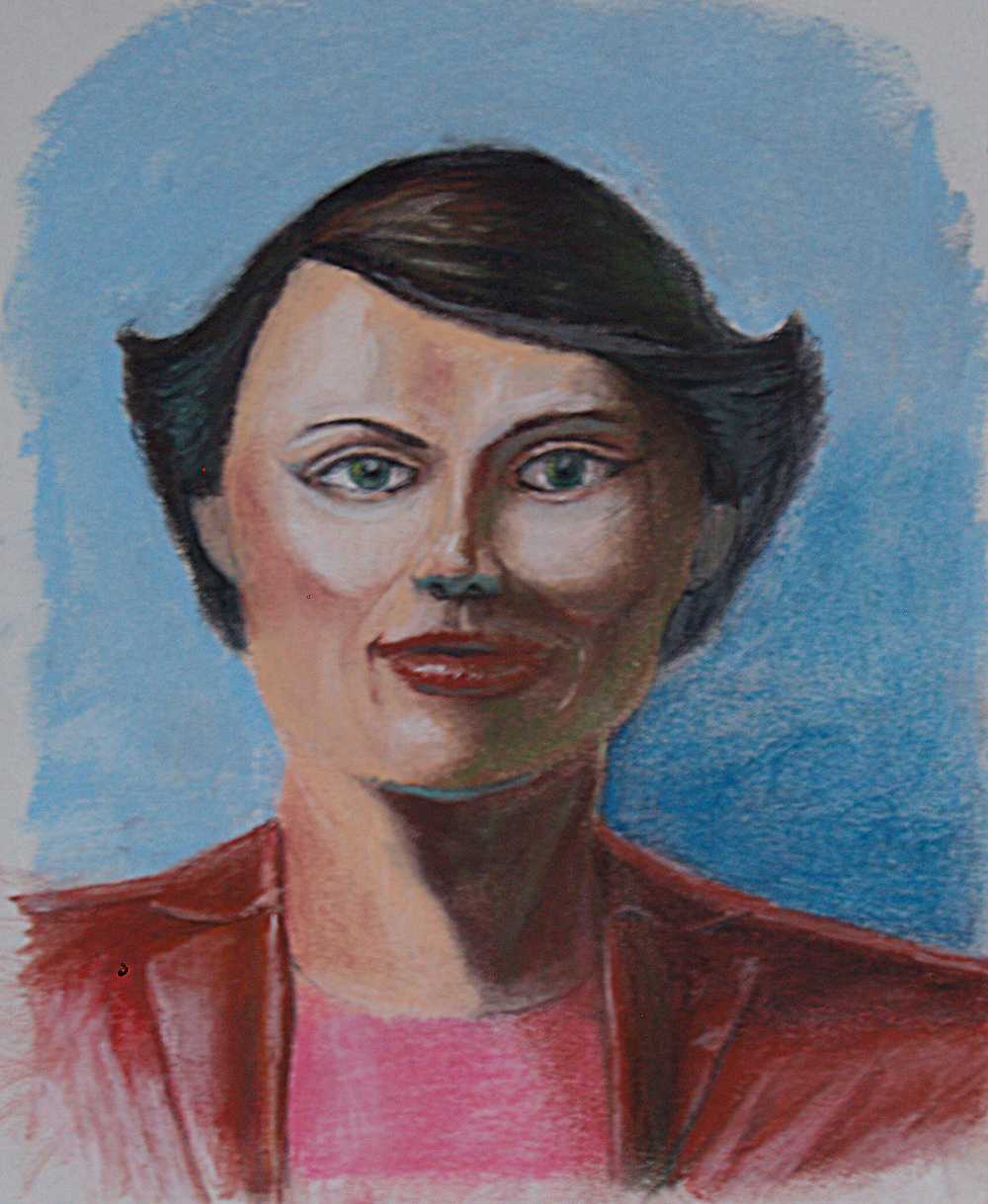
|
|
| Author: | dinasset [ Thu Jan 04, 2018 12:24 pm ] |
| Post subject: | Re: Erisian's sketch book |
It can come out something good, but IMO you have to improve the area marked here in green. It looks to me somehow "innatural" (irregular face contour, mainly). Attachment: 1812_FirstPastel-dn.png [ 1.98 MiB | Viewed 2614 times ] |
|
| Author: | Erisian [ Thu Jan 04, 2018 12:26 pm ] |
| Post subject: | Re: Erisian's sketch book |
There is a lot I have to improve. I haven't used pastels since I was a teenager. |
|
| Page 3 of 4 | All times are UTC - 5 hours [ DST ] |
| Powered by phpBB © 2000, 2002, 2005, 2007 phpBB Group http://www.phpbb.com/ |
|