I just noticed that I now have reached a whopping 300 deviations on
deviantart. Some of these are journals, but with more than 230 images it's still a number I'm quite proud over!
So I'll celebrate with a brief historical cavalcade of the images I put there since 2006 (which is when I joined DA):
2006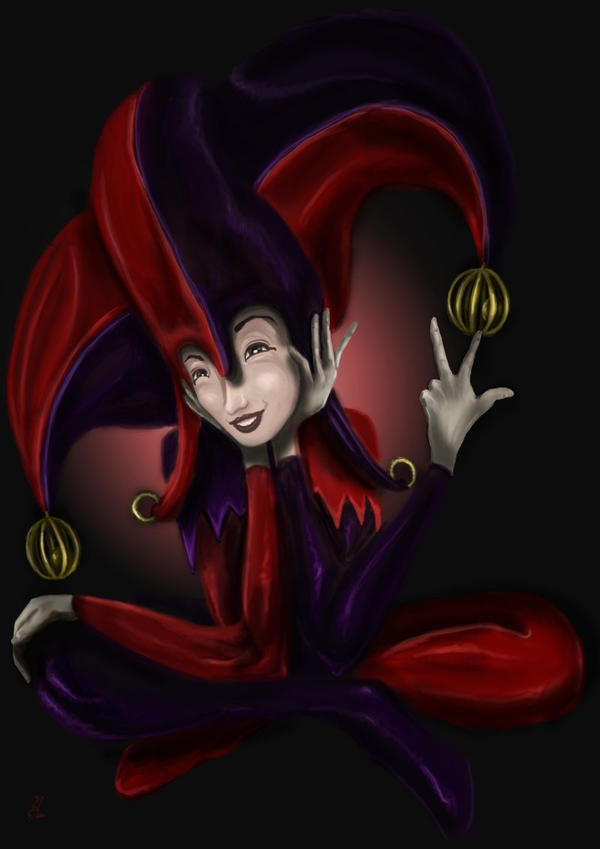
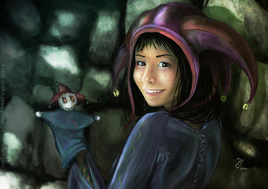
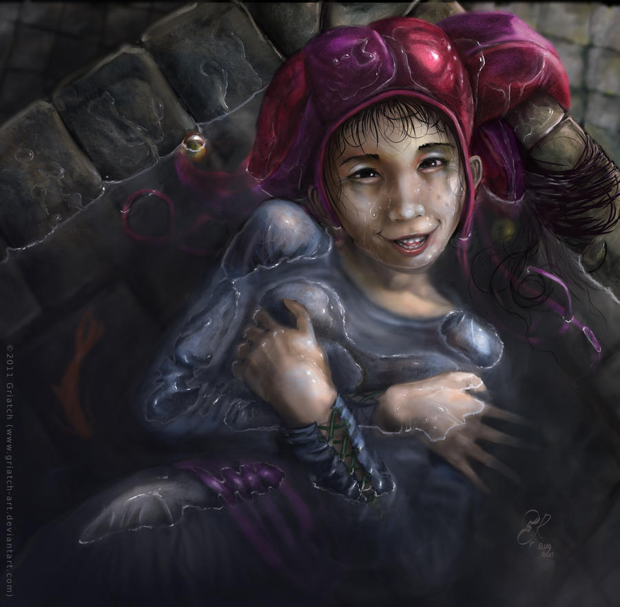
At this time I was heavily involved in an roleplaying forum known as Unicorn's Visions. It was a play-by-post forum that allowed that you created any character except "pure" humans. All of my main characters on the forum later got a lot of attention from me graphically. The four-handed Jester is one of those characters. This image is also the first image I uploaded to DeviantArt, in August 2006. It was all done in GIMP.
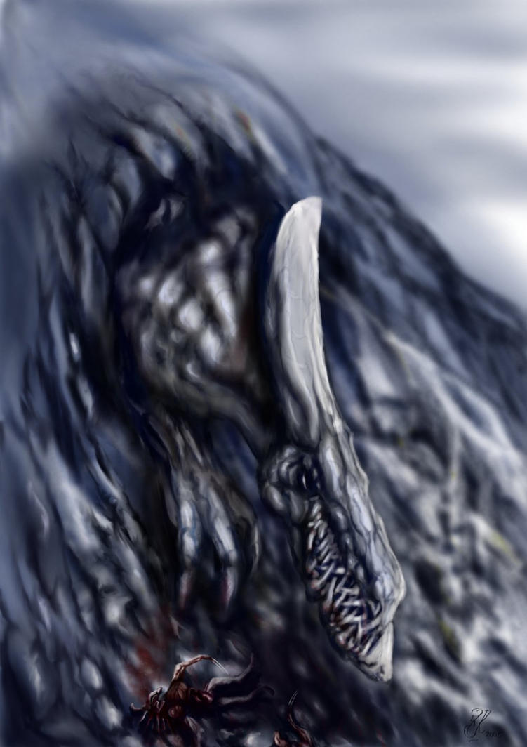
Another character of mine on Unicorn's Visions was "Ebb", the giant gray dragon that I've later come to develop and depict many times in art. This particular image represented a shift in style for me, using smoother gradients and learning GIMP's smudge tool (and low opacity!) to a much better extent than before.
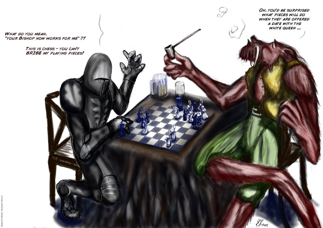
"Troll Chess." The final character I used on Unicorn's Visions was Blackback, the mountain-troll merchant. He was a good guy, but sly and greedy as few. He has also appeared many a time later. This image is coincidentally one of my first attempts ever at a "comic" concept, with text. I still like the punchline of this quite a bit and still get comments on it.
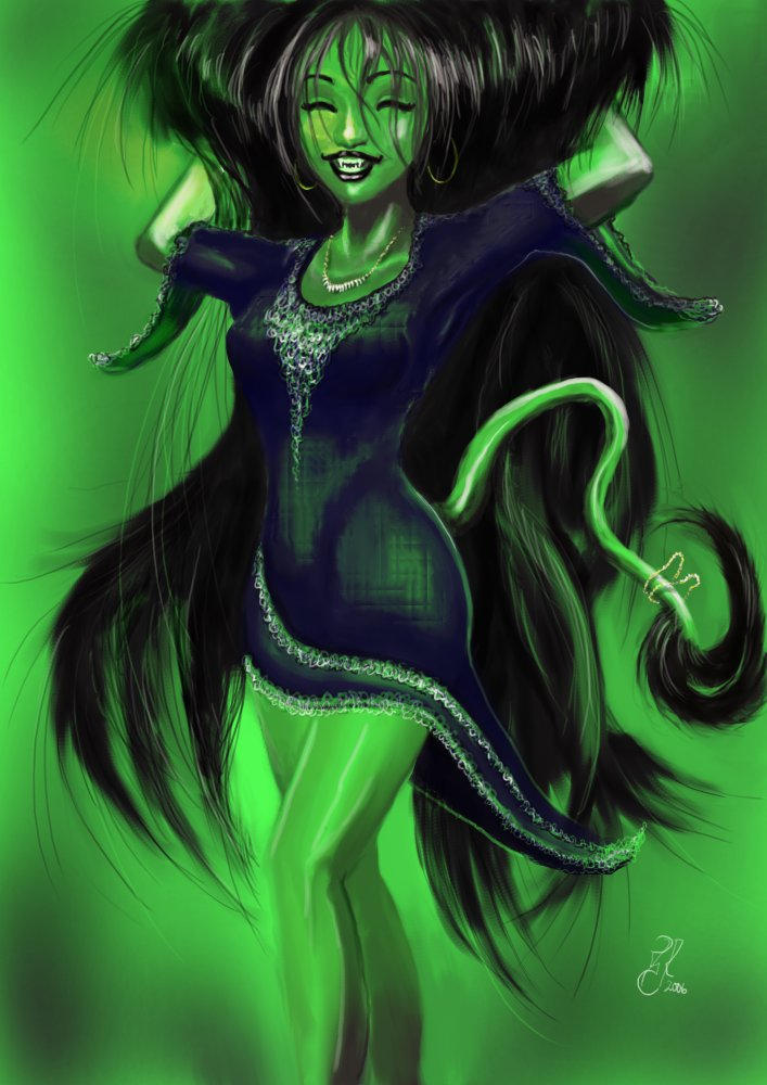
"Party of Trolls" is a fun image. I really made it as a fun throw-away character. I first gave her normal skin color but wanted to test having green light, which colored her green - which led to the idea of making her a full-on troll. This was not intended to be a recurring character at all, but she became so popular among some of my relatives that I find myself re-making her over and over.
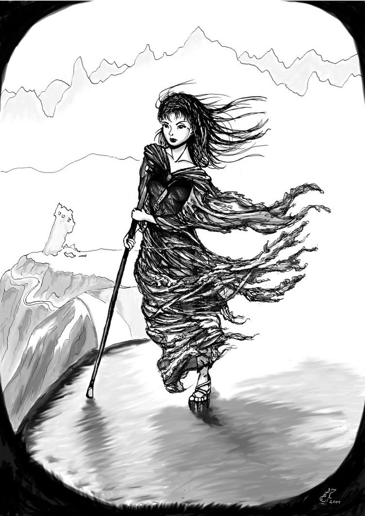
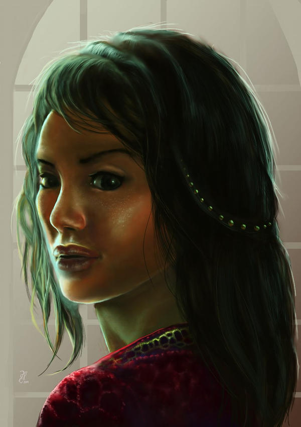
"Tattered Wanderer" - this was actually an older image that I belatedly uploaded to DA in October 2006. It is not a character from Unicorn's Visions this time, but from a novel project I worked on some years prior. Yes, this is an early-look prototype for the "Unknown Girl", here in a more fantasy-like setting. To this day I'm liking the dynamics of the rags here. While inked in GIMP, this one might even have been scanned from pencils, but I don't remember for sure.
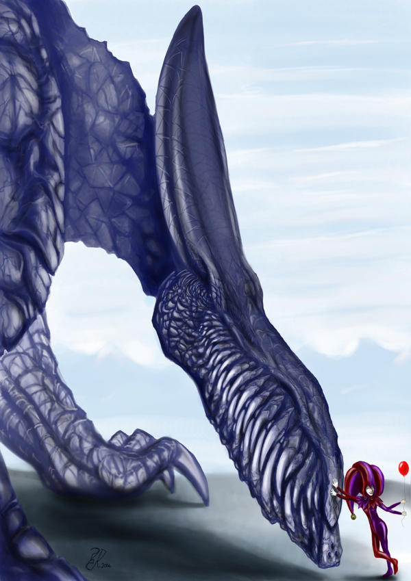
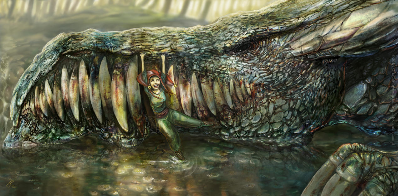
The "Dragon meeting Jester" series of images were always quite popular. The contrast between the flimsy jester and the grim-looking dragon was always appealing to me. This was at the time the most work I'd ever put into the dragon's armor.
2007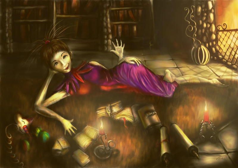
"Jester relaxing by the fire". In 2007 I was since long a member/moderator of the GimpTalk forum. This image was one of the earlier tutorials I did, pertaining to creating light and mood in GIMP using the "glass pane" technique.
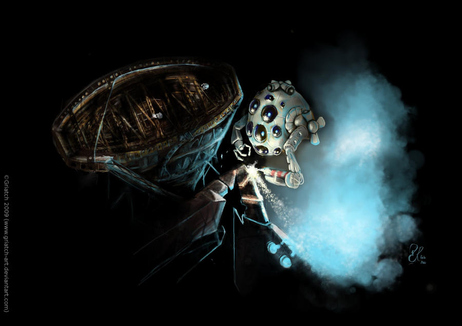
"Asteroid City". For the longest time, this was my most popular image on GimpTalk since it came (and still comes) with an extensive tutorial on how to reproduce it. As I recall some 50+ images were done based on that tutorial which is quite good considering how much work it entails.
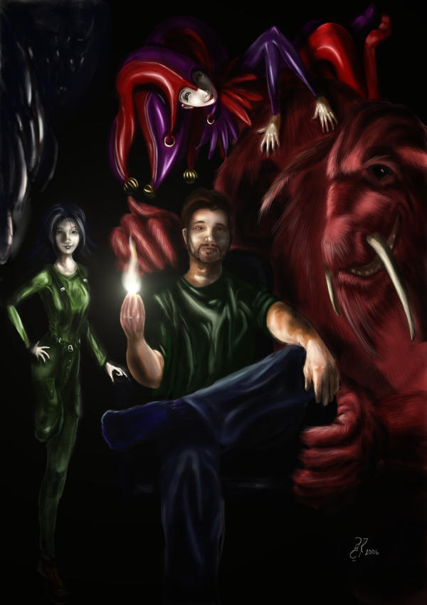
This image has a spot here since it was (and still is) my only self-portrait, surrounded by the characters that have followed me around for all those years. One can guess the teeth of the dragon in the upper left. Then we have the Unknown girl to the left, and Blackback the troll holding my chair with the Jester camping on his shoulder. A fun image, although I'm not too happy with how I came out (I guess one's never happy with one's own looks).
"Out of its element" was for the longest time my most popular image on DeviantArt - by far; there was no comparison until "Vättebron" came along many years later. While fully painted in GIMP, this was the first time I did a 3D rendering to study the perspective of the dragon beforehand (it was done in an open-source program called gsculpt which I've never used since, weirdly enough). This one sold several large framed prints around the world, one of which hangs at a relative's house to this day (it's cool to see your own work hanging on the wall, I recommend it to everyone).
"Queen in the morning" was one of the first full-color GIMP-made portraits I was really happy with. I got a lot of nice feedback on her skin and whereas I think I overdid the blurring of her hair I'm still liking this one.
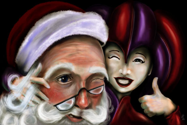
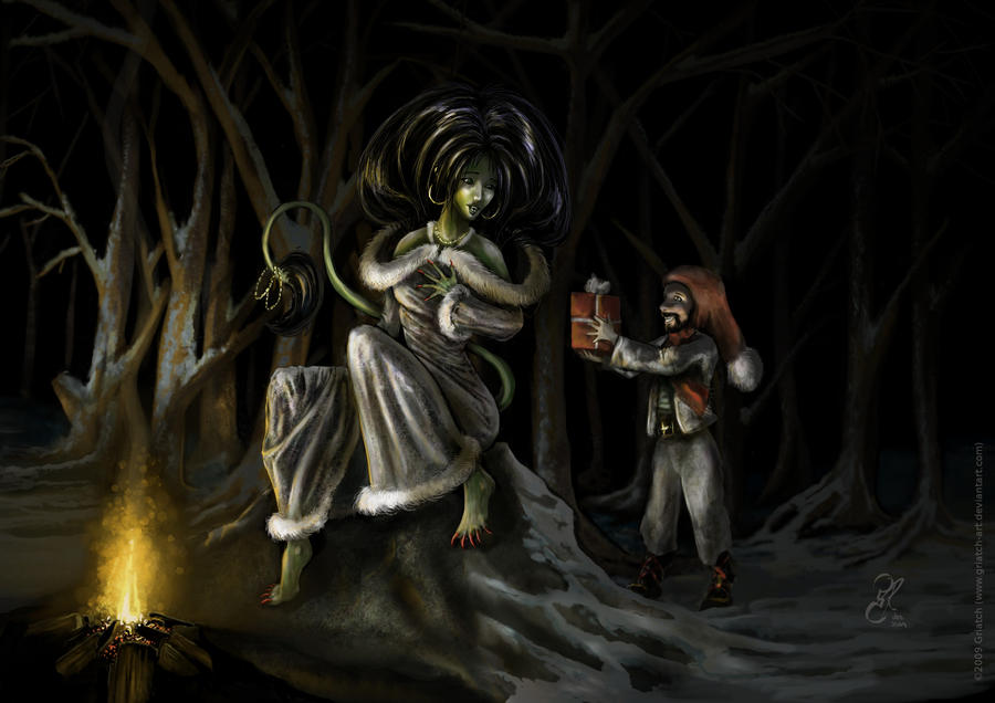
2007 was also the year when I started making my yearly Christmas cards. This one is probably the most light-hearted of them all.
2008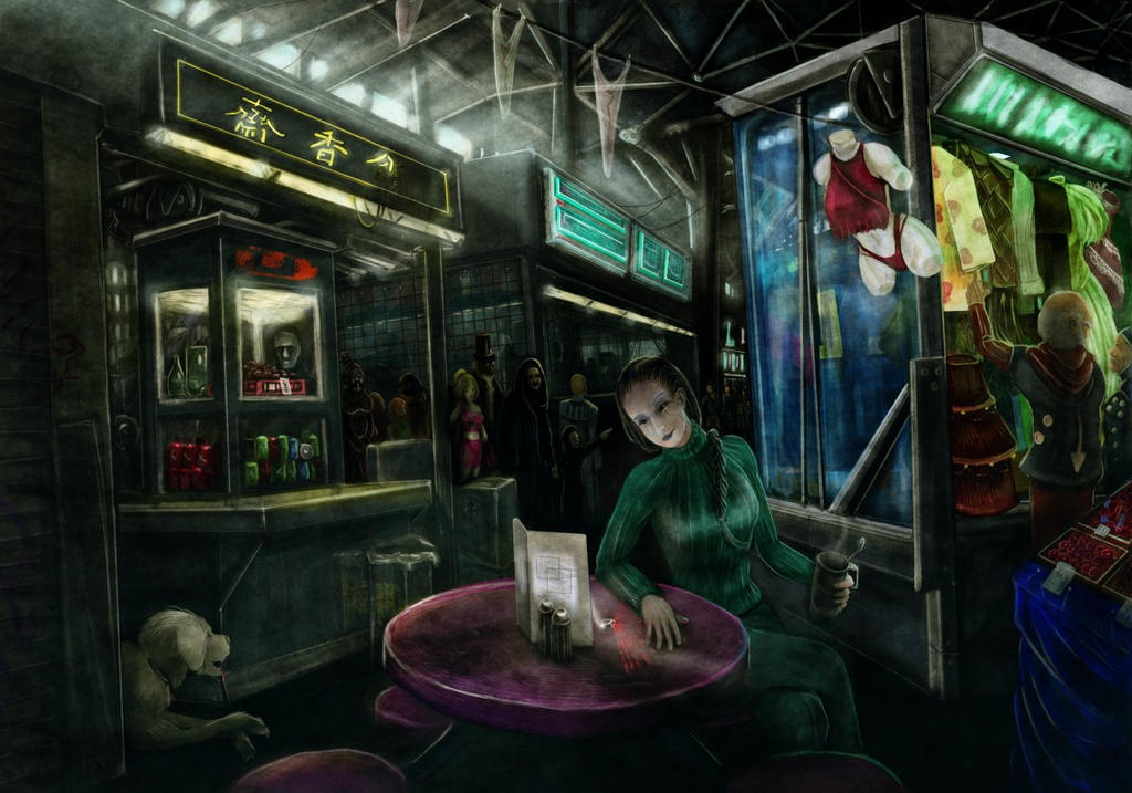
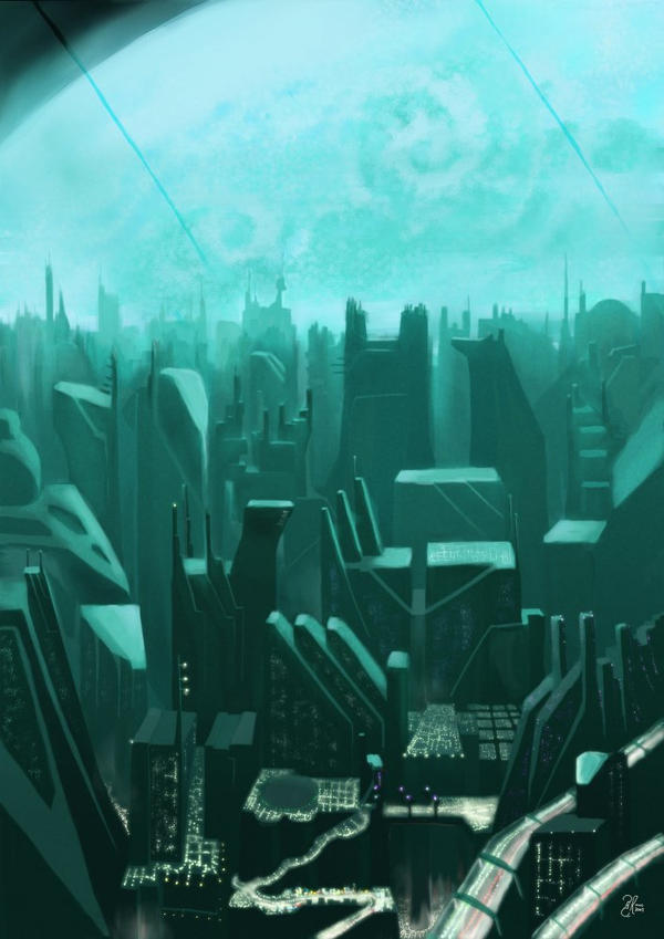
"In the mall of Chimaera" marks me working on the bigger series if
Shrike sci-fi images with the same protagonist. From a technical standpoint this was also the first time I did a large set-piece with lots of background, props and other people lounging around. Whereas the style is a little stiff when judging it today, this image remains one of my favorites for the world-building that went into it.
This was, as I recall, my first commissioned work, a CD cover for an indie Brittish hip-hop group "Vice Versa". They had very specific directions for the image but it was fun to do this one. I used Blender for testing the perspective. In the end I think the result is a little too dark for print, but I never heard any complaints (nor any follow-ups on if it ever made it into a CD, I suspect not - they didn't seem very organized).
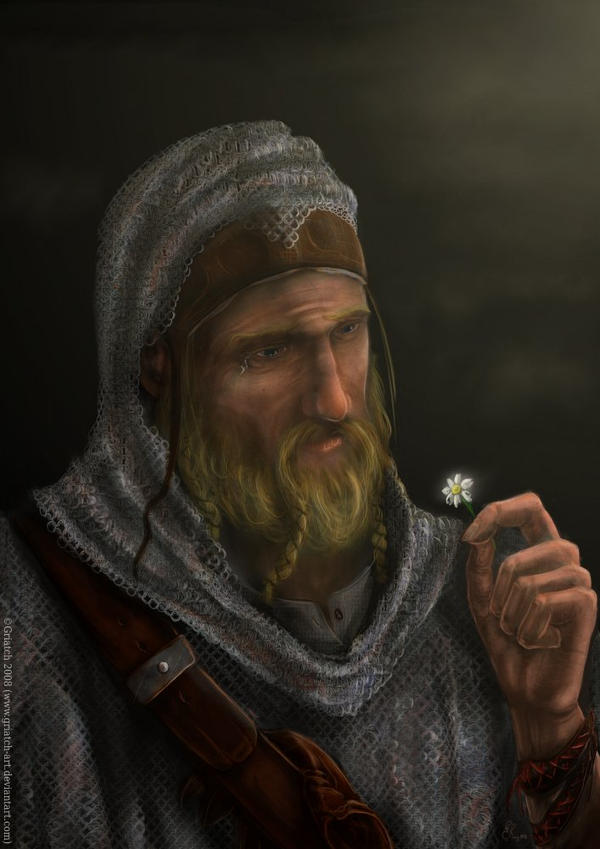
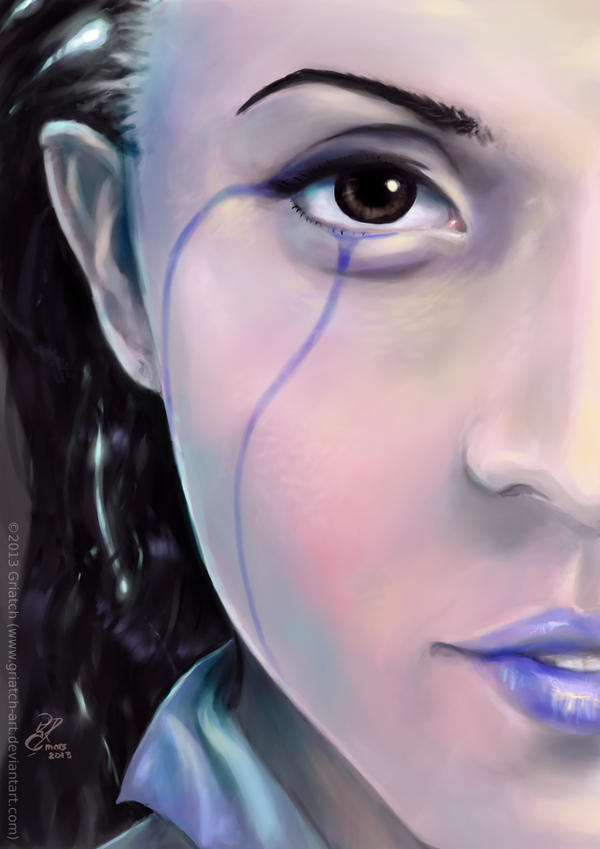
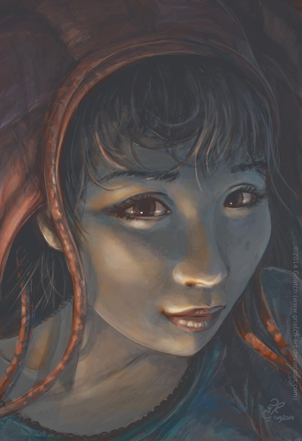
"The Tear" is notable since it is one of my first attempts at making a portrait of a realistic-looking man. I also tested out the makehuman program for this, to get the planes of the face right. I remember making the chainmail coif was a nightmare!
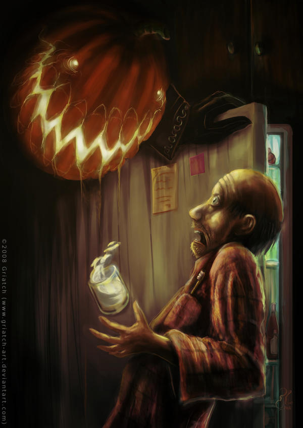
"All hallow's night snack" is one of those one-off concepts that ended up working surprisingly well. It was made for Halloween of that year and respresents a mixture of realism and comic-style expression that I experimented more with later.
[url]
[/url]
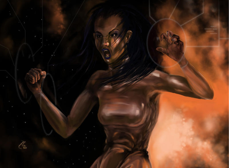
"Stellar fury" is maybe not all that interesting in itself as an image, but it is the first image I ever did in MyPaint, in December 2008. At the time, Mypaint was at version 0.5 and had basically no functionality beyond the plain drawing - you had no layers and could only save to PNG. You didn't have any buttons to press on either - just a menu and keyboard shortcuts aplenty. And I loved it, have loved it ever since. At the time few people had actually used MyPaint for any sort of polished work, so when I posted this image to the MyPaint forums the MyPaint developer at first didn't believe it was made in his program ... he had to check the raster-pattern of the image (MyPaint used a peculiar raster-engine back then) to confirm it.

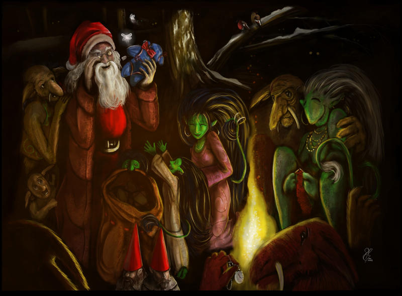
The Christmas card I made for 2008; it was not quite a tradition yet at that point. While it has Santa and plenty of trolls this is probably my least favorite among the cards I've done.
2009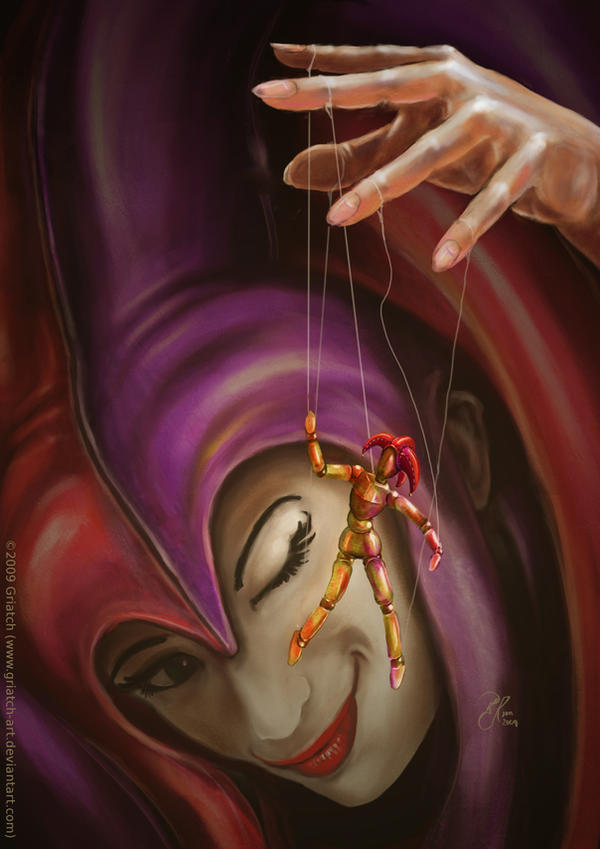
"Dance my Jester" is one of the last images I did depicting the four-handed version of my Jester character. Fully done in GIMP, I used a ley doll as reference for the puppet she's moving. I've gotten a lot of mileage out of this image though, it's surprisingly useful to have an image to depict "puppet masters" in various situations.
"Cutting up a Corpse" took 3 hours and marked a point of me wanting to use MyPaint more fully to paint. It was for a contest on GimpTalk.
The Christmas card for that year remains one of my personal favorites - although it seems I'm mostly alone in that notion.
It was also the card I got down to doing in decent time which meant I had time for other images that year too.
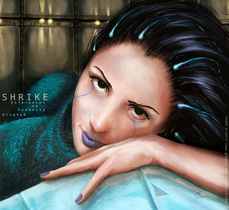
"Stare into the camera" was probably my most successful portrait up to that point. It also established the look of the
Shrike protagonist and I've used this image as a back-reference for all shrike images after this. I remain happy with how her clothes came out in this. And her gaze. I like that gaze.
2010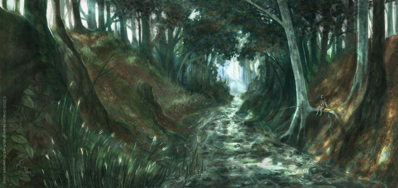
"The River Tunnel" was the first time I employed GIMP-clone-tool texturing to what was primarily a landscape image. This image was done very quickly I remember. I dreamt the scene you see, woke up and painted it basically in one sitting. The making-of of this became quite popular online. It was my desktop background for many years (I have two monitors).
Having drifted away from the Unicorn's Visions forum, the character of the Jester took on a different tack: She lost one pair of arms and became more normal human. This image, "Say hi to Mrs Buttons", became the defining image for the character, the one I still go back to in order to check she looks familiar. It also established the look of her hand-puppet that came to appear many times later.
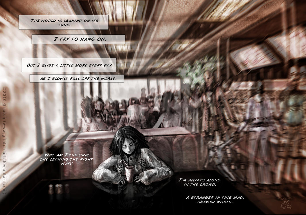
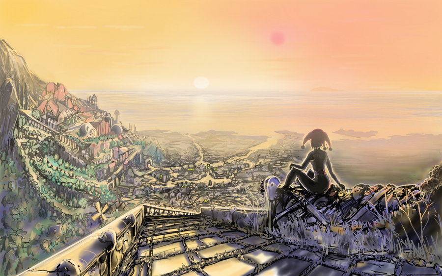
I know few would agree with me, but "Skew World" remains one of my favorite images among all I've done. It was the first hint at what would later be the design of the "Red Apples Lie" comic. The gloomy text and the shaky surroundings make for an impression I'm still very happy with. I know people who get physically nauseated by this image which must be a good sign.

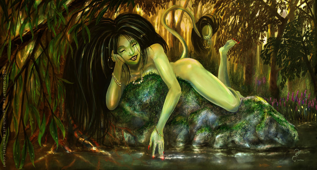
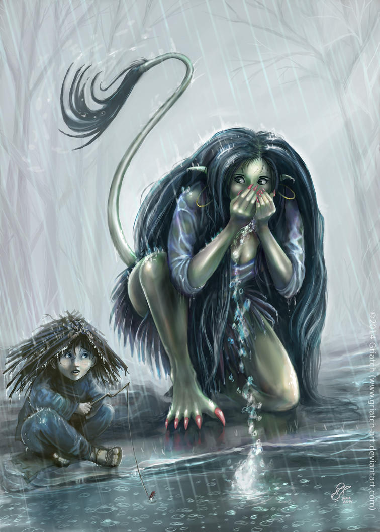
"Forest of Trolls" started a style of drawing water which I've kept ever since. The pose of the troll girl is actually based off a self-shot of myself lying in my bed (and in case you wonder, no I don't have those curves. But the pose would be quite tricky to get right without reference!).
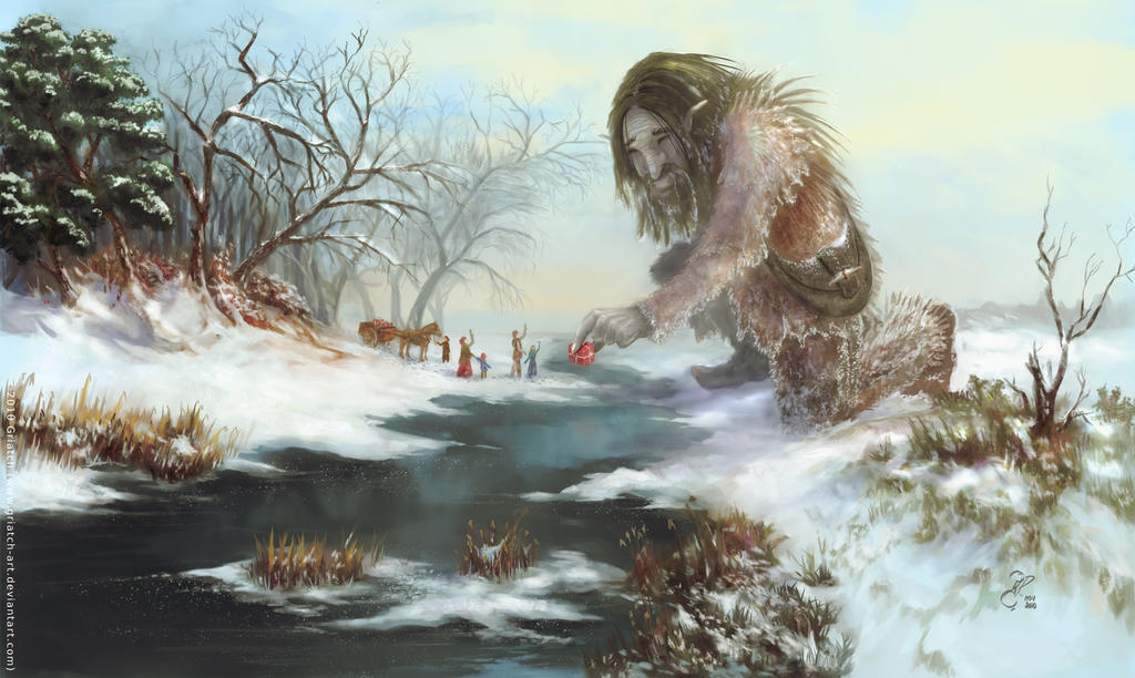
Inspired by 19th century landscape painters, the Christmas card for this year, "Good neighbors" marked me spending (considerably) more time on working on the card. I have always have a pretty easy time making landscapes, which is why I had to complicate it with a giant and some humans too. As it turned out, this card set the tone for many cards to follow.
2011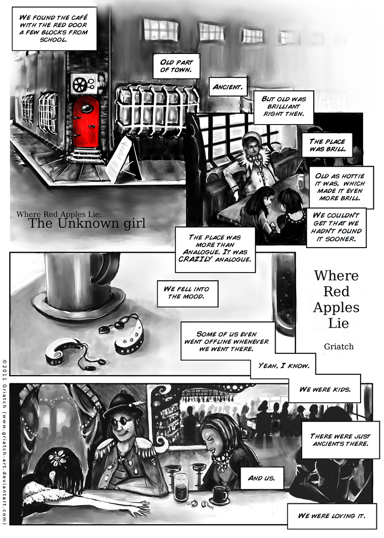
Over the Christmas holiday of this year I completed the first "snippet" of my comic "Where Red Apples Lie", where the Unknown girl is formally given a "name". I had never done a longer, connected piece of work like this before so it was very much a learning experience. This snippet (just 9 pages long) got a lot good responses and whereas the art is a bit uneven in places I like the story of this one and hope to expand on it one day.
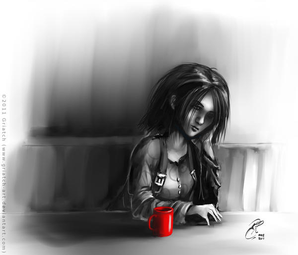
In the wake of Red Apples Lie I made other images about the Unknown Girl. The making of this one, called "Looking out", is used in one of my first art-related Youtube videos.
"After Rain comes Fire" was technically interesting since I uses stark black with only snippets on lighter color here and there. The speedpaint (on youtube) is also one of my more popular videos.
"No comfort in Light" is another in my "really black" period of images. Maybe not so noteworthy in itself if it hadn't been that the making of this image is used as a musical video for Matt Guest's song "Hollow".
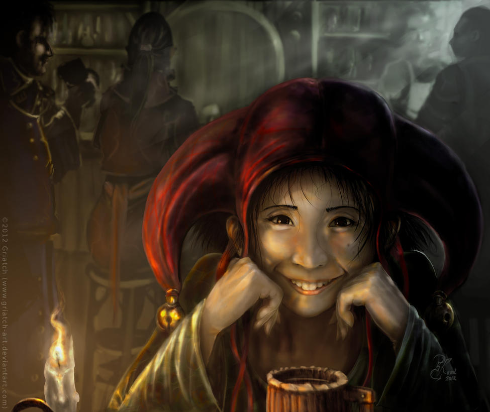
"No frowns in Misery" series (this is the second installment) has the jester depicted in unpleasant circumstances but still being cheerful. This image was mostly notable for the water depiction which I worked a lot on here.
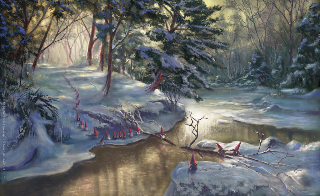
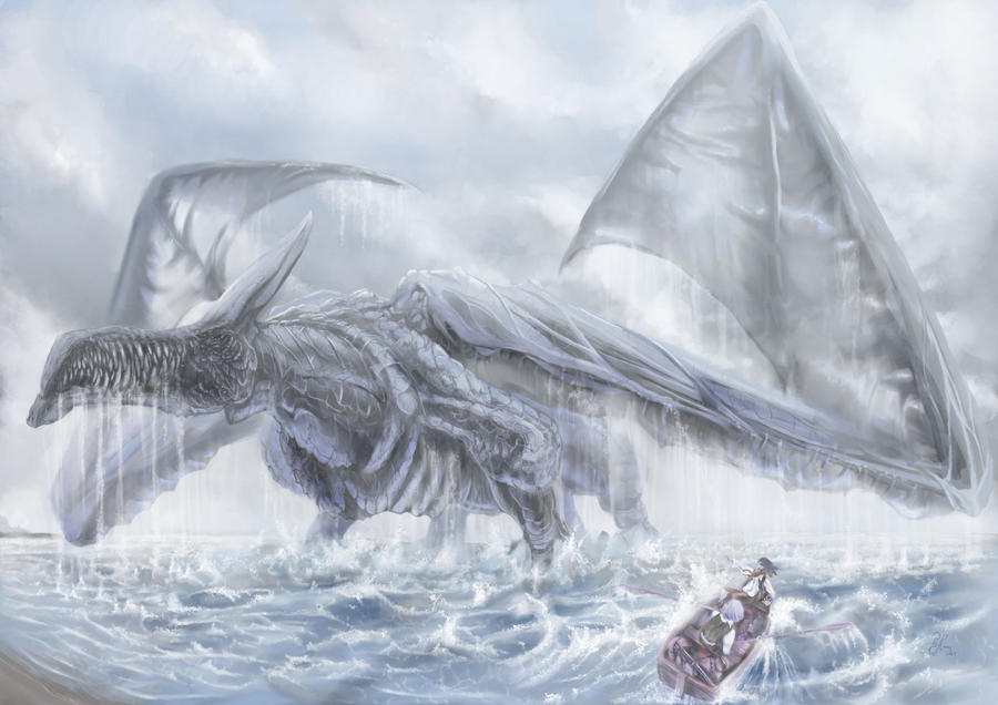
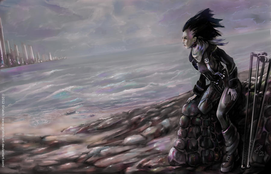
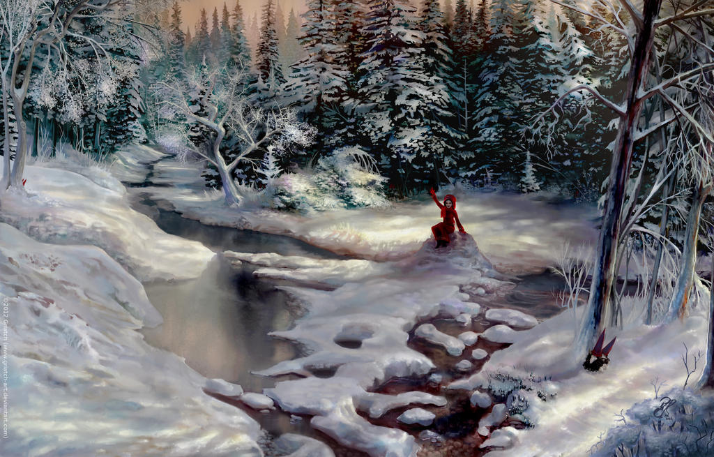
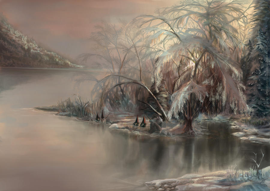
"Vättebron" is my most popular image on DeviantArt, by far outnumbering "Out of its Element" both in favorites and comments. Closely inspired by Turner's The shining brook (19th century), this was good exercise for painting snow and detailed shrubbery as well as water. It's also the first time the vaette (gnomes in Swedish) appear in my work.
2012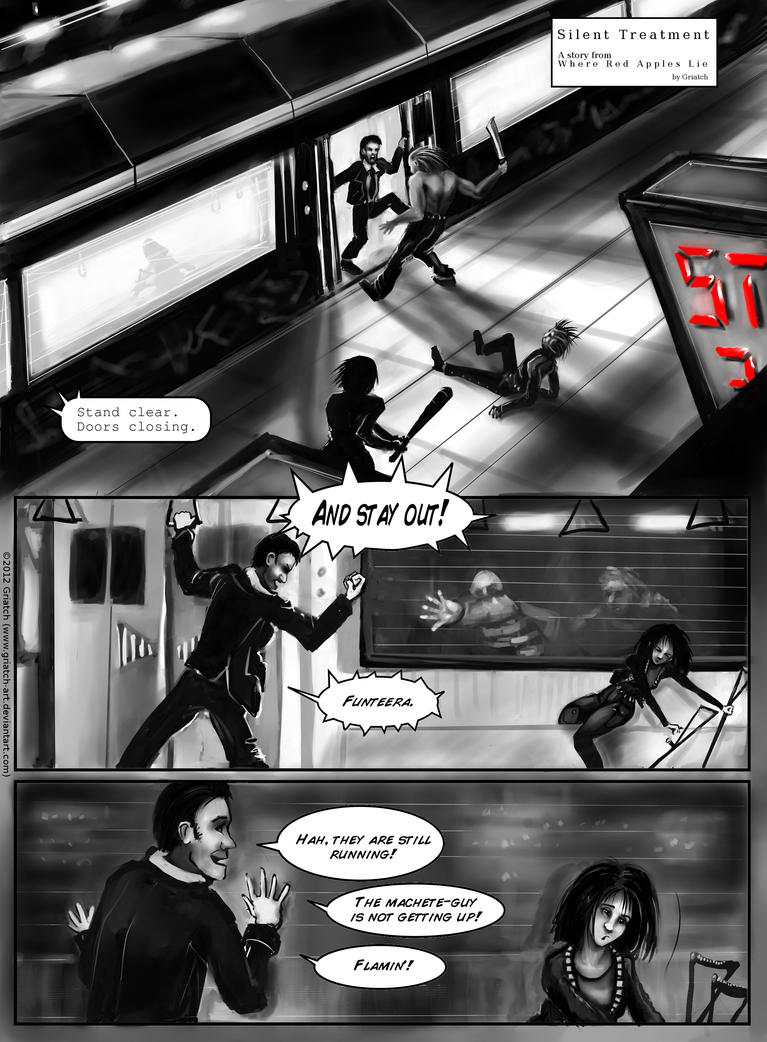
During the Christmas holidays I worked on another short installment of Where Red Apples Lie, this time showing off some of the Unknown Girl's other qualities. It was not nearly as popular with the audience as the first intallment. The anatomy and art of this is shaky at best and I would probably have ordered the story differently had I done it today, but working with a monologue remained very interesting.
"What's yer name" was marked by its heavy use of MyPaint in combination with GIMP as well as the amount of fun I had making the jester look her most mischievous.
"Not looking at the water" was one of those images that started out as a doodle and then grew into a full composition. It is one of my most favorite images of the Unknown Girl because making it went so effortlessly yet I feel the result comes out as reasonably polished.
The "Morning routine" sequence I drew sitting cross-legged on a summer-lit porch. I drew it left-to-right on MyPaint's infinite canvas and only later pasted it together to fit on a normal page. I'm really happy with how it came out and keep thinking I should do more of these little exercises in expression.
"Faerie appeal" is a study in skin color and was the first time when I tried a grayscale workflow - that is, to make the image first in grayscale and then color it afterwards. Some have steadfastedly suggested that I depicted myself as an old man here. I didn't do so knowingly, but if so I look kinda cool when old.
"Usurper Saga" was an image made for a game project. It is done primarily in MyPaint and uses water-coloring techniques for the background.
The Christmas Card for this year had me scrambling to paint fern trees - those branches took forever! I was getting more confident with snow structures at this point though. The timelapse of this is probably one of the more interesting since it is heavily annotated and shows all the mistakes I do along the way (including removing a fully realized second character from the image!).
2013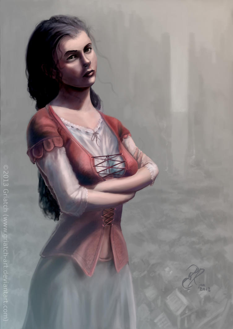
The image "Guide into the fog" is in itself not very notable perhaps, but it was technically marking the use of MakeHuman and Blender to test the pose. I didn't use that technique much after this, the pose tends to be pretty stiff and not necessarily all that realistic either.
During this time I was part of the "Deviant Deadlines" group on DA. This works a little like the Random Art Prompt except the person defining the theme rotated from week to week. Many of the images during those years where inspired by such deadlines. This image "The Can" is based on a Devious Deadline" challenge that required one to make an image containing at least a teddy bear, an empty can and one locket.
I have done relatively few heavily exaggerated figures and even when the theme for Deviant Deadlines (DD) was "charicatures", I could only manage to bring myself to some sort of manga-fication of some of my characters. Even so I'm happy with the emotions here.
During 2013 I made my "Closeup" series, which showed half of the face of almost all my characters. This is "Tattooed closeup", depicting the protagonist of Shrike.
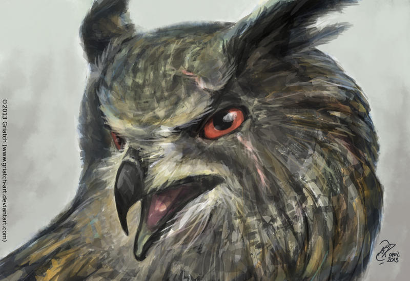
I also started to experiment with the program Krita, which was getting more useful (but still pretty rough) around this time. The "hardcase owl" was made solely using Krita's sketchbrush.
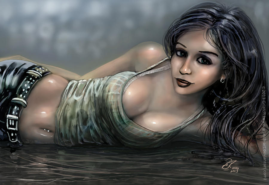
I rarely do outright sexy images, but I suppose "Tank top pose" qualifies. A fun throw-away image and one of my cuter girls I think, although I have gotten some rightful critique that her bosom appears to have gravity-defying properties.
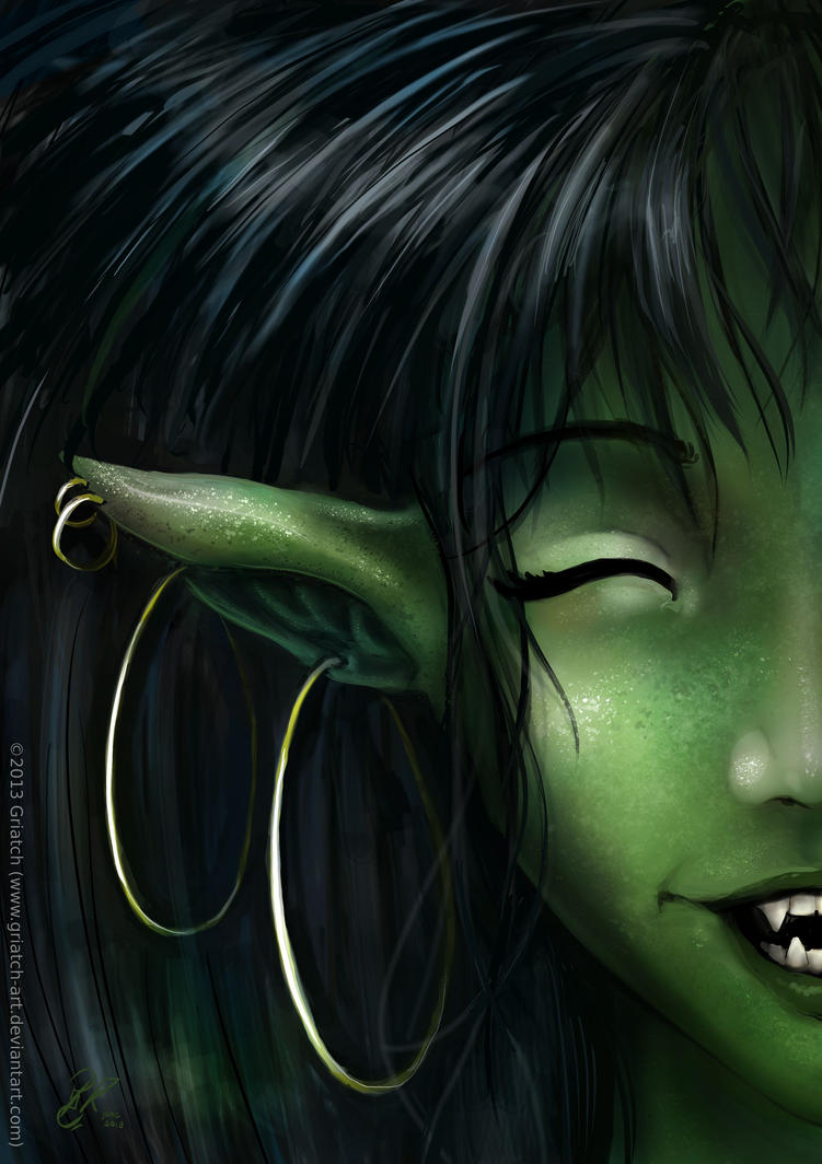
The "closeup" series progressed along the way. This is the 5th and last in the series, showing the troll girl.
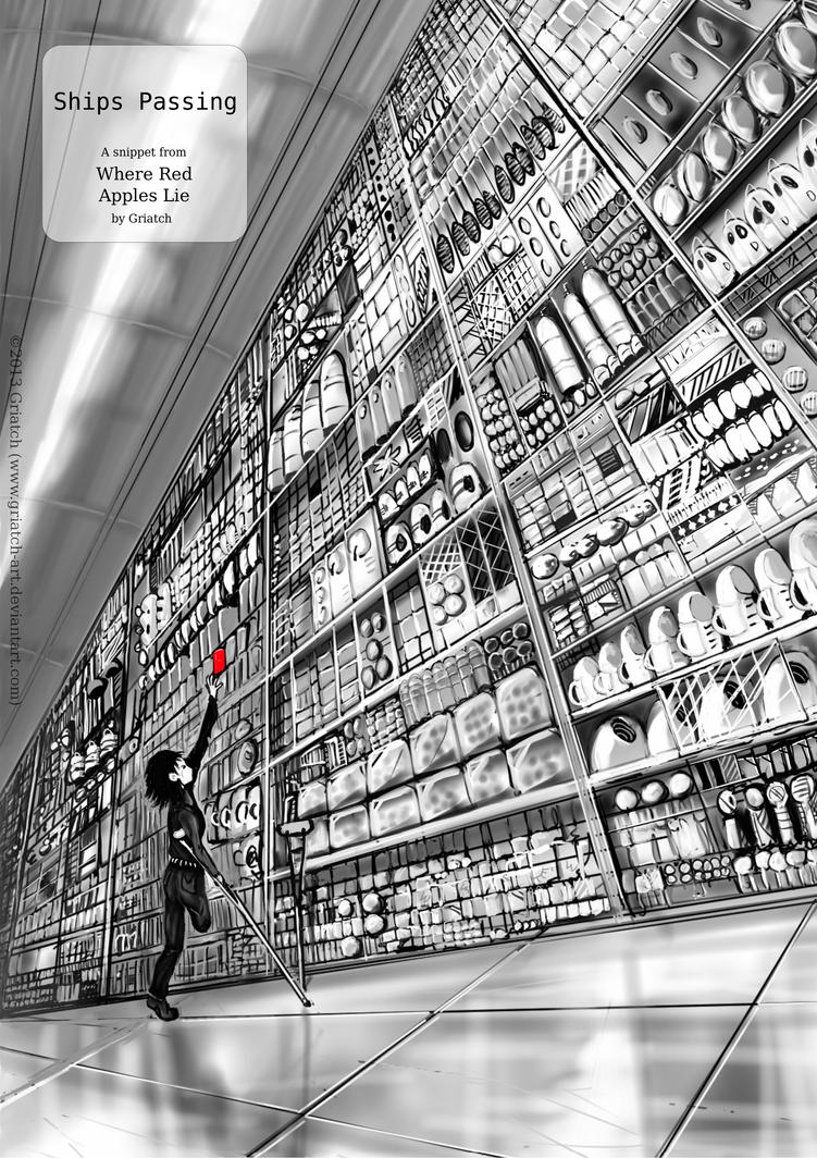
During summer I worked on another snippet for Red Apples Lie. "Ships passing" has gotten good reviews with many people trying to interpret it - it is seemingly a simple story but if you read it carefully it has some rather disturbing connotations that many people picked up on and liked. This was also, together with the previous installments translated to Chinese by an enthusiastic fan.
Technically this marks the first time I did the initial sketch on an android tablet (using the program Sketchup) before importing it into the computer.
The "View over the Empress summer palace" was created on the tablet and then finished in Mypaint+GIMP. I think the cartoony style shows, that is what the table was best at.
The Christmas card for 2013, "Fishing Luck", I sketched on the train and then fleshed out in MyPaint and GIMP. In the end it turned out very differently from how I had imagined it and it's probably the card I'm least happy with in the recent years.
2014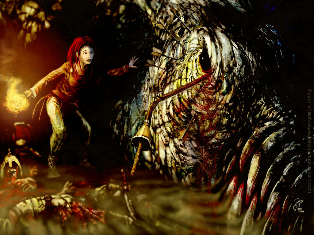
"Dragon Meeting Jester III" continued the long standing theme of the jester meeting the dragon in dramatic circumstance. Technically this was done on the tablet in black&white and then colored on the computer. To that point it was one of my more work-intensive pieces and her pose is probably the part I like the best to this day.
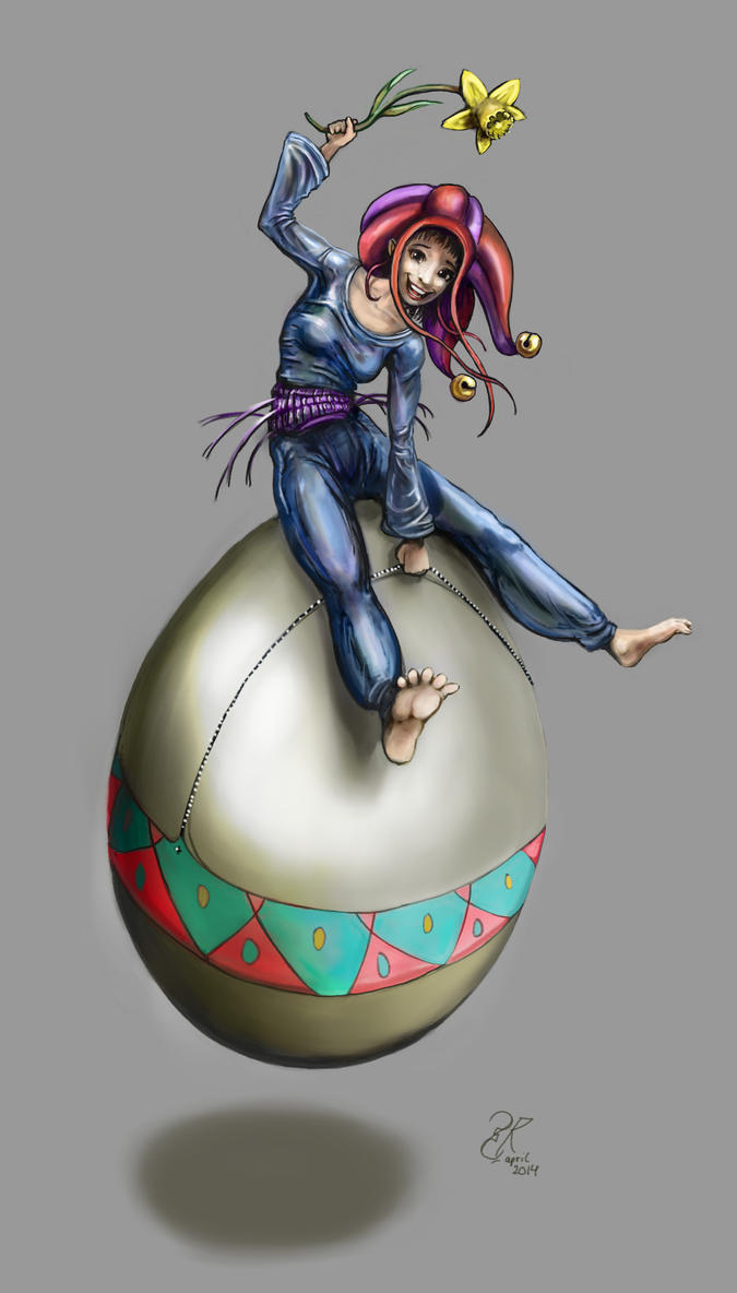
Whereas I have never been big on cartoony-styles I found with this image that I had a rather easy time to make it. Maybe my anatomy has improved to a point where one can play around a little, who knows. This was anyway made as a happy-easter card.
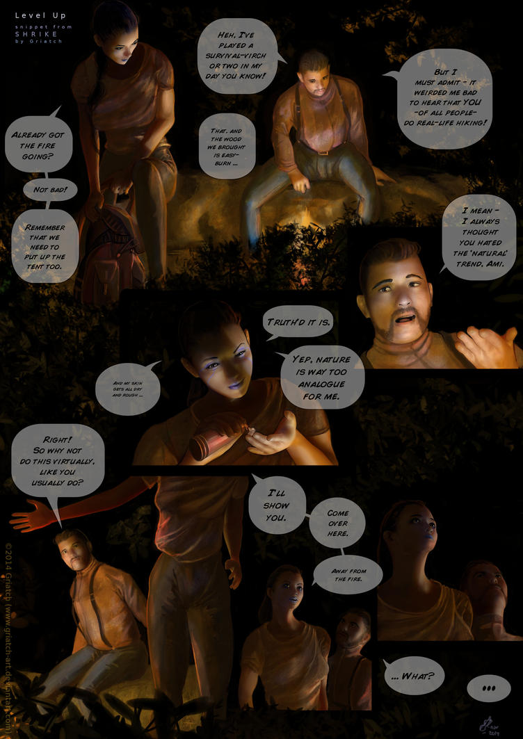
The "Shrike-Level up" comic was probably the most ambitious comic project I had done up to that point - and the one that people liked the least. The characters were created in Makehuman, posed in Blender and once positioned on the page I over-painted the whole thing (never trust facial expressions to a renderer!). The result was pretty realistic but each page took a very long time to make for this reason, which maybe also reduced some of the spontaneousness, with the characters being a little stiff in places. While short, there is a lot of story in this one but maybe there is too much text or too much darkness for people to appreciate it, who knows.
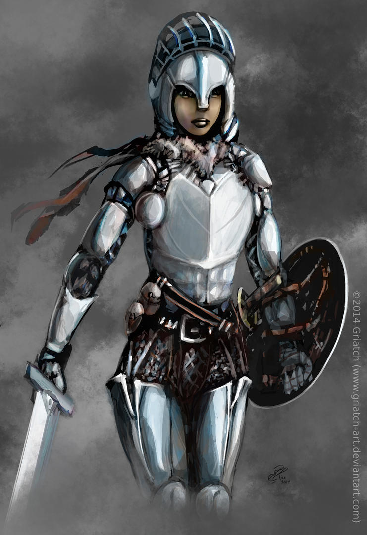
This little fun study (done in Krita) is less interesting in itself but more in the whole sub-culture it put me in contact with - it turns out there is a whole little world of people on DeviantArt that are opposing the concept of "bikini armor" - that is. female armor that is only meant to be sexy and does not have any actual protective properties. This armor of mine was taken in as a "positive example", luckily. After this I have found the concept of "anti-bikini armor" to pop up in many places. Maybe the times are slowly changing, who knows.
"Surprise of trolls" was probably one of the more work-heavy single images I did that year. Done in MyPaint, Krita and GIMP, I tried to polish this more than I usually do, which meant the damn think took the better part of a week to finish.
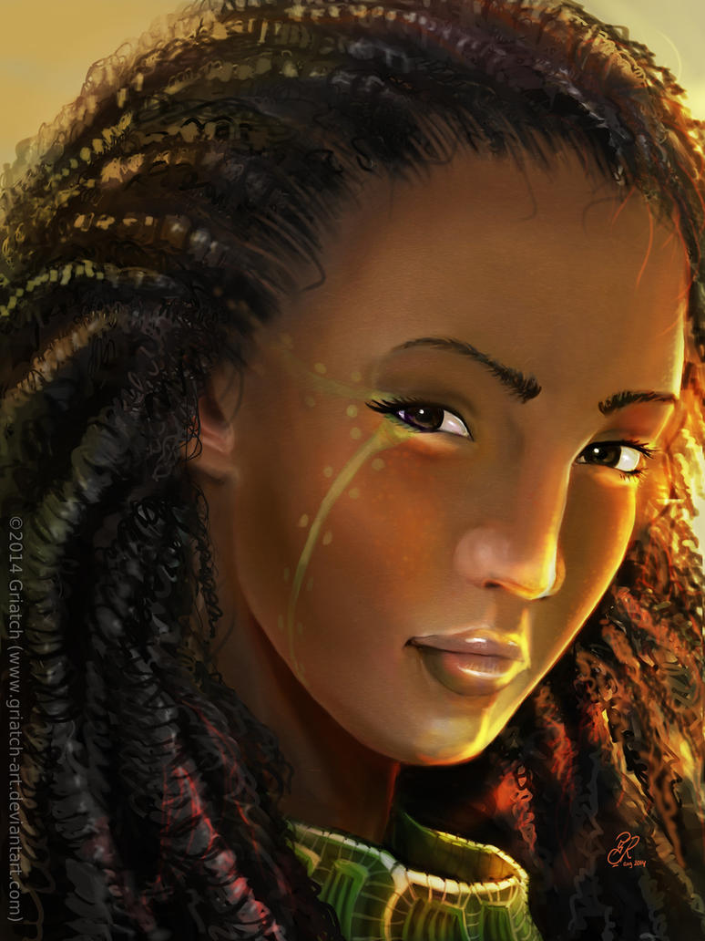
"Sophine d´Empheba", from the Shrike universe, was an experiment with making darker skin, which I found I have not done much at all (except for the troll-girl's green skin which has some similar properties to dark skin technically). I got a lot of positive comments about her dreadlocks.
Was in a portrait-painting mood here. "The curious look" was done completely using Krita's sketchbrush (the same that I used for the "Hardcase Owl" image a few years earlier. This image taught me a thing or two about color balance; the original was a bit too desaturated for its own good.
"The eminently climbable" is technically "Dragon meeting Jester IV" but at this point it felt boring to keep using the same name. Ever since the first image in this series, this is by far the most work I've spent on texturing and light. Plenty of details in this one and it took a looong time to do from its initial idea on the drawing tablet.

"The sleigh trip" was 2014's Christmas card, done in MyPaint and GIMP. Whereas not my most popular card, I was happy with how the snow and counter-light came out in this one. Even so it might be time to go for some other basic theme for these cards for next year. Time will tell.
2015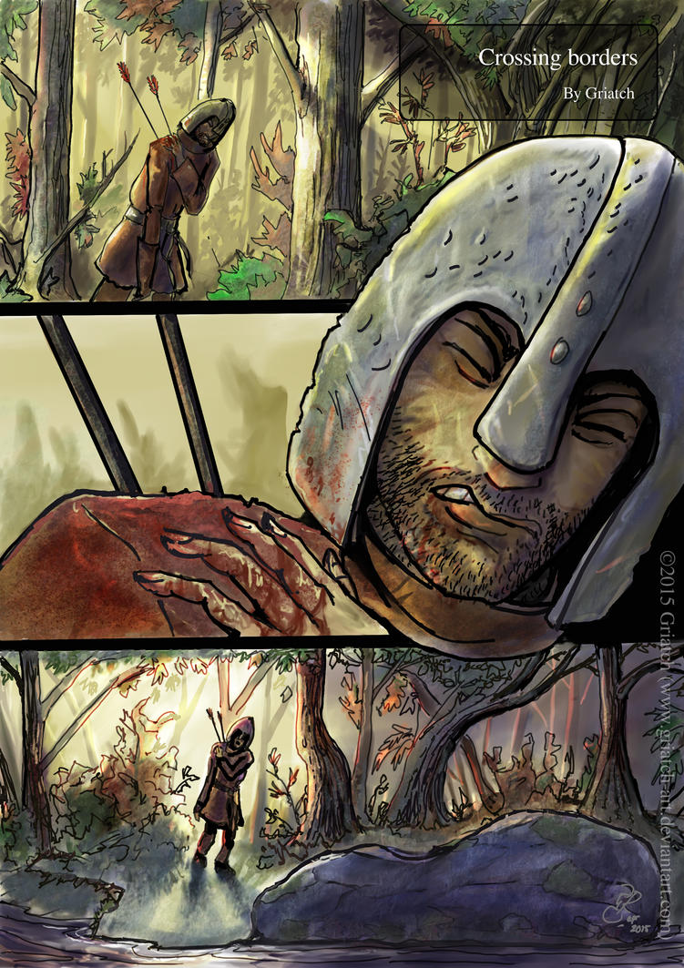
"Crossing borders" is my latest (at this time still ongoing) comic project. It returns to a fully painted form (no makehuman or blender props) of Where Red Apples Lies but does so in full color and using a very different setting. Time will tell how it works out. It's done in MyPaint with support from Krita and GIMP.
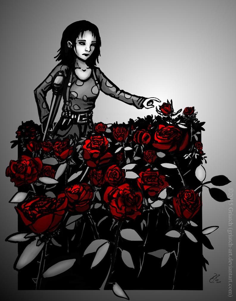
The Random Art Prompt (RAP) which I started a week ago (at the time of this post) is an attempt to bring back the style of Deviant Deadlines (which has now been dead for a year or more) and get to do new artwork based on random prompts that one might never do otherwise. This image, "Field of Roses" was my first take on this prompt (one among many who tried it and came up with cool results in
this thread).
So that's a summary of 300 odd deviations over some 9 years. Now onwards to the next 300!
.
Griatch