@ofnuts
After mulling it over and letting the image rest for a day, I find myself agreeing with
all of your critiques actually.

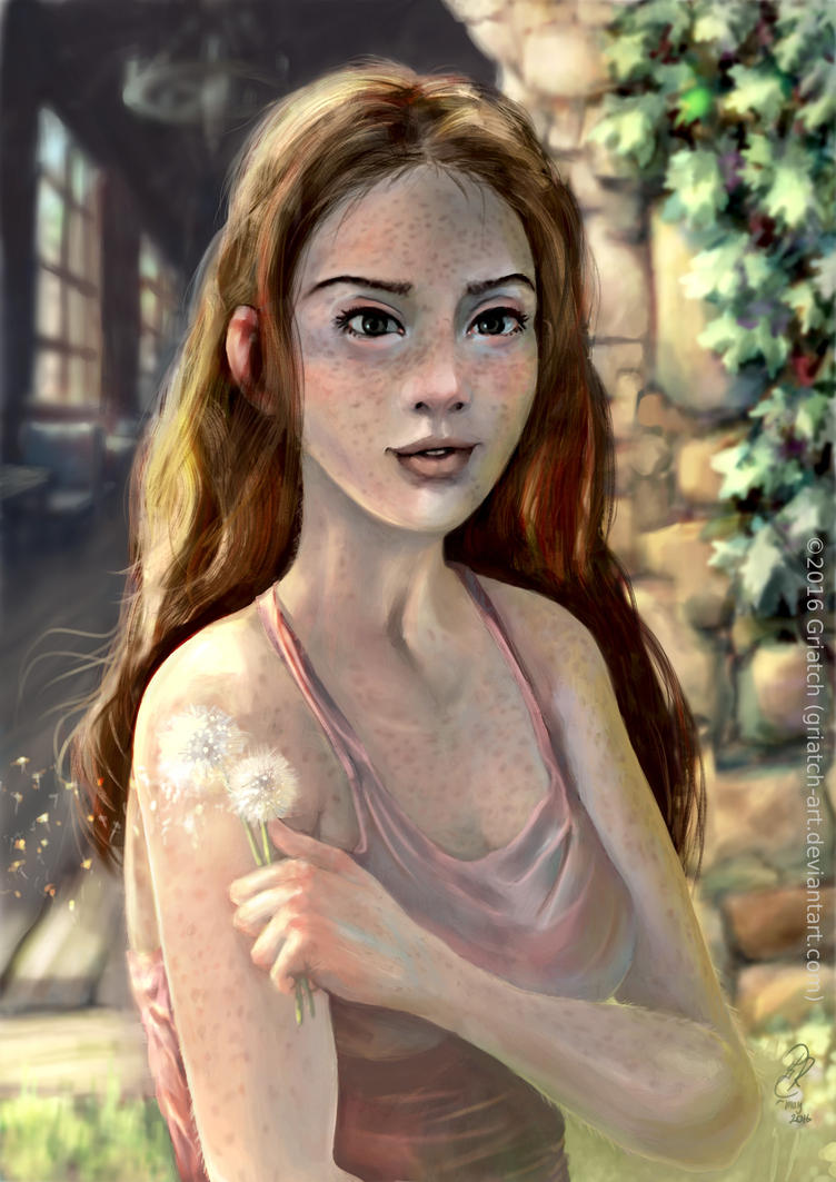
So I went back to the image and made the following changes:
- Made the freckles go further into her decoltage
- Reduced the size of her head. This was something I had a feeling about already, but it was not really clear to me until actually trying with a smaller head.
- Made the right upper arm "swell" in the right way.
- Made the left upper arm more curvy and also shorter, moving the elbow up to better match the right one. Exactly how to measure the length in perspective is not always intuitive to me I find, but this does seem to fit better.
- Reworked the background considerably, making the windows more clear as you suggest. Also a good idea to show more colors through them, it hints at a greater world out there. Also added a wheel-chandelier and some furniture as well as lowered the perspective a bit.
- Added some hints of her hair moving with the dandelion seeds.
- Finally, since her head is smaller there was a lot of empty space above her. So I enlarged all of her to again fill the image similarly to before.
Updated the image in the first post. Original can be seen for a while
here.
Thanks a lot again for the critique, that was very useful. I believe the image has gotten better for it, what do you think?

.
Griatch


