It is currently Thu Apr 18, 2024 9:15 am


All times are UTC - 5 hours [ DST ]


Post new topic Reply to topic  [ 18 posts ] 
Author Message
 Post subject: Playing with perspective -- WIP
PostPosted: Tue Jul 19, 2016 2:54 pm  (#1) 
Offline
GimpChat Member

Joined: Jul 17, 2016
Posts: 293
Location: Arlington, TX
Some of you may have already seen this picture in ofnuts' thread about his intermediate-path script.
Image

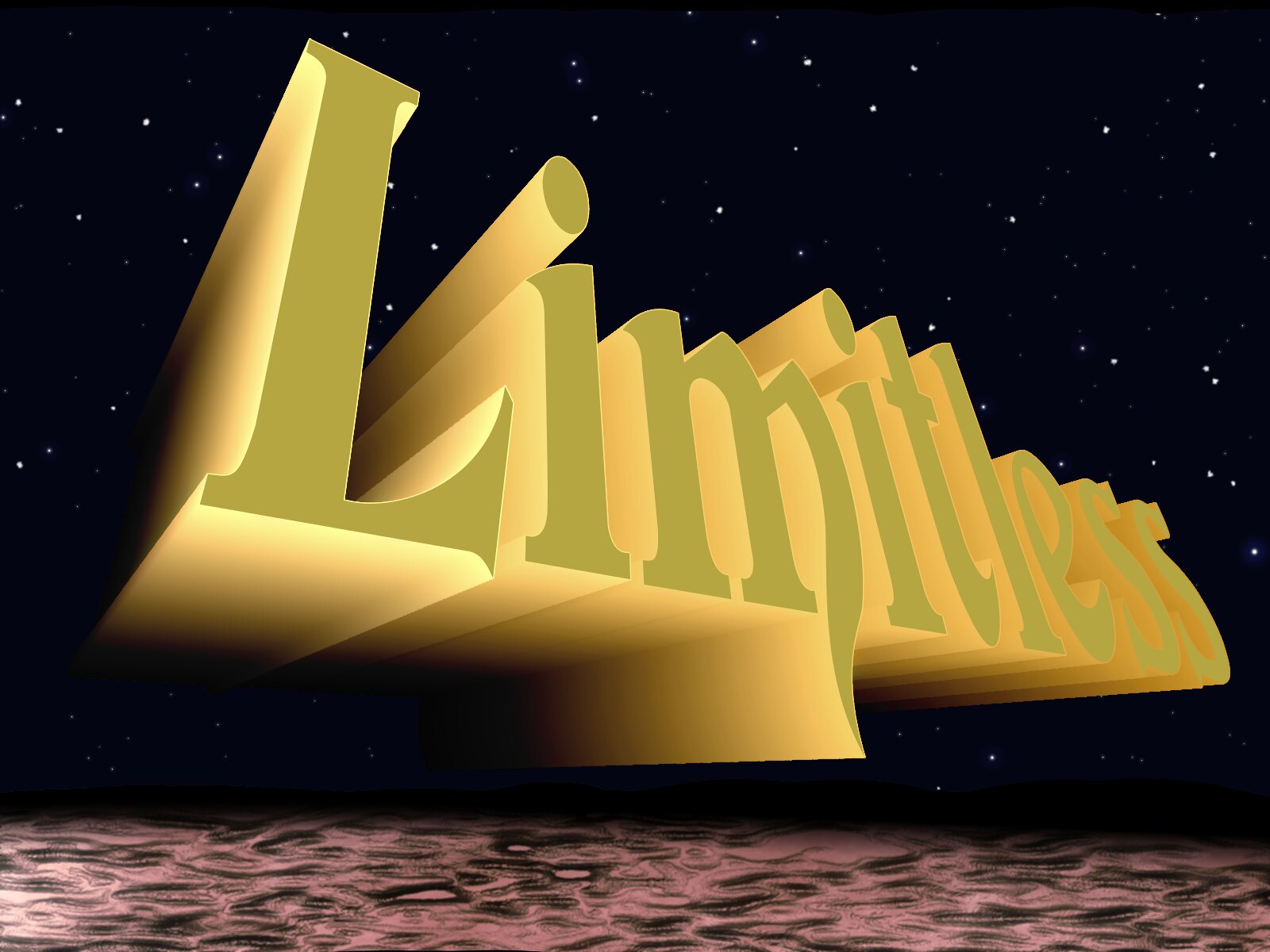
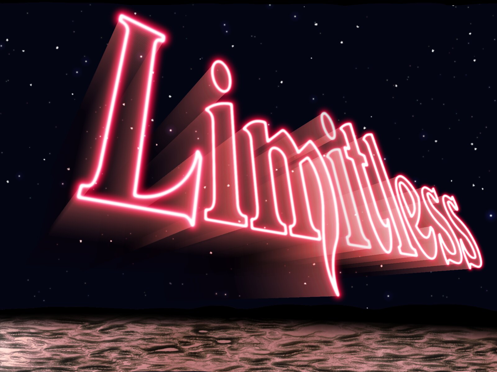
I decided the perspective didn't convey the massiveness I was after, so I fixed it. I added a bit of color mostly to get an idea which way to go. The background is tolerable, but still needs work. The foreground is barely begun. But you can get an idea of where I am going with this. Much work yet to do. Much fun being had.
Image

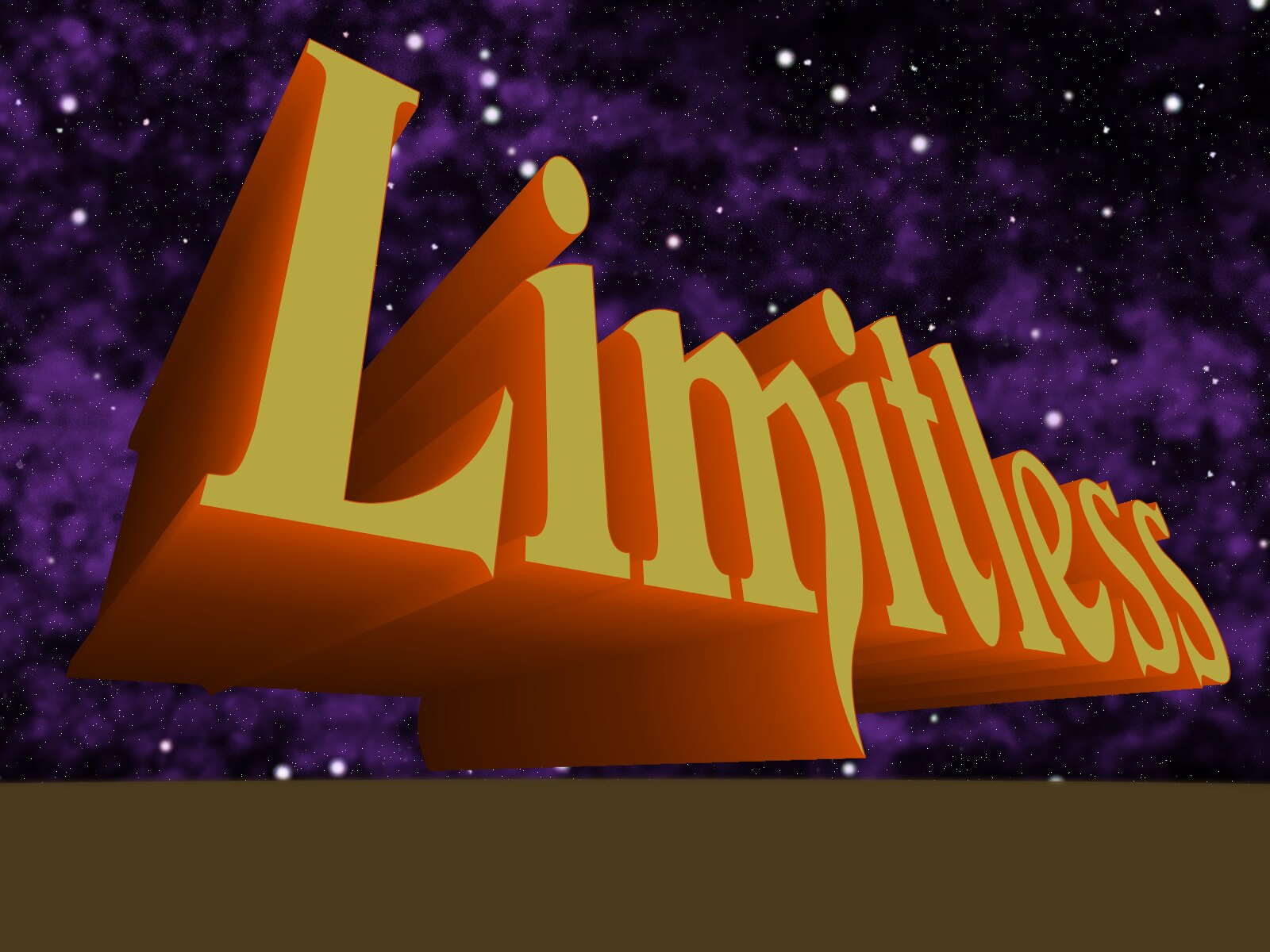
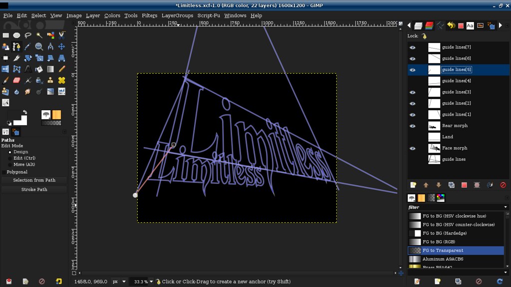
In case you're wondering, I did the perspective exactly the same way as you would do on paper. Only instead of a ruler I used the path tool to create my guide lines.
Image

Things I still need to fix? Everything;
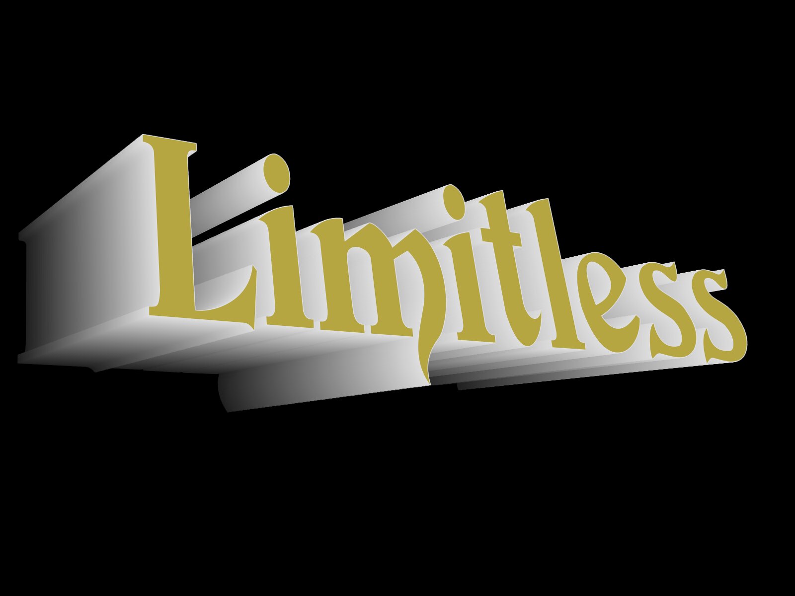
I screwed up and made all the letters one single block. So shading and coloring them individually is impossible-ish. I have to delete all the extrusion and redo each letter individually. That way each letter can be on it's own layer so I can work between them and tweak each one separately. Obviously the lettering needs color, texture, and lighting to make it fit into the picture.
I'm not entirely happy with the background. The stars are too big and clustered for my liking. The nebula looks respectable enough. But it seems a bit monochrome to me.
The foreground is barely begun. The plan is to make it sort of a rocky, asteroid-like surface. I hope to get adventurous and add people marveling at the site before them. We'll see just how far I get with that.

Anyhow, if you see something I could improve or have some idea how I can proceed more easily, please chime in.

_________________
Just a short while ago I was a complete idiot when it comes to GIMP. Today, after many hours of practice, reading, and watching tutorials, I am proud to say I am an incomplete idiot.

Image


Share on Facebook Share on Twitter Share on Orkut Share on Digg Share on MySpace Share on Delicious Share on Technorati
Top
 Post subject: Re: Playing with perspective -- WIP
PostPosted: Tue Jul 19, 2016 3:38 pm  (#2) 
Offline
Administrator
User avatar

Joined: Aug 10, 2012
Posts: 13005
Location: Native to NYC living in Arizona, Gimp 2.8 & 2.10, Win 11 PC.
Nice work Sasquatch.
:clap

_________________
Image
"A wise man learns more from a foolish question than a fool can learn from a wise answer"
Image


Top
 Post subject: Re: Playing with perspective -- WIP
PostPosted: Tue Jul 19, 2016 3:48 pm  (#3) 
Offline
GimpChat Member

Joined: Jul 17, 2016
Posts: 293
Location: Arlington, TX
Thanks, Wallace. I'm fairly proud of it so far. At a bit of a loss as to what to do next. But I'll sort it out.

_________________
Just a short while ago I was a complete idiot when it comes to GIMP. Today, after many hours of practice, reading, and watching tutorials, I am proud to say I am an incomplete idiot.

Image


Top
 Post subject: Re: Playing with perspective -- WIP
PostPosted: Tue Jul 19, 2016 6:00 pm  (#4) 
Offline
Administrator
User avatar

Joined: Aug 10, 2012
Posts: 13005
Location: Native to NYC living in Arizona, Gimp 2.8 & 2.10, Win 11 PC.
Sasquatch wrote:
Thanks, Wallace.
I'm fairly proud of it so far. At a bit of a loss as to what to do next.
But I'll sort it out.

Here's a thought...

Maybe by adding something to the background and or foreground,
(a planet or spaceship etc.).
Might help to convey a more dynamic sense of scale to the text?

_________________
Image
"A wise man learns more from a foolish question than a fool can learn from a wise answer"
Image


Top
 Post subject: Re: Playing with perspective -- WIP
PostPosted: Tue Jul 19, 2016 6:12 pm  (#5) 
Offline
GimpChat Member

Joined: Jul 17, 2016
Posts: 293
Location: Arlington, TX
I definitely plan to add stuff. I'm just trying to get the basic structure squared away before I worry too much about details. And I honestly don't know what details I want to add yet.

_________________
Just a short while ago I was a complete idiot when it comes to GIMP. Today, after many hours of practice, reading, and watching tutorials, I am proud to say I am an incomplete idiot.

Image


Top
 Post subject: Re: Playing with perspective -- WIP
PostPosted: Sat Jul 23, 2016 11:44 am  (#6) 
Offline
GimpChat Member

Joined: Jul 17, 2016
Posts: 293
Location: Arlington, TX
Alrighty then.

I changed the background. I added some basic shading between the letters. And I gave the land some texture. I'm not entirely sure I'm thrilled with the land. My rock kung-fu seems to be failing me. But I'm happy with the way it's progressing.

I still need to work on the letters to make them less cartoony. And they need to fit into the environment better as well.

Image

There might be a useful tip in this most recent version;
The contour of the horizon line, which is critical to making it seem more realistic vs the original smooth curve, was created by simply running a displacement map on the layer mask of the land layer.

_________________
Just a short while ago I was a complete idiot when it comes to GIMP. Today, after many hours of practice, reading, and watching tutorials, I am proud to say I am an incomplete idiot.

Image


Top
 Post subject: Re: Playing with perspective -- WIP
PostPosted: Sat Jul 23, 2016 4:03 pm  (#7) 
Offline
GimpChat Member
User avatar

Joined: Apr 09, 2016
Posts: 580
Location: Sheffield UK
Brilliant work Sasquatch, I'm new to GIMP and I really appreciate the way you also explain how you achieved your outcome - in Peace RJKD

_________________
Image


Top
 Post subject: Re: Playing with perspective -- WIP
PostPosted: Sat Jul 23, 2016 5:44 pm  (#8) 
Offline
GimpChat Member

Joined: Jul 17, 2016
Posts: 293
Location: Arlington, TX
RJKD wrote:
Brilliant work Sasquatch, I'm new to GIMP and I really appreciate the way you also explain how you achieved your outcome - in Peace RJKD

I'm flattered by your praise, RJKD. I'm fairly new myself. And I'm certainly not one of the more capable members of this forum. So what you don't see here is the hours of tinkering behind these modest pictures. I spend most of my time playing with different techniques to see what happens. Occasionally it leads to something useful.

As for the sharing of tricks... well, I'd like to think that's what this forum is about. I consider sharing what little I know to be sort of the price of admission.

_________________
Just a short while ago I was a complete idiot when it comes to GIMP. Today, after many hours of practice, reading, and watching tutorials, I am proud to say I am an incomplete idiot.

Image


Top
 Post subject: Re: Playing with perspective -- WIP
PostPosted: Sun Jul 24, 2016 1:37 am  (#9) 
Offline
Global Moderator
User avatar

Joined: Apr 01, 2012
Posts: 7712
Location: On the other side of this screen
I like your text. I still haven't mastered how to do it that way.

_________________


Top
 Post subject: Re: Playing with perspective -- WIP
PostPosted: Sun Jul 24, 2016 6:38 am  (#10) 
Offline
GimpChat Member

Joined: Jul 17, 2016
Posts: 293
Location: Arlington, TX
sallyanne wrote:
I like your text. I still haven't mastered how to do it that way.

Set up the guide paths like I showed in the one post above. Then use the perspective tool to deform the text layer until it fits into the guide paths. Or, use those guide paths to create a new rectangular path and use Saulgoode's "warp text" script to shape the text into that perspective path. That gives you the face. Do the same process to create the rear of the letters. Then ofnuts' "create intermediate layers" and "stroke visible paths" scripts can fill the gap between the two like magic.

_________________
Just a short while ago I was a complete idiot when it comes to GIMP. Today, after many hours of practice, reading, and watching tutorials, I am proud to say I am an incomplete idiot.

Image


Top
 Post subject: Re: Playing with perspective -- WIP
PostPosted: Sun Jul 24, 2016 7:22 am  (#11) 
Offline
GimpChat Member

Joined: Jul 17, 2016
Posts: 293
Location: Arlington, TX
sallyanne wrote:
I like your text. I still haven't mastered how to do it that way.

Here you go, Sallyanne. The attached xcf has the easy part done. All you have to do is create the paths and fill in the gap. :) If nothing else, that should at least give you an idea of how I did it.


Attachments:
File comment: Perspective tweaked sig.
SallyGift.xcf [216.28 KiB]
Downloaded 72 times

_________________
Just a short while ago I was a complete idiot when it comes to GIMP. Today, after many hours of practice, reading, and watching tutorials, I am proud to say I am an incomplete idiot.

Image
Top
 Post subject: Re: Playing with perspective -- WIP
PostPosted: Sun Jul 24, 2016 9:01 am  (#12) 
Offline
GimpChat Member

Joined: Jul 17, 2016
Posts: 293
Location: Arlington, TX
And here's the final piece. I forgot to turn on one of the layers while I was checking things out. The resulting translucent effect was so perfect that I decided to pursue that direction instead. I'm very happy with the final result. I also decided not to clutter the image with extra bits. I still think the land could be better. But I'll worry about that some other time.

Image

_________________
Just a short while ago I was a complete idiot when it comes to GIMP. Today, after many hours of practice, reading, and watching tutorials, I am proud to say I am an incomplete idiot.

Image


Top
 Post subject: Re: Playing with perspective -- WIP
PostPosted: Sun Jul 24, 2016 1:42 pm  (#13) 
Offline
GimpChat Member
User avatar

Joined: Apr 08, 2010
Posts: 5420
Location: Northwest Ohio
Beautiful. The only thing that might be improved are the stars that shine through the lettering...IMO, they should be less bright so they look more like they are behind the translucent letters.


Top
 Post subject: Re: Playing with perspective -- WIP
PostPosted: Wed Jul 27, 2016 6:26 pm  (#14) 
Offline
GimpChat Member

Joined: Jul 17, 2016
Posts: 293
Location: Arlington, TX
2-ton wrote:
Beautiful. The only thing that might be improved are the stars that shine through the lettering...IMO, they should be less bright so they look more like they are behind the translucent letters.

Thanks. That's a pretty good suggestion about dimming the stars. I'll work on that this weekend. The more I look at it, the more I dislike the terrain. I really need to find a way to create better rocky terrain without using stock photos.

_________________
Just a short while ago I was a complete idiot when it comes to GIMP. Today, after many hours of practice, reading, and watching tutorials, I am proud to say I am an incomplete idiot.

Image


Top
 Post subject: Re: Playing with perspective -- WIP
PostPosted: Wed Aug 03, 2016 12:53 pm  (#15) 
Offline
GimpChat Member
User avatar

Joined: Apr 09, 2016
Posts: 580
Location: Sheffield UK
Hi Sasquatch, what font did you use for this creation?

_________________
Image


Top
 Post subject: Re: Playing with perspective -- WIP
PostPosted: Thu Aug 04, 2016 3:14 pm  (#16) 
Offline
GimpChat Member

Joined: Jul 17, 2016
Posts: 293
Location: Arlington, TX
RJKD wrote:
Hi Sasquatch, what font did you use for this creation?

I'll look for it. I don't have access to that computer at the moment. I'll get back to you ASAP.

_________________
Just a short while ago I was a complete idiot when it comes to GIMP. Today, after many hours of practice, reading, and watching tutorials, I am proud to say I am an incomplete idiot.

Image


Top
 Post subject: Re: Playing with perspective -- WIP
PostPosted: Fri Aug 05, 2016 1:43 am  (#17) 
Offline
Administrator
User avatar

Joined: Aug 10, 2012
Posts: 13005
Location: Native to NYC living in Arizona, Gimp 2.8 & 2.10, Win 11 PC.
RJKD wrote:
Hi Sasquatch, what font did you use for this creation?


Might be devinne swash?
I'm sure Sasquatch will verify this for us if it is or not.


Image

_________________
Image
"A wise man learns more from a foolish question than a fool can learn from a wise answer"
Image


Top
 Post subject: Re: Playing with perspective -- WIP
PostPosted: Fri Aug 05, 2016 4:09 am  (#18) 
Offline
GimpChat Member

Joined: Jul 17, 2016
Posts: 293
Location: Arlington, TX
Wallace wrote:
RJKD wrote:
Hi Sasquatch, what font did you use for this creation?


Might be devinne swash?
I'm sure Sasquatch will verify this for us if it is or not.

Yup, that's it.

_________________
Just a short while ago I was a complete idiot when it comes to GIMP. Today, after many hours of practice, reading, and watching tutorials, I am proud to say I am an incomplete idiot.

Image


Top
Post new topic Reply to topic  [ 18 posts ] 

All times are UTC - 5 hours [ DST ]


   Similar Topics   Replies 
No new posts Attachment(s) Perspective

6

No new posts Seamless pattern in perspective

4

No new posts Attachment(s) PERSPECTIVE TOOL BENDING OTHER SIDE BACK

13

No new posts Attachment(s) Playing with my photos

809

No new posts Attachment(s) Playing with Crystals Background

0


* Login  


Powered by phpBB3 © phpBB Group