It is currently Tue Jul 02, 2024 9:38 pm


All times are UTC - 5 hours [ DST ]


Post new topic Reply to topic  [ 6 posts ] 
Author Message
 Post subject: background and foreground: discussion of a little GIMPWork with b/w
PostPosted: Sun Jan 12, 2020 6:19 am  (#1) 
Offline
GimpChat Member

Joined: Aug 08, 2019
Posts: 9
hello dear all good day,

working on a little campaign i need to have a kind of a school- or classroom that functions as a kind of foil in the background where in the foreground i set a claim...

version a. Wir suchen die digitalsteschule Deutschlands.
es geht um unser Land

translated: were looking for the most digital school in Germany
its about our country.

Attachment:
classroom_version__a__wide_view_low_res.jpg
classroom_version__a__wide_view_low_res.jpg [ 11.39 KiB | Viewed 1758 times ]

Attachment:
classroom_version_b_wide_view_low_res.jpg
classroom_version_b_wide_view_low_res.jpg [ 19.79 KiB | Viewed 1758 times ]


version b. Wo ist die digitalste Schule Deutschlands
es geht um unser Land

translated: where is the most digital school in Germany
its about our country.


question: i want to know which image looks more convincing and nice. Which is better.
I have created several views on the version a. - small and narrow look and view and a more widescaled view

i have created one version of b:


i for one - like the version a. and especially the one with the narrow look - wehre we cannot see the full classroom.

what do you say - which one do you like most!?

love to hear from you
btw- have a great day


credits: photo taken with the consent of the author Clemens Vogelsang https://www.facebook.com/clemens.vonvogelsang
https://www.flickr.com/photos/vauvau/57 ... otostream/
photo published under the creative commons 2 see https://creativecommons.org/licenses/by/2.0/


Attachments:
File comment: version a
wir_suchen_die_digitalste_schule_deutschlands__full_size.jpg
wir_suchen_die_digitalste_schule_deutschlands__full_size.jpg [ 4.5 MiB | Viewed 1758 times ]
Share on Facebook Share on Twitter Share on Orkut Share on Digg Share on MySpace Share on Delicious Share on Technorati
Top
 Post subject: Re: background and foreground: discussion of a little GIMPWork with b
PostPosted: Sun Jan 12, 2020 6:27 am  (#2) 
Offline
GimpChat Member

Joined: Aug 08, 2019
Posts: 9
hi there

was not able to add the third image - the version a - narrow-view: - which i like most.

now i add this image here.

Attachment:
classroom_version_a_narrow_view_low_res.jpg
classroom_version_a_narrow_view_low_res.jpg [ 110.48 KiB | Viewed 1755 times ]


i look forward to hear from you

regards


Top
 Post subject: Re: background and foreground: discussion of a little GIMPWork with b
PostPosted: Sun Jan 12, 2020 8:10 am  (#3) 
Offline
GimpChat Member
User avatar

Joined: May 10, 2013
Posts: 1389
Location: FInland
The classroom looks really dark, first I would make it brighter.
Never been a fan of placing text inside blocks, using Gimp's text tool I would type the quote on the bottom.
Centered, using some common font in same size and color for all the text.
Add a stroke and subtle shadow to make sure it doesn't blend with the image.


Top
 Post subject: Re: background and foreground: discussion of a little GIMPWork with b
PostPosted: Sun Jan 12, 2020 3:05 pm  (#4) 
Offline
GimpChat Member

Joined: Aug 08, 2019
Posts: 9
hello dear Nidhogg,

first of all - many many thanks for the quick reply and for all idea-sharing. I am very glad to hear from you.

- youre right. the classroom is pretty dark. I guess that i have to make it a bit brighter.
- regarding the text block that i have placed in the center of the picture. You prefer placing the text to toe bottom - centered.

good idea.

what do you mean by
Nidhogg wrote:
adding a stroke and subtle shadow to make sure it doesn't blend with the image.


i will digg deeper and try out to go ahead - many many thanks for all you did.

have a great day.

:)


Top
 Post subject: Re: background and foreground: discussion of a little GIMPWork with b
PostPosted: Mon Jan 13, 2020 4:02 am  (#5) 
Offline
GimpChat Member
User avatar

Joined: May 10, 2013
Posts: 1389
Location: FInland
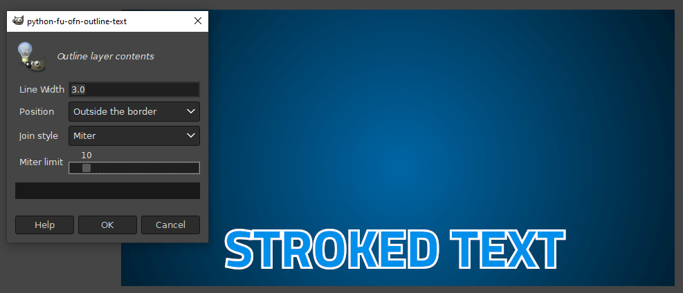
Stroke is the line around text. It's a usual, simple technique to make text stand out or separate it from the background.

There is the layerfx plug-in, but I recommend Ofnuts' ofn-outline-layer.py
It's almost on top, here:

https://sourceforge.net/projects/gimp-tools/files/scripts/


Extract the zip archive and put the .py file in the Gimp user plug-ins folder.
You didn't mention your OS, in Windows (Gimp 2.10 series) that is:
C:/Users/"YourUserName"/AppData/Roaming/GIMP/2.10/plug-ins
In Linux:
/home/config/GIMP/2.10/plug-ins

Menu entry for the plug-in is Layer/Outline Layer Contents.
This is pretty simple plug-in, play with the settings and you'll soon find a pleasing result.
Note that it uses the active background color to stroke the path.

Just a quick example using Titillium font.

Image


Top
 Post subject: Re: background and foreground: discussion of a little GIMPWork with b
PostPosted: Mon Jan 13, 2020 8:22 pm  (#6) 
Offline
GimpChat Member
User avatar

Joined: Oct 12, 2016
Posts: 377
Image


1) Brighten classroom using Colors/curves

2) Place text on front of classroom using text tool
with corbel bold font color white (ffff)

3) Add long shadow to text filters\light & shadow\
long shadow color blue (2747c7). Shadow length 3-4.5,
Angle 85 to 95 all other settings as is.

4) Position text using Unified Transform Tool.

Mainah_Ayuh

_________________
Image


Top
Post new topic Reply to topic  [ 6 posts ] 

All times are UTC - 5 hours [ DST ]


   Similar Topics   Replies 
No new posts Change foreground and background color

2

No new posts Change Foreground Colour

0

No new posts Gimp always "not responding" when I use the foreground select tool.

1

No new posts Attachment(s) how could i make this background

7

No new posts Background patterns

3


* Login  


Powered by phpBB3 © phpBB Group