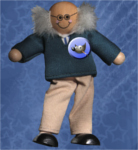
neurolurker wrote:
Patrice, thank you for asking. Strictly speaking, I'm fond of visual symmetry and I needed something placed close to the bottom of the overall image to balance the white-spaced "title" that I had put at the top of the image.
Symmetry does it very well

neurolurker wrote:
........./......so the handwriting ended up looking like a printed exhibit identification card. And that actually gave the piece it's Museum Fantasy designation.
The words "artist and date unknown" was just imitating something I've often seen used for artifacts in museums.
That was one of my thoughts, the museum theme, where we can often see artist unknown, date unknown,

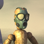
neurolurker wrote:
I used online translators to make images of the Greek text, which I cannot read myself. My hat is off to you!
Ben
Oh no, no hat off please

, I don't speak Greek nor can read Greek, but out of curiosity I did use my phone with the
Google translate App, where it uses the camera and reads an image and the writing on the image is translated

(Where I live we got a lot of mall specialized with food product from Korea, Japan, China, etc, and there is no English on the packaging... Yes lot of people are with their phone scanning the product in those malls

)
I hope you will do more "museum fantasy" I like the theme