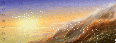
I like this result very much, a very cool structure/room. Much more accessible than fractals full of colour I think - this is definitely a style you ought to continue experimenting with.
One critique I have is that there is no sense of different weight to the various parts of the image. With equal weights the eye cannot read the depth quite as well as it may. One thing you might want to try is going over the large "flat" surfaces with a large brush to clean out some of the multitude of small lines on the large surfaces - I suspect this is an easy way to further make the image "pop" by creating contrasting areas of low- and high detail. Enhancing details with the Dodge tool could also easily add highlights and further bring out the parts you want to be in the foreground or focus of the image. Just some ideas.

Very cool at any rate, thumbs up!
.
Griatch


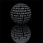
 i am cheating...it is a 3d fractal quickly edited with gimp C2G (in gegl operation)+ unsharpmask 2 ..