Erisian wrote:
Unusual for you to use greyscale Moko. I like it - it's a great effect.
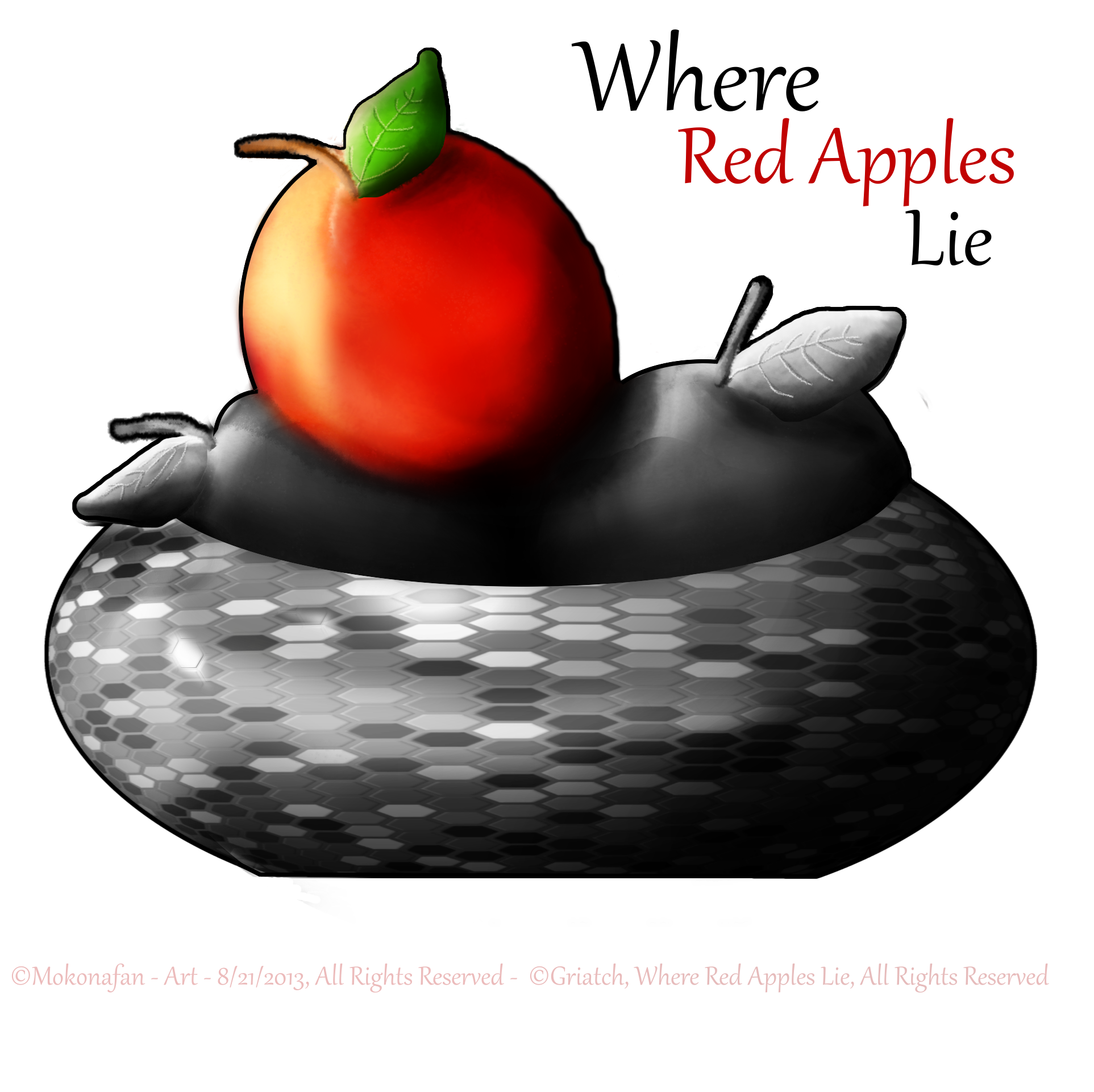
Yeah it is, I like color color and colorrrrrr!!!
I'm glad you like it.

Griatch wrote:
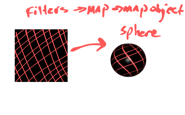
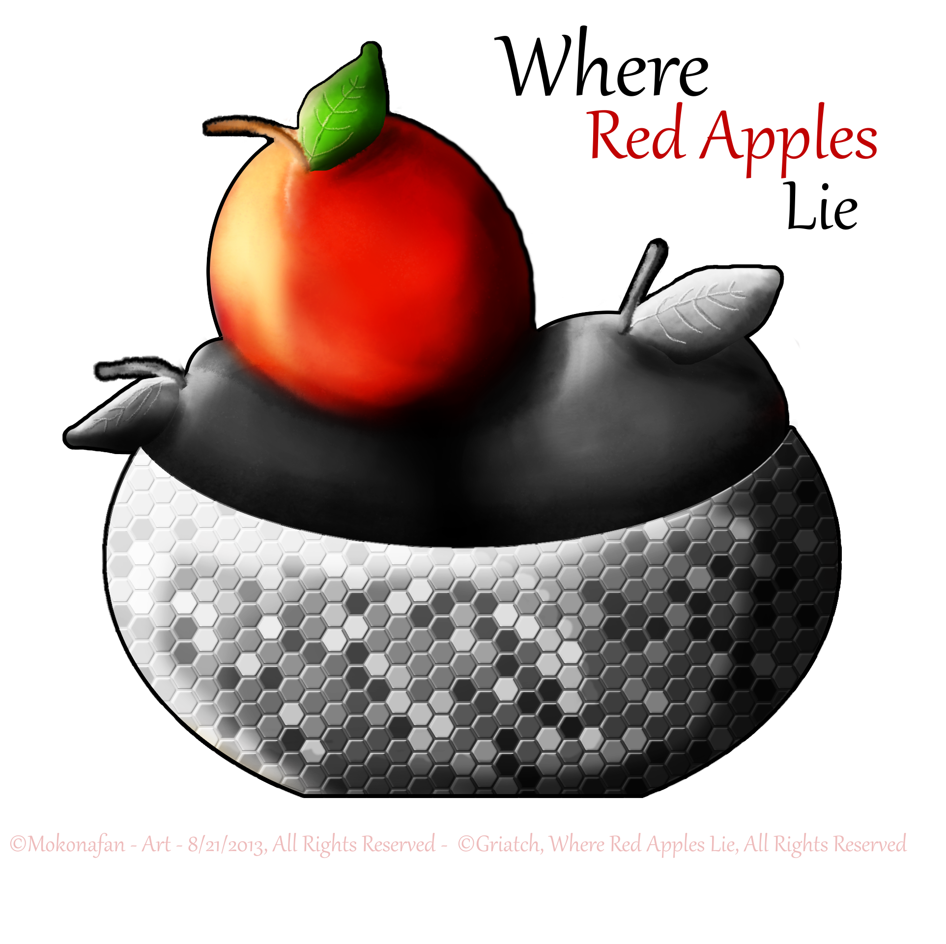
Oooh, that's cool Moko! Much appreciated! I like the stark outline around the whole piece, gives it an iconic feel, very much a part of your personal style I think. Applying the spherical map did add more depth to the bowl too.

Interesting technique to do everything in colour and then desaturate; as you say it was probably more work this way, but as long as it works!
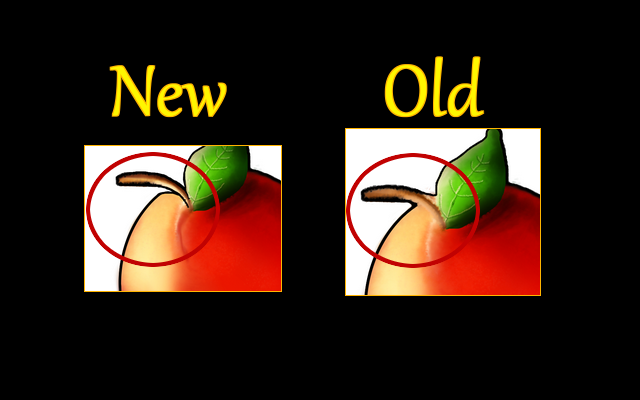
Since I know you want feedback, you could maybe take another look at the apple. Apples are like bloated doughnuts, around the stem on both sides there is a deep recess (look at the Apple logo for example). I think you could just add a bit more dark-red shading around the stem in this case, and maybe a highlight to show the "dip" around the stem.
Thanks for the great Red Apples Lie themed image!
.
Griatch
You're welcome I'm glad you liked it!
I was having issues with the red apple's outline, it wasn't "popping" like I wanted!

Maybe shading will help, I'll see if I can fix that that way...


