molly wrote:
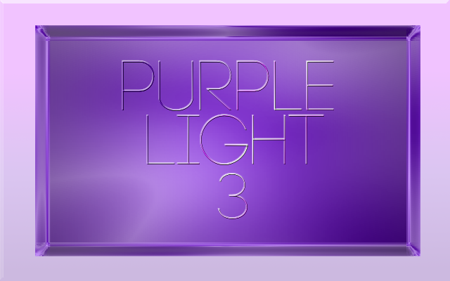
one more... maybe not
[ Image ]
It won't just be one more though will it Mo?
 Lovely purple!
 | GIMP Chat http://gimpchat.com/ |
|
| 2 tons of gold http://gimpchat.com/viewtopic.php?f=12&t=8666 |
Page 3 of 6 |
| Author: | Erisian [ Thu Oct 03, 2013 4:36 pm ] |
| Post subject: | Re: 2 tons of gold |
molly wrote: one more... maybe not [ Image ] It won't just be one more though will it Mo? Lovely purple! |
|
| Author: | Rellik419 [ Thu Oct 03, 2013 5:22 pm ] |
| Post subject: | Re: 2 tons of gold |
molly wrote: one more... maybe not [ Image ]  Keep em coming! Keep em coming! 
|
|
| Author: | molly [ Thu Oct 03, 2013 7:23 pm ] |
| Post subject: | Re: 2 tons of gold |
Your turn
|
|
| Author: | 2-ton [ Thu Oct 03, 2013 8:25 pm ] |
| Post subject: | Re: 2 tons of gold |
Tux, your instructions are great! But the only 2 tons gradient I ended up was #2, so I used that one. I could not figure out how to make it hue-shifted to get the engraved look but I got the rest of it down! Thanks so much, here is what I have so far! Any and all hints and helps are welcome, I still have to add more text and graphics to it. 
|
|
| Author: | GnuTux [ Fri Oct 04, 2013 2:16 am ] |
| Post subject: | Re: 2 tons of gold |
Looking good, 2-ton! The hue shift is basically a color change toward more a darker copperish gold, rather than a lighter yellow gold. As far as getting an engraved -vs- embossed effect, that is normally achieved by inverting the Bump Map. To me though, it seems the result is dependent on the colors used and the size & shape of the image. More often than not, if I stare at the bump, it becomes an optical illusion, sometimes looking like it's embossed and sometimes looking engraved, kinda like the old wire frame box effect. At times, I can a better engraved effect by creating a darker inner shadow on one side and a lighter outer shadow on the other side (or an overall glow). In the following, I hue shifted and added an inner shadow to the bump mapped text. 
|
|
| Author: | GnuTux [ Fri Oct 04, 2013 5:10 am ] |
| Post subject: | Re: 2 tons of gold |
Here's my 1st attempt at a gold coin. 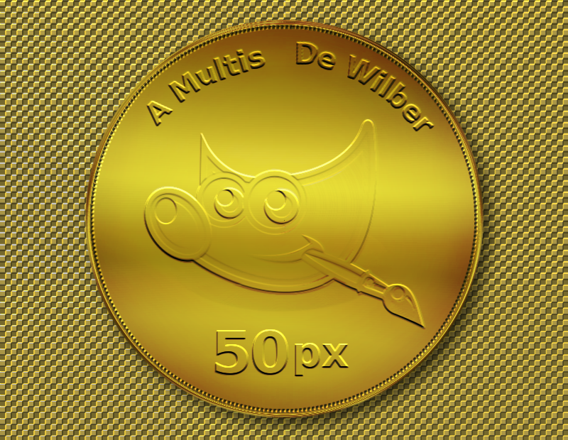
|
|
| Author: | molly [ Fri Oct 04, 2013 5:12 am ] |
| Post subject: | Re: 2 tons of gold |
I love that wow. How do you get that checkerboard bumped? Or is that a pattern? |
|
| Author: | GnuTux [ Fri Oct 04, 2013 5:16 am ] |
| Post subject: | Re: 2 tons of gold |
Thanks, Molly. I filled the BG with this pattern.. Attachment: Colorized it, then Bump Mapped it with itself in the Lighting Effects filter . I think I can get better color and shine on the coin with a different emap and extra lighting effects. Silver or copper should work good too.
|
|
| Author: | molly [ Fri Oct 04, 2013 5:23 am ] |
| Post subject: | Re: 2 tons of gold |
Well thank you for that. I was trying everything. I put a gradient on to a transparent layer and tried bump mapping it and when I saved it, it wasn't there, of coarse cuz it was transparent. dumb me. |
|
| Author: | GnuTux [ Fri Oct 04, 2013 5:40 am ] |
| Post subject: | Re: 2 tons of gold |
More Copperish.. 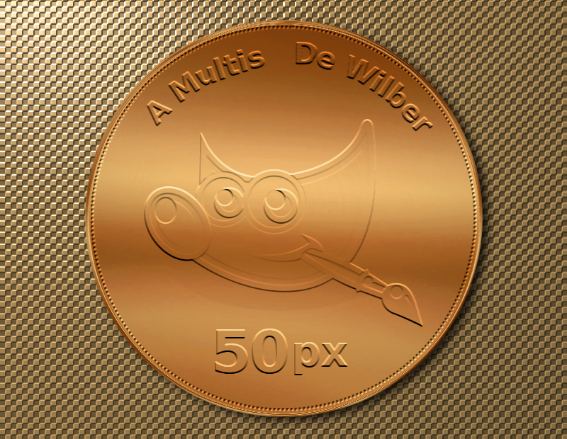 Extra Lighting.. 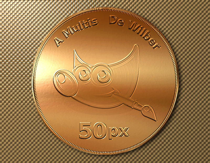
|
|
| Author: | molly [ Fri Oct 04, 2013 6:28 am ] |
| Post subject: | Re: 2 tons of gold |
very good... I was working on a copper one but the ridge didn't go around the outside but I was able to stroke the dots, so I am still struggling. Better go get some more coffee first. BTW, I like the second one best. |
|
| Author: | GnuTux [ Fri Oct 04, 2013 6:52 am ] |
| Post subject: | Re: 2 tons of gold |
Blur the outside edge of the black circle for the bump map, the same as you did with the black rectangle bump map, except maybe not quite as much. |
|
| Author: | molly [ Fri Oct 04, 2013 7:51 am ] |
| Post subject: | Re: 2 tons of gold |
Thanks Tux, here is the best I could get so far. Not happy with the curve on Canada and I would like the leaf more subtle. Anyway, still working on it. 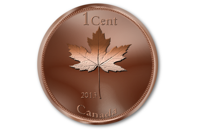 This is more real so far 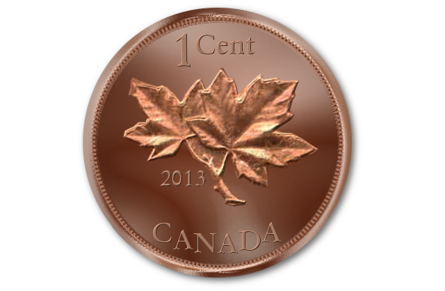 |
|
| Author: | GnuTux [ Fri Oct 04, 2013 12:28 pm ] |
| Post subject: | Re: 2 tons of gold |
Looks fantastic, Molly. The 2nd one is just about perfect! |
|
| Author: | molly [ Fri Oct 04, 2013 12:32 pm ] |
| Post subject: | Re: 2 tons of gold |
   Thank you, I am working on a Canadian Nickel now. This is more than fun. Thank you, I am working on a Canadian Nickel now. This is more than fun.
|
|
| Author: | AnMal [ Fri Oct 04, 2013 1:01 pm ] |
| Post subject: | Re: 2 tons of gold |
molly:  that second coin really looks good! well done - and well deserved after all the work you put in that second coin really looks good! well done - and well deserved after all the work you put in |
|
| Author: | Rellik419 [ Fri Oct 04, 2013 1:07 pm ] |
| Post subject: | Re: 2 tons of gold |
Well, I originally started my attempt at Gnutux's copper coin image, but.... Somehow, my brain went haywire and I ended up with this... 
|
|
| Author: | molly [ Fri Oct 04, 2013 1:30 pm ] |
| Post subject: | Re: 2 tons of gold |
Thank you anmal. love doing this stuff. Nice job Rellik419 |
|
| Author: | molly [ Fri Oct 04, 2013 4:26 pm ] |
| Post subject: | Re: 2 tons of gold |
I have been trying all afternoon to do a nickel. I haven't had any luck finding a suitable enviromap for nickel that is shiny. It just doesn't have the zip that shiny metal has. I used tux's graybackground pattern but I shore don't know how to bump map it. I tried over and over. 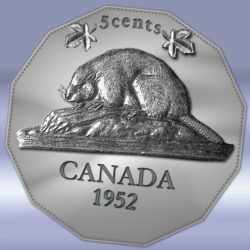 Edit: does anyone have any suggestions on how I can achieve this nickel type gradient. The actual nickel wasn't that blue but it did have a very blue cast to it. 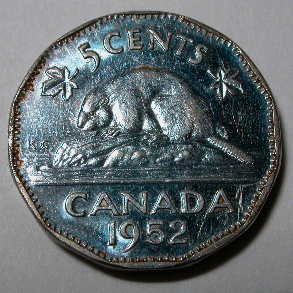 I did a little antiquing to see if I can make it realistic but there is still something missing, maybe the text. It is still too new looking. 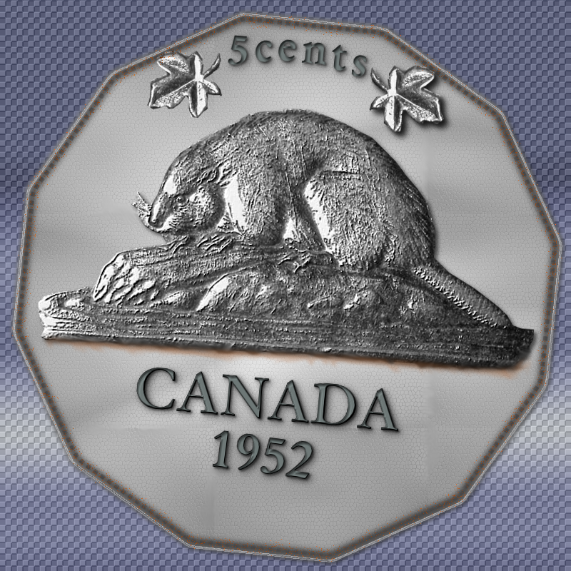 |
|
| Author: | he4rty [ Fri Oct 04, 2013 11:41 pm ] |
| Post subject: | Re: 2 tons of gold |
Wow, some amazing images in this thread the gold is looking good and coins are wonderful, excellent work Gimpers. |
|
| Page 3 of 6 | All times are UTC - 5 hours [ DST ] |
| Powered by phpBB © 2000, 2002, 2005, 2007 phpBB Group http://www.phpbb.com/ |
|