Re: GIMP Chat Banners
Sat Mar 15, 2014 10:33 am
AnMal wrote:gimp started out with one completely random and (dare i say it?) unusable green bell pepper brush. thanks to the untiring efforts of us gimp chatters (especially one of us, no names mentioned) it now also has an animated version of the aforesaid brush, as well as a red, a purple and a pink (and guess who contributed that one?
) bell pepper brush. i thought that this proud part of gimp history needed celebrating with a gimp chat banner!
Great use of these often under utilized and overlooked brushes AnMal.
I can't wait to see this GC banner in the banner rotation. (Hint, Hint)
Re: GIMP Chat Banners
Sat Mar 15, 2014 10:59 am
Put this one back up. I wouldn't mind making a few more as well. I like making these:

Re: GIMP Chat Banners
Sat Mar 15, 2014 12:28 pm
The Warrior wrote:Put this one back up. I wouldn't mind making a few more as well. I like making these:
[ Image ]
Very nice Warrior.

Re: GIMP Chat Banners
Sat Mar 15, 2014 12:45 pm
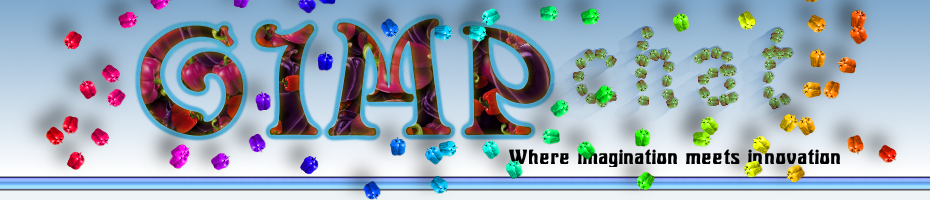
Thanks Wallace. Just finished this one up:

Looks kinda cool on the header:

Looks kinda cool on the header:
Re: GIMP Chat Banners
Sat Mar 15, 2014 2:18 pm
Re: GIMP Chat Banners
Sat Mar 15, 2014 2:40 pm
I had it like that earlier, and thought the edge looked too hard. But, you're right, it does look better. Changed it back.
Re: GIMP Chat Banners
Sat Mar 15, 2014 2:58 pm
AnMal wrote:gimp started out with one completely random and (dare i say it?) unusable green bell pepper brush. thanks to the untiring efforts of us gimp chatters (especially one of us, no names mentioned
Nice banner AnMal.
Re: GIMP Chat Banners
Sat Mar 15, 2014 5:32 pm
Thanks for the new banners, folks. They're all great.
I'll get them up in rotation soon.
I'll get them up in rotation soon.
Re: GIMP Chat Banners
Sat Mar 15, 2014 5:36 pm
GnuTux wrote:Thanks for the new banners, folks. They're all great.
I'll get them up in rotation soon.

Re: GIMP Chat Banners
Sat Mar 15, 2014 5:41 pm
Thanks GT, appreciate it.
Re: GIMP Chat Banners
Sat Mar 15, 2014 6:22 pm
The Warrior wrote:I had it like that earlier, and thought the edge looked too hard. But, you're right, it does look better. Changed it back.
Much better, but then again it's a matter of aesthetics, to each his/her own...
Re: GIMP Chat Banners
Sun Mar 16, 2014 6:54 am
Gnu Tux: thank you for putting the new banners up 
molly: thanks
wallace: hehe, overlooked and under utilised is the word!
warrior: i really like the one that looks like your splash screen! funny how my thoughts about this differed on this one, though: first, i didn't like it when you took away the blur on the edges, i thought it looked too harsh. then i changed my mind and thought the hard edges were best. then i started thinking the blurred edges might be better anyway and if i were you i'd have cut off the piece that hangs under the bar - good thing it's not my banner, i would never have finished it!
Re: GIMP Chat Banners
Sun Mar 16, 2014 7:48 am
I haven't got any new ones up yet but hopefully, I'll get to it this week. If anyone would like to submit any new ones, now would be a good time. : 
Re: GIMP Chat Banners
Sun Mar 16, 2014 9:36 am
AnMal wrote:warrior: i really like the one that looks like your splash screen! funny how my thoughts about this differed on this one, though: first, i didn't like it when you took away the blur on the edges, i thought it looked too harsh. then i changed my mind and thought the hard edges were best. then i started thinking the blurred edges might be better anyway and if i were you i'd have cut off the piece that hangs under the bar - good thing it's not my banner, i would never have finished it!
Haha, I hear ya. So many options. Originally, I didn't have the edges blurred. But when I added it to the web page, I thought it looked harsh. Then I blurred the edges. The first time, I actually had an oval shape around the BG, with blurred edges, but it didn't look right to me, with part of the letters off the BG, and part on. Then I had a rounded corner rectangle selection around it, with blurred edges. Then I had a smaller rectangle selection around it. Then Wallace mentioned that it would look better without the blurred edge. So, I tried it again, and agreed, haha.
Re: GIMP Chat Banners
Sun Mar 16, 2014 2:45 pm
I think rounding the corners was the answer. Took the harshness off the edges, and goes with the round font better. 
viewtopic.php?f=11&t=7794&p=130261#p130261
viewtopic.php?f=11&t=7794&p=130261#p130261
Re: GIMP Chat Banners
Sun Mar 16, 2014 3:13 pm
The Warrior wrote:I think rounding the corners was the answer. Took the harshness off the edges, and goes with the round font better.
viewtopic.php?f=11&t=7794&p=130261#p130261
That looks good too.
Re: GIMP Chat Banners
Mon Mar 17, 2014 4:01 am
With Wallace's new Red Pepper Brush, I had no excuse. So here is a use for the two most useless brushes, another banner. (thanks Wallace)

Re: GIMP Chat Banners
Mon Mar 17, 2014 4:13 am
wbool63: of course! nice job on the banner!
warrior: i liked the rounded corners!
of course! nice job on the banner!warrior: i liked the rounded corners!
Re: GIMP Chat Banners
Mon Mar 17, 2014 6:25 am
AnMal wrote:warrior: i liked the rounded corners!
Thanks, appreciate it. I think the rounded corners were the answer to the harshness.
Re: GIMP Chat Banners
Mon Mar 24, 2014 12:04 am

