Re: GIMP Chat Banner Challenge
Wed Aug 22, 2012 11:20 pm
another version...im still not sure, the dark blue is kind of....i dont know....too windows ? 

- GIMPCHAT_ESPrd_final_V2.png (125.23 KiB) Viewed 1505 times
Re: GIMP Chat Banner Challenge
Wed Aug 22, 2012 11:55 pm
esper: that's definitely too creative for windows! i think it looks like the startup screen (don't know the correct word) for an old video game escaped into web 2.0  . maybe it's a bit tiring for the eyes with all that detail though? could the diagonal "gimpchat stripes" in the background be toned down a bit?
i like how you solved the problem of "where imagination meets innovation", i thought that was the trickiest part. your solution is very elegant!
i like how you solved the problem of "where imagination meets innovation", i thought that was the trickiest part. your solution is very elegant!
Re: GIMP Chat Banner Challenge
Thu Aug 23, 2012 12:15 am
thanks for the input, AnMal
yes, its a bit like an old video game, thats on purpose (although im not a gamer)
you think the overall design and the diagonal stripes are too busy ?
i will think about that
the text along path bit is better, i think so too
i tried it with yellow first, but it steals away all the attention from the logo, so that doesnt work
i still think the colors dont work, the blue GimpChat looks good in purple, but i think purple is just horrible zeitgeist
tried to invert the colors, which looks great, but this is not ChocoChat, im afraid
- ChocoChat_iz_tasty.png (124.3 KiB) Viewed 1503 times
- This_is_what_it_sounds_like_when_doves_cry.png (121.26 KiB) Viewed 1502 times
Re: GIMP Chat Banner Challenge
Thu Aug 23, 2012 6:26 pm
hehe, with that edible banner some of us (no names mentioned but i know her well) would completely loose concentration . hmm... tricky to find just the right shade, especially with those coloured echo layers. but what exactly was it about the dark blue that you didn't like?
Re: GIMP Chat Banner Challenge
Thu Aug 23, 2012 6:29 pm
Very creative design, Esper. The blue color themes will probably integrate better with the site. Well done!
Re: GIMP Chat Banner Challenge
Thu Aug 23, 2012 6:35 pm
AnMal wrote:hehe, with that edible banner some of us (no names mentioned but i know her well) would completely loose concentration
dunno, im not too happy with the whole thing
im a bit of a perfectionist and i feel when im struggling to much with finding a way to make it work, something is wrong
whatever, it was worth the experience

Thanks, i will leave it that way for the moment, i think, and have another go some other timeGnuTux wrote:Very creative design, Esper. The blue color themes will probably integrate better with the site. Well done!
Re: GIMP Chat Banner Challenge
Fri Aug 24, 2012 11:14 pm
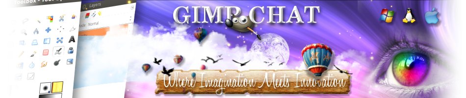
Here is my design, I hope you like it.
Re: GIMP Chat Banner Challenge
Sat Aug 25, 2012 2:18 am
Xgeous wrote:Here is my design, I hope you like it.
Yes it is very nice, I like it.
Re: GIMP Chat Banner Challenge
Sat Aug 25, 2012 3:52 am
beautiful design! it looks so proffessional. impressive how you got so many details in it without making it feel overloaded.
Re: GIMP Chat Banner Challenge
Sat Aug 25, 2012 9:26 am
my thoughts exactlyAnMal wrote:beautiful design! it looks so proffessional. impressive how you got so many details in it without making it feel overloaded.
i like the "dreamy" theme as well
Re: GIMP Chat Banner Challenge
Sat Aug 25, 2012 9:39 am
Eye looking up and the rays are a nice touch to set off the catch phrase.
Re: GIMP Chat Banner Challenge
Sat Aug 25, 2012 9:44 am
Xgeous wrote:Here is my design, I hope you like it.
That is really beautiful and professional looking.
Re: GIMP Chat Banner Challenge
Sat Aug 25, 2012 9:45 am
i did some more tweaking, so this is my final version (i think)
- GIMPCHATfinal3.png (166.67 KiB) Viewed 1654 times
Re: GIMP Chat Banner Challenge
Sat Aug 25, 2012 9:59 am
That's really cool Esper. I like the echoed writing. There's a lot of really good work in this thread.
Re: GIMP Chat Banner Challenge
Sat Aug 25, 2012 10:10 am
I like it a lot Esper. Do you think it would have more depth if you lowered the opacity a bit on the watermarks of the BG and maybe a 2 or 3 blur.
Re: GIMP Chat Banner Challenge
Sat Aug 25, 2012 10:16 am
molly wrote:I like it a lot Esper. Do you think it would have more depth if you lowered the opacity a bit on the watermarks of the BG and maybe a 2 or 3 blur.
like this ?
- GIMPCHAT_molly_thinks.png (180.23 KiB) Viewed 1648 times
Re: GIMP Chat Banner Challenge
Sat Aug 25, 2012 10:33 am
To me that is better, maybe lower the opacity a bit more, it still seems to be fighting with your main text I just think when everything has the same color value, it looks too flat with no depth. JMO
Edit: maybe the water marks would be better behind the glass reflections too instead of on top. I am not being picky just observing.
Edit: maybe the water marks would be better behind the glass reflections too instead of on top. I am not being picky just observing.
Re: GIMP Chat Banner Challenge
Sat Aug 25, 2012 10:35 am
I agree with Mo - that does look better.
Re: GIMP Chat Banner Challenge
Sat Aug 25, 2012 12:41 pm
yes, that's it! with the diagonal text layer toned down it's a lot less busy and the gradient on the blue text makes it less harsh - good job, esper  i was actually a bit disappointed when you said you wouldn't work anymore on the banner, your design is so fun and different with that video-game-goes-web 2.0-look. are you happy with it yourself now?
i was actually a bit disappointed when you said you wouldn't work anymore on the banner, your design is so fun and different with that video-game-goes-web 2.0-look. are you happy with it yourself now?
Re: GIMP Chat Banner Challenge
Sat Aug 25, 2012 12:46 pm

- Andy_Crisis.png (206.01 KiB) Viewed 1635 times
EDIT:
oh, that post was ninjad, AnMal

i must say i liked the crisper version better, but i can see why people think the molly version is better
ask me again in three months