Re: Challenge? "Finished Banner Released"
Sun May 02, 2010 7:23 am
I had a go since GnuTux said that it would be nice for anyone to give it a shot, but as usual it looked better in my head then in the end result.  Not happy about the text/font.
I'll post it for the fun of it anyway.

And with no depth
with 1 pixel border. (I can never decide what I like best. )
)
The Wilber is from http://chrisdesign.wordpress.com/2009/0 ... ollection/
Bloodwell, your banner would look much nicer without the hands. It's a bit unclear what they are doing there. Think it would look really good with just the middle bit.
Not happy about the text/font. I'll post it for the fun of it anyway.
And with no depth
with 1 pixel border. (I can never decide what I like best.
The Wilber is from http://chrisdesign.wordpress.com/2009/0 ... ollection/
Bloodwell, your banner would look much nicer without the hands. It's a bit unclear what they are doing there. Think it would look really good with just the middle bit.
Re: Challenge? "Finished Banner Released"
Sun May 02, 2010 7:42 am
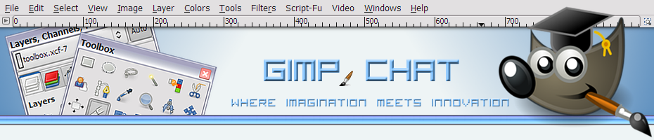
Very good Jolie.
I like your blue txt in Gimp Chat but may be better with vibrant colors and a shadow.
I love the little tool thingys.
Also the tool options on the left and Wilbur might be better a little smaller.
Now this is just my opinion.... nice and clean otherwise
I like your blue txt in Gimp Chat but may be better with vibrant colors and a shadow.
I love the little tool thingys.
Also the tool options on the left and Wilbur might be better a little smaller.
Now this is just my opinion.... nice and clean otherwise
Re: Challenge? "Finished Banner Released"
Sun May 02, 2010 8:13 am
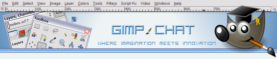
The text could be bigger with darker blue. I tried darker blue but didn't look nice. Might need another, bolder font.
Initially I scaled the toolbox and layersdock down, but everything got so blurry so I ended up just rotating and sharpening it. You might have a point about wilber. Don't know how small you have in mind though.
Got an idea <- that's supposed to be a lightbulb.
I'll upload the xcf file and anyone can edit , or delete if they hate it.
Initially I scaled the toolbox and layersdock down, but everything got so blurry so I ended up just rotating and sharpening it. You might have a point about wilber. Don't know how small you have in mind though.
Got an idea
<- that's supposed to be a lightbulb. I'll upload the xcf file and anyone can edit
, or delete if they hate it.
Attempt at banner
Sun May 02, 2010 11:04 am
I've been trying some different things. Still don't think it's great but while I'm at it might as well upload it.
Re: Attempt at banner
Sun May 02, 2010 1:08 pm
This is excellent work, Jolie and a really great concept for this site. I like it better that the colored pencils. I'm thinking rather than boxing in Wilber and the layers dialogs, it could be designed where the elements are stand alone, with the double bar you see just below the banner being the lower delimiter.
It's a little hard to explain what I'm saying and I won't know what it looks like until I try so could you attach the original .xcf to the thread so I can play with it?
It's a little hard to explain what I'm saying and I won't know what it looks like until I try so could you attach the original .xcf to the thread so I can play with it?
Re: Attempt at banner
Sun May 02, 2010 1:20 pm
Thanks.  I stole the idea from my youtube channel. Well this was the original idea for my youtube channel but in the end the only thing that's the same is the use of the toolbox and layer as images. I changed the theme of my gimp to match the forum here.
The .xcf file is in a post of bloodwell's thread. (not sure if it has the border but that's easily made again.) There's a reply of molly to this banner too. You might want to move those posts.
Knock yourself out with the xcf file. I'm curious what you'll make of it.
Does it look a bit washed out up there or is it me? *insert dunno smiley*
Oh, I'll attach the toolbox and layers pictures too.
Re: Attempt at banner
Sun May 02, 2010 1:27 pm
Thanks. I'll check 'em out a little later today.
Re: Attempt at banner
Sun May 02, 2010 1:33 pm
Looking good, I like the overall idea and it's cool to have the Dialogues visible at an angle; breaks up all the straight lines and makes for a looser composition. One thing I would suggest is to move Wilber down and to the right - his hat now is in contact with the upper frame which looks strange.
In fact, since this is a png which can have transparency, why not move Wilber so that part of him sticks outside the frame to the right and below the banner, to break up the rectangular shape completely?
Just some ideas, anyway. Good work!
.
Griatch
In fact, since this is a png which can have transparency, why not move Wilber so that part of him sticks outside the frame to the right and below the banner, to break up the rectangular shape completely?
Just some ideas, anyway. Good work!
.
Griatch
Re: Attempt at banner
Sun May 02, 2010 2:05 pm
I didn't think of that. Spend too much effort in opening an image window of exactly 930x200 to make a screenshot of. 
Re: Attempt at banner
Sun May 02, 2010 5:11 pm
Jolie, I took Griatch's advice about moving Wilber. The banner is a little wider. I rotated Wilber so his hat wouldn't match up with any h or v lines. Anyway, here's my rendition. I love your banner. It is so appropriate for in here.
Re: Attempt at banner
Sun May 02, 2010 8:23 pm
I really like these banners, but I sort of miss the colored pencils...maybe a mini of the colored pencils can be incorporated into it somehow.
Re: Attempt at banner
Sun May 02, 2010 8:38 pm
You know, we could spell out "Gimp Chat" with colored pencils. That might be cool.
Re: Attempt at banner
Sun May 02, 2010 9:15 pm
Do you have a clean version of the colored pencils? Might be fun to try.GnuTux wrote:You know, we could spell out "Gimp Chat" with colored pencils. That might be cool.
Here's a link to a lot of pencil fonts. Some shaped with pencils, some look like they're written with pencils. I ended up downloading way too many.

http://www.fontspace.com/category/pencils?p=5
Re: Attempt at banner
Sun May 02, 2010 11:06 pm
Here's the original xcf with the colored pencils..
Re: Attempt at banner
Mon May 03, 2010 1:53 am
Jolie, I've attempted to use my favorite elements of your design and integrate those into a seamless floating banner, which should adjust and flow, no matter what the screen resolution might be. To achieve this effect, I really needed get out of the box and allow the banner to flow into a 1x200 sliver fill on each side of the banner. The banner is always centered and the 1px sliver will fill on either side of the banner, as needed when your browser scales.
Here's the single layer PNG banner...
Just refresh your browser cache to see what I have up. I think this is a good staring point and we can tweak from here. I'm open to all ideas for improvement. The "Gimp Chat" text is a little small for the banner so maybe that can be increased. I'm not sure what font you used there or what you did to get it to look like that.
Maybe a few more elements can be added and/or we play around with the text a bit more and get the lettering properly scaled and positioned. I'm very pleased with the progress made so far.
I'm attaching your xcf, with the additions I made (I stuck the website sliver in there too).
Re: Attempt at banner
Mon May 03, 2010 3:31 am
Having another go at this.

Re: Attempt at banner
Mon May 03, 2010 5:20 am
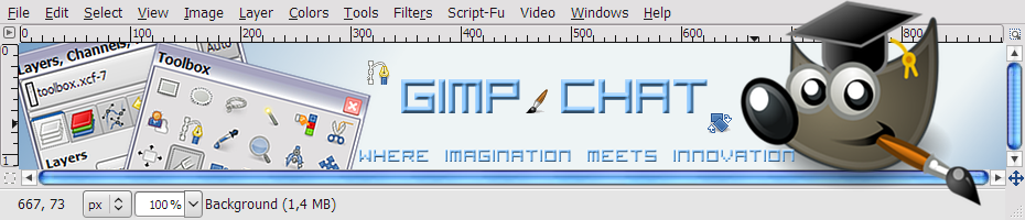
I was about to say that it didn't look good in my browser, but then I refreshed and it filled the whole page.
How about reversing the gradient? Dark in the middle, light on the sides?
And if you let Wilber sit on the edge. The blue line thingy at the bottom, his brush will stick out. Obviously you have to decrease height of the visible banner.
Little footnote. Wilbers shadow seems to be a bit to the right. The drop shadow of the text is to the left. I tried a drop shadow but I thought it make the text harder to read. Yours looks fine though
I used Visitor TT1 BRK as font. And layer effects script - bevel and emboss - inner bevel - rest at default on the text.
I used that font to match the rulers on the image window.
My banner may have looked a bit busy, but if I'm honest, yours looks a bit too bare. Different font might help, like the pencils. Maybe drop shadow on the layers dialog/toolbox?
I'm not feeling well so gonna leave it at this.
Re: Attempt at banner
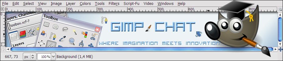
Mon May 03, 2010 6:13 am
OK, made a rough draft.
I'm also wondering what this one will look like with the web sliver so the gray of the image window extent both sides? Might look awful but think it's worth taking a look.
 sitelogo-topimgwindow.xcf
- (620.71 KiB) Downloaded 124 times
I'm also wondering what this one will look like with the web sliver so the gray of the image window extent both sides? Might look awful but think it's worth taking a look.
Re: Attempt at banner
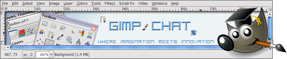
Mon May 03, 2010 7:26 am
A bit better. Wilber smaller. rotate tool next to the rotated dialog boxes and brush tool lined up.
Re: Attempt at banner
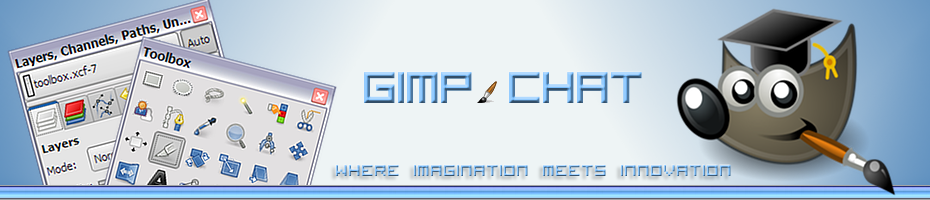
Mon May 03, 2010 8:53 am
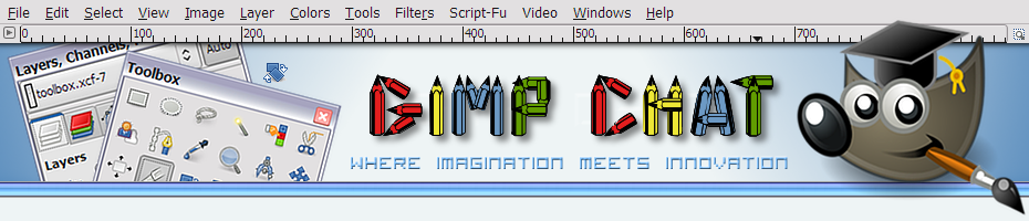
sorry for so many posts in a row. Added pencil font. But looking at it now, it looks too busy.