GIMP Chat http://gimpchat.com/ |
|
Bevelled Metal Text effect http://gimpchat.com/viewtopic.php?f=23&t=6500 |
Page 1 of 1 |
Author: | Esper [ Wed Feb 20, 2013 9:57 pm ] |
Post subject: | Re: composing a bevelled metal text effect |
Part 1: A word of "warning": this is not a beginners tutorial, you need to understand things i showed in previous tutorials. 
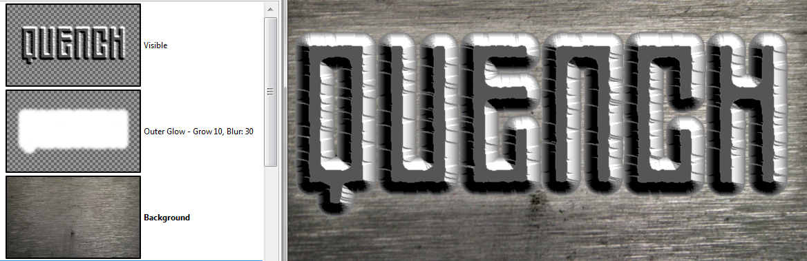
Stuff like how to make an Outer Glow and other text effects. http://gimpchat.com/viewtopic.php?f=23&t=6234 http://gimpchat.com/viewtopic.php?f=23&t=6374 To be precise, its not even a real tutorial, its more of a walkthrough. You dont want to copy exactly what i did – im just documenting how i get to my results. I think when you understand how texteffects aka layerstyle works, its like painting and composing. 1. to start we need a background. A good source is texturemate.com - there is a category for metal-textures: http://www.texturemate.com/category/ima ... ries/metal you can also use the ones from the original PS tutorial, that is here: http://psd.tutsplus.com/tutorials/text- ... xt-effect/ 2. create a new canvas, i used 900x550px. 3. Open your background metal texture in a new document, copy it and close it again. 4. Activate your 900x550 canvas and paste - a floating layer will appear activate the floating layer and Scale it to your needs - these textures are most of the time very big, when you are happy anchor your layer my texture looked a bit fuzzy, so i applied 'Unsharp Mask' 
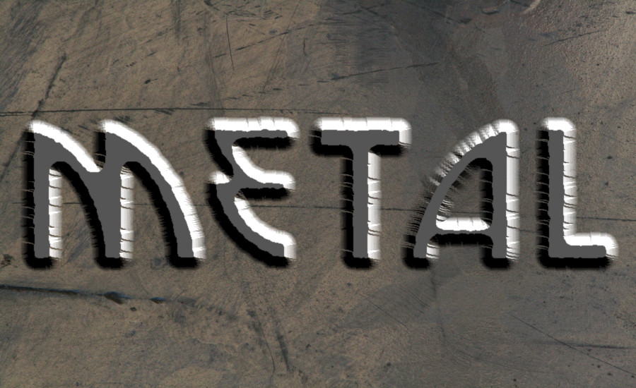
5. type your text, the font should not be too thin, and fit the theme – i used Zephyrean BRK 312px for the color choose a dark grey, as black or white has certain disadvantages, when it comes to effects - i used #555555 
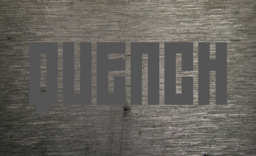
6. alpha select your text Shrink the selection - what we want is a text effect, so that it is flat on top and bevelled at the edges – with the Shrink, we will define the flat bit i used Shrink 10 7. for the irregular edges we will 'Distort' the selection – dont make it too extreme i used these values:
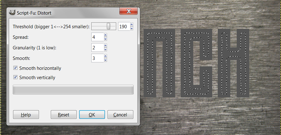
 then Invert and Cut alpha select your result and save the selection to a Channel - this always comes handy 
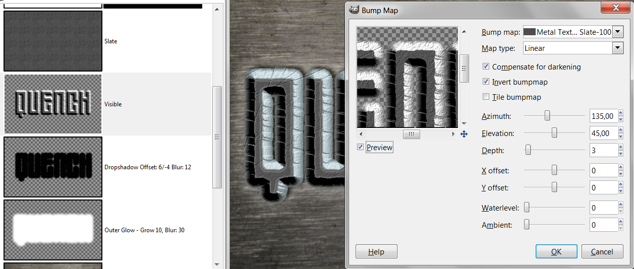
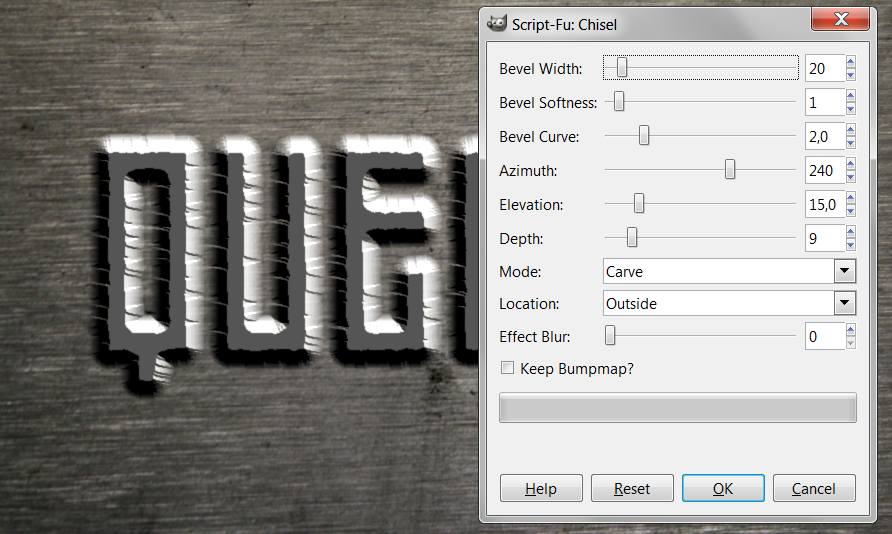
8. apply an outer bevel with RobA's Chisel Script (its under Filters → Decor → Chisel) and put it under the the flat text 
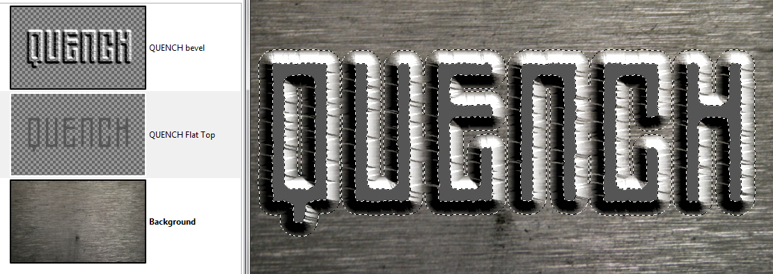
9. turn off the background and click 'New from visible', then put the chisel and flat top layer under the background - we dont need it any longer alpha select your final chiseled text and save it to a Channel 
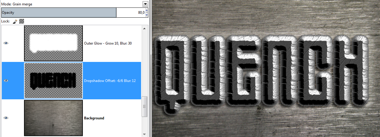
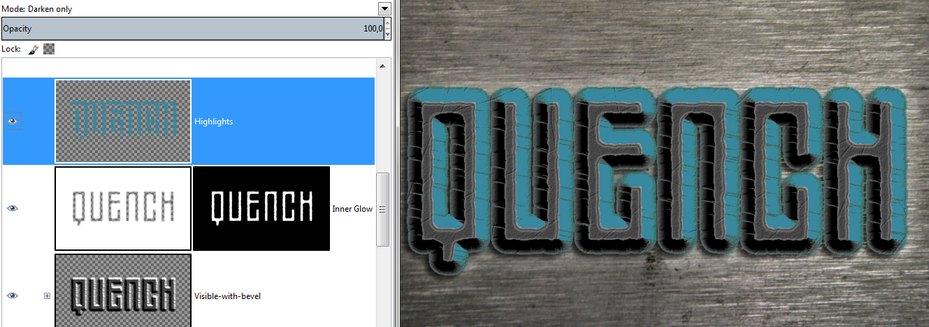
In part 2 we will "decorate" our base text effect. |
Author: | Graechan [ Thu Feb 21, 2013 12:36 am ] |
Post subject: | Re: Bevelled Metal Text effect |
The lighting needs to be directly above otherwise a good effect |
Author: | AnMal [ Thu Feb 21, 2013 3:18 am ] |
Post subject: | Re: Bevelled Metal Text effect |
esper: and you had to post this on a day when i probably won't get any computertime at all? well, i'll be back when part 2 comes out and take it all in one go. |
Author: | Esper [ Thu Feb 21, 2013 9:28 am ] |
Post subject: | Re: Bevelled Metal Text effect |
Part 2 10. first the text gets an Outer Glow – you must decide on your own what you want and what looks good to you i used Grow: 10, Gaussian Blur: 30, put it under the Chisel Layer and set the Mode to 'Soft Light' – tweaked the glow with a Contour ('Half Round') and set the Opacity to 64%. Note that the Outer Glow is barely visible. A lot of effects can be very subtle, but they will make a difference in the end. 11. next a Dropshadow – create new transparent layer, fill alpha selected text with black, then Offset depending on your direction of light, blur and reduce Opacity, set Mode i used: Offset: -6/6 and Gaussian Blur: 12, Opacity: 80% Mode: 'Grain Merge' Opacity and Modes are fine tuning – but this stuff can really make a difference. The fallback Mode for a dropshadow is 'Multiply' because it makes everything darker. Choosing other modes makes small differences - i chose 'Grain Merge', because it merges the texture of the background better with the shadow. 12. InnerGlow: alpha select the flat top of your text, Shrink by 1 then Invert – fill with white, apply layermask and Contours: 'Rolling Slope descending' - Offset -3/3, turn down Opacity to 55% and set Mode to 'Value'. This gives us something to accentuate the flat top borders. If you dont have the Contour Curves, get them here: viewtopic.php?f=12&t=5672&start=10#p79105 Of course you can always shape them freehand, gives you the same result. 13. for the Highlights: use the 'Select By Color Tool' to select the highlights of your bevel, mine needed a Threshold of 100 when you are happy fill on a new transparent layer with a greyish blue (i used #38889f) and save the selection to a Channel just in case we will need it again – set the Mode to 'Darken Only' and turn down the Opacity to 13% - we only want a hint of blue (another option i considered was to set the Mode to 'Color') 14. next we want some scratches: create a new transparent layer, activate the 'Pencil Tool' and set it to black 1px paint some random lines across the layer and add some that only touch the bevel erase them again, where they dont make sense – think about it: how did the scratches get there ? then create a white layer and merge both layers together so that you get a bumpmap activate your bevelled text layer and apply the BumpMap make sure to use the same values for 'Azimuth' and 'Elevation' as with the Chisel script, a 'Depth' of 1 should be enough 15. to give the whole text a bit more texture i filled a new layer with a pattern called "Slate" and bumpmapped the text layer by 4 16. for some fine tuning, create a new layer, alpha select your bevelled text layer, set the Mode to 'Burn', turn down the Opacity to 25% and stroke it with the attached gradient until you are happy 17. next is Satin (http://gimpchat.com/viewtopic.php?f=23&t=6452) create a new white layer, alpha select bevelled text, fill with black, duplicate, set upper layer to 'Difference', Offset (shortcut: Strg + O) y-axis by 40/-40, 'Color To Alpha' with white, blur by 30, alpha select satin and fill with orange (#f49103), turn down Opacity to 23% and set Mode to 'Hard Light' 18. the whole tone of the piece is too nice, we need some darkness create new transparent layer, 'Select All', Shrink by 50, Invert, fill with black, Gaussian Blur by 150 add another layer and stroke a Radial Gradient, transparent to black, from center to the side, if not happy, shape with curves on alpha to shrink or expand the transparency to black value as the great saulgoode explained in this thread: viewtopic.php?f=8&t=5789 19. i also decided the Satin needs some tweaking, i wanted to get rid of the orange color on the not flat top bits, so i alpha selected the flat top, Invert and added a White Layermaks on that layermask i filled the inverted selection with a 60 grey, so its half translucent also i tweaked the orange SAtin with Noise to make it more grainy and changed the Mode to 'Dodge' 21% 20. still not happy with the overall look i found the solution: a Pillow Emboss made with layerfx That concludes this tutorial - i hope it inspires you to do your own text effects composed from lots of layers |
Author: | molly [ Thu Feb 21, 2013 9:49 am ] | ||
Post subject: | Re: Bevelled Metal Text effect | ||
Very nice tute Esper. I made a pdf for myself if anyone wants to share it.
|
Author: | Esper [ Thu Feb 21, 2013 9:57 am ] |
Post subject: | Re: Bevelled Metal Text effect |
Graechan wrote: The lighting needs to be directly above otherwise a good effect thanks Grachan ! it seems with some values, the bevel behaves odd as it seems to become transparent dont know if this is a bug in the script or soemthing else thanks molly please note there is a small mistake in my tutorial on some screenshots the dropshadow goes in the other direction i noticed this too late and only corrected it in some case - this should not be a problem EDIT: i found another mistake: i told you to use the same values for Azimuth and Elevation in all your scripts well im an idiot and didnt stick to my own advice, which you can clearly see in the screenshots, for the bumpapping of the texture and the scratches |
Author: | he4rty [ Thu Feb 21, 2013 11:07 am ] |
Post subject: | Re: Bevelled Metal Text effect |
Nice tut Esper some interesting techniques to ponder over, here is my attempt. |
Author: | molly [ Thu Feb 21, 2013 11:09 am ] |
Post subject: | Re: Bevelled Metal Text effect |
very cool He4rty. |
Author: | Esper [ Thu Feb 21, 2013 11:13 am ] |
Post subject: | Re: Bevelled Metal Text effect |
sneak attack from he4rty - that was quick ! great ! im wondering if the dropshadow fights the overall effect, because the bevel seems to blend with the background and the shadow interrupts that effect |
Author: | 2-ton [ Thu Feb 21, 2013 4:25 pm ] |
Post subject: | Re: Bevelled Metal Text effect |
ARGH, I want to do this but I am on vacay and have a monthly GB data limit so I can't hang out online as much as I want! (using my phone as hotspot). I might have to wait until next week to try this. |
Author: | AnMal [ Sat Feb 23, 2013 7:41 pm ] |
Post subject: | Re: Bevelled Metal Text effect |
no one but he4rty who posted one? i hope more people will give it a go! he4rty: yours looks awesome, works very well with that font too! here's my try: i'm not sure i didn't like it better before i put on the pillow emboss and satin effect, but i have the xcf so i can always change it. my original is a wallpaper, so i'll try and see what looks best on my screen. |
Author: | Esper [ Sat Feb 23, 2013 8:01 pm ] |
Post subject: | Re: Bevelled Metal Text effect |
impressive AnMal, i was wondering what you would come up with ! i must say, and that is related to all the results, including mine, it looks more like stone than metal, tbh yours looks a bit like covered with snow or ice crystals |
Author: | AnMal [ Sat Feb 23, 2013 8:19 pm ] |
Post subject: | Re: Bevelled Metal Text effect |
esper: thank you! yes, all our results look more like stone - but pieces of metal photographed close up often look a lot like stone too, so maybe we're not that far off? i think i should have used a different metal texture, though, i was choosing between this and a brushed metal texture which looked like it would work better with this effect - only i liked this one so much better i used it anyway . |
Page 1 of 1 | All times are UTC - 5 hours [ DST ] |
Powered by phpBB © 2000, 2002, 2005, 2007 phpBB Group http://www.phpbb.com/ |