Esper`s Banner Texteffect [mini-tutorial]
Thu Jul 25, 2013 4:52 pm
this was requested by Lurifax

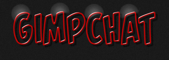
01. type your text - an italic font might be a good idea, because the highlights look especially good on angled surfaces

02. alpha select, shrink (i used 5) and delete
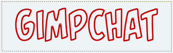
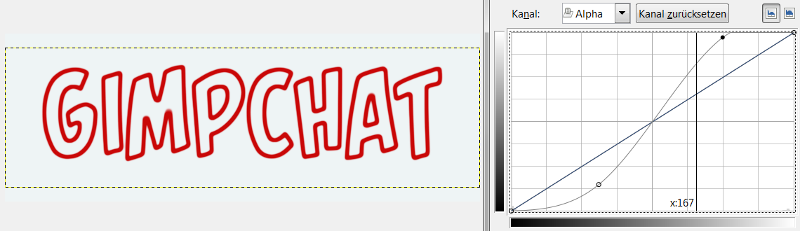
03. if you got jaggy edges, blur text (3-5), and tighten with alpha-curve
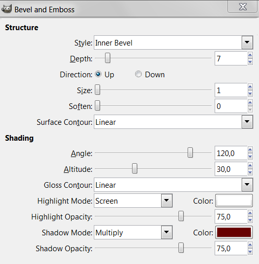
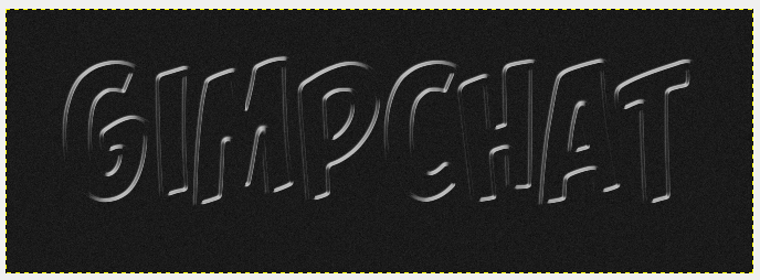
04. apply a bevel with layerfx
05. blur highlight slightly (3-5) (not always necessary), then tighten with an alpha-curve, so it becomes nice and crisp
06. paint highlights with a fuzzy brush if you like
01. type your text - an italic font might be a good idea, because the highlights look especially good on angled surfaces
02. alpha select, shrink (i used 5) and delete
03. if you got jaggy edges, blur text (3-5), and tighten with alpha-curve
04. apply a bevel with layerfx
05. blur highlight slightly (3-5) (not always necessary), then tighten with an alpha-curve, so it becomes nice and crisp
06. paint highlights with a fuzzy brush if you like
Re: Esper`s Banner Texteffect [mini-tutorial]
Thu Jul 25, 2013 5:12 pm

Esper.
Re: Esper`s Banner Texteffect [mini-tutorial]
Thu Jul 25, 2013 5:17 pm
nice one Rod !
i especially like the way all letters are interconnected, thats a very nice touch and great idea
if i may give some constructive criticism
your highlight is a bit jaggy, thats because you didnt find the optimal alpha curve
there is always a spot between too jaggy and too fuzzy
sometimes finding that spot takes a bit of trying
so dont imitate my curves example 1:1
its just a rough guide and needs to be customised, depending on your text and bevel
Re: Esper`s Banner Texteffect [mini-tutorial]
Thu Jul 25, 2013 9:46 pm
Nice and straightforward tutorial.

Re: Esper`s Banner Texteffect [mini-tutorial]
Thu Jul 25, 2013 10:08 pm
Thank you very much Esper!
This becomes one of my favorite text effects!
This becomes one of my favorite text effects!
Re: Esper`s Banner Texteffect [mini-tutorial]
Thu Jul 25, 2013 10:34 pm
*scratches head*
i didnt expect this to be popular
i didnt expect this to be popular
Re: Esper`s Banner Texteffect [mini-tutorial]
Thu Jul 25, 2013 11:31 pm
Nice tutorial, for the Highlights I used your metallic Highlight gradient.

Re: Esper`s Banner Texteffect [mini-tutorial]
Fri Jul 26, 2013 7:27 am
Not sure why you though this would be unpopular, Esper. The simple effects are the best ones. 

Re: Esper`s Banner Texteffect [mini-tutorial]
Fri Jul 26, 2013 9:42 am
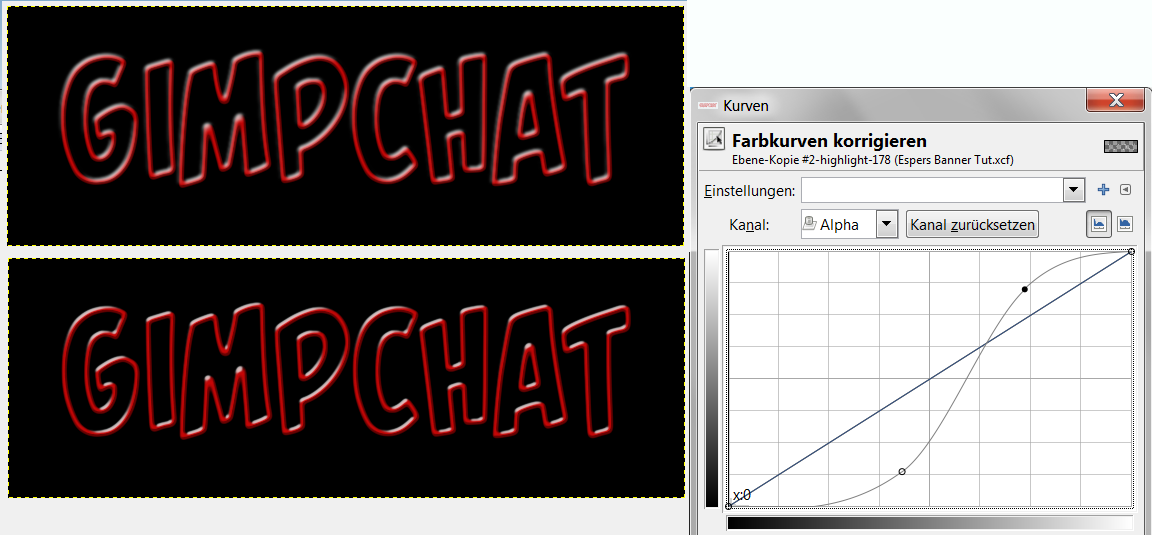
i feel that a lot of the participants didnt get the highlights what they were meant to be
first of all, if you use a layerfx that gives you a layer with a layermask, apply the layermask before you proceed !
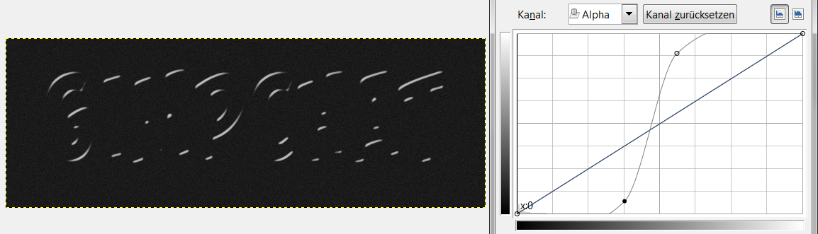
when i apply layerfx, my highlights look like this
when i apply the alpha-curve it looks like this: BAD !
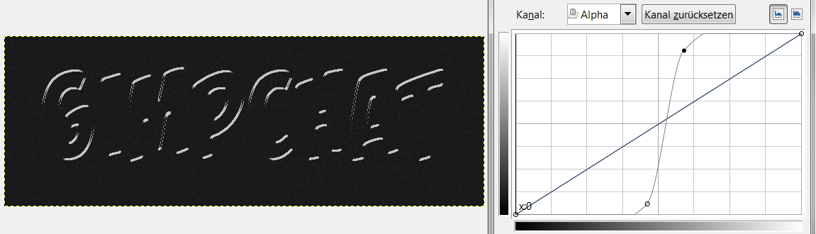
the highlights need blur, so we can compress it with the curve - in this case as much as 6px
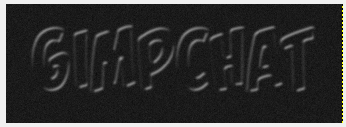
if we apply the alpha-curve now, it look nice and crisp and shiny
again, if you do not find the correct curve, your highlights will be tight but also jaggy: BAD !
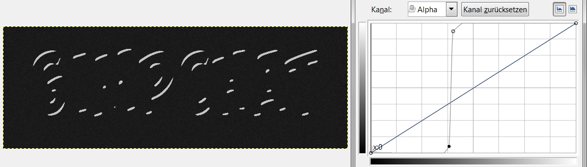
this is what it needs to look like
first of all, if you use a layerfx that gives you a layer with a layermask, apply the layermask before you proceed !
when i apply layerfx, my highlights look like this
when i apply the alpha-curve it looks like this: BAD !
the highlights need blur, so we can compress it with the curve - in this case as much as 6px
if we apply the alpha-curve now, it look nice and crisp and shiny
again, if you do not find the correct curve, your highlights will be tight but also jaggy: BAD !
this is what it needs to look like
Re: Esper`s Banner Texteffect [mini-tutorial]
Fri Jul 26, 2013 11:29 am
esper: i think mike is right, the simple effects are often the best ones. i haven't tried this yet, but i'm sure it won't be as simple as it looks to get everything right.
Re: Esper`s Banner Texteffect [mini-tutorial]
Fri Jul 26, 2013 12:31 pm
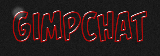
Closer?

Re: Esper`s Banner Texteffect [mini-tutorial]
Fri Jul 26, 2013 12:37 pm
It looks great on darker bg Esper.
I'd love to see your banner more like the last 3 images in your mini-tut, without that mandatory(?) bluish nonsense.
I'd love to see your banner more like the last 3 images in your mini-tut, without that mandatory(?) bluish nonsense.
Re: Esper`s Banner Texteffect [mini-tutorial]
Fri Jul 26, 2013 2:46 pm
Mike wrote:Closer?
much better !

looks really blam that way, doesnt it ?!!
K1TesseraEna wrote:It looks great on darker bg Esper.
I'd love to see your banner more like the last 3 images in your mini-tut, without that mandatory(?) bluish nonsense.
thanks K1te
i like to stick to the rules, but i agree on what you say