Re: Chrome Letter Tutorial
Thu Jun 20, 2013 2:59 pm
I tried what you said up there and even used your image and incandescent gradient. I didn't bump map it, but did fill it with the chrome gradient first. All I ended up with was a flat, gradient-colored picture with none of the depth that yours has.The Warrior wrote:By the way, as Oregonian has demonstrated, you can do pretty much anything that's black and white.
Re: Chrome Letter Tutorial
Thu Jun 20, 2013 4:47 pm
ek22 wrote:e-book cover I made for an author friend, using your improved chrome technique. Works like a charm.

Nice!
Re: Chrome Letter Tutorial
Thu Jun 20, 2013 4:51 pm
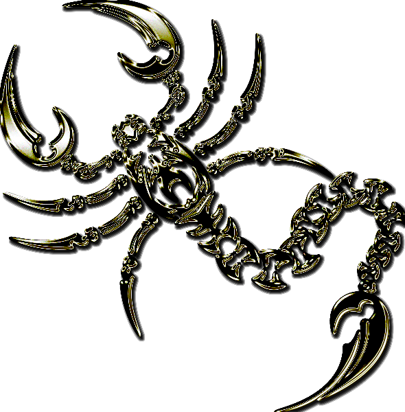
Oregonian wrote:I tried what you said up there and even used your image and incandescent gradient. I didn't bump map it, but did fill it with the chrome gradient first. All I ended up with was a flat, gradient-colored picture with none of the depth that yours has.The Warrior wrote:By the way, as Oregonian has demonstrated, you can do pretty much anything that's black and white. Here's a scorpion I did once. Inverted the colors, so the scorpion was white, gaussian blurred, etc, etc. Once it was to the bump point, I just gradient mapped it with an "Incandescent" gradient. Didn't even have to use curves. Before, and after:
[ Image ]
[ Image ]
I did bump mine first, I guess I didn't word that too well. But apparently I'm mistaken. Here's bumped and just gradient mapped:

Here's chromed and gradient mapped:

I could have swore I didn't have to chrome it first.
Re: Chrome Letter Tutorial
Thu Jun 20, 2013 4:55 pm
This one has just been gradient mapped. I did sharpen the heck out of it though:

Re: Chrome Letter Tutorial
Thu Jun 20, 2013 4:56 pm
I love it, thanks for this wonderful tutorial
Re: Chrome Letter Tutorial
Thu Jun 20, 2013 4:57 pm
Mario Bross wrote:I love it, thanks for this wonderful tutorial
You're very welcome, it was fun to do.
Re: Chrome Letter Tutorial
Thu Jun 20, 2013 4:59 pm
I applied the tut to these signs of the zodiac. Gold off course, what do you think?

BTW, I'm a Libra.
BTW, I'm a Libra.
Re: Chrome Letter Tutorial
Thu Jun 20, 2013 5:07 pm
Wallace wrote:I applied the tut to these signs of the zodiac. Gold off course, what do you think?
BTW, I'm a Libra.
Nice Wallace! Fun turning stuff into gold/chrome, isn't it?
Re: Chrome Letter Tutorial
Thu Jun 20, 2013 5:09 pm
After playing with it for awhile, I think I got it sussed. Do the tutorial as it is up and through the color curves. Next step is gradient map.
This Celtic cross, (got it here) I blurred only 3 and then bump mapped it twice to get the patterning.

This Celtic cross, (got it here) I blurred only 3 and then bump mapped it twice to get the patterning.
Re: Chrome Letter Tutorial
Thu Jun 20, 2013 5:18 pm
Nice Oregonian. I wish I would have saved some of the chromed stuff I've done over the years. I used to have some custom gold gradients I made, that worked fantastic, but lost them.
Re: Chrome Letter Tutorial
Thu Jun 20, 2013 11:15 pm
Oregonian wrote::lpShall we start calling you Gollum?Akros wrote:Hmmm
My precious we need to try ...
The tutorial looks good teaching and rich in images, we should manage to do it, oh yes, we need a time for this, but we have already downloaded the gradient.
The results are also very good, we have to downloading the fonts and try some!
We can not resist my precious ...
Oregonian, you captured the spirit of the thing!


I think I managed follow step by step, still tracing the gradient makes a difference in the end.
Wanted to be able to play the scorpion equal to the example, but gave up after a few attempts.
Maybe Molly make a PDF of this tutorial, or Graechan make a script, who knows!?
Thx all!

Also, do not get the same result with the rose. But at least I was in the right direction.

Re: Chrome Letter Tutorial
Fri Jun 21, 2013 12:31 am
I like it Akros.
Re: Chrome Letter Tutorial
Fri Jun 21, 2013 6:39 am
i'm experimenting with this tut and some paisleys (is anyone surprised?) but getting nothing nice so far. i will, though, just give me some time  ! one problem i have is that some of the depth of the paisleys is lost when i put on the gradient, so i always have to put on an extra bevel or something.
O: i really like your celtic cross in gold, nice job!
O: i really like your celtic cross in gold, nice job!
Re: Chrome Letter Tutorial
Fri Jun 21, 2013 6:43 am
Very nice gold cross O. The green background really sets it off too.
Re: Chrome Letter Tutorial
Fri Jun 21, 2013 8:06 am
AnMal wrote:i'm experimenting with this tut and some paisleys (is anyone surprised?) but getting nothing nice so far. i will, though, just give me some time
O: i really like your celtic cross in gold, nice job!
Larger, flat surfaces tend to not do so well. I was experimenting last night, with a very wide text, and big letters. It definitely loses the effect on the flats.
Re: Chrome Letter Tutorial
Fri Jun 21, 2013 8:18 am
I love your crustacean!Akros wrote:Oregonian, you captured the spirit of the thing!
I think I managed follow step by step, still tracing the gradient makes a difference in the end.
Wanted to be able to play the scorpion equal to the example, but gave up after a few attempts...
Re: Chrome Letter Tutorial
Fri Jun 21, 2013 8:59 am
the warrior: yeah, anything that was originally planned out as a text effect is wasted on larger surfaces - i've given up trying to apply that kind of things to solid paisley shapes long ago. i'm working on the contours of paisleys and it looks okay but not the way i want it to look. like i said, though, i'm not giving up .
Re: Chrome Letter Tutorial
Fri Jun 21, 2013 12:10 pm
I found some paisley drawings and gave them a try. They were very rough and I smoothed them up a bit and zipped and attached them below. This is one of them.AnMal wrote:the warrior: yeah, anything that was originally planned out as a text effect is wasted on larger surfaces - i've given up trying to apply that kind of things to solid paisley shapes long ago. i'm working on the contours of paisleys and it looks okay but not the way i want it to look. like i said, though, i'm not giving up

Re: Chrome Letter Tutorial
Fri Jun 21, 2013 1:32 pm
Nice work Oregonian.
Re: Chrome Letter Tutorial
Fri Jul 12, 2013 10:00 pm
This is my result, pretty cool effect! Made my self a logo type thing