It is currently Sat Sep 26, 2026 8:33 am


All times are UTC - 5 hours [ DST ]


Post new topic Reply to topic  [ 64 posts ]  Go to page 1, 2, 3, 4  Next
Author Message
 Post subject: Re: GIMP Themes - Getting Started
PostPosted: Fri Jun 13, 2014 8:08 am  (#11) 
Offline
GimpChat Member
User avatar

Joined: Apr 07, 2010
Posts: 14182
I have been trying to change the drop down windows, instead of all pink, I want another color. I don't seem to be able to figure what line it is.
Edit: I got the text changed, it is under fg color.
How do I change the colors of the drop down windows?

_________________
Image


Top
 Post subject: Re: GIMP Themes - Getting Started
PostPosted: Fri Jun 13, 2014 8:27 am  (#12) 
Offline
Script Coder
User avatar

Joined: Jun 22, 2010
Posts: 1171
Location: Here and there
molly wrote:
I have been trying to change the drop down windows, instead of all pink, I want another color. I don't seem to be able to figure what line it is.
Edit: I got the text changed, it is under fg color.
How do I change the colors of the drop down windows?


You're jumping ahead of the lessons here :)

For some reason, the
class "GtkWidget" style "gimp-default-style"
doesn't style the menubar and menus, so there's another style definition for those:
include "rc_menu.rc"
widget_class "*GtkMenu*"      style:highest "menu"


Which is telling GTK to load the file "rc_menu.rc" and to apply the "menu" style (defined in the file) to the menu widget classes.

So to alter the styling for the menus, you have to edit the rc_menu.rc file:
style "menu" = "gimp-default-style"
{
  xthickness = 1
  ythickness = 4
}

You would need to add the bg[NORMAL] etc. code to this "menu" style, for example
style "menu" = "gimp-default-style"
{
  xthickness = 1
  ythickness = 4
  bg[NORMAL] = "yellow"
}

Try it to see what happens, but I think it's probably not what you want as it will style the menu bar as well - which is a hint as to what I'll show you next, but I'm not really going to have time to do that until Monday. So this might be a good moment for someone else to jump in and explain the next step.

Kevin


Top
 Post subject: Re: GIMP Themes - Getting Started
PostPosted: Fri Jun 13, 2014 8:35 am  (#13) 
Offline
GimpChat Member
User avatar

Joined: Apr 07, 2010
Posts: 14182
Thanks Kevin, I will wait till Monday, anyway, I didn't know I was jumping ahead. I just couldn't understand why I couldn't change those pink drop downs so they wouldn't be the same color as the pink that is there now.

_________________
Image


Top
 Post subject: Re: GIMP Themes - Getting Started
PostPosted: Fri Jun 13, 2014 8:48 am  (#14) 
Offline
GimpChat Member
User avatar

Joined: Jun 02, 2013
Posts: 2090
Nice work. When I did the Teal Appeal theme, my first, I would make an icon a bright red, and install it, because it would stick out, and I would be able to easily tell what it was for. Same with the gtkrc. Changed the color code to bright red, which would obviously stick out compared to the teal and bright green.

_________________
Image


Last edited by The Warrior on Fri Jun 13, 2014 9:31 am, edited 1 time in total.

Top
 Post subject: Re: GIMP Themes - Getting Started
PostPosted: Fri Jun 13, 2014 8:57 am  (#15) 
Offline
GimpChat Member
User avatar

Joined: Apr 07, 2010
Posts: 14182
Where did you change the color code in gtkrc? do you have a screen shot, this is all very foreign to me so I am practising on Kevin's pink test script

_________________
Image


Top
 Post subject: Re: GIMP Themes - Getting Started
PostPosted: Fri Jun 13, 2014 11:03 am  (#16) 
Offline
Script Coder
User avatar

Joined: Jun 22, 2010
Posts: 1171
Location: Here and there
One final thing before the weekend:

In the gtkrc file we have started with, I applied a single theme to all widgets with "Menu" in their name, but now Molly has a requirement to separate out the styles for the menubar and the menus.

So we will need to create suitable styles in the rc_menu.rc file:
style "menu" = "gimp-default-style"
{
  fg[NORMAL] = "blue"
  fg[PRELIGHT] = "#FF0000"
  bg[NORMAL] = "yellow"
  bg[PRELIGHT] = "green"
}

style "menubar" = "gimp-default-style"
{
}

So here the menubar just defaults to "gimp-default-style", but the menu has some new fg and bg colours defined.

Back in the gtkrc we need to apply these styles, replacing the original code with this:
include "rc_menu.rc"
widget_class "*<GtkMenu>*"      style:highest "menu"
widget_class "*<GtkMenuBar>*"      style:highest "menubar"
and now we are applying different styles to the different types of widget.

Attachment:
Untitled.png
Untitled.png [ 11.33 KiB | Viewed 10530 times ]


Kevin


Top
 Post subject: Re: GIMP Themes - Getting Started
PostPosted: Fri Jun 13, 2014 12:06 pm  (#17) 
Offline
GimpChat Member
User avatar

Joined: Apr 07, 2010
Posts: 14182
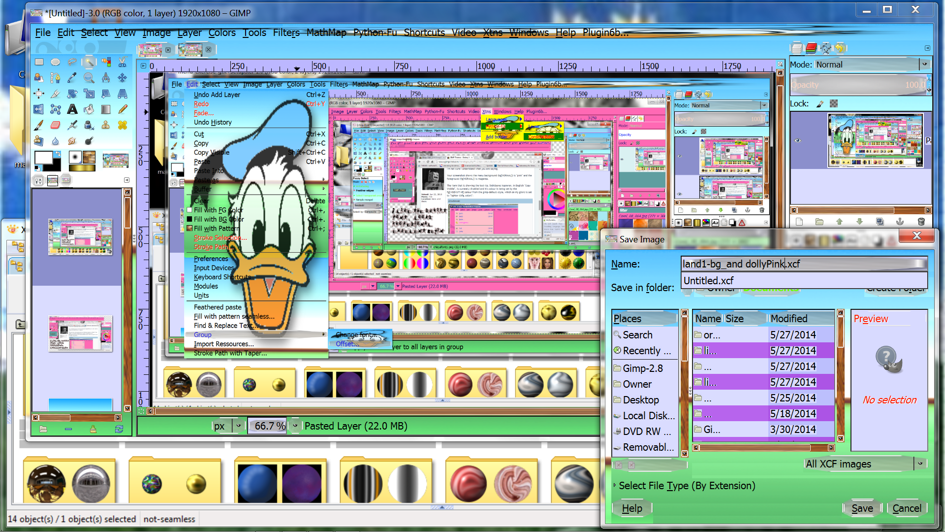
I am having fun playing with this. new text and new colors.
Image

_________________
Image


Top
 Post subject: Re: GIMP Themes - Getting Started
PostPosted: Mon Jun 16, 2014 6:06 am  (#18) 
Offline
GimpChat Member

Joined: Oct 02, 2010
Posts: 106
Hallo, with the rc_menu.rc I have problem that not all Name of colour seem to work or have this to do with version of Gimp. I try this tutorial on Computer where Gimp 2.6.11 on it?
style "menu" = "gimp-default-style"
{
  fg[NORMAL] = "magenta"
  fg[PRELIGHT] = "darkblue"
  bg[NORMAL] = "pink"
  bg[PRELIGHT] = "black"
  xthickness = 1
  ythickness = 4
}

thank you


Top
 Post subject: Re: GIMP Themes - Getting Started
PostPosted: Mon Jun 16, 2014 6:33 am  (#19) 
Offline
Script Coder
User avatar

Joined: Jun 22, 2010
Posts: 1171
Location: Here and there
I don't think there's anything wrong with your colour names - the ones you have specified work on my GIMP 2.6.7 on Windows 7

Make sure you made the changes to the gtkrc file as well:
include "rc_menu.rc"
widget_class "*<GtkMenu>*"      style:highest "menu"
widget_class "*<GtkMenuBar>*"      style:highest "menubar"


Kevin


Top
 Post subject: Re: GIMP Themes - Getting Started
PostPosted: Mon Jun 16, 2014 7:17 am  (#20) 
Offline
GimpChat Member

Joined: Oct 02, 2010
Posts: 106
Hallo Kevin,
I think the gtkrc is not problem. What problem is that see word like Save by start that is one I not chose.
I try take colour like hotpink4 form
https://www.ncl.ucar.edu/Document/Graph ... lors.shtml and not work.
I add screenshot German version of Gimp.
Thank your
Andrew


Attachments:
File comment: one test
Gimptheme.jpg
Gimptheme.jpg [ 165.93 KiB | Viewed 10528 times ]
Top
 Post subject: Re: GIMP Themes - Getting Started
PostPosted: Mon Jun 16, 2014 7:40 am  (#21) 
Offline
Script Coder
User avatar

Joined: Jun 22, 2010
Posts: 1171
Location: Here and there
Hallo abraess,

I'm not sure I understand what you are saying.

Your screenshot shows the menu background (bg[NORMAL]) is "pink" and the foreground (fg[NORMAL]) is magenta.

The item that is showing the tool-tip, Sichtbares kopieren, in English "Copy Visible", is currently disabled and it's colour is being set by the fg[INSENSITIVE] colour from the gimp-default-style, which on my gtkrc is set to "lighter (@fg_color)":
Attachment:
Untitled.png
Untitled.png [ 80.36 KiB | Viewed 7721 times ]


You can add a fg[INSENSITIVE] to the "menu" style to change it: eg:
  fg[NORMAL] = "magenta"
  fg[PRELIGHT] = "darkblue"
  fg[INSENSITIVE] = "green"
  bg[NORMAL] = "pink"
  bg[PRELIGHT] = "black"


Kevin


Top
 Post subject: Re: GIMP Themes - Getting Started
PostPosted: Tue Jun 17, 2014 7:22 am  (#22) 
Offline
Script Coder
User avatar

Joined: Jun 22, 2010
Posts: 1171
Location: Here and there
While we're on the subject of styling the menus/menubar, I'll show you how to apply a background image like the ones Mikechat is so keen to show us.

There are a couple of ways to do this.

You can add a bg_pixmap[NORMAL] entry to your style:
style "menu" = "gimp-default-style"
{
  fg[NORMAL] = "blue"
  fg[PRELIGHT] = "#FF0000"
  bg[NORMAL] = "yellow"
  bg[PRELIGHT] = "green"
  xthickness = 1
  ythickness = 4
  bg_pixmap[NORMAL] = "bg.png"
}
This will tile the background image onto your menu. If the image is bigger than the menu, you will only get the part of the image that fits. Note that this can be applied to any style, including the gimp-default-style.

The alternative method allows some more control:
style "menu" = "gimp-default-style"
{
  fg[NORMAL] = "blue"
  fg[PRELIGHT] = "#FF0000"
  bg[NORMAL] = "yellow"
  bg[PRELIGHT] = "green"
  xthickness = 1
  ythickness = 4
  engine "pixmap"
  {
    image
    {
      function      = BOX
      detail      = "menu"
      file      = "/menus/menu_bg.png"          # image for the background of drop-down menus
      border      = { 0, 0, 0, 0}
      stretch      = FALSE
    }
  }
}
Here we are using the "pixmap" rendering engine to apply the image. The control we have is to specify if the image should be tiled or distorted to fit the available space as demonstrated by Mikechat's examples.
Setting the stretch parameter to FALSE means the image will be tiled. TRUE means it will be distorted to fit.

In addition we have the border parameter. This specifies how much of the edges must not be stretched, in the order Left, Right, Top, Bottom. This is best illustrated with an example:
Attachment:
gimp_menu_image.png
gimp_menu_image.png [ 121.54 KiB | Viewed 7707 times ]

Here I have used a partly transparent image (see menu_bg.png attached) with 1 pixel borders
and have specified the border parameter as {1, 0, 0, 0} so 1 pixel of the left edge is not stretched but the other borders are.

I have used a partly transparent image for the background to show how the background colour shows through, which is a way of making the theme common across the widgets without having to edit all the images for each widget when you change the colours.

Kevin


Attachments:
menu_bg.png
menu_bg.png [ 503 Bytes | Viewed 7707 times ]
Top
 Post subject: Re: GIMP Themes - Getting Started
PostPosted: Tue Jun 17, 2014 10:37 am  (#23) 
Offline
GimpChat Member

Joined: Oct 02, 2010
Posts: 106
Hallo Kevin,
I try second code but after I put in rc_menu.rc it look not like your even closely. The green in Border in Menu tab get also no my menu tab stay grey like show in last picture. Thank you


Top
 Post subject: Re: GIMP Themes - Getting Started
PostPosted: Tue Jun 17, 2014 10:52 am  (#24) 
Offline
Script Coder
User avatar

Joined: Jun 22, 2010
Posts: 1171
Location: Here and there
Hi abraess,

There are two ways I can think of to find the problem, either you zip your theme folder up, attach it to a post and I (or anyone else who wants to help) has a look, or I post my theme so far and you compare it with what you have done.

So I have attached my theme as it it now and if you want us to look at yours, just attach it.

Kevin

p.s. I have changed the name of the folder so it won't over-write anything you have done so far if you have kept the original name.


Attachments:
Theme-Test-2.zip [50.04 KiB]
Downloaded 330 times
Top
 Post subject: Re: GIMP Themes - Getting Started
PostPosted: Tue Jun 17, 2014 12:07 pm  (#25) 
Offline
GimpChat Member

Joined: Oct 02, 2010
Posts: 106
Thank I will compare it with my. If I find not my mistake i will pack my and attach it. Byway I have change the folder name that I have good name if I'm finish.
Thank you

I know now hat was worng I copy first code there was stretch = FALSE with stretch = TURE look reight


Top
 Post subject: Re: GIMP Themes - Getting Started
PostPosted: Wed Jun 18, 2014 6:08 am  (#26) 
Offline
Script Coder
User avatar

Joined: Jun 22, 2010
Posts: 1171
Location: Here and there
Now let's move onto buttons.

I have put the styling for buttons into the rc_buttons.rc file and pulled it into the gtkrc using import "rc_buttons.rc"

Buttons are styled using a set of images, one for each state of the button:
Attachment:
gimp_buttons.png
gimp_buttons.png [ 9.76 KiB | Viewed 7664 times ]
Here I have made button images that are transparent just to keep the theme modification simple again.

The code in rc_buttons.rc looks like this:
style "buttons"
{
  engine "pixmap"
  {
    image
    {
      function   = BOX
      detail   = "buttondefault"
      file      = "/buttons/button-default.png"  # used to indicate which button will be activated when the Return key is pressed
      border   = { 2, 2, 2, 2} # how much of the image should not be stretched (L, R, T, B)
      stretch   = TRUE
    }

    image
    {
      function   = BOX
      state      = NORMAL
      file      = "/buttons/button-normal.png"          # image for a button
      border   = { 2, 2, 2, 2}
      stretch   = TRUE
    }

    image
    {
      function   = BOX
      state      = PRELIGHT
      shadow   = OUT
      file      = "/buttons/button-prelight.png"      # image for a hovered-over button
      border   = { 2, 2, 2, 2}
      stretch   = TRUE
    }

    image
    {
      function   = BOX
      state      = PRELIGHT
      shadow   = IN
      file      = "/buttons/button-active-prelight.png"  # Don't know
      border   = { 2, 2, 2, 2}
      stretch   = TRUE
    }

    image
    {
      function   = BOX
      state      = INSENSITIVE
      file      = "/buttons/button-inactive.png"    # image for an inactive (i.e. disabled) button
      border   = { 2, 2, 2, 2}
      stretch   = TRUE
    }

    image
    {
      function   = BOX
      state      = ACTIVE
      file      = "/buttons/button-active.png"      # Image for button when pressed
      border   = { 2, 2, 2, 2}
      stretch   = TRUE
    }
  }
}
So for each of the states of the buttons, there is an image file defined. Note that there is one state I haven't created an image file for: button-active-prelight.png as I don't know of any circumstance where it is possible for this state to be reached.

You can see that I have defined the borders to be 2,2,2,2 because that is how much bevelled edge each button image has and I don't want those to be stretched.

I have also modified the button_default.png from the version in the theme I have supplied to make it possible to see when it is being used:
Attachment:
button_file_new.png
button_file_new.png [ 23.08 KiB | Viewed 7664 times ]

You can see the OK button has extra detail because the button-default image is being applied as well as the button-normal image.

If you have a look at Warrior's Teal Appeal theme you can see the buttons can be much more elaborate than I have done here.

You will also see that buttons are used in many places - for the tools in the toolbox, for the colour patches on the colour picker etc. and can be individually styled if you can find the right combination for the style application:
class "GtkButton"               style "buttons"

Only want to style the buttons on the toolbox?:
widget_class "*Tool*Button*"            style "buttons"

Only want to style the buttons on dialog windows?:
widget_class "*Dialog*Button*"            style "buttons"


Kevin


Top
 Post subject: Re: GIMP Themes - Getting Started
PostPosted: Thu Jun 19, 2014 11:35 am  (#27) 
Offline
Script Coder
User avatar

Joined: Jun 22, 2010
Posts: 1171
Location: Here and there
Today it's the turn of Check-Boxes and Radio Buttons.

As they are very similar, I'll just show the code for the Check-Boxes, but here's the example to show the images I have created for this theme:
Attachment:
Untitled.png
Untitled.png [ 58.68 KiB | Viewed 7646 times ]


The code in rc_checkbuttons.rc is this:
style "checkbuttons" = "gimp-default-style"
{
  engine "pixmap"
  {
    image
    {
      function         = CHECK
      state            = NORMAL
      shadow         = OUT
      overlay_file      = "/checkbuttons/check-norm-unchecked.png" # image for unchecked check button
      overlay_stretch   = TRUE      # set TRUE to get GtkCheckButton::indicator-size to be used
    }

    image
    {
      function         = CHECK
      state            = PRELIGHT
      shadow         = OUT
      overlay_file      = "/checkbuttons/check-prelight-unchecked.png" # image for hovered-over unchecked check button
      overlay_stretch   = TRUE
    }

    image
    {
      function         = CHECK
      state            = ACTIVE
      shadow         = OUT
      overlay_file      = "/checkbuttons/check-norm-unchecked.png" # image for unchecked check button when being clicked
      overlay_stretch   = TRUE
    }

    image
    {
      function         = CHECK
      state            = INSENSITIVE
      shadow         = OUT
      overlay_file      = "/checkbuttons/check-insens-unchecked.png" # image for unchecked disabled check button
      overlay_stretch   = TRUE
    }

    image
    {
      function         = CHECK
      recolorable      = TRUE
      state            = NORMAL
      shadow         = IN
      overlay_file      = "/checkbuttons/check-norm-checked.png" # image for checked check button
      overlay_stretch   = TRUE
    }

    image
    {
      function         = CHECK
      recolorable      = TRUE
      state            = PRELIGHT
      shadow         = IN
      overlay_file      = "/checkbuttons/check-prelight-checked.png" # image for hovered-over checked check button
      overlay_stretch   = TRUE
    }

    image
    {
      function         = CHECK
      recolorable      = TRUE
      state            = ACTIVE
      shadow         = IN
      overlay_file      = "/checkbuttons/check-prelight-checked.png" # image for clicked checked check button
      overlay_stretch   = TRUE
    }

    image
    {
      function         = CHECK
      recolorable      = TRUE
      state            = INSENSITIVE
      shadow         = IN
      overlay_file      = "/checkbuttons/check-insens-checked.png" # image for disabled checked check button
      overlay_stretch   = TRUE
    }

    image
    {
      function      = FLAT_BOX
      recolorable   = TRUE
      file         = "/checkbuttons/checklight.png" # Used to create a highlight for the whole widget (including label)
      border      = { 1, 1, 1, 1}
      stretch      = TRUE
    }
  }
}
As with the buttons it's just a case of pointing to the various images for each of the states. Here we also have the checklight.png which is used to highlight the current button in the same was as the PRELIGHT state. In fact if you remove that image, you get the standard PRELIGHT states for the text.

As these were not included in the theme I have attached the latest version.

Finally, is there anyone following this, or am I talking to myself ;)

Kevin


Attachments:
Theme-Test-3.zip [61.16 KiB]
Downloaded 306 times
Top
 Post subject: Re: GIMP Themes - Getting Started
PostPosted: Thu Jun 19, 2014 12:38 pm  (#28) 
Offline
GimpChat Member
User avatar

Joined: Apr 07, 2010
Posts: 14182
Thank you Kevin.

_________________
Image


Top
 Post subject: Re: GIMP Themes - Getting Started
PostPosted: Thu Jun 19, 2014 7:44 pm  (#29) 
Offline
GimpChat Member

Joined: May 23, 2012
Posts: 150
Image

we are reading great work,
but give me some time
to drink a beer.
thank you Kevin!


Top
 Post subject: Re: GIMP Themes - Getting Started
PostPosted: Thu Jun 19, 2014 8:05 pm  (#30) 
Offline
GimpChat Member

Joined: May 23, 2012
Posts: 150
Image

well that last post was all about Kevin
maybe i should one about me if
it don't offend you.


Top
Post new topic Reply to topic  [ 64 posts ]  Go to page 1, 2, 3, 4  Next

All times are UTC - 5 hours [ DST ]


* Login  


Powered by phpBB3 © phpBB Group