molly wrote:
Excellent Wooble, You did a very nice job as usual.
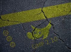
Thanks Molly, it actually looks better as an xcf at 200%. It loses a bit of definition when viewed at 100% . I must say , I think the yellow is a " bitch " of a colour to get right. I have two monitors and the yellows look entirely different on the screens, Much more so than the blues and reds. Also I have trouble distinguishing between pure whites and light yellows (my eyes), so although Drac's instructions get you close to the mark, I find that I always want to see if I cant get it just a little bit better and if there is not a better combination, of layers and then slowly you end up with a mess and have to start all over again. Still the exercise here is to teach you how to combine layers to achieve a result. There are probably quite a few more combinations that will give the same result. You'll note that for each colour there are different combinations that work best for each colour because the colours behave differently on a screen or monitor when mixed with layer combinations.
Cheers Wbool63