This is a short tut on how to make a hatch filled font. Elaborate hachures were often found in old map titles and advertisements. Hachures are also the curly scribbly lines on maps to denote shadows of mountains or other relief features on maps or old stamps. Mostly this method was used before colour printing was commonly available.
Basically, A largish fat font is used so that the "hatch/ hachure" can be included within the outlines of the font. The font is stripped of the fill colour and the outline is used as a path or selection to stroke with Black or Colour. The selection is shrunk and is filled with parallel lines, either in black or in colour.
This method of embellishing a font is only good for titles or headings, a small letter will not be suitable.
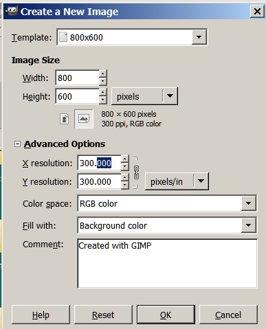
1) Make a new image 800 X 600 (300 dpi) - if you intend to print your image later. sh01
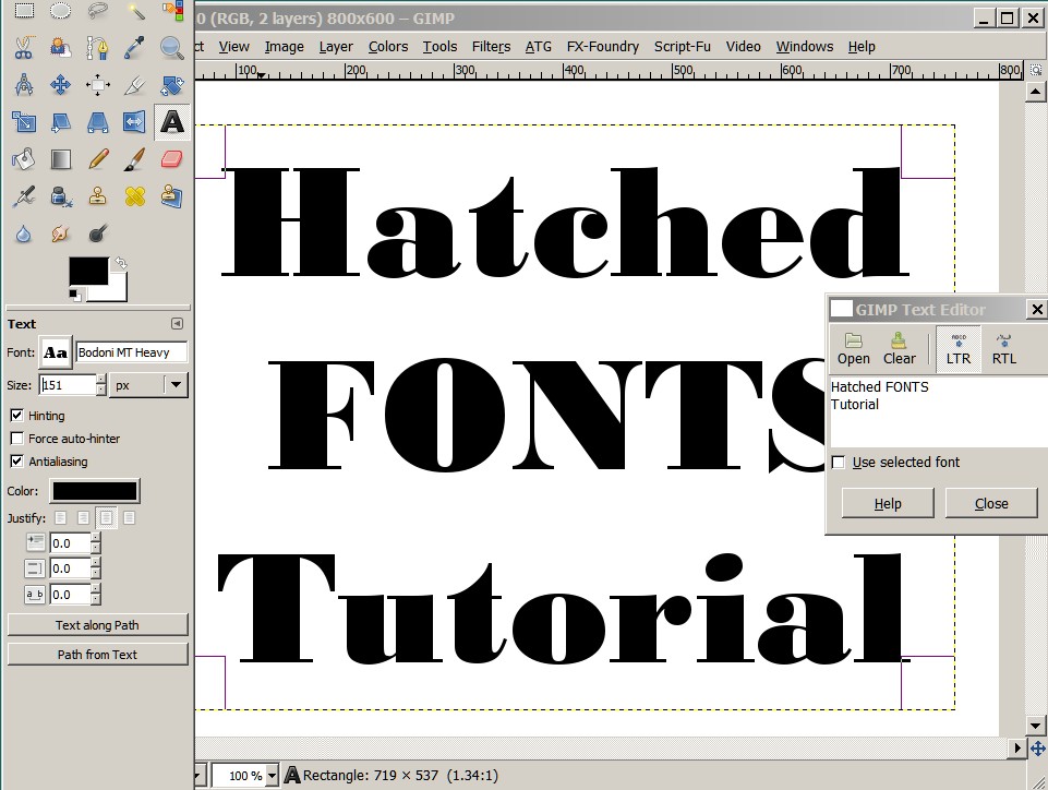
2) Select a large fat font eg.Bodoni MT Heavy and type something, enlarge it as much as you like or what you can to fit as your title or caption. I centered my caption. sh02
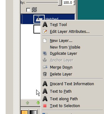
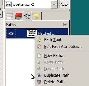
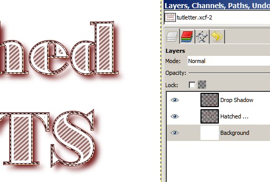
3) Click on the text layer and select text to path. This will put a black filled path in the paths dialogue. If you open up the paths dialogue you can duplicate the path, make the path visible (a faint coloured line) if you click the eye. Make the path visible by clicking the eye. sh06
4) If later you want put in a drop shadow then you may want to duplicate the path. Do not make it visible. Otherwise do not do this step. sh08
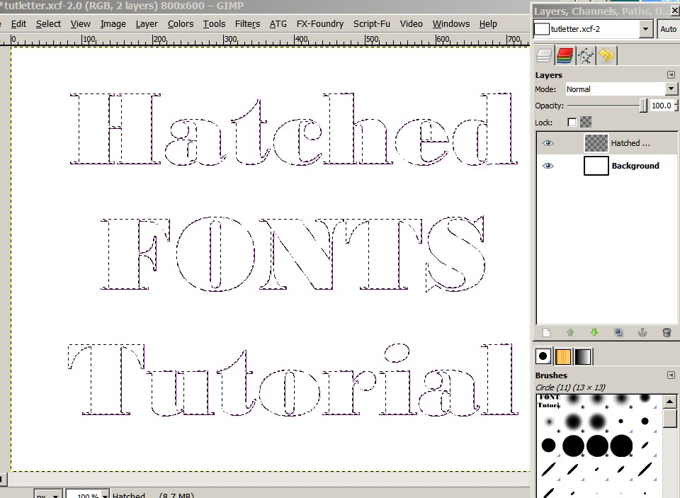
5) Click on the text layer and select "Layer to Image Size". This makes the text layer the same size as your image. When you do this step the text information is lost and you will have a transparent layer with the black text and the faint coloured outline. sh13
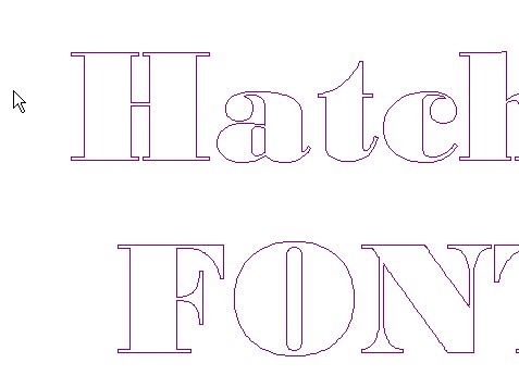
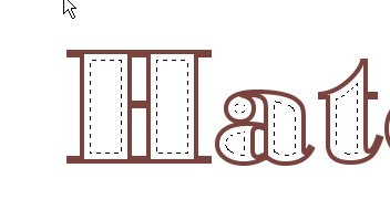
6) Select the Text layer and do a Select by Colour on the black and cut the selection (Ctl-X). You should now have a white image with a faint outline and marching ants. The marching ants are the selection and the faint line is the path. If you now Select None , you will be left with a nice faint smooth outline . sh14 sh15
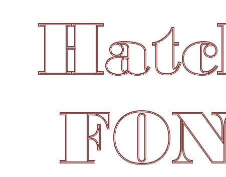
7) Stroke the path with a colour or black . This depends entirely on you. This tut will use coloured outlines and hatch, because it adds to the learning experience. If you prefer black then use black. This tut will use a sepia tone. I will use a stroke width of 4. You may want to use another thickness. It depends on the size of your message. You may want experience with the stroke width as each font needs different stroke widths. sh16
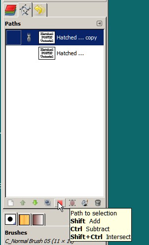
8) Turn off the path visibility (remove the eye)and select path to selection. Shrink The selection by 5 to 8 (depends on your font and message) sh17 sh18
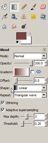
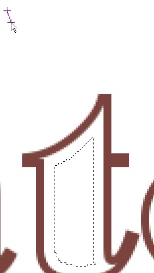
9) At this stage you will have your latest colour and white or just black and white if you decided to stick with black and white.Now the shrunk selection will be filled with a striped pattern. The striped pattern is made with using a gradient in repeat triangular mode, adaptive supersampling. Turn on magnification to 400 and experiment to get your results. You need to have a very small stroke to make a nice ripple and it depends on your font and text. Turn off selection visibility to look at the result.(Ctl-T) Set angle control can be effected by using the Ctl key.sh19 sh20
10) You will notice that the white between the sepia is quite contaminated. You can eliminate this to some extent by altering the gradient . (duplicate the gradient and play with the sliders, more white)sh22

11) if you want to add a drop shadow now use the saved path in step 4 . (filters/light and shadow/drop shadow) sh24
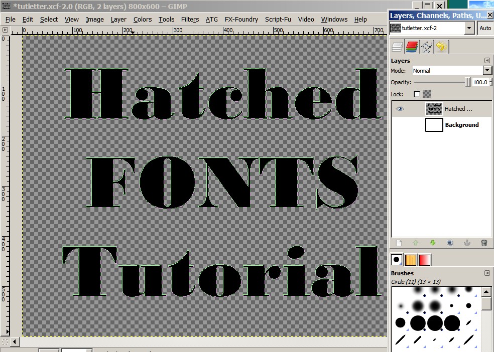
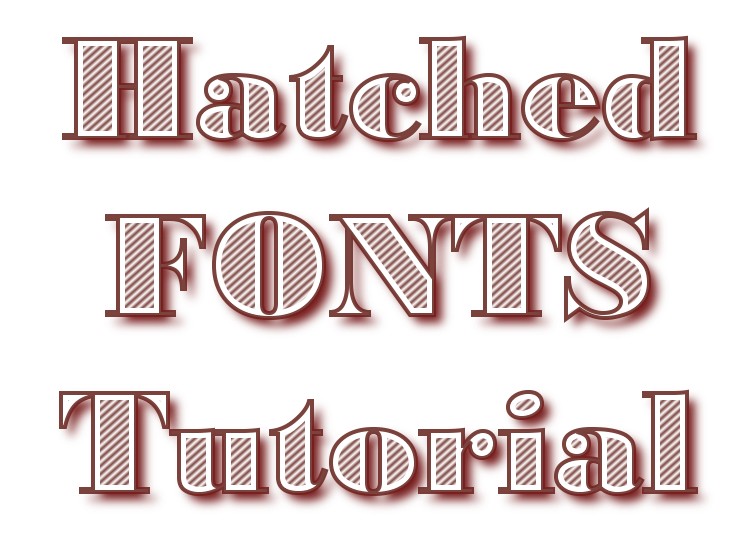
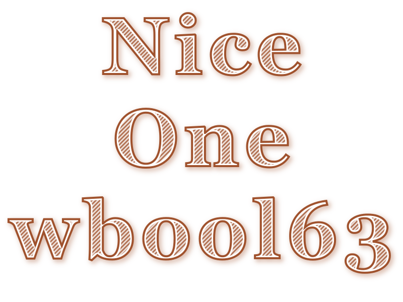
You should end up with something like this in Black or your desired colour sh25
This is only an initial idea, you can add all sorts of additions. You can add flowery images behind, You can change the direction and thickness of the fill, add additional layers with grunge or colour, distress the gradient layer selection, run a second gradient at another angle to get a Cross Hatch fill, move the gradient layer to fake mis-registration. Instead of using the gradient method to fill, you could fill with patterns or brushes to get the effects you desire.
Dont take this too seriously, It is a guide not a test.
Pdf post #3


 this is another variation I threw together.