A COOL, COLOR FLEXIBLE BACKGROUND / WALLPAPER
a GIMP tutorial by dietmar
inspired by a video tutorial
This will create a nice background you can use as wallpaper. It is created
in a way that you can change the base color easily later to produce different
versions. Finally, we add some cool chrome text to the wallpaper.
This is the final result:

Please notice:
Red arrows/lines/etc. are not part of the image and are only intended to
clarify some technical issues!
I also recommend activating "View -> Snap to grid" for better selection
management.
I used GIMP 2.8.14 on Win7 64Bit for this, so I am not sure whether it will
work on older versions of GIMP.
And remember: Save often, perhaps with different filenames for the different
steps, to make reproducing or changing afterwards easier!
Here we go...
* Create a new image. I used the size of my desktop (1366x768) to create it
as a wallpaper.
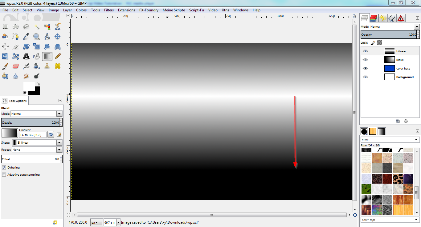
CREATING THE COLOR BASE
* New layer "color base".
* Fill layer with a standard color to start with. I chose "blue" (#013ecb).
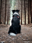
* New layer "radial".
* Drag a radial gradient from white (#ffffff) to black (#000000) as shown
below:
* Set layer mode to "overlay".
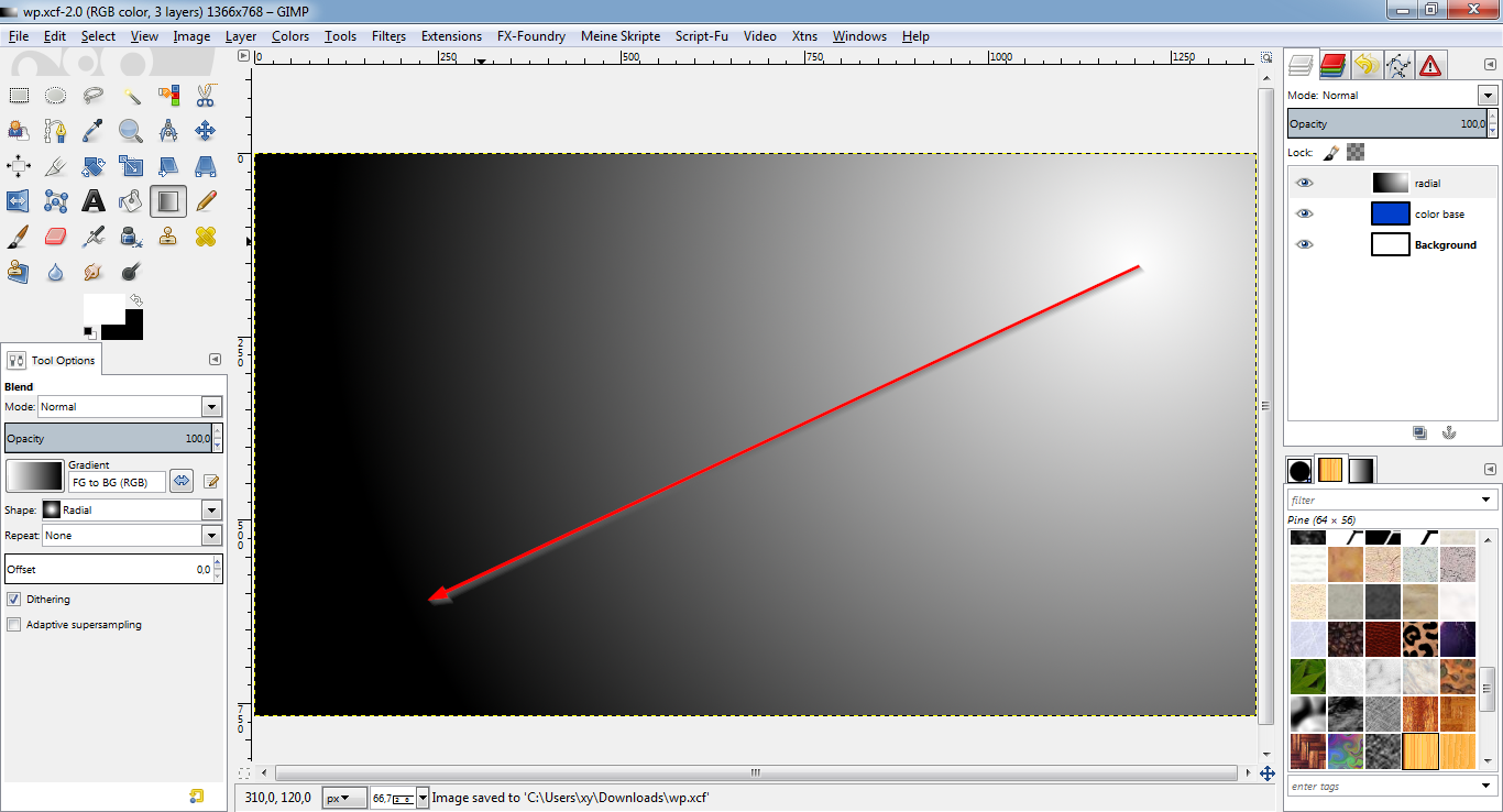
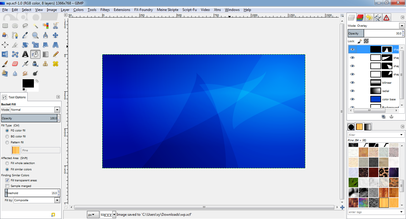
* New layer "bilinear".
* Drag a bilinear gradient from white (#ffffff) to black (#000000) as shown
below:
* Set layer mode to "overlay".
* Lower the opacity to about 50%.
* This is what it should look like:
CREATING HIGHLIGHT SHAPES
STEP 1.1
* New layer "shape1".
* Fill layer with white (#ffffff).
* Set layer mode to "overlay".
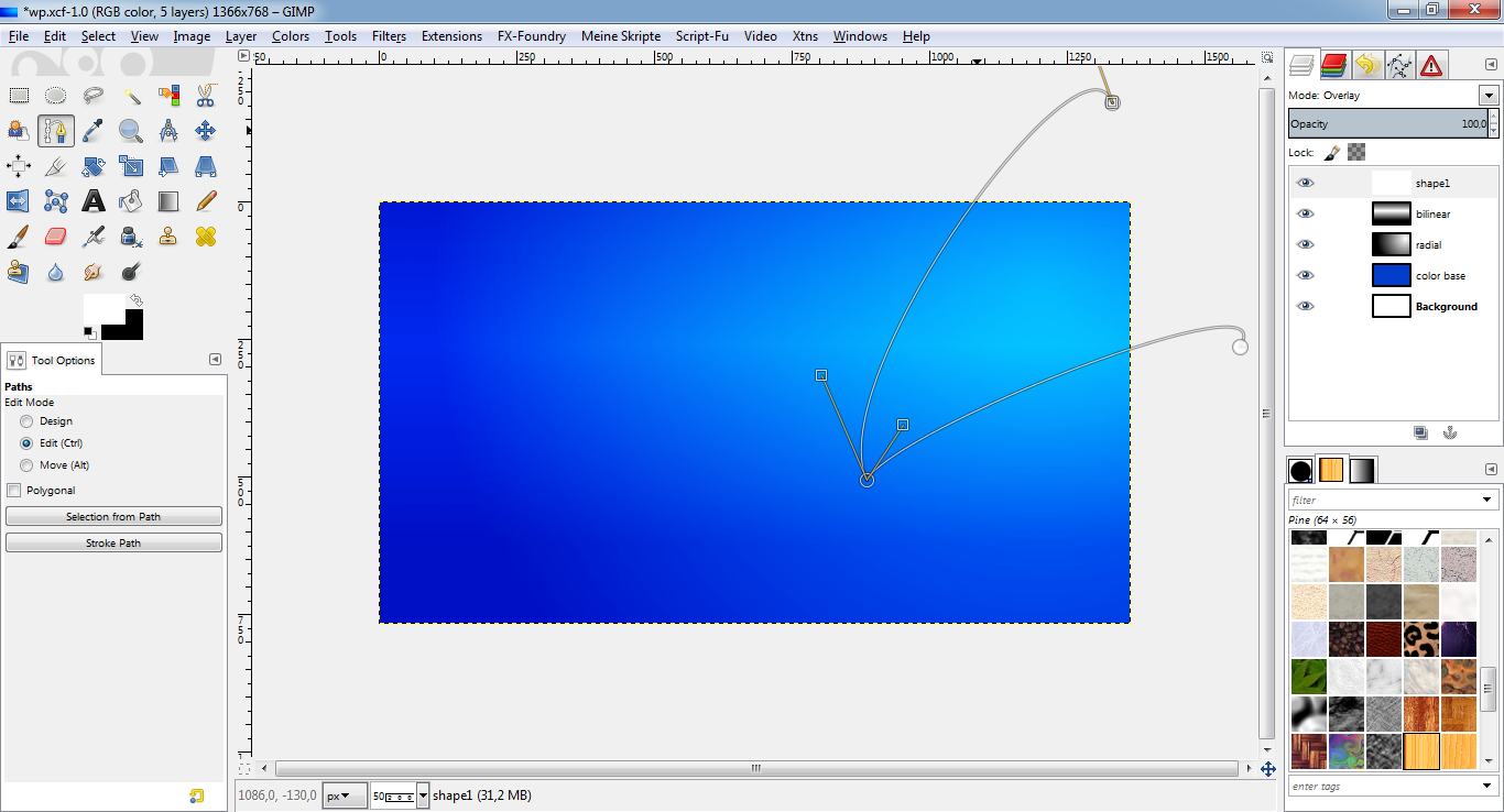
* With the path tool, create a "nose" in the upper right corner like shown:
STEP 1.2
* Name the path "shape1" and "path to selection".
* Layer -> Add layer mask, to selection.
* Select -> None.
* Lower the layer opacity to something you like.
* This is what it should look like:
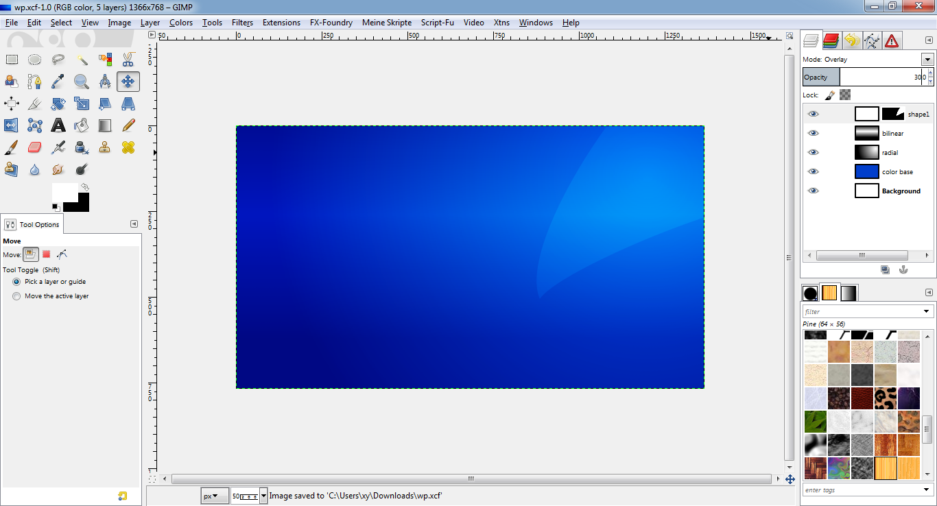
* Repeat steps 1.1-1.2 for a second "nose" (path "shape2") on a new layer
("shape2") in the lower right corner.
* This is what it should look like:
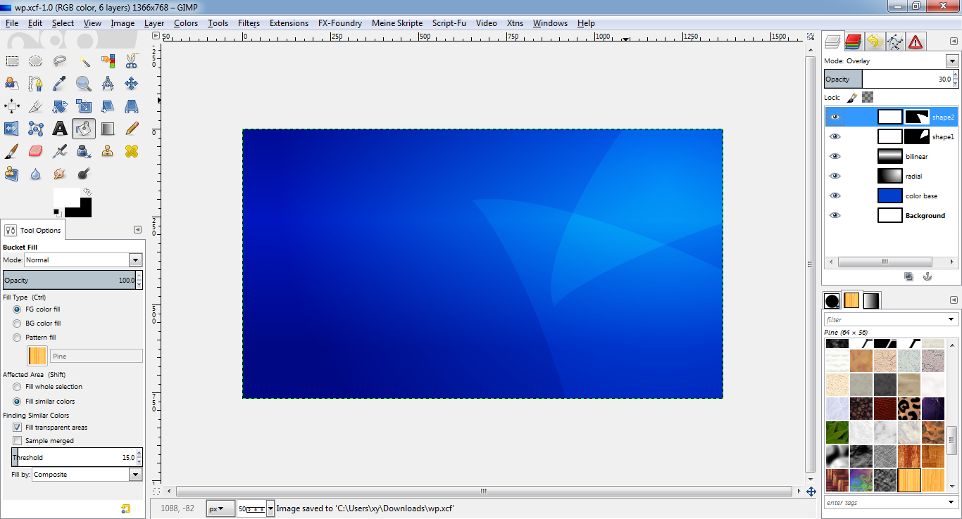
* Repeat steps 1.1-1.2 for a third "nose" (path "shape3") on a new layer
("shape3") in the lower right corner.
* This is what it should look like:
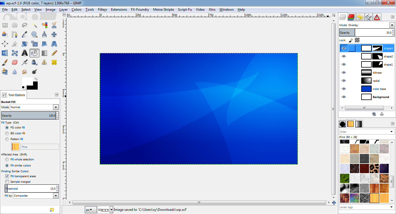
Of course you can use this technique to create any other shapes, too.
CREATING LOWLIGHT SHAPES
STEP 2.1
* New layer "shape4".
* Fill layer with black (#000000).
* Set layer mode to "overlay".
* With the path tool, create a "nose" in the lower left corner.
STEP 2.2
* Name the path "shape4" and "path to selection".
* Layer -> Add layer mask, to selection.
* Select -> None.
* Lower the layer opacity to something you like.
* This is what it should look like:
* Repeat steps 2.1-2.2 for a second "nose" (path "shape5") on a new layer
("shape5") in the lower right corner.
* This is what it should look like:
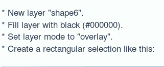
* New layer "shape6".
* Fill layer with black (#000000).
* Set layer mode to "overlay".
* Create a ellipse selection like this:
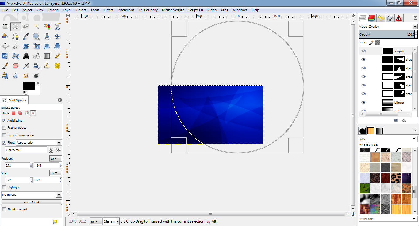
* Layer -> Add layer mask, to selection. THIS TIME WITH "INVERT MASK"!
* Select -> None.
* Lower the layer opacity to something you like.
* This is what it should look like:
Of course you can use this technique to create any other shapes, too.
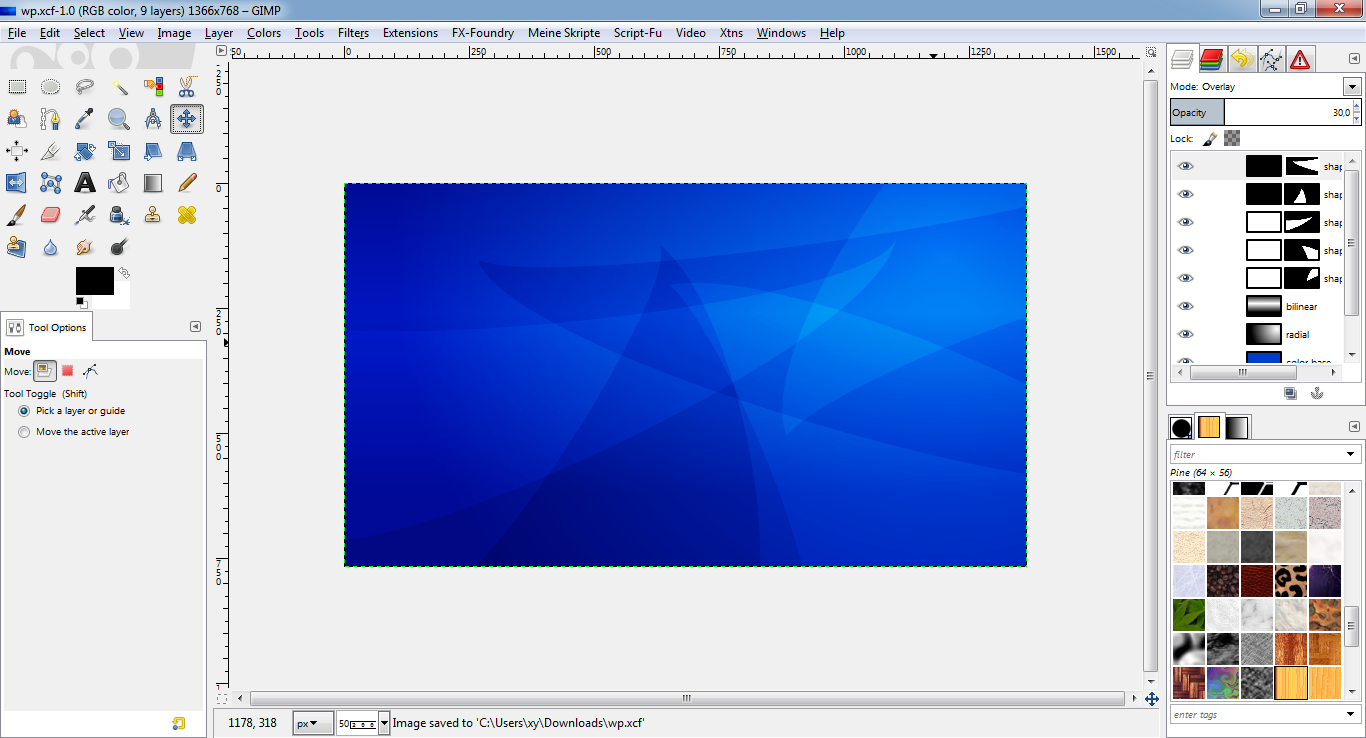
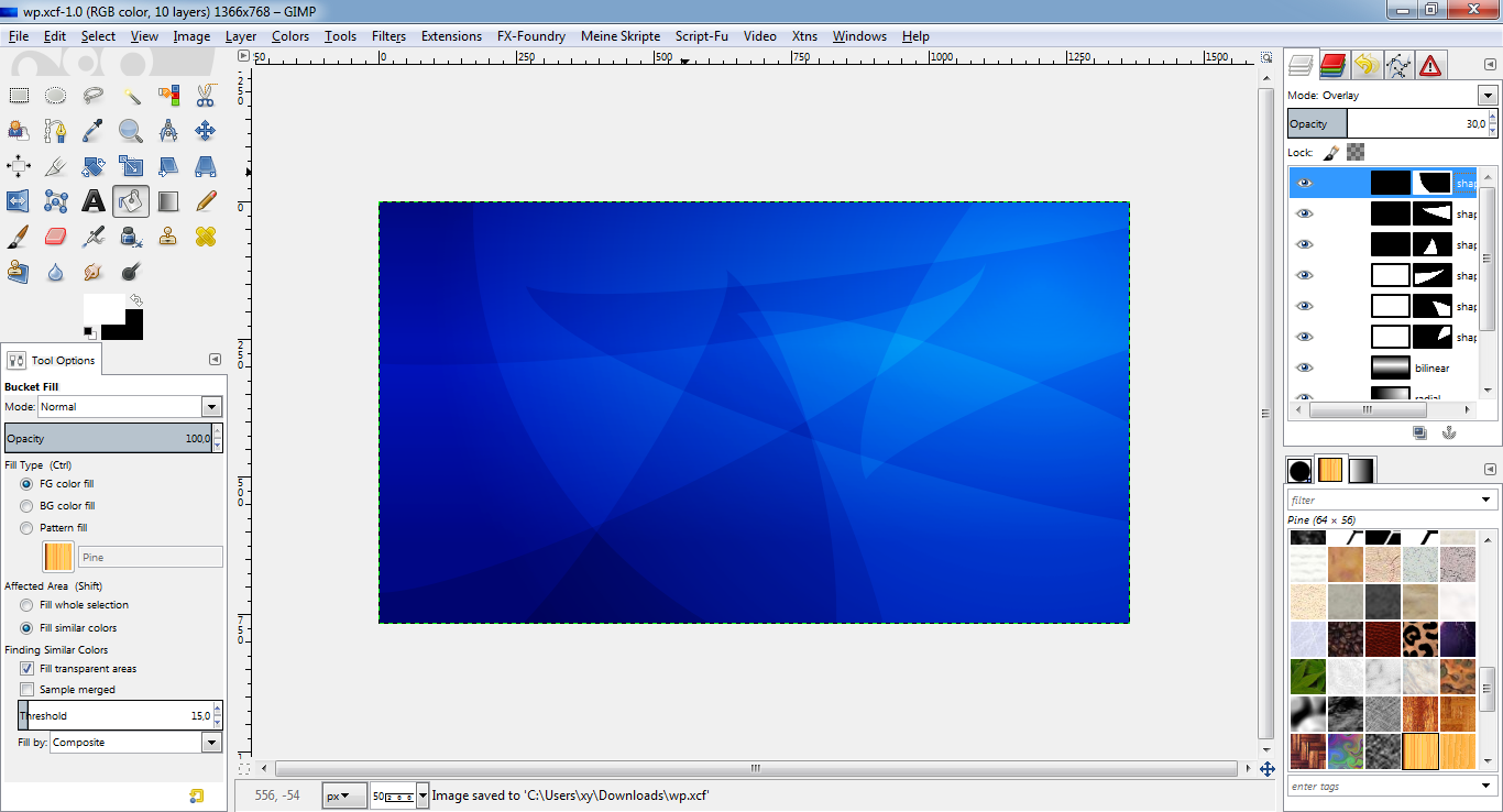
Now you can play with your colors. Just change the color of the "color base"
layer to any other color by bucket filling, gradients, color filters like
"Hue-Saturation" or others!
For the last step (creating some cool text on the wallpaper) I changed the
base color to a medium grey (#777777).
CREATING A CHROME TEXT
Hint: There is already a tutorial to create a chrome text here:
viewtopic.php?f=23&t=7586I will try a slightly different approach.
STEP 3
* Create a new text layer on top of all layers.
* I used the font "moonhouse", color #808080, size 100, available here:
http://www.dafont.com/moonhouse.font* Type the text you want and center it in the image using the align tool.
* Script-Fu: Bevel and emboss, inner bevel, up, depth/size 10, set opacities
to 100%.
* This is what it should look like:
The following steps will "smoothen" the chrome effect:
* Merge down the by the bevel effect created two layers to the text layer.
* Duplicate the layer.
* Select the layer copy.
* Lock the opacity of the layer (small button in the layer dialog).
* Drag a vertical linear gradient from FG black (#000000) to white (#ffffff)
from the bottom of the text to the top of the text.
* Set the opacity of the layer to about 20%.
* Merge down the layer to the original text layer.
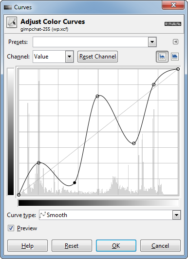
* Use "Colors -> Curves to enhance the coloring effect like this:
* If you don't have G'MIC yet, it is the best chance to download and install
it now:
http://gmic.eu/ (It is a wonderful set of filters, actions etc. for image processing.)
* Use Filters -> G'MIC -> Repair -> Smooth (anisotropic) with amplitude 100,
anisotropy max. and iterations 2 to smoothen the quite hard edges resulting
from the prior actions.
NOTE:
At the moment, this filter may be broken and does not work, see:
viewtopic.php?f=28&t=11715I already filed a bug on this. So if you also run into this trap, use the
following steps to achieve a similar result:
* Use Filters -> G'MIC -> Repair -> Smooth (median) with radius 3.
(In fact, unfortunately there seem a lot of other GMIC smooth filters to be
broken...)
UPDATE:
I just got an answer:
"Try to set the parallel processing option to one or two and see if that
helps."
For me, it worked. Thank you!
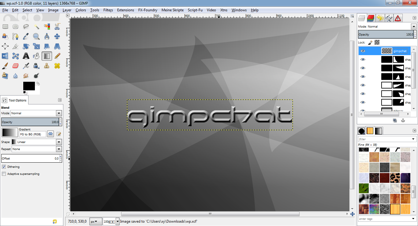
* This is what it should look like:
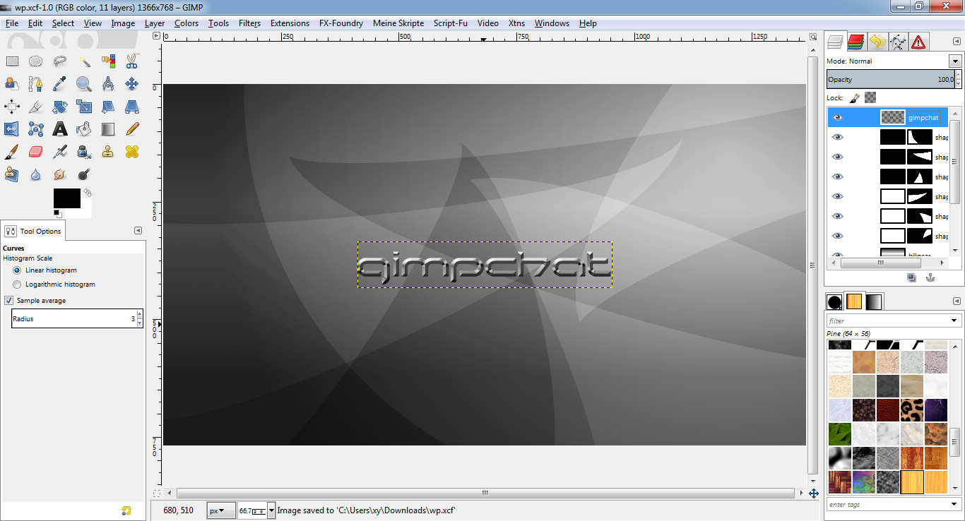
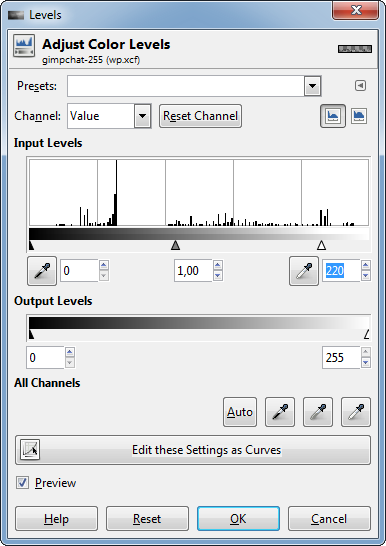
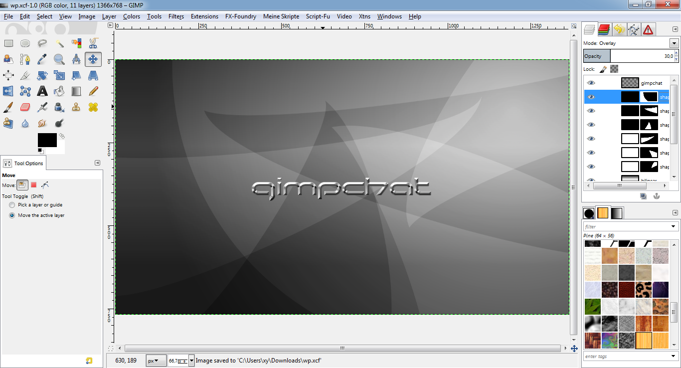
* Use Colors -> Levels in the following way to enlighten the text:
* Script-Fu: Stroke, white (#ffffff), opacity 40%, mode "grain merge", size
1, position 0.
* When the result is ok, merge down the stroke layer to the text layer.
* This is what it should look like:
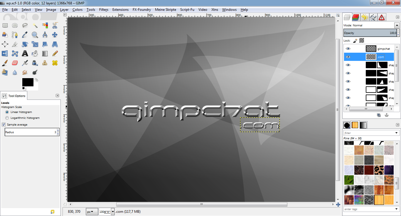
(I just repeated step 3 for a second text.)
* This is what it should look like:
DONE!
Congratulations, you have successfully completed the tutorial! Now it would
be a wise decision to save your work under a new name for later changes or
whatever.
If you find any errors or something I could improve, feel free to comment!
dietmar
Admin note: I have attached a PDF document of this great tutorial - O