Finger paint TutorialWith G'MIC 1.6.1.0, coming whenever it is ready, a slightly revised Gimp Fingerpaint filter will be going down the slide ways, launching into a Gimp near you. The current 2014/12/11 version migrates to 2015/02/23 or maybe a little higher. No change in the interface, but a slight darkening that has occurred with strong highlights has been minimized, along with some internal parameter tuning: a brighter, lighter Finger paint is in the offing.
I never wrote up a Gimp Chat tutorial for Finger paint as I had done for Hairlocks, last December, so this puts that to right. Everything here will work with the current Finger paint version, and continue to work with the new. You might be less inclined to raise the gamma or otherwise lighten the result of this filter after you take 1.6.1.0 on board, which will have the 2015/02/23 version, or thereabouts.
What is Finger paint? First, if you have no idea whatsoever about what Finger paint is, it lives in the G'MIC plug-in, so you need the G'MIC plug-in before any of this makes sense. Here's how you can get it (
gmic.eu/gimp.shtml). There are also fine people here on Gimp Chat who compile integrated versions of Gimp and G'MIC. One such good person is
samj (
www.aljacom.com/~gmic/), another is
partha, (
partha.com). Searching on either of those names will turn up many, many installation related discussions, and both are enormously helpful. Last, but not least, the author and lead developer of G'MIC,
ronounours, is here almost daily; look in the G'MIC Discussion area.
If you have the G'MIC plug-in, then Chris Fiedler did one of those nice, wordless video tutorials which always has such charm. It is worth three minutes of your time:
Chris Fiedler Fingerpaint Tutorial On YouTube.
Second, there are resources at gmic.eu
- The Fingerpaint Filter: A brief introduction to the Gimp Fingerpaint filter
- Fingerpainting: A walk through of the G'MIC code inside the filter, for those who want to hack the G'MIC
command language straight up: no ice, oh, maybe a little water on the side.
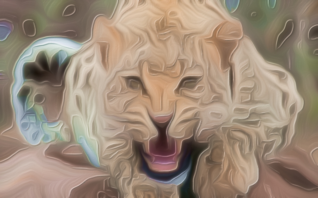
The filter abducts G'MIC's anisotropic smoothing machinery to make a bump map of finger or brush strokes, these based on regions of similar color. It uses a primitive lighting model to furnish basic light and shadows, and specular highlights.
PremiseYou want to transform a photograph into a mimic finger painting. Literally. Three dimensional paint hanging off of canvas, with brush strokes casting shadows and shiny highlights.
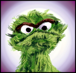
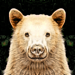
- Pick a Layer. Make it Active. Strong images with contrasting edges are usually the most successful, though low contrast, high key images can work as well. Here is a prime example:
- Observe that the color has slight variation to it. Painters sometimes like to mix colors on canvas, so that no one region is absolutely just one color. There are a bunch of ways to achieve this. One technique, which tends to follow edges and such, harnesses the G'MIC Spectral Filters ► Bandpass filter. See Post Script: Diversifying Color, following.
- Choose Filters ►G'MIC. In the middle of the plug-in there is a selection box containing filter groups. Find Artistic and click on the '►' icon to open it ('▼'). scroll down to Finger paint and click on it. The Finger paint dialog box should open.
- Paint and Render Detail. You should find two groups of widgets. The widgets clustered under “Paint Detail” let you furnish hints and policy to guide the business of decomposing an image into strokes. “Render Detail” allows you to furnish hints about how the paint itself should appear.
Paint Detail- Finger Size: Ranges from zero to one and defaults to 0.5. Larger values imply fatter fingers with less detail dexterity. Your image will degenerate into paint swirls near values of one.
- Keep Detail: Ranges from zero to one and defaults to 0.5. Larger values makes Finger paint more assiduous about finding image edges. Smaller values induce rather random scribbles. Edges orient brush strokes, so if Finger paint can't be arsed to find edges, strokes generally meander all over the place. That may be perfectly fine in some cases, aggravating in others.
- Bristle Size: Ranges from zero to one and defaults to zero. By default, Finger paint uses diffusion ellipses with eccentricities very near one. This lends a fine, sable-hair brush appearance to the “paint.” Increasing this number makes the ellipses less eccentric, giving the appearance of fatter, coarser bristles. Near unity, bristles tend to disappear.
- Edge Detect Includes Chroma (EDIC): Turn this on if you'd like to organize brush strokes primarily by color; such an image would tend to have very saturated objects on less saturated backgrounds – think of colored festival balloons floating off into an evening sky, It is of indifferent utility if the image is unsaturated; you'd be better off turning it off in those cases.
Render Detail- Light Direction: Ranges from zero to 360° and defaults to 45.° The default value lights up surfaces facing to the northwest; zero degreees lights from the left, 180° lights from the right.
- Shadow: Ranges from zero to one and defaults to 0.5. Larger numbers engender darker shadows.
- Highlight: Ranges from zero to one and defaults to 0.5. Larger numbers engender brighter highlights but less saturated and darker mid-tones.
- Specular: Ranges from zero to 360° and defaults to 45°. Larger numbers might suggest that the paint is glossy.
Resolution DependenceGrounded on anisotropic smoothing, everything about Finger paint is scale dependent. It operates at pixel scales, and when one pixel grows larger in relation to the overall image, the Finger paint effect increases. Put another way, smaller images produce more dramatic effects.
As a consequence, the plug in preview may not preview all that well. For an accurate preview, I suggest that you set the layer presentation at 100%, then set the plug-in preview scaling so that the size of features in the preview match the same features on the layer. That is, a circle 70 pixels wide in the original layer should appear in the preview also at 70 pixels wide. There is no easy way to fix this.
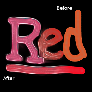
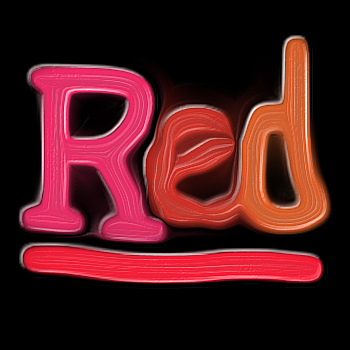
Examples- Red: Fingerpainted at 350 × 350. Finger size: 0.5 Keep detail: 0.5 Bristle size: 0.01 EDIC: off Light direction: 45 Shadow: 0.1 Highlight: 0.1 Specular: 0.9

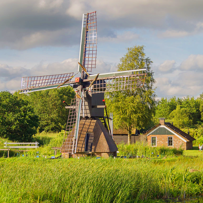
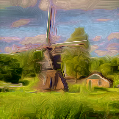
- Windmill: Fingerpainted at 1024 × 1024, reduced to 400 × 400. Finger size: 0.4, Keep detail: 0.53, Bristle size: 0.05, EDIC: off, Light direction: 135, Shadow: 0.07, Highlight: 0.08, Specular: 0.13:
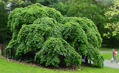
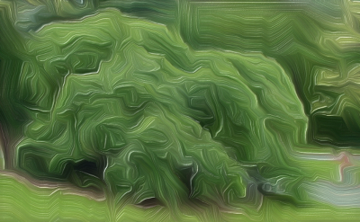
- Camperdown Elm, Prospect Park, Brooklyn:
- 1150 × 710, reduced to 400 × 247, not fingerpainted:
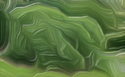
- finger painted at 1150 × 710 then reduced to 400 × 247. Finger size: 0.4 Keep detail: 0.3 Bristle size: 0.1 EDIC: on Light direction: 45 Shadow: 0.06 Highlight: 0.5 Specular: 0.9
- Reduced to 400 × 247 then finger painted. Finger size: 0.4, Keep detail: 0.3 Bristle size: 0.1 EDIC: on Light direction: 45 Shadow: 0.06 Highlight: 0.5 Specular: 0.9
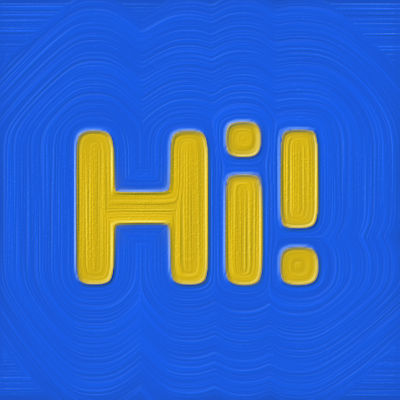
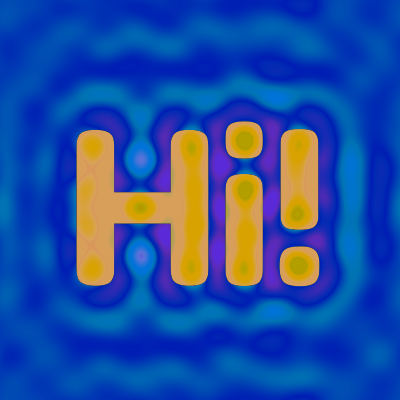
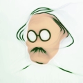
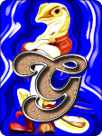
Post Script: Diversifying Color and GeometryVector Graphics tend to have large masses that are the same color. The following 400 × 400 greeting has just two colors, a blue-green and a yellow-orange.

The finger painting of this greeting shows absolute, ruler straight, brush strokes. No human being can make those kind of brush strokes (settings: Finger size: 0.5, Keep detail: 0.5 Bristle size: 0.01 EDIC: off Light direction: 45 Shadow: 0.5 Highlight: 0.5 Specular: 0.5 ):
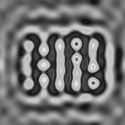
The G'MIC filter, Spectral Filters ►Bandpass, breaks up these monotone masses with variations that are sensitive to the geometry of the image, so that the variations are plausibly from a human hand. That same output may also warp the graphic just a little bit to suggest a hand drawn aspect. In the following, All values are
guidelines. Experiment and play with them:
- Duplicate the layer to be finger painted. On the duplicate layer, above the original in the layer stack, run the G'MIC Spectral Filters ►Bandpass. (Settings: Low Frequency: 0.08 High Frequency: 0.2 Channel(s): HSV[hue] Value Action: Normalize Preview Type: <whatever you prefer>). Your top layer should look like this:
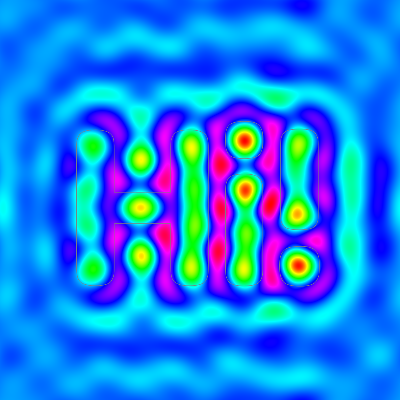
This is your “color variation layer.” Now we are going to make the “Geometry variation layer.” - Duplicate this top layer (you now have three layers) and desaturate it via Colors ►Desaturate. Choose the “Luminosity” radio button and click on 'OK'. Your top “Geometry layer should look something like this:
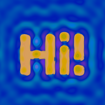
This is your “Geometry variation layer”. Turn its visibility “off” for now – we'll come back to this layer shortly. - Switch the middle “Color variation layer” and set its mode to “Difference” and its opacity to 0.30. Make sure the original, still pristine layer on the bottom is visible ( toggle the leftmost “eye” button to “on”) The composite of the middle and bottom layer should look something like this:
Try Grain Merge, Grain Extract, Add, and Subtract modes for other variations. Play with opacity too. When you are done, merge the middle layer down to the bottom layer (Right Mouse Button on middle “Color variation layer” ► “Merge Down”. - Select the now-merged bottom layer. Choose Filters ►Map ► Displace to acquire the “Displace” dialog. Choose both 'X' and 'Y' displacement, set the distortion magnitude to '3.0' and choose the top “Geometry variation layer” as the displacement source. Hit 'OK'; your bottom layer should now look something like this:
- Summon Filters ►G'MIC ► Artistic ► Finger paint and use settings something like: Finger size: 0.40, Keep detail: 0.50 Bristle size: 0.02 EDIC: off Light direction: 160 Shadow: 0.5 Highlight: 0.8 Specular: 0.7. Could be that your results might look like this:
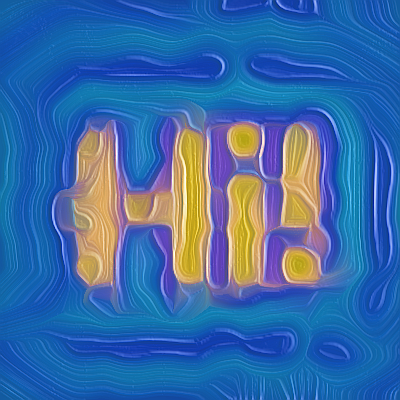
This is how my fingers would paint “Hi!”, spastic as I am. - Go on and have fun. Take care.
A PDF file is attached reproducing all the spelling and grammatical errors that are here in this original.


 for posting it.