It is currently Thu Apr 25, 2024 9:12 am


All times are UTC - 5 hours [ DST ]


Post new topic Reply to topic  [ 2 posts ] 
Author Message
 Post subject: Quick tip on value and color mode
PostPosted: Thu Jun 30, 2011 3:19 pm  (#1) 
Offline
GimpChat Member

Joined: Apr 12, 2010
Posts: 5870
when merging in value or color mode (same for lightness and luminosity ) the sharpness derive ONLY by the BW layer (or anyway of the layer from which get the greyscale

Now you may have noticed nasty effect on the colors in both Value and color mode, that may be avoided by simply using gaussian blur on the color layer (default , 5px blur is usually good )

a example to clear:
here the Value layer on top

Attachment:
more-dali_000004.png
more-dali_000004.png [ 1.21 MiB | Viewed 4121 times ]


here the other layer, (without blurring)

Attachment:
more-dali_000001.png
more-dali_000001.png [ 1.27 MiB | Viewed 4121 times ]


Now look at the message below

_________________
My 3D Gallery on Deviantart http://photocomix2.deviantart.com/
Main gallery http://www.flickriver.com/photos/photocomix-mandala/
Mandala and simmetry http://www.flickriver.com/photos/photocomix_mandala/

Image

Mrs Wilbress


Share on Facebook Share on Twitter Share on Orkut Share on Digg Share on MySpace Share on Delicious Share on Technorati
Top
 Post subject: Re: Quick tip on value and color mode
PostPosted: Thu Jun 30, 2011 3:34 pm  (#2) 
Offline
GimpChat Member

Joined: Apr 12, 2010
Posts: 5870
Here the result of merging in value mode at 100% opacity

Attachment:
more-dali.png
more-dali.png [ 1.38 MiB | Viewed 4114 times ]


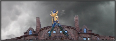
please note on the lower part the colors on Dali cloth, in several spot the color look ugly sprayed or pixelated and noisy, and also in the bluish area at right of his head is not too nice

Now check the difference

Attachment:
more-dali_000006.png
more-dali_000006.png [ 1.18 MiB | Viewed 4114 times ]


Sharpness is the same , that of the top layer (no so much, but unchanged) but the color is better merged with the greyscale, no more noisy or pixelated

only difference was a 5px gaussian blur on the color layer, note that (except for unreasonable high amount of blur, but not in case of blur between 2 and 5 px) color remain well separated and will not flood
in a percetible way

but the blur was quite heavy see how would look the color layer (without merging)

Attachment:
more-dali_000003.png
more-dali_000003.png [ 579.62 KiB | Viewed 4110 times ]


Note,i used 5px blur just to show that will not interfere with sharpness of combination or cause the color to mix togheter
But , no need for all that blur
i found half of that (2.5 blur) sufficent to avoid that, for me very ugly and noisy, spray of color

_________________
My 3D Gallery on Deviantart http://photocomix2.deviantart.com/
Main gallery http://www.flickriver.com/photos/photocomix-mandala/
Mandala and simmetry http://www.flickriver.com/photos/photocomix_mandala/

Image

Mrs Wilbress


Top
Post new topic Reply to topic  [ 2 posts ] 

All times are UTC - 5 hours [ DST ]


   Similar Topics   Replies 
No new posts Attachment(s) GEGL Color Light Fusion (12 blend modes for color overlay)

9

No new posts Attachment(s) Background color chanage and typed text color change

8

No new posts Attachment(s) Color does not exactly match color in GIMP 2.10 (SOLVED)

9

No new posts Open images in RGB mode automatically

1

No new posts Attachment(s) New GEGL Extrusion filter - USE THE BEHIND BLEND MODE!

18


* Login  


Powered by phpBB3 © phpBB Group