This tutorial was written by poet666d at
Gimp Talk.
 Engraved inline-hatched Text tutorial by Poet666d.Requirements
 -
Layer Effects script -
http://registry.gimp.org/node/186Create a new document.
I like to work large so I used 1600x1200 just for this text.
(its better to work large and scale down if you need to rather than the other way!)
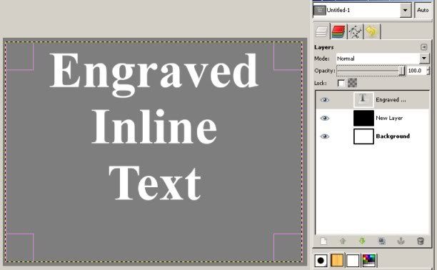
Step 1. Create a White layer and add a black layer above it.
Step 2. Set the black layers opacity to 50% (to give us a nice mid grey so we can see what we're doing)
Step 3. With the text tool fill the entire canvas with your text, set its colour to WHITE.
(I used Times New Roman Bold for the example with a size of 266)
You should have something like this:
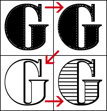
Step 4. With your text layer still highlight Go to: Script Fu - Layer Effects - Stroke.
Set the Colour to White, the Size to "8" and slide "Position" to "100", leave everything else.
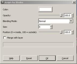
This should add a "your text ...stroke" layer UNDER your text layer.
Step 5. Select your text layer again and again go to: Script Fu - Layer Effects - Stroke.
Set the Colour to #7e5a16 (a nice mid brown, or whatever you like) and increase the size to "10", leave everything else.
(setting the size to "9" might be better here for a thinner more attractive shadow)
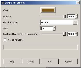
This should add a "your text ....stroke#1" layer ABOVE your first "...stroke" layer.
Step 6. Select the new "stroke#1" layer and move it down 3 pixels and to the right 3 pixels.
Then move the layer down in the list underneath the first "stroke" layer.
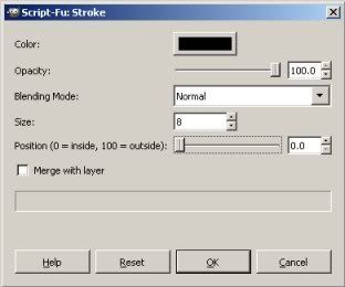
Step 7. Select your original text layer again and again go to: Script Fu - Layer Effects - Stroke.
Set the colour to Black, size to "8" and slide "Position" down to "0", leave everything else.
Step 8. Create a new Transparent layer on top of all the rest and select it.
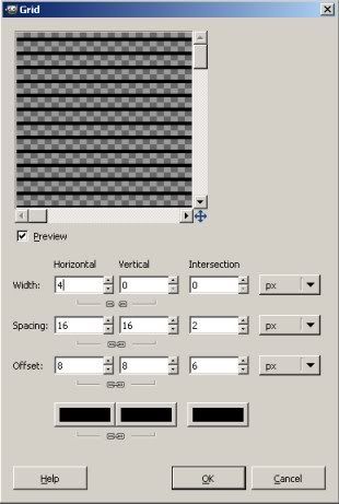
Step 9. Go to: Filter - Render - Pattern - Grid.
Unlink Horizontal and Vertical "Width" and set Width to "4" and Vertical to "0" Spacing to 16 x 16 and Colours to Black.
Step 10. Right click on original Text layer and "Text to Selection"
Step 11. Click on your Grid layer to make it active, go to Select - Invert Selection and then Edit - Clear.
Step 12. Select - None and then delete your Black Layer and you're done.
Marvel at your new Typograhy skills.
ADDITION:1. If you want to achieve the "offset" look to the fill.
2. In step 7 set the black inner fill size to "4"
3. Use Filter - "repeat Stroke" to make another the same size.
4. Move the newly created copy left 3 or so pixels (make sure no white gaps appear!).
5. Go to Original text and "Text to path".
6. Go to Paths dialogue and select "Path to selection"
7. Go back to the black inner-stroked layer that you just moved left, Select - Invert and Edit - Clear.
8. Go back to Original Text layer and repeat the above step 3,4,6 and 7. Moving the new copy more each time ie 6 pixels, 9 pixels, 12 pixels etc.
Four or so repeats should do it.
Offset "fill":

The above is an attempt to replicate the effect based on this Tutorial by Yves Peter:
http://fontfeed.com/archives/engraved-festive-type/The Gimp version gives more rounded edges to the shadows and doesn't have the "fill" offset to the left as in the original tutorial.
Both would be nice touches, and if anyone has any suggestions how that might be achieved please feel free to add!
Thanks.

EDIT
------
Might be better to set size to "9" in step 5.
Gives a thinner and more attractive outline.
All other steps the same.
EDIT 2
------
Added method to offset fill as "Addition" to tutorial.