How to Make Pitted Metal
This tutorial will show you how to make pitted metal with bronze overtones and then using it to make some really cool looking text effects. You will need to have the G’MIC plug-in installed to complete this tutorial. You can download the latest version here:
G'MIC. You will also need Python installed with the Selection Bevel (Bevel2) script, as well as this sand texture available from CGTextures.com.
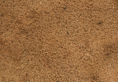
Here’s the link to download the sand texture
http://www.cgtextures.com/texview.php?i ... 4n1489vl63You can get Python here:
http://www.python.org/ftp/python/2.6/python-2.6.msi and the Selection Bevel script is included in the attached zip file, along with the DeVinne Ornamental font. You will also need to download and install both to complete this tutorial.
Step 1.
Open a new image 800 x 600 pixels and use 300 ppi for the resolution.
Step 2.
Go to Filters>Render>Clouds>Solid Noise and use 1 for the detail, X and Y as well. Click on the “Seed” a few times to find a really light pattern. Everybody knows what clouds look like so I won’t bother with a pic.
Step 3.
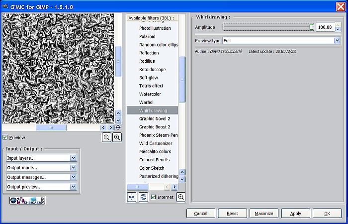
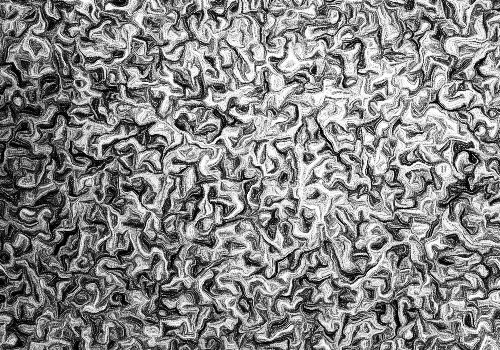
Next, go to Filters>GMIC>Artistic>Whirl Drawing and enter 100 for the Amplitude setting, then click OK.
You should get an image with a bunch of swirly things like this.
Step 4.
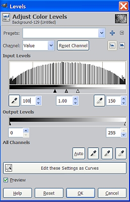
OK, we have our whirls pattern, but there is way too much detail. We want to reduce this so go to Colors>Levels and where it says “Output Levels,” set the left value to 100, the right one to 150, then click OK.
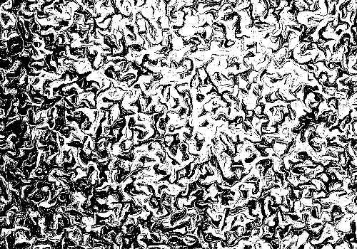
Our image now looks like this.
Step 5.
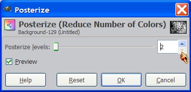
Next we go to Colors>Posterize and select 2 for the number of colors and click OK.
You won’t really notice a lot of change so no need for another pic.
Step 6.
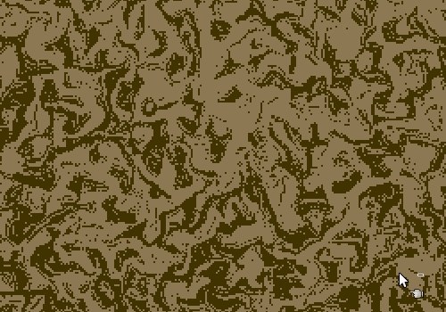
Set your FG color to 403300, and your BG color to 8C7853. Increase your view setting to at least 200% to make the next few steps easier. Click on the Select by Color tool and select one of the white areas to select all the white regions and drag the BG color over to the selection to fill it with the lighter color. Now do the same thing with the black areas using the FG color, then deselect it. (Select>None). You should now have a two color image something like this.
Step 7.
Right click on your background layer in the layers dialog and select Add Alpha Channel. Now duplicate it two times and rename the top one “Light”, the middle one “Dark” and the bottom one “Pattern”. Use the Select by Color tool again and on the top layer select the darker areas and hit your delete key. Now click on the middle layer and select the light areas, then hit the delete key. Now go to Filters>Blur>
Gaussian Blur and blur it at about 5. Repeat for the top layer then go to Select>None and your layers should now look like this.
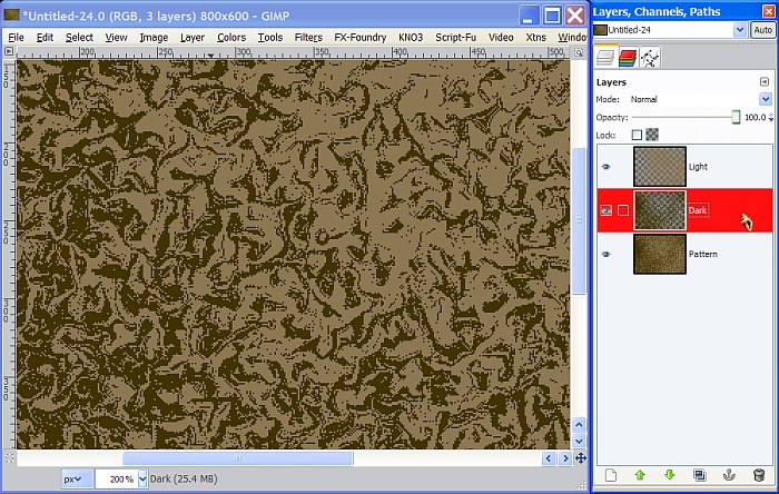
Step 8.
Turn off the visibility of the top two layers, Light and Dark, and select the Pattern layer to make it active. Go to Filters>Map>Bump Map and use the following settings. Make sure you have the Light layer selected to use as the bump map at the top of the dialog for the first bump map process.
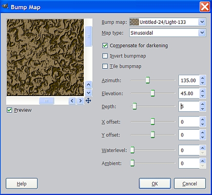
Now bump the Pattern layer again, but this time use the Dark layer as the map with these settings.
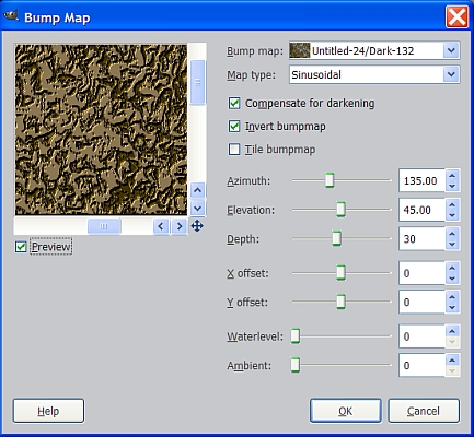
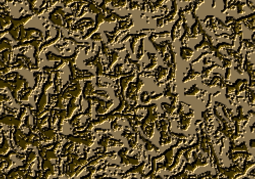
We now have some depth to our pattern, and we can delete the light layer, but hang on to the Dark layer for now.
Step 9.
With the Pattern layer still active, use the Select by Color tool and select one of the lighter areas. Go to Colors>Curves and adjust the curve in the center diagonally up one square like so.
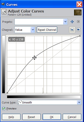
The reason we didn’t just start with a lighter color for our fill step, is that this way does not affect the highlights and shadows created during the bump map process.
Step 10.
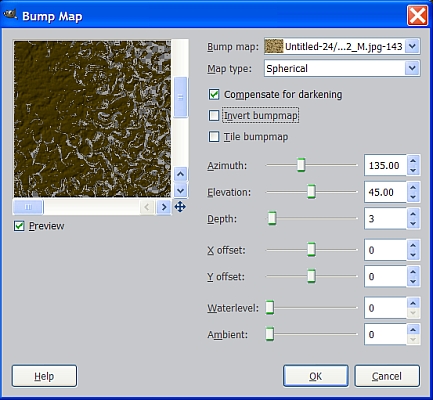
Go to File>Open as Layers and navigate to wherever you saved the sand texture image you downloaded. Once you have it open, right click on it in the layers dialog and select Layer to Image Size, then turn off the visibility. Click on the Dark layer to make it active and select Alpha to Selection. Here’s how we add just a little texture to the large flat darker areas of the Pattern layer. With the selection active, click on the Pattern layer to make it the active layer. Go to Filters>Map>Bump Map and use the sand texture for the map at the top of the dialog and enter these settings.
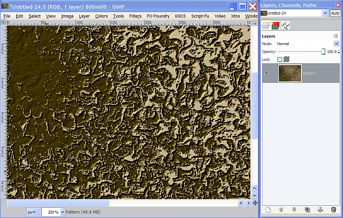
Now deselect the Dark layer, Select>None, and delete both the Dark layer and the Sand texture layer so that you only have the pattern layer left. (Viewed at 200% for clarity)
Step 11.
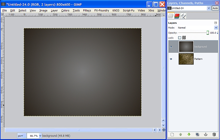
Now that we have our pattern completed, save it to our desktop as a JPG file in case you want to use it again. Don’t close the window yet because I’m going to show you how to use it to create some text effects. Create a new white layer above it and name it Background. Set your FG color to 7D7D7D and your BG color to 2A231B. Select the Blend tool and set the gradient to FG to BG and the Shape to Radial. Zoom out to 66.7% so you can see the whole image and use the rulers at the left and the top to place your cursor as close to the center as possible. Left click and hold down the mouse button and drag from the center to any corner to apply the gradient. It should come out looking like this.
Step 12.
Select the text tool and select the DeVinne Ornamental font, from the attached zip file, and let’s make our text about 260 pixels. Type in your text in all caps and center it from left to right only using the alignment tool.
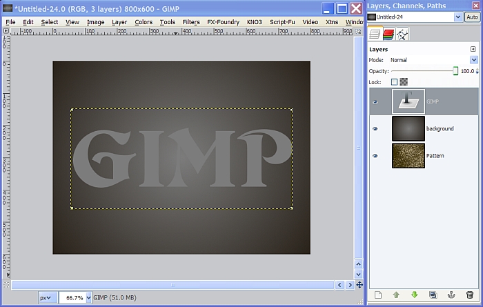
Place a horizontal guide at the 300 mark using the ruler on the left, to help make the next step more accurate. Now, grab the Move tool and click on the text image to activate the tool. Use the arrow keys to move the text to the top half of the image where the bottom is at the center vertically. By using the arrow keys, we can keep from having to center our text from left to right again. Delete or just turn off the guide after your text is positioned.
Step 13.
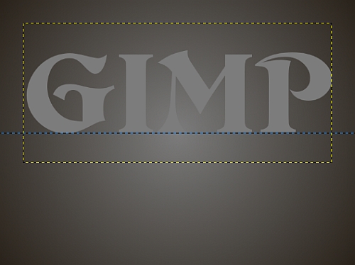
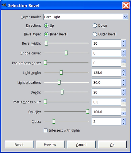
Right click on the text layer in the layers dialog and select Alpha to Selection. Go to Filters>Distorts>Bevel and enter the following settings. This is the Python based Selection Bevel script I included in the attached zip file.
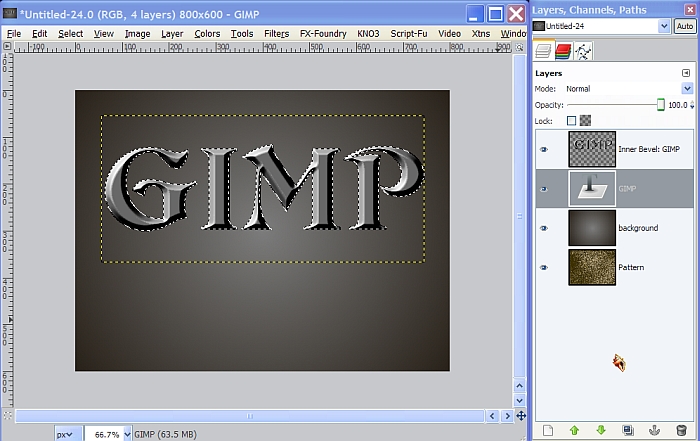
What we get is a great looking bevel effect with some additional lighting effects as a bonus!
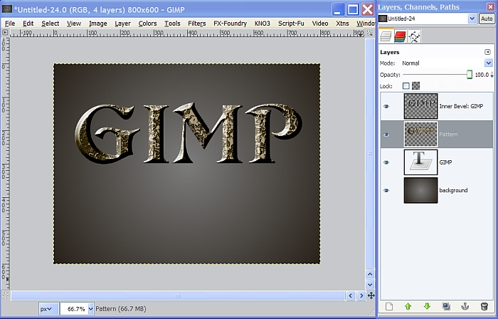
Step 14.
Your selection should still be active with the text layer still selected as the active layer. Go to Select>Invert to select the area outside of the selection and click on the pattern layer to make it the active layer, then hit the delete key. If you look over at the layers dialog you will see the pattern layer background is gone around the text. Now move the Pattern layer above the text layer in the layers dialog and you should see this.
Step 15.
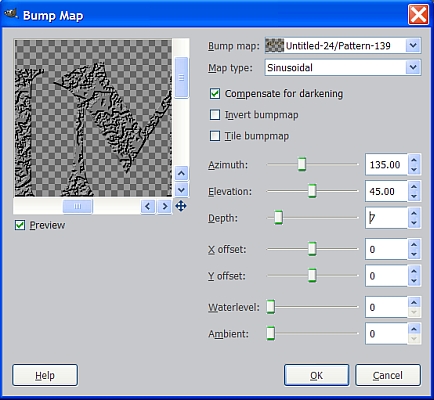
Set the layer Mode on the Pattern layer to Grain Merge and the Opacity to about 85%. Click on the Text layer and select Layer to Image Size. Now go to Filters>Map>Bump Map and enter these settings using the Pattern layer for the map to add even more depth.
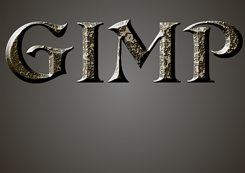
Now our text is complete, and you can increase the last bump map for more depth if you like, but we’re not quite done with our image yet.
Step 16.
Turn off the visibility on the background layer and right click anywhere in the layers dialog to select Merge Visible Layers. Go to Layer>Transform>Flip Vertically and use the Move tool to position the flipped duplicate layer just under the original text layer, aligned and touching as shown below.
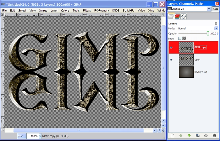
This will be our reflection. Now turn on the visibility for the background layer and change your view setting to 100%. Right click on the flipped layer (the reflection) and select Add Layer Mask. When the dialog comes up, select the one at the top that says White (full opacity) and click on the Add button at the bottom.
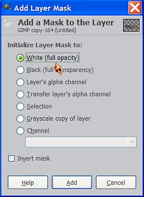
A white rectangle will appear just to the right of the flipped layer in the layers dialog.
Step 17.
Select the Blend tool and set the gradient to FG to Transparent, and the Shape to Linear. Be sure to check the little box next to the gradient to reverse it, then reset your FG/BG colors to the default black and white, and click on the white mask in the layers dialog to make sure you are working on the mask. Now drag your gradient from top to bottom of the flipped text itself (not the whole layer) using the control key to get it perfectly vertical. Once you have applied the gradient to that portion of the mask, it will look like the bottom half of the reflection has started to fade away, which is exactly what we want, but it still doesn’t look quite right yet.
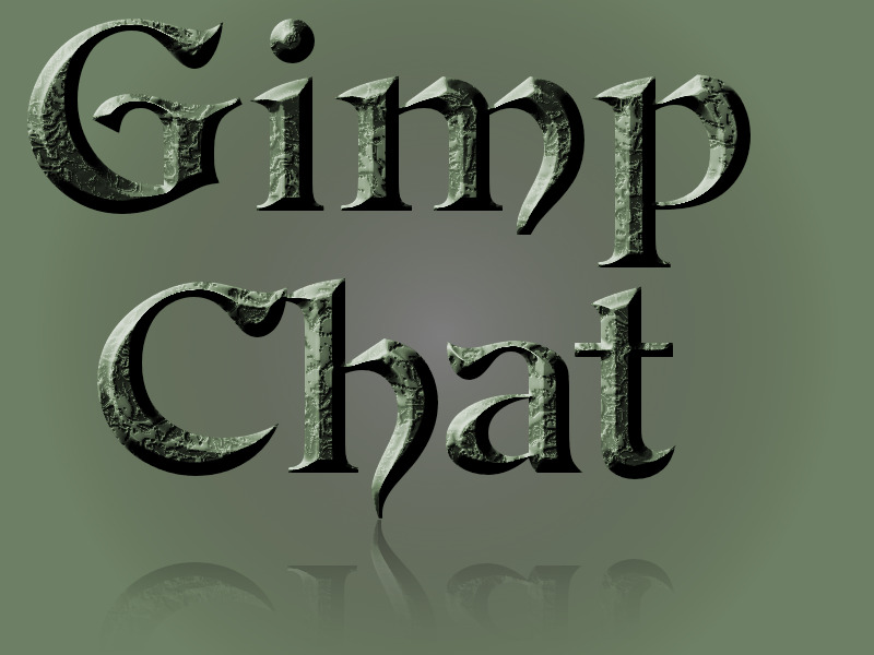
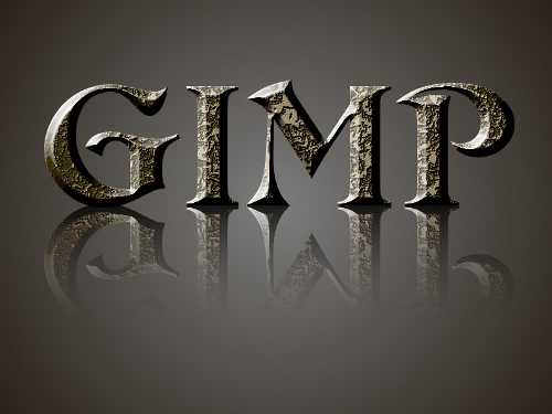
Apply the gradient again in the same manner, then set the layer Opacity to about 80% for a better fading effect. Change up the Opacity setting to get it just the way you want it, or you might even apply the gradient again. When you are finished, right click in the layers dialog, select Merge Visible Layers and your Pitted Metal Text image is completed!
I hope you enjoyed this tutorial.
Next up in our Metal Wurx series is how to make a Hull Plating texture like this.