Metal Wurx – XIX
Indicator Lights - Part C
Colors & Conditions
If you have already completed
Part A and
Part B, then we are now ready to move on to the last part of this segment and complete our indicator lights. Open gimp and load your saved XCF file from
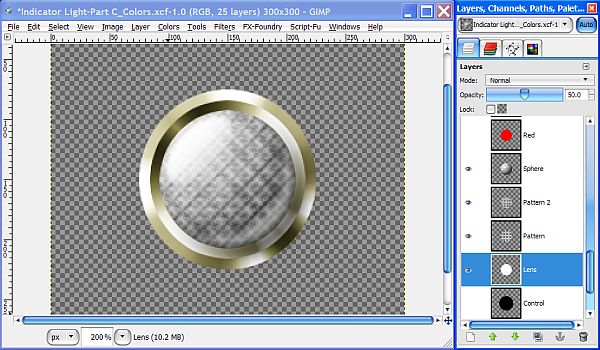
Part B which should now include all the Bezel/Rim and Lens layers.
When we completed
Part B, I explained that what we are going to do next is create several additional layers for colors and glow to simulate an ON and OFF condition for each of our completed lights. The end of
Part C is extremely complex even though there are only a few steps, so read very carefully and make sure you get everything exactly right or your lights will look either too bright, too dark, washed out, or otherwise be messed up and dissimilar. You can of course make any adjustments to each matrix to get your own effects.
I need to add one comment before we begin. This script was written using GIMP Version 2.6.11 which allowed me to use the Voronoi plug-in which is only available in 32 bit at the present. Due to input by others, I have since edited this tutorial by adding the rendered Voronoi pattern for those using 64 bit machines and cannot run the plug-in. You can now find the pattern included in the attached Resources folder in
Part A - Bezel.
Step 1.
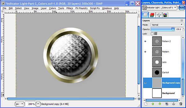
Set your view to 200%, then go all the way down to the bottom of the layer stack and duplicate the Background layer. Set your FG color to a light gray (B0B0B0) and drag the FG color over to the image to fill the Background copy layer. This will make it easier to see the “Glow” layers we will make later on.
Step 3.
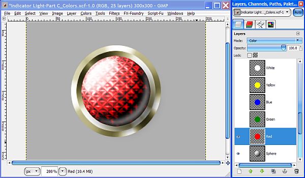
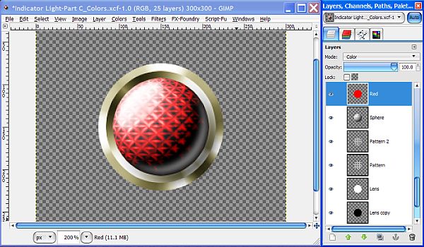
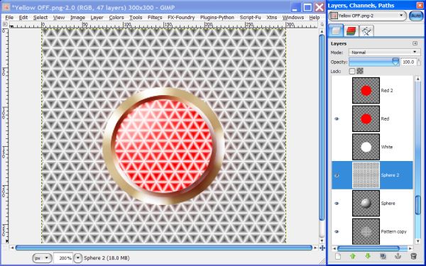
Now we can make the other colors of OFF condition lights. Right click on the Lens layer in the layers dialog and choose Alpha to Selection. Now create a new transparent layer above the Sphere layer and name it “Red”. Set the layer Mode for the Red layer to Color.
Duplicate this layer 4 times and name the duplicate layers Green, Blue, Yellow, and White. Change your FG color to match whichever layer you choose to begin with, and drag the color over to fill each layer with the corresponding color.
Change the layer Mode of the White layer to Overlay. Turn off the visibility of the Green, Blue, Yellow and White layers, then turn off the selection. Red should be the only color layer with the visibility turned on.
Step 4.
Turn on the visibility of the Lens layer and change the Opacity to 50%. Turn off the visibility of the background layers and you can see that since none of the layers above the Control layer are in Normal Mode or at 100% Opacity, we need another layer.
We don’t really need the Control layer anymore and it’s too big anyway, so since we are finished making our Rim layers, go ahead and delete it. Duplicate the Lens layer and move the duplicate down in the layer stack below the Lens layer. Go to Colors>Invert to change it to black. Adjust the layer Opacity of the black Lens copy layer to 100%, turn the visibility of the Red layer back on and our image looks “normal” again and not transparent.
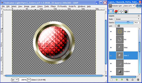
The reason it looks so dark in the lower right quadrant is because the Opacity of the Lens layer is still at 50%. Raise the Opacity of the Lens layer back up to 75% for now then change the layer Mode of the Gloss 2 layer to Screen.
Remember, these will usually be viewed much smaller so reduce your view to about 25% and you will be able to see how it looks after it is scaled down with the different settings by adjusting the Opacity of the Lens layer to 50%, and 100% then leave it at 50%.
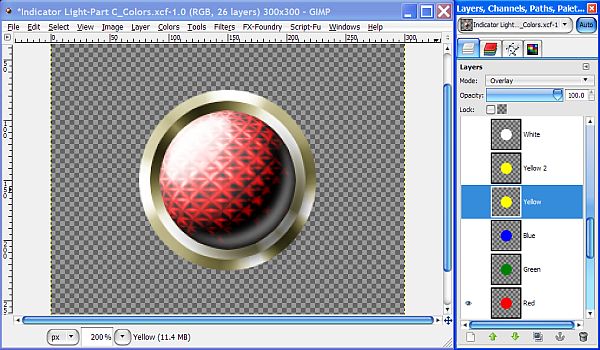
The Yellow OFF light presents a challenging problem which results in a completely different combination of settings and layers. In order to make the Yellow OFF light similar in appearance, we will have to make these adjustments.
Step 5.
Raise the Opacity of the Gloss 2 layer to 100%, then duplicate the Yellow color layer and
rename it “Yellow 2”. Set the layer Mode of the Yellow 2 layer to Grain Merge and the Opacity to 50%. Now, select the Yellow layer and set the layer Mode to Overlay.
Step 6.
Create a new transparent layer above the Gradient layer and name it “Gradient 2”. Select the Blend tool and in the tool dialog select the FG to Transparent gradient. Reverse the gradient so that black is on the right side of the gradient. Set the Shape to Radial then go to View and check the box for Show Guides to turn the guides back on.
Increase your view setting to 300%, then right click on the Gradient layer and choose alpha to selection. Reselect the Gradient 2 layer to make it active, and make a diagonal stroke at a 45 angle from top left to bottom right, passing thru the center, to apply the gradient. Set the layer Mode to Overlay and leave the Opacity set to 100%.
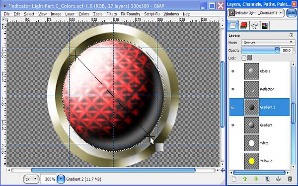
Go to Select>None to turn off the selection, and let’s go ahead and turn off the visibility of the Gradient 2 layer for now. Change your view setting back to 200% then turn off the guides and we are ready to start saving our lights using the different colors.
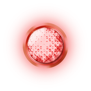
Turn on each colored layer in turn (making sure the other colors are turned off) and save each light as a separate PNG file to preserve the transparency. This is where you have the opportunity to change the metallic finish color, or select the Rim layer design combination you prefer, to start making your sets. These will serve as our “OFF” condition lights.
Different colors sometimes require different conditions. These can get quite confusing as you will see in a moment when we look at the ON Condition lights.
For a “Chrome” bezel, just turn off the colored layer above whichever Rim layer you want to use. Keeping the layers intact gives you a lot of options.
For convenience, I have prepared a chart for the OFF condition lights that can be saved for future reference.
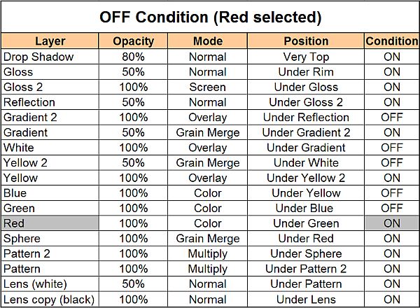
Notice the visibility is turned off for the Gradient 2 and Yellow 2 layers. These two layers are only used when making the Yellow indicator light. All other colors use the matrix as shown above for the Red “OFF” condition indicator light.
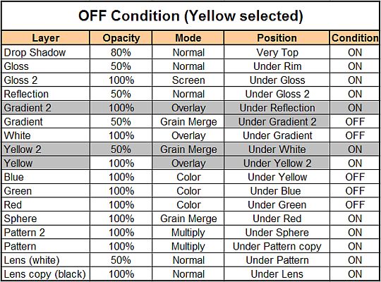
Here is the “Yellow selected” table reflecting the changes we made in Steps 5 and 6.
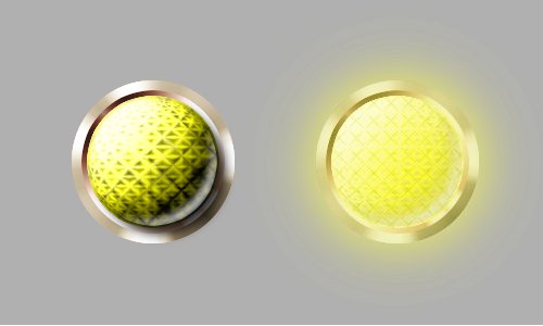
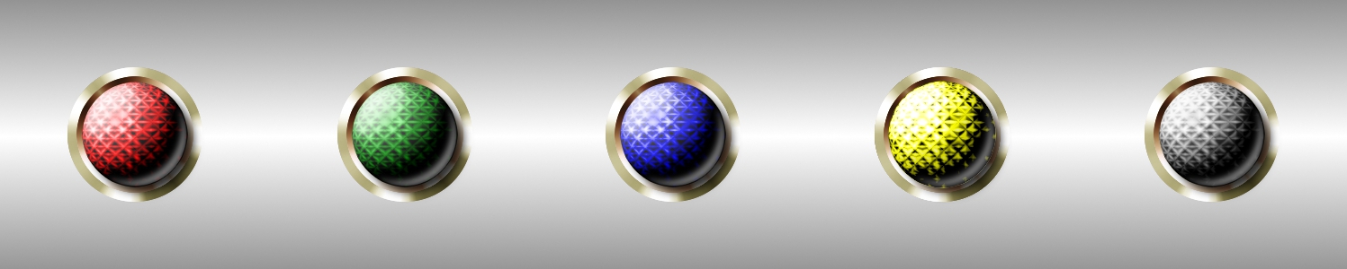
The image below shows a few examples using the tables above with different bezels and metallic finishes, all in the OFF condition.
Once you have saved all the combinations of OFF condition lights you want, we are ready to get started with the ON condition lights. Different colors sometimes require different settings as we have already seen with the Yellow OFF light. These can get quite confusing as you will see in a moment when we look at the ON Condition lights. There will be a lot of setting changes and sometimes the order of layers as well, so pay very close attention to all the details because this is where it gets a little tricky.
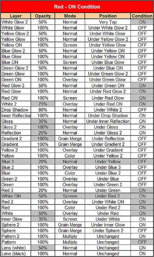
Change your layer settings and order in the stack to match the each particular color’s “Matrix” and save them as you go. These color Matrix changes are absolutely necessary to achieve similarity in appearance for all the ON condition lights. I’ll walk you through the making of the Red ON light then you can create the other “ON” colors on your own using the tables provided. The grey colored cells indicate something that is different to help you get everything just right.
Step 7.
Turn on the visibility of the gray Background copy layer and turn off the visibility of any other colored layers that are still on. Red should be the only color still on. Double check the other layers to make sure they correspond exactly with the Red OFF matrix settings above before you go to the next step.
Step 8.
Duplicate the White Layer and rename the duplicate to “White ON”. Move the White ON layer all the way to the top of the layer stack above the drop Shadow layer. Turn on the visibility and go to Filters>Blur>Gaussian Blur and enter 100 for both amounts and click OK.
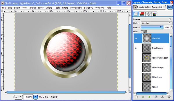
Step 9.
Set the layer Mode for the White ON layer to Screen then turn off the visibility again. Take each of the Yellow, Blue, Green and Red layers, working with one at a time, just like we did with the White layer, duplicate the layer, rename it, move it to the top of the layer stack, and apply the blur at 100, and set the layer Mode of the Red ON layer to Screen.
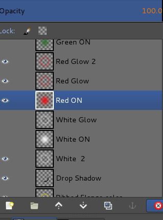
Arrange your layers to match the screenshot below and in the same order as the colored layers. When you’re done, turn off the visibility of all these new ON layers except the Red ON layer.
Reduce the Opacity of the Reflection layer to 25%, then raise the Lens layer Opacity to 100% and your image and layers should now look like this.
Step 10.
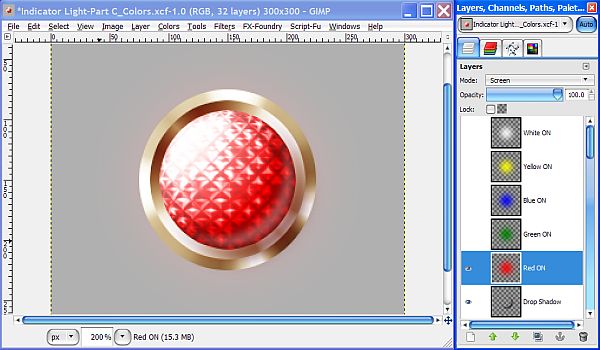
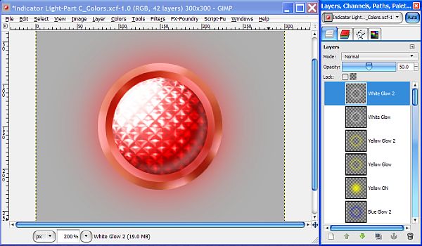
Duplicate the White ON layer and rename it “White Glow”. Right click on the Lens layer and choose Alpha to Selection. Go to Select>Shrink and enter a value of 1 pixel then click OK. Reselect the White Glow layer and hit your delete key to “cut out” the center area creating a “corona” effect. Set the layer Mode to Normal. Turn the visibility on and off a few times to see the effect of the White Glow layer. Leave the selection on, but leave the visibility of both the White ON and White Glow layers turned off for now.
Step 11.
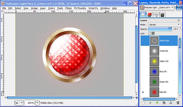
Now repeat the same process with the rest of the colored layers until you have a Glow layer for each color, then go to Select>None to turn off the selection. Set the layer Mode for all the Glow layers to Normal. Your Glow and ON layers should now look like this.
Step 12.
Move the White On layer back down in the layers stack underneath the Green layer. Now move the White layer down below the Red layer in the layers stack.
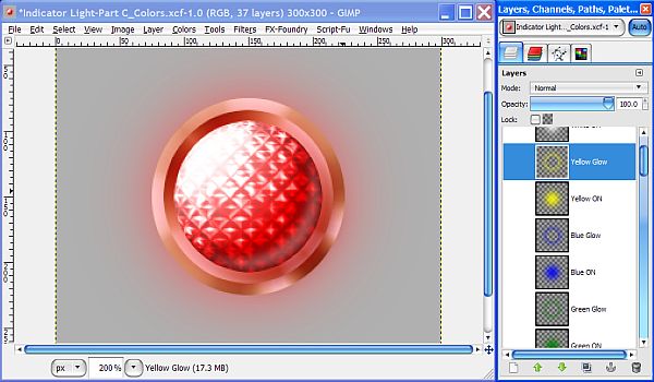
Next, duplicate the Red Glow layer and rename it to “Red Glow 2” and reduce the Opacity of the Red Glow 2 layer to 50%. Now repeat the same process with the other Glow layers until they are all duplicated, renamed respectively and layer Opacity reduced to 50%.
Step 13.
Select the White layer, duplicate it and rename it to “White 2”. Set the layer Mode to Overlay and move it all the way up underneath the Red ON layer in the layer stack and leave the visibility turned off.
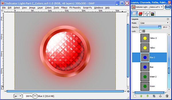
Now duplicate the Red, Green, and Blue layers, renaming them “2” respectively except leave them in position as they are duplicated. Change the Red 2, Green 2, and Blue 2 layer Modes to Overlay. All these duplicate layers should have the visibility turned off except the Red 2 layer which needs to be turned on.
Step 14.
We need to make a few more adjustments since our lights will now be illuminated and radiating light in all directions evenly.
First we turn off the Gradient layer, but there is still a slight overall gradient which is generated by the Sphere layer. For our ON layers to look right we need to create a different Sphere layer without this gradient effect.
Right click on the Sphere layer and select New Layer. When the New Layer dialog pops up, select Transparent as the Layer Fill type and name it “Sphere 2”.
Note: If you are using Gimp version 2.8.1 or above, simply open the Voronoi pattern image from the resources folder provided in Part A - Bezel, place it above the Sphere layer and skip to Step 15.
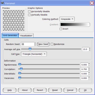
Go to Filters>Render>Pattern>Voronoi and use the exact same settings for both tabs just as we did in
Part B when we created the first Sphere layer and click OK to render the pattern. Here are the settings we used for the Grid Generator tab. (disregard the gradient)
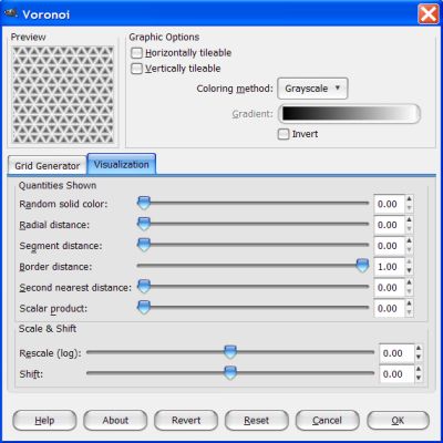
And here are the settings we used for the Visualization tab. (Disregard the gradient)
When you have finished entering the settings, click OK to render the pattern.
Step 15.
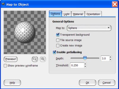
Go to Filters>Map>Map Object. On the Options tab select Transparent background and set the Map to window to Sphere again, but this time notice the direction of the light and the resulting gradient in the preview window.
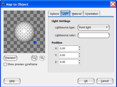
Now click on the Light Tab and where it says Position, change both the X and Y values to 0 and the Z value to 6. Click the Preview button to see the changes, then click OK.
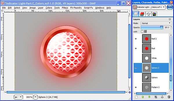
Your image and layers should now look like this.
Step 16.
Our Sphere 2 layer is a little too big so we need to scale it down to fit like we had to do when we created the first Sphere layer. Go to Layer>Scale Layer, set the scale mode to “percent” and set the amount to 78% for both values then click OK.
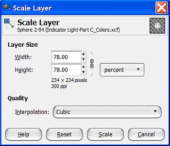
Once the filter completes the scaling process, right click and select Layer to Image Size.
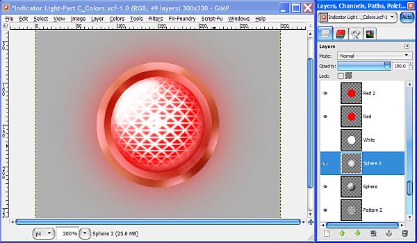
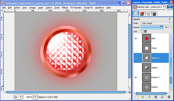
Now that looks better! Turn off the visibility of the Pattern layer, then turn off the visibility of the other Sphere layer and set the layer Mode for the Sphere 2 layer to Grain Merge and you will see that the light is now evenly distributed and our light is a little brighter overall, but we still have some “spots” to deal with.
Step 15.
Increase your view setting to about 300% for accuracy sake and right click on the Sphere 2 layer to create a new transparent layer above it called “Inner Glow”. Right click on the Lens layer and select Alpha to Selection. Now click on the Inner Glow layer again to make it active, then go to View>Show Guides to get our guides back.
Select the Blend tool and in the tool dialog set the gradient to FG to Transparent and make sure the box is checked to reverse the gradient. Set the Shape to Radial then reverse the FG/BG colors so that your FG is white. Drag from the center of the selection where the center guides intersect down and to the right at a 45 degree angle to the outside edge of the selection to apply the gradient.
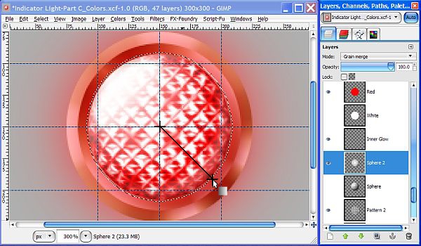
Change your view back to 200%, then set the layer Mode to Screen, and the Opacity to 35%. Turn off the selection, then turn off the guides, and your image and layers should now look like this.
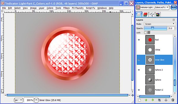
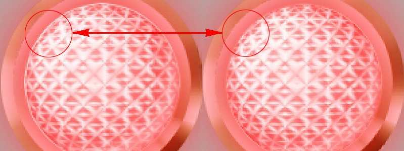
This brightens up the outside edges of the lens, as well as correcting the "spots", but as you can see, this unfortunately makes the overall effect way too bright and so we need to tone it down a bit so we can see the red color more.
Step 18.
Duplicate the Red 2 layer and rename it to "Red 3". Yep, that’s right, another layer. (48 so far) Set the layer Mode to Normal and reduce the Opacity to 20%. Now it’s not quite so bright.
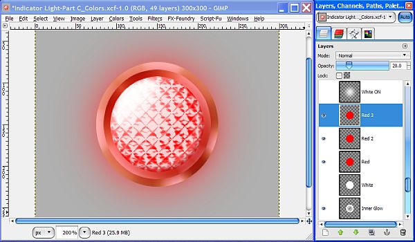
Let’s go ahead and make our final adjustments now. Move the Red 3 layer up in the layer stack above the White ON layer, then adjust the Lens layer Opacity to 50%. Turn on the visibility of the White ON, White Glow 2 layers.
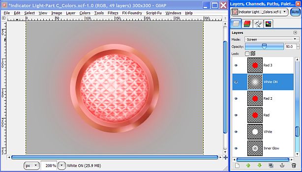
Turn on the visibility of the White layer and set the Opacity at 50%. Turn on the visibility of the White 2 layer and adjust the Opacity at 75%. Change the Gloss 2 layer Mode to Overlay, and adjust the Opacity to 35%. Finally, adjust the White ON layer Opacity to 50%.
Step 19.
We’re almost finished but there’s one last adjustment to make. Since our light is in the
“ON” condition, the inner portion of the bezel will be illuminated rather than having a gradient shadow like the lights in the Off condition. To correct this we will need to do two things. First, we need to turn off the visibility of the Drop Shadow layer. Second, we need to create one more layer.
Select the Ribbed layer and right click to choose Alpha to Selection. Create a new
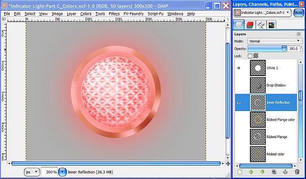
transparent layer below the Drop Shadow layer and name it “Inner Reflection”.
Set your FG/BG colors to the default black and white then select the Blend tool. In the Blend tool dialog, select FG to Transparent and make sure the Shape is set to Linear. Check the little arrows next to the FG/BG colors to reverse them so that White is the FG color and White portion is on the left side of the gradient.
Go to View>Show Guides and check the box to turn on the guides. Increase your view setting to about 300% and place two additional vertical guides at 100 and 200 pixels, then place two new horizontal guides at 100 and 200 pixels. Place your cursor at the top left edge of the selection and stroke down and to the right at about a 45 degree angle passing through the center where the guides intersect to apply the Gradient.
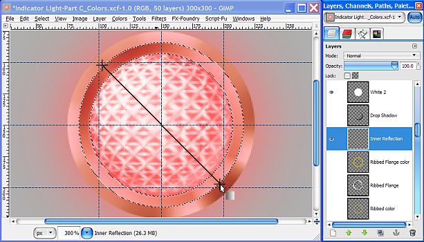
Once the gradient has been applied, turn off the selection (Select>None) and turn off the guides. Reduce your view setting back to 200% and you have successfully completed the “Red ON” indicator light!
You may end up with a little bit of white edge effect due to the difference between the selection boundries and the antialiasing of the gradient. If you do, then Right click on the Lens layer and select Alpha to Selection. Go to Select>Shrink and enter 1 pixel and click OK. Reselect the Inner Reflection layer and then hit your delete key to clean it up.
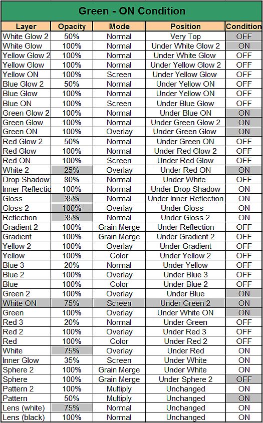
To complete your set of ON lights, you will need to adjust several factors for each of the other colors as I mentioned earlier, and since this can be very confusing to try to explain, I have created a chart that shows the layer Opacity, layer Mode, and Position in the layer stack of each layer for each of the ON Condition colors. Make these changes for each color to reflect the correct combination then save each one as you go.
Now you know why we kept all these layers! Once you have the Red light set up for the ON condition, make sure to keep the visibility is turned off for both background layers and save your image as a PNG with whatever options you want.
You may want to make several sets with different options. Again, pay very close attention to all the changes in the following charts for the remaining colors and note any new layers you may need to create.
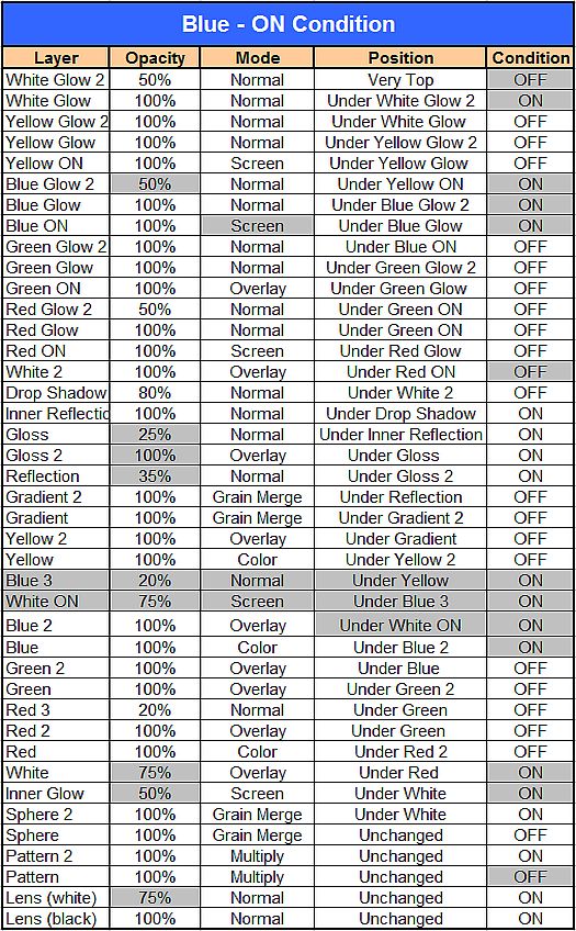
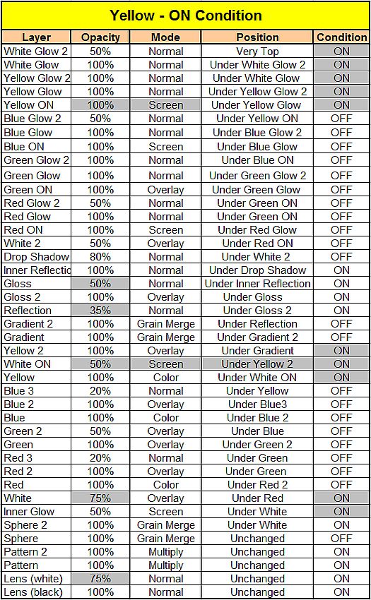
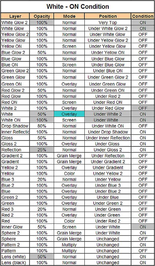
Here is the chart for all the settings we just used to make the Red ON condition light, and individual charts for each of the additional colored ON lights.
Again, pay very close attention to all the changes in the following charts for the remaining colors.
 Note:
Note: No “Green 3” layer is required for the Green colored indicator light.
 Note:
Note: You will need to create a “Blue 3” layer just like we did for the Red ON light.
 Note:
Note: No “Yellow 3” layer is required for the Yellow ON indicator light.
 Note:
Note: No White 3 layer is required for the White ON indicator light.
You should by now have created at least one complete set of Indicator lights in the ON and OFF condition.
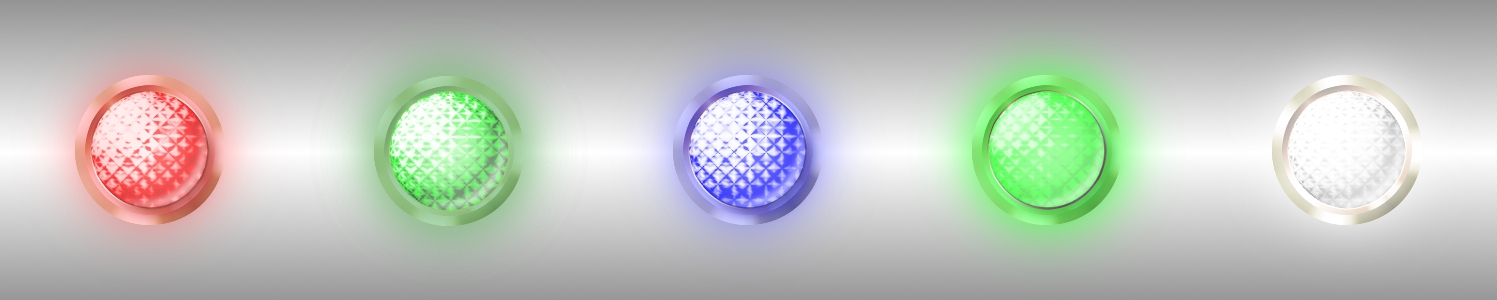
Here’s the completed ON set using the basic Brass Rim layer we started with.
If you have stayed with me this far, you are to be congratulated. You are definitely a certifiable, die hard Gimper! Either that or you are just plain stubborn enough to stay with it.

I hope you found this tutorial informative and provided you with some interesting techniques and resources to add to your Gimp arsenal.
In my next
Metal Wurx segment, I’ll show you how to make another kind of control panel component and I promise it will not be anywhere near as long as this one!