It is currently Tue Apr 23, 2024 3:19 pm


All times are UTC - 5 hours [ DST ]


Post new topic Reply to topic  [ 15 posts ] 
Author Message
 Post subject: Gimp Text Effects Tutorial as seen in PS Layerstyles
PostPosted: Thu Jan 17, 2013 9:48 pm  (#1) 
Offline
GimpChat Member
User avatar

Joined: Jul 17, 2012
Posts: 2770
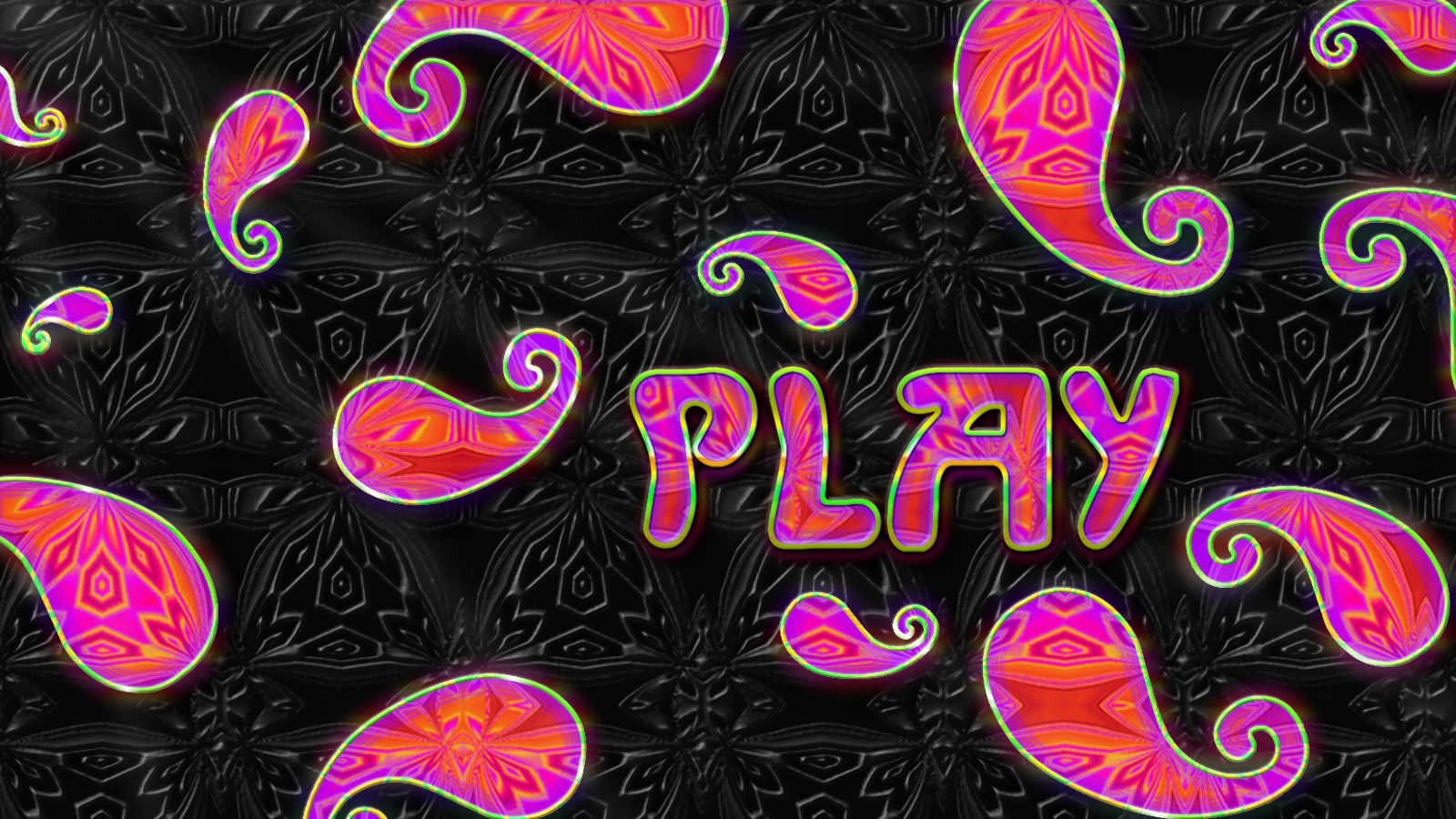
In this tutorial i will show you a series of text effect techniques, that are mostly similar to what you can do in PhotoShop with Layerstyles. We will do it all by hand, except for bevelling.
There is a script written by Jonathan Stipe, called "LayerFX"
This script does all the things i will show in this tutorial. Maybe in a different way, but the outcome will look similar.

The python version is better than the scm, because you have a preview option. Install it in your plug-ins folder and find it with a right click on your text or under Layers.

Before you start, download the "Esper Gimp Text Effects Tut Resources.zip" from the bottom of this post - open it with a program like Win.rar or 7zip, and put the gradient in your gradient folder and the pattern in your patterns folder.

BASE
Create a new white layer 800x350px.
Type your text, i used Sans Bold 167px, spacing -4, black.
(This step is optional) duplicate your text and put it underneath the white layer, this is our fallback text, in case we need the original.
Go to 'Layer' → 'Autocrop Layer',
use the 'Alignment Tool' to center your text and then right click 'Layer To Image Size'.
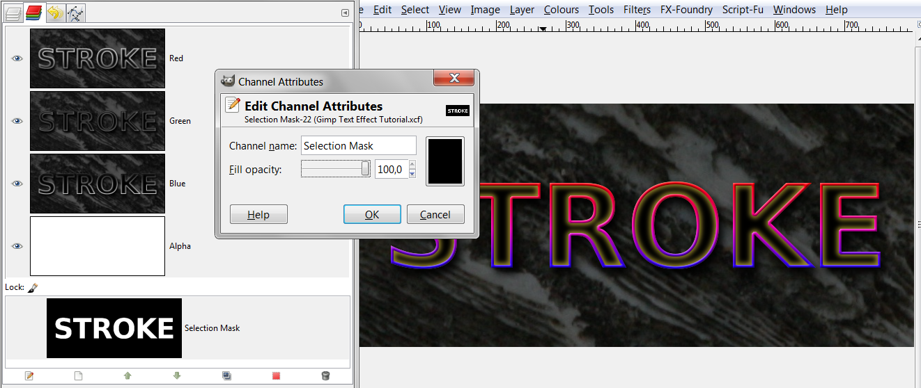
Alpha select your text and save the selection to a Channel (this step is important, as we will use the channel quite a bit – it might even come handy if you pull out the 'Channels Tab', so that it is always on your screen. That saves you clicking the tab each time you want to use the dialogue).
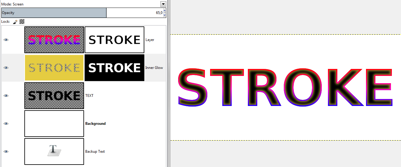
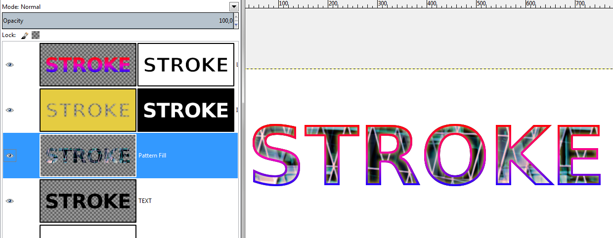
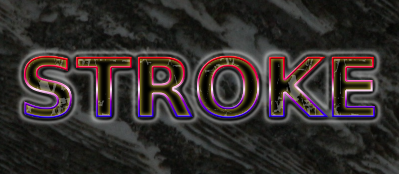
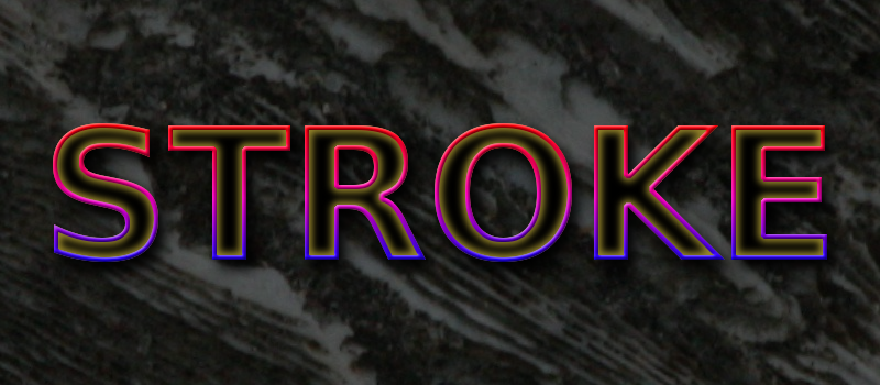
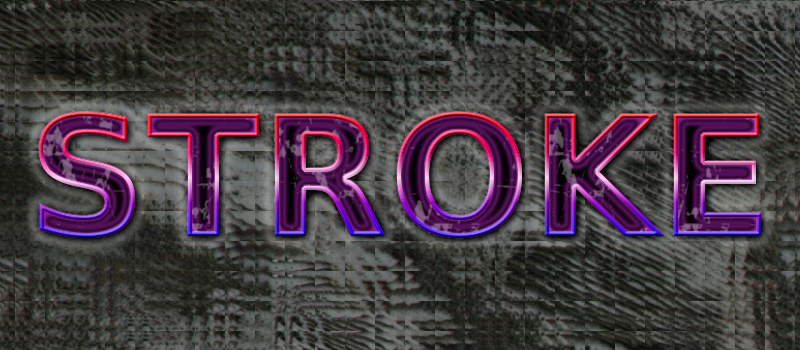
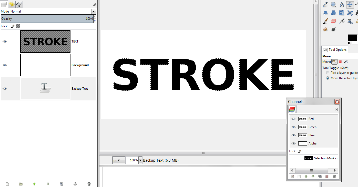
Image

STROKE
First we are going to make a Stroke. The usual technique would be, to save the selection to a path and then stroke the path, because that way, you dont get jagged edges.
Instead im using a different technique with a layermask, because i think that gives more control.
(more on this technique, here: viewtopic.php?f=23&t=6559)

Create a new transparent layer on top of the text.
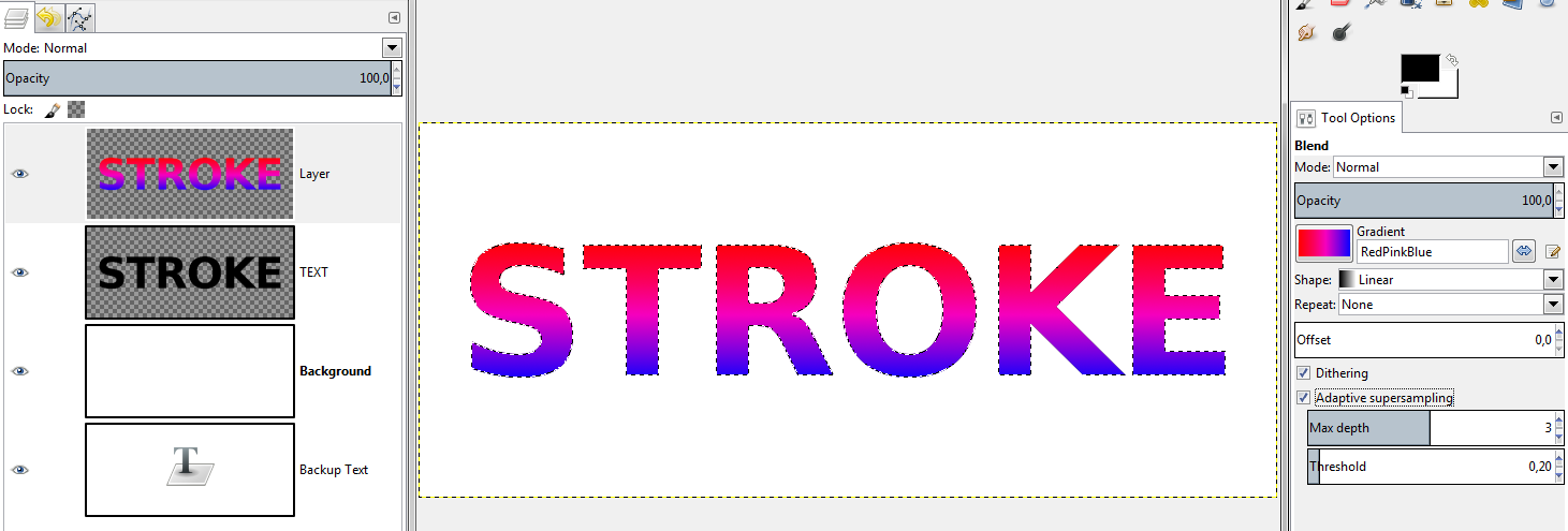
Activate the 'Gradient Tool' and choose the 'RedPinkBlue' gradient that is included in the resources pack attachment - make sure you check 'Adaptive Supersampling' for a nice gradient.
On your transparent layer, drag the gradient from the top of the selection to the bottom,
if you want to make sure the gradient is absolutely straight, hold down Strg when you drag the mouse.

Image

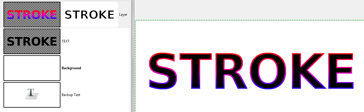
Go to 'Select' → 'Shrink' - i used a value of 4pixels.
Now, right click on your Gradient Text Layer, choose 'Add Layer Mask' and check 'Selection' and 'Invert Mask', then 'Select' → 'None'.

The big advantage of this method is, that its non destructive. If we later decide we want a different stroke, all we have to do is change the layermask.
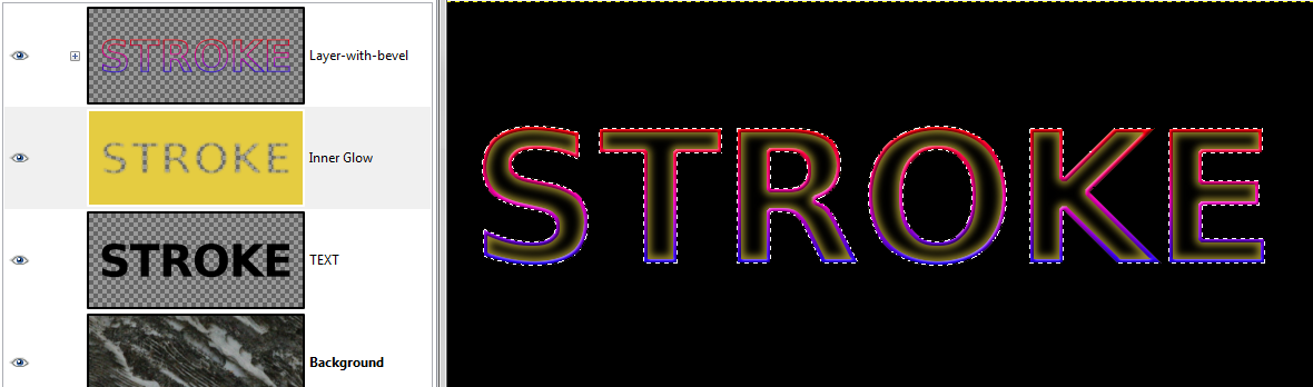
Image

INNER GLOW
Next i want to add an Inner Glow. (more on this topic,here: viewtopic.php?f=23&t=6391)
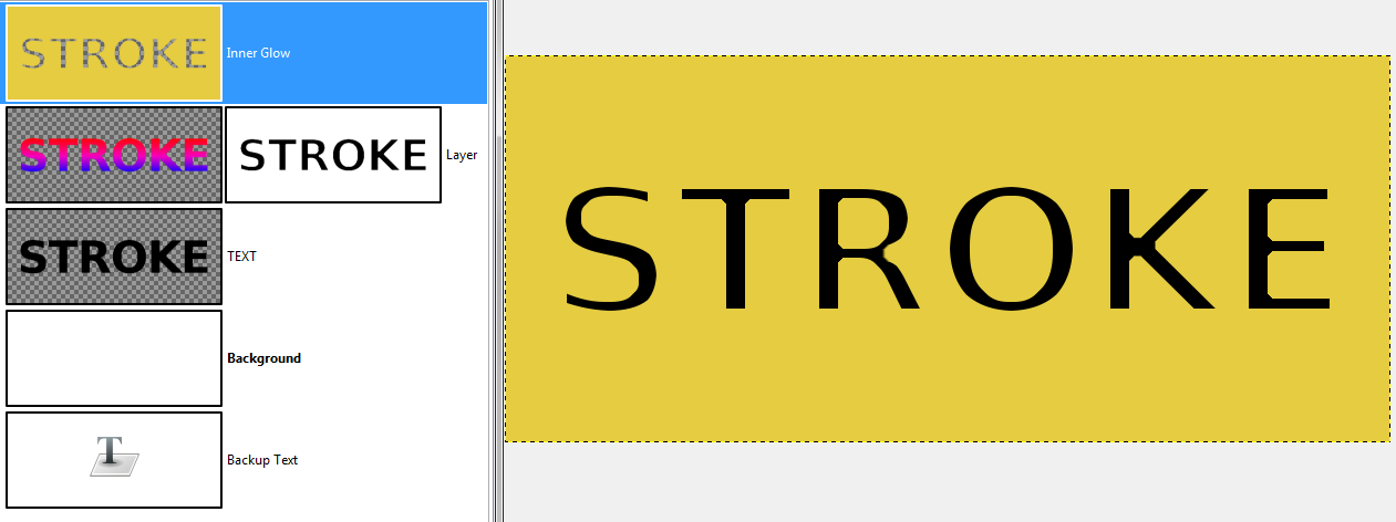
Go to your 'Channels' and 'Select from Channel'.
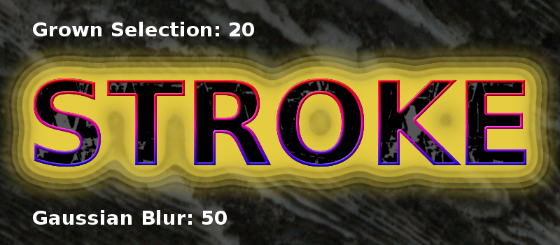
Depending on the effect you want to achieve, you can use the selection as it is, but because we have a stroke, i will shrink the selection by 7px.
Create a new transparent layer on top of the Gradient Layer and name it 'Inner Glow'.
Invert the selection and fill it with a color of your choice – i used e5cc41.
Select → None.

Image

Now we will 'Gaussian Blur' the layer. I used a value of 10.
Choose a value that looks good to you. We will be able to tweak the effect later.
Alpha Select from your Channel again – Invert and then add an inverted layermask from Selection.
'Select → None' and put the layer under the gradient stroke.
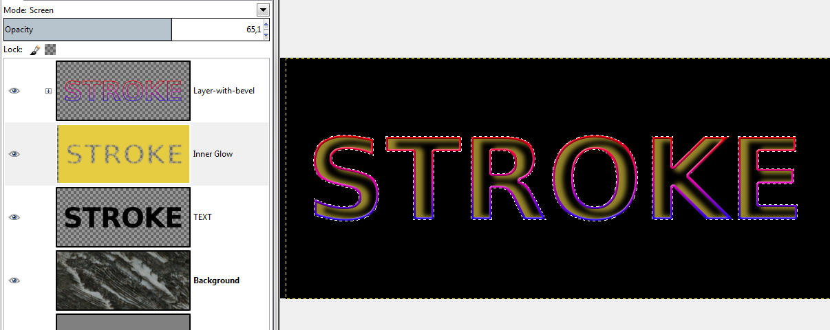
Change the Opacity, to what you think looks good (I used 65%) and i changed the mode to 'Screen'.

Image

CONTOURS
Now for the tweaking – its called 'Contours'.
(for more in-depth information, look here: viewtopic.php?f=10&t=6518)
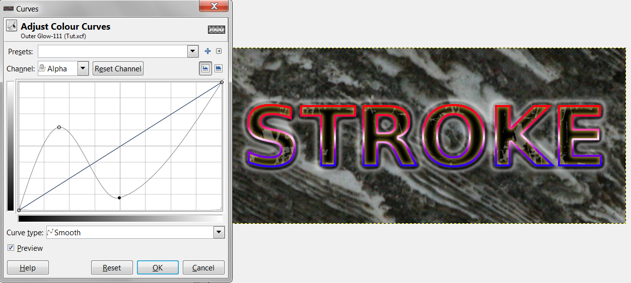
Make sure your 'Inner Glow Layer' is active, go to 'Colours' → 'Curves', change the 'Channel' to 'Alpha'. (This is most important !)

Image

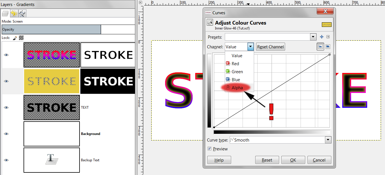
When you click the curve in the middle and drag it diagonally up or down, you will see, that the blurred 'Inner Glow' will become bigger or smaller.
Thats how you can tweak your Glow.
If you want to give your glow a shape, try to recreate the form of the curves as you can see in this chart:

Image

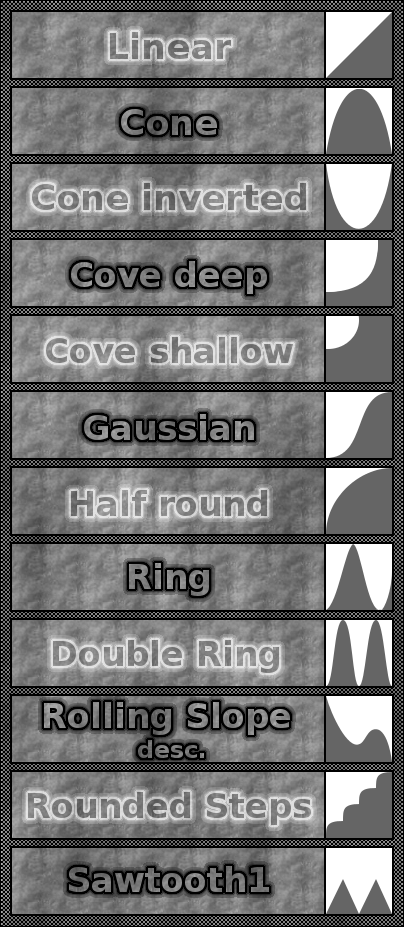
Some of the Contours will only look good on certain types of blurred layers. For instance 'Rounded Steps' is best visible when you have a really big area to work with.
Image

Experiment with the curves !

PATTERN FILL
Next we will do a Pattern Fill.
This is really simple. Alpha select your text from the 'Saved Channel'. Create a new transparent layer on top of your 'Text Layer'.
Select the pattern from the attached resource pack, its called 'Facets tribluegreen'
Image


and fill your selection with the 'Bucket Fill Tool'.

Image

Now we will tweak that a bit. I used 'Threshold' 131/189 and a 'Gaussian Blur' of 2.
I set the Opacity to 67% and the Mode to 'Grain Merge'
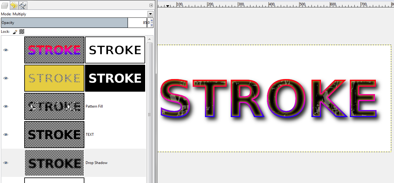
DROP SHADOW
Next is a 'Drop Shadow'. We already have a black text layer, so we just duplicate that, put it under the 'Text Layer', blur it, and then offset.
I used Gaussian Blur 20 and Layer → Transform → Offset: 7/9.
Instead of the Offset Dialogue you could of course use the 'Move Tool'.
Turn down the Opacity (i used 85%) and set the Mode to 'Multiply'.

Image

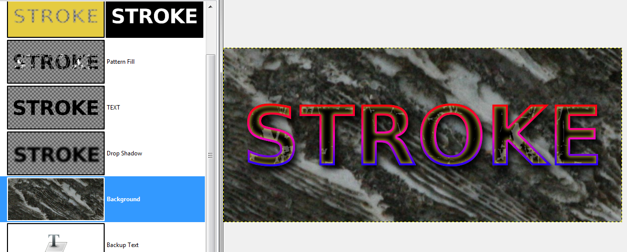
Lets make the piece look a bit nicer by adding a background other than the plain old white.
I used a texture from texturemate.com:
http://www.texturemate.com/image/view/2967/_original
Copied the picture, activated the white background layer and then paste. A floating layer appears on top of your layers. You can use the 'Move Tool' to drag it around and when you are happy, anchor it. Click 'Layer to Image Size', to finalize this layer.
If you like, tweak the background with Contrast, Brightness, Modes, Levels, Colourcurves, G'Mic Filters, etc.
Do what you like.
Right now my project looks like this:

Image

I think it would be cool to make the stroke a bit nicer, so we will apply a gradient.
Create a new transparent layer on top of your layers. Alpha Select the text from your Channel.
Set the foreground color to white and go to the 'Gradient Tool'.
Choose 'FG to Transparent' and set the Shape to 'Bi-Linear'. Adaptive Supersampling is optional.
Go to any of your letters, and drag the mouse from the middle a tiny bit up or down.
Then Select None.

Image

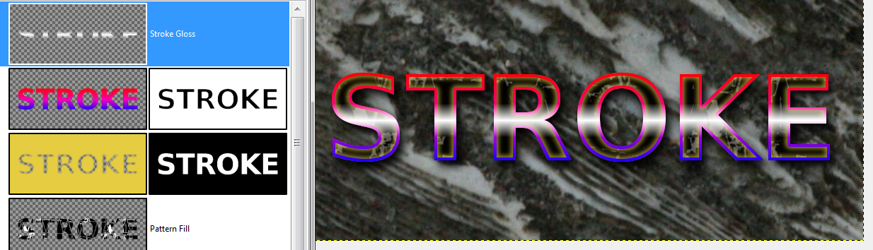
Click on the Layer Mask of your Gradient Overlay Layer, and choose 'Mask to Selection', then click on your 'Gloss Stroke Layer' and 'Add Layer Mask' → 'From Selection' (and uncheck 'Invert Mask'!)
Then deselect.
Play with Opacity and Mode. I used Opacity 90% and Mode 'Screen'.
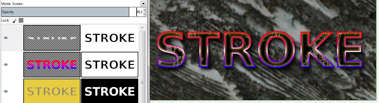
Image

OUTER GLOW
I think an added 'Outer Glow' would look good. Technically thats very similar to a 'Drop Shadow', but mostly with no offset.
Create a new transparent layer on top of your layers. Alpha select your text from the Channel.
'Grow' (i used a value of 2), then fill with color (i used white for simplicity, an alternative would be, to use the gradient again).
Deselect.
'Gaussian Blur' (i used 20).
Put the 'Outer Glow' under the 'Text Layer' and over the 'Drop Shadow'.
Play with Opacity and Mode. I used Opacity 60% and Mode 'Screen'.

Image

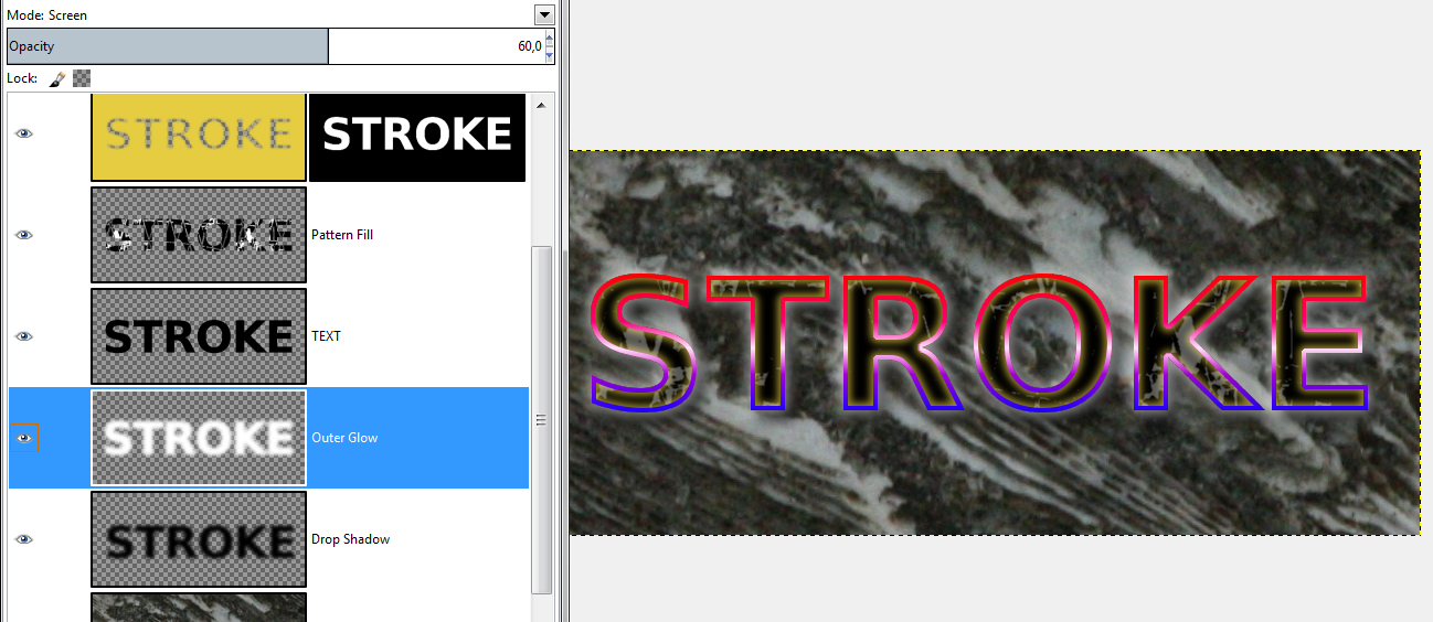
Again you could apply some 'Contours' to your 'Outer Glow' with the 'Curves Tool' set to Alpha.
For the sake of this tutorial i applied the following curves, to give the text a halo effect:

Image

Right now i have shown you most of the effects Photoshop Layerstyles has:
Stroke, Pattern Fill, Outer and Inner Glow, Drop Shadow.
There is also 'Color Overlay', which should be self explanatory and 'Inner Shadow', which is an Inner Glow, but mostly with dark colors and offset.
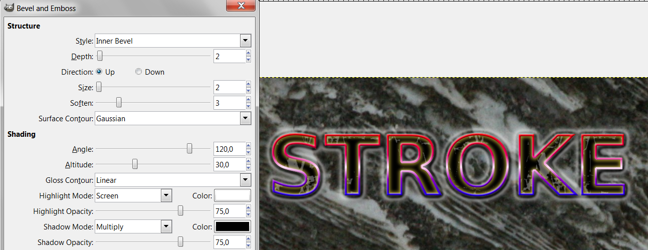
There is also 'Satin' which i will perhaps cover in another tutorial and 'Bevel and Emboss'.
After much research it seems to me, a good bevel is made with a BumpMap. And the latest python version of layerfx, does a pretty good job.

If you look close at our image, the stroke may look a bit jaggy. One way to fix that would be to apply the Layer Mask and then Gaussian Blur the stroke a tiny bit.
Instead i will create a small 'Inner Bevel' with layerfx.

Image

Finally i decided the background is a bit too strong, so i created a medium grey layer underneath it and set the Mode of the 'Background Texture Layer' to 'Multiply'.

Image

That concludes this tutorial.


Attachments:
Esper Gimp Text Effects Tut Resources.zip [553.67 KiB]
Downloaded 484 times


Last edited by Esper on Fri Mar 08, 2013 11:33 pm, edited 2 times in total.
Share on Facebook Share on Twitter Share on Orkut Share on Digg Share on MySpace Share on Delicious Share on Technorati
Top
 Post subject: Re: Gimp Text Effects Tutorial as seen in PS Layerstyles
PostPosted: Fri Jan 18, 2013 5:38 am  (#2) 
Offline
GimpChat Member
User avatar

Joined: Aug 30, 2012
Posts: 2174
Thanks for the tut Esper, easy to follow and some nice little tricks in there I never knew about before.

Image

_________________
Image


Top
 Post subject: Re: Gimp Text Effects Tutorial as seen in PS Layerstyles
PostPosted: Fri Jan 18, 2013 6:18 am  (#3) 
Offline
GimpChat Member
User avatar

Joined: Jul 17, 2012
Posts: 2770
Thank you he4rty ! Im very happy you liked it.


Here is another trick i wanted to show:
its the reason why im using the 'Channel'.

The base image with 'Stroke' and the 'Inner Glow'.
Image

Technically an 'Inner Shadow' is the same as an 'Inner Glow', but often the shadow is offsetted. Here the opacity of the 'Selection Mask' comes in handy.
When you right click on your channel, there is an option 'Edit Channel Attributes'.
Turn up the 'Fill Opacity' to 100%.

Image

Click on the eye of the Channel and then 'Select from Channel'.
You will get a black layer, only with your selected text visible.

Image

Now select the 'Inner Glow' layer, and use the 'Move Tool' (or Transform → Offset) to offset the layer.

Image

Instantly you get a 3D-ish effect.
When you are happy, turn off the Channel and add the layer mask as in the tutorial above.


Last edited by Esper on Fri Jan 18, 2013 5:57 pm, edited 1 time in total.

Top
 Post subject: Re: Gimp Text Effects Tutorial as seen in PS Layerstyles
PostPosted: Fri Jan 18, 2013 6:36 am  (#4) 
Offline
Global Moderator
User avatar

Joined: Apr 07, 2010
Posts: 14182
Very nice Esper, I made it into a PDF for myself and posted it below for anyone wanting it.


Attachments:
Esper GIMP Text Effects.pdf [1.61 MiB]
Downloaded 448 times

_________________
Image
Top
 Post subject: Re: Gimp Text Effects Tutorial as seen in PS Layerstyles
PostPosted: Fri Jan 18, 2013 7:37 am  (#5) 
Offline
GimpChat Member

Joined: Nov 28, 2012
Posts: 85
Location: France
Excellent Esper !
Thank you for this very detailed tutorial I suffer not have time to test right now all I see on GC, but I set aside the pdf of Molly (thank you) for later.


Top
 Post subject: Re: Gimp Text Effects Tutorial as seen in PS Layerstyles
PostPosted: Fri Jan 18, 2013 7:55 am  (#6) 
Offline
GimpChat Member
User avatar

Joined: Nov 15, 2012
Posts: 949
Location: Mesa, AZ
I like what you've shown here. Selecting from channel and applying layer masks as selections is not something I ever thought of. I'll definitely try to incorporate some of these techniques in the future though.

Image

_________________
Image

I now have a Tumblr, check it out!


Top
 Post subject: Re: Gimp Text Effects Tutorial as seen in PS Layerstyles
PostPosted: Fri Jan 18, 2013 5:30 pm  (#7) 
Offline
GimpChat Member
User avatar

Joined: Jul 17, 2012
Posts: 2770
he4rty, nice pattern fill and colors - the fill looks a bit like copper that has become green (dont know what its called in english)

thank you molly for the pdf, very much appreciated !

thanks steeno for the comment !

EK22, glad to hear you find my tutorial inspiring and nice result !
i like the filter you used on the background and the white bits from the pattern fill
great, you tried the contours on the inner glow - that technique seems the hardest to understand for some people


im beginning to wonder if it is perhaps a bit too much information in one tutorial

originally i wanted to split it into several tutorials. one for each effect, beginning with Stroke
but then i thought this would be a bit too simple


Top
 Post subject: Re: Gimp Text Effects Tutorial as seen in PS Layerstyles
PostPosted: Sat Jan 19, 2013 4:37 am  (#8) 
Offline
GimpChat Member
User avatar

Joined: Aug 16, 2012
Posts: 4271
Location: Göteborg, Sweden
esper: you did a very thorough job on that tutorial, it took some time to read it through without missing info but ince i had got it all it was worth it.
he4rty and ek22: nice looking results! i like the patterns you both used.

here's mine, i was happy with til i was just about to post, then i noticed something strange had happened to the "y" - my original text layer has it nicely rounded off but from the first gradient layer and upwards the y is sort of chipped. a mystery to me! i'm in a hurry right now, though, so i posted anyway - main point is how well the effects worked.
Image

_________________


Top
 Post subject: Re: Gimp Text Effects Tutorial as seen in PS Layerstyles
PostPosted: Sat Jan 19, 2013 4:46 am  (#9) 
Offline
GimpChat Member
User avatar

Joined: Jul 17, 2012
Posts: 2770
nice one AnMal, i like the contrast of the acid green with the pink ! :bigthup

its a bit "Rave"

i dont think the 'Y' looks bad

any tips how i could have improved the readability of the tutorial ?


i made a variation of my result - EK22 inspired me to try a few things
Attachment:
Gimp Text Effect Tutorial Variation.png
Gimp Text Effect Tutorial Variation.png [ 212.63 KiB | Viewed 9477 times ]


Top
 Post subject: Re: Gimp Text Effects Tutorial as seen in PS Layerstyles
PostPosted: Sat Jan 19, 2013 3:24 pm  (#10) 
Offline
GimpChat Member
User avatar

Joined: Aug 16, 2012
Posts: 4271
Location: Göteborg, Sweden
esper: i don't know if there's anything really wrong with the readability, i suppose any tutorial with lots of explanation would take time to get through and if you're not concentrated enough you'll miss things.
that "y" has serious problems, i want to fix it but the xcf is on a usb-stick that i can't find - i'm on a bus going north at the moment and i probably missed packing that one. in the meantime i played a bit with my patterns and gradients and the effects from the tutorial and came up with this:
Image

_________________


Top
 Post subject: Re: Gimp Text Effects Tutorial as seen in PS Layerstyles
PostPosted: Sat Jan 19, 2013 5:59 pm  (#11) 
Offline
GimpChat Member
User avatar

Joined: Jul 17, 2012
Posts: 2770
thats an extremely nice wallpaper, AnMal !

the contrast between the black relief and the glowing colorful text looks great !
how do you get the effect, that the pattern is so nicely distorted as if mapped to an object ?


Top
 Post subject: Re: Gimp Text Effects Tutorial as seen in PS Layerstyles
PostPosted: Sat Jan 19, 2013 6:21 pm  (#12) 
Offline
GimpChat Member
User avatar

Joined: Aug 16, 2012
Posts: 4271
Location: Göteborg, Sweden
esper: thank you! but what do you mean by "nicely distorted"? it's just an ordinary pattern fill, basically.

_________________


Top
 Post subject: Re: Gimp Text Effects Tutorial as seen in PS Layerstyles
PostPosted: Sat Jan 19, 2013 6:28 pm  (#13) 
Offline
GimpChat Member
User avatar

Joined: Jul 17, 2012
Posts: 2770
AnMal wrote:
esper: thank you! but what do you mean by "nicely distorted"? it's just an ordinary pattern fill, basically.
really ? oh....
it looks like its stretched and warped, like a paisley flying through a wormhole :mrgreen:
did you make the pattern yourself ?


Top
 Post subject: Re: Gimp Text Effects Tutorial as seen in PS Layerstyles
PostPosted: Sat Jan 19, 2013 6:47 pm  (#14) 
Offline
GimpChat Member
User avatar

Joined: Aug 16, 2012
Posts: 4271
Location: Göteborg, Sweden
esper: nothing stretched and warped here but my mind :hehe . but i think i know what you mean now - it's the subtle light rays, they give a sort of direction. the pattern is made following one of he4rty's tutorials: tileable abstract patterns, for the background i desaturated, blurred and bump mapped it.

_________________


Top
 Post subject: Re: Gimp Text Effects Tutorial as seen in PS Layerstyles
PostPosted: Wed Jan 23, 2013 1:34 am  (#15) 
Offline
GimpChat Member
User avatar

Joined: Jul 17, 2012
Posts: 2770
to show you some more examples, here is something i recreated from a photoshop tutorial about gradient overlay:
http://psd.tutsplus.com/articles/tools/gradient-overlay-layer-styles/
the sample is at the bottom of the page

the recreation may look a tiny bit jagged, and thats because i chose the font (AddCityboy from dafont.com) quickly and then had to scale the path, which is in this case not optimal for the best look when it comes to smoothness

if you want to study the demo, download the xcf-file and gradient in the attachment

Attachment:
LayerstyleDemo GradientText_.png
LayerstyleDemo GradientText_.png [ 120.86 KiB | Viewed 1432 times ]

Attachment:
Screenshot.png
Screenshot.png [ 131.99 KiB | Viewed 1432 times ]


Attachments:
Layerstyle Demo Gradient Text.zip [111.61 KiB]
Downloaded 118 times
Top
Post new topic Reply to topic  [ 15 posts ] 

All times are UTC - 5 hours [ DST ]


   Similar Topics   Replies 
No new posts Attachment(s) Create A Leather Text (Two effects: Emboss and Deboss)

4

No new posts Attachment(s) GEGL Layer Effects and Text Styling filter

187

No new posts Attachment(s) GEGL Text Styling effects on individual Gimp layers

11

No new posts Attachment(s) Quick and Easy Text Tutorial

5

No new posts Attachment(s) GEGL "Glass over Text' is STAND ALONE BUT NOW PART OF GEGL EFFECTS

5


* Login  


Powered by phpBB3 © phpBB Group