It is currently Wed Apr 24, 2024 6:17 pm


All times are UTC - 5 hours [ DST ]


Post new topic Reply to topic  [ 28 posts ]  Go to page 1, 2  Next
Author Message
 Post subject: Re: Gimp-Science-Labs
PostPosted: Wed Mar 27, 2013 2:46 pm  (#1) 
Offline
Retired Staff
User avatar

Joined: May 22, 2008
Posts: 6947
Location: Somewhere in GIMP
Great resource, Esper. Keep up the good work.

_________________
Image
World War IV will be fought with sticks and stones. - Albert Einstein


Share on Facebook Share on Twitter Share on Orkut Share on Digg Share on MySpace Share on Delicious Share on Technorati
Top
 Post subject: Re: Gimp-Science-Labs
PostPosted: Thu Mar 28, 2013 11:08 am  (#2) 
Offline
GimpChat Member
User avatar

Joined: Sep 22, 2012
Posts: 2089
Location: US
Esper, I have a grievance to air. I was trying many times to leave a comment on your blog site and failed, it can't verify my G+ account


Top
 Post subject: Re: Gimp-Science-Labs
PostPosted: Fri Apr 12, 2013 5:54 pm  (#3) 
Offline
GimpChat Member
User avatar

Joined: Apr 08, 2010
Posts: 5420
Location: Northwest Ohio
Yay, I finally got the time to do the ombre tutorial on Esper's site! Of course it's not as nice as the originals, but I still got through it. I need to do about 10 run-throughs to get comfortable with this, but I learned how to be comfortable with saving to channel and to paths and call them back to reuse.
*edited because I forgot to add my text, lol.
Image

Image


Top
 Post subject: Re: Gimp-Science-Labs
PostPosted: Fri Apr 12, 2013 6:00 pm  (#4) 
Offline
GimpChat Member
User avatar

Joined: Jul 17, 2012
Posts: 2770
what do you mean its not as good ???

its AWESOME !! :jumpclap


Top
 Post subject: Re: Gimp-Science-Labs
PostPosted: Sat Apr 13, 2013 4:39 am  (#5) 
Offline
GimpChat Member
User avatar

Joined: Aug 16, 2012
Posts: 4271
Location: Göteborg, Sweden
2-ton: :wow a really great result, well done, sister! now try the other gsl tuts, they're all fun :).

_________________


Top
 Post subject: Re: Gimp-Science-Labs
PostPosted: Sat Apr 13, 2013 1:54 pm  (#6) 
Offline
GimpChat Member

Joined: Mar 04, 2013
Posts: 105
2-ton: I think your Ombre text is very good. :clap

I was not going to take up any more Gimp Chat bandwidth with my attempt at the 'Shine' tutorial, but I decided to post this result and say thanks to Esper for his patience. :tyspin

Image


Top
 Post subject: Re: Gimp-Science-Labs
PostPosted: Sat Apr 13, 2013 4:32 pm  (#7) 
Offline
GimpChat Member
User avatar

Joined: Apr 08, 2010
Posts: 5420
Location: Northwest Ohio
I love all the different shiny text tutorials, lol.


Top
 Post subject: Re: Gimp-Science-Labs
PostPosted: Sat Apr 13, 2013 8:51 pm  (#8) 
Offline
GimpChat Member
User avatar

Joined: Apr 08, 2010
Posts: 5420
Location: Northwest Ohio
I had to make another from the Ombre tutorial. I get most of it ok, but I cannot remember how to make something look like metal. I wanted the outer border to look like metallic gold or copper. I tried using curves but it was a big fail. I had to resort to using the gold gradient in gimp.
Image


Top
 Post subject: Re: Gimp-Science-Labs
PostPosted: Sat Apr 13, 2013 9:18 pm  (#9) 
Offline
GimpChat Member
User avatar

Joined: Apr 08, 2010
Posts: 5420
Location: Northwest Ohio
I need to find a brush that is just four spikes for shine twinkles. Someone posted them once, but I didn't grab them and now can't find them, lol. As for the Ombre tutorial, I think color choices make quite a difference in how it looks. The colors in the tutorial make the best looking results.


Top
 Post subject: Re: Gimp-Science-Labs
PostPosted: Sun Apr 14, 2013 12:26 am  (#10) 
Offline
GimpChat Member

Joined: Mar 04, 2013
Posts: 105
2-ton's excellent results got me interested in playing around with Ombre again, and I came up with this. It's the Ombre effect after an attack by the concentric circles script. :)

Image


Top
 Post subject: Re: Gimp-Science-Labs
PostPosted: Sun Apr 14, 2013 2:22 am  (#11) 
Offline
Script Coder
User avatar

Joined: Feb 18, 2011
Posts: 4827
Location: Bendigo Vic. Australia
Jas45 that's an excellent image

2-ton your sparkle brushes are below

Image

Attachment:
Sparkle_brushes.zip [1.02 MiB]
Downloaded 120 times

_________________
Image
No matter how much you push the envelope, it'll still be stationery.


Top
 Post subject: Re: Gimp-Science-Labs
PostPosted: Sun Apr 14, 2013 2:40 am  (#12) 
Offline
GimpChat Member
User avatar

Joined: Jul 17, 2012
Posts: 2770
Jas45 wrote:
I'm holding my breath until Esper sees it, for fear that I still have something out of place. :)

i think it looks just great, perfect in terms of replicating my version !

maybe you could work some more on the inner shadow, but that is a matter of taste

2-ton wrote:
I get most of it ok, but I cannot remember how to make something look like metal. I wanted the outer border to look like metallic gold or copper. I tried using curves but it was a big fail. I had to resort to using the gold gradient in gimp.

Image
i think it looks really great, 2-ton, you executed the basic effect in a spectactular way and the sparkly bit in the middle looks much better as in your black/red version !

i dont think there is something like a formula for making "it metal"
not even in PS and i think the stroke is something that could be improved in all my designs as well but i dont have the nerve for working on it right now
bevelling is always a good idea or doing it completely different by applying an outer bevel to the ombre bit !

chrome curves didnt work for me either so far

what i think could improve your piece is really working more with inner shadow/glows
that is a bit hard to explain, because its like painting
you have to find the right combination of color, mode, opacity, blur and offset but you can always experiment

i usually try to go for colours that are a shade of the base colour (not black or white), blur by 10 for starters and then just try -
i have a very basic understanding of what modes will do, but i can not explain that - you just have to read the descriptions so you understand the math behind it and do a few experiments
then you can always change things with alpha-curves and colour-modification until you are happy
subtle stuff can make big differences and dont be afraid to layer more glows/shadow - they do that in PS all the time

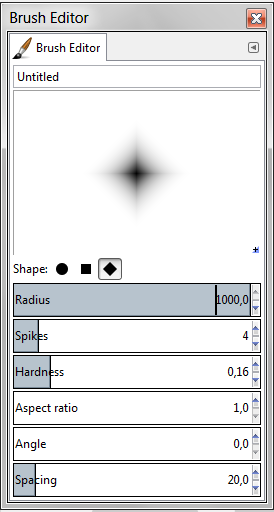
for the sparkles you can just use a simple fuzzy brush or make one in the brush editor, but i wouldnt overdo that effect, because after a while you want to add sparkle to everything you do and it gets old
Image


Last edited by Esper on Sun Apr 14, 2013 2:58 am, edited 1 time in total.

Top
 Post subject: Re: Gimp-Science-Labs
PostPosted: Sun Apr 14, 2013 2:53 am  (#13) 
Offline
GimpChat Member
User avatar

Joined: Jul 17, 2012
Posts: 2770
Jas45 wrote:
2-ton's excellent results got me interested in playing around with Ombre again, and I came up with this. It's the Ombre effect after an attack by the concentric circles script. :)

Image
now Jas, that kind of stuff is the real reason why im doing my blog

you made great use of the basic effect and took it to the next level

how awesome is that ?!!!!!!!!!!

the greens are great, the cubism effect looks beautiful, the highlights are very effective, yet subtle and the concentric circles are a great idea of how to solve the stroke problem

only thing that could be improved is the pink-ish stroke as i think it look a bit lost in its simplicity
maybe change the colour with a subtle gradient or a hint of texture ?

also remember, you can always use more than two colours for the ombre-effect
maybe black-green-black would be a good idea ?
although right now i think that using pure black should mostly be avoided
instead i would go for dark, almost black colours


EDIT: there is something wrong with the dropshadow, i think you used the wrong selection for filling with black, as its way too small ;)


Top
 Post subject: Re: Gimp-Science-Labs
PostPosted: Sun Apr 14, 2013 8:33 am  (#14) 
Offline
GimpChat Member
User avatar

Joined: Apr 08, 2010
Posts: 5420
Location: Northwest Ohio
Jas, that is beautiful!
Thanks so much for the brushes, G!
And yes, I used the sparkle to add a bit of cheesy effect to this one! I do need to learn more about inner and outer glows, bevels, shadows, and highlights. I love to make things have depth, and those effects are the way to do that.


Top
 Post subject: Re: Gimp-Science-Labs
PostPosted: Sun Apr 14, 2013 10:38 am  (#15) 
Offline
GimpChat Member

Joined: Mar 04, 2013
Posts: 105
Thanks to everyone for the comments.

@Esper Thanks for the suggestions. Actually, I intentionally shrunk the drop shadow. I thought it looked good that way when I was working on it last night, but looking at it again today I can see that normal size would be better. Also, I see what you mean with the stroke.

:tyspin


Top
 Post subject: Re: Gimp-Science-Labs
PostPosted: Sun Apr 14, 2013 11:46 am  (#16) 
Offline
Global Moderator
User avatar

Joined: Nov 16, 2011
Posts: 5128
Location: Metro Vancouver, BC
Depending on background lighting, sometimes setting the text Drop shadow Offset X and Y values to 0 and unchecking the Allow resizing checkbox is a good choice.

_________________
Image
Gimp 2.8.18, Linux, median user
Gimp Chat Tutorials Index
Spirit Bear (Kermode)


Top
 Post subject: Re: Gimp-Science-Labs
PostPosted: Sun Apr 14, 2013 12:10 pm  (#17) 
Offline
GimpChat Member
User avatar

Joined: Apr 08, 2010
Posts: 5420
Location: Northwest Ohio
haha, need to get off to work, but wanted to try out something metallic first. So this is not the ombre tutorial, but I did use some of the inner and outer glow methods to try and make the text look better. I used the inner glow process on the outside of the letters to make them stand out better, and of course, the outer glow to make it, well, glow a bit. Also used the save to channel for keeping the base selection, and using levels and curves on the alpha channel. So I now can pretty much use those processes on my own, without following a tutorial word for word. Yay me, lol. This is an odd combination of chrome look and non-chrome look metal. Next I am going to try and do the ombre tutorial and make the outer stroke look like chrome metal.

Image


Top
 Post subject: Re: Gimp-Science-Labs
PostPosted: Sun Apr 14, 2013 12:41 pm  (#18) 
Offline
GimpChat Member
User avatar

Joined: Jul 17, 2012
Posts: 2770
2-ton wrote:
So I now can pretty much use those processes on my own, without following a tutorial word for word
awesome, 2-ton, i can see more great things coming from now on
exactly what i had hoped for

you and Jas45 just made every second i put into my blog worthwhile !

and i love your silver text, especially the whole mood with the glow and the vignette !


Top
 Post subject: Re: Gimp-Science-Labs
PostPosted: Sun Apr 14, 2013 2:21 pm  (#19) 
Offline
GimpChat Member

Joined: Mar 04, 2013
Posts: 105
2-ton: Your silver text is outstanding. I like the way you used alpha-curves (I presume) to give the texture to the inside of the letters, and the whole effect looks great.


Top
 Post subject: Re: Gimp-Science-Labs
PostPosted: Sun Apr 14, 2013 7:41 pm  (#20) 
Offline
GimpChat Member
User avatar

Joined: Apr 08, 2010
Posts: 5420
Location: Northwest Ohio
you presume correctly, Jas. I called up my saved channel selection, shrank it down, and added a very light grayish white, then duped it, then blurred the lower layer a bit and bump mapped the upper layer with the blurred layer, then used curves on the alpha channel of that upper layer to give it that metallic sheen look. Before I did than, it was ok, but a bit flat looking.


Top
Post new topic Reply to topic  [ 28 posts ]  Go to page 1, 2  Next

All times are UTC - 5 hours [ DST ]


cron

* Login  


Powered by phpBB3 © phpBB Group