It is currently Thu Apr 25, 2024 5:47 am


All times are UTC - 5 hours [ DST ]


Post new topic Reply to topic  [ 47 posts ]  Go to page 1, 2, 3  Next
Author Message
 Post subject: New GIMP logo
PostPosted: Sat Apr 26, 2014 8:51 pm  (#1) 
Offline
GimpChat Member

Joined: Apr 26, 2014
Posts: 5
Hi. I've been working with GIMP for a few months already and I think it is a very powerful tool. You could say I kinda fell in love with open source graphic design software not only because is good, responsive, and complete, but also for the philosophy behind it.

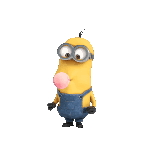
Though I love GIMP, I think it has some flaws, as every software does, and one of those is its brand. Don't get me wrong, I love Wilber, but I think despite it being iconic at some level, it is also a little "weird". The current logo somehow "stoles" the professionalism intended for the software and it is not something only I am saying, on the internet you can find several users that think GIMP needs a new logo. There was a moment in the process were I thought it would have been good to create a new logo from scratch but then I realized I couldn't remove Wilber completely from the concept. That's why I tried to get to redesign the GIMP logo, based on two major facts:

1. GIMP needs a new image.
2. Wilber is a well known icon in the open source community and in the graphic design world.

So I decided that despite being a new logo, it wouldn't be a reinvention but a refreshing redesign.

I would love that my proposal gets to be the starting point for other designers to come up with new ideas for the GIMP brand, so we can share ideas and concepts, and of course get feedback from each other, and who knows, maybe the GIMP team accepts one of those proposals and we get a new branding for the next GIMP release. That would be awesome.

So here they are:

Image

So, basically what I did was to re imagine Wilber with a more modern look. Also I tried to remove the pencil, since GIMP is a more versatile program and is not only used on digital painting, but also used in photography and retouching. Despite this, I didn't remove the "painting" element completely, I placed it on its "cheek" as a more subtle way to imply that a painting process can be made with the software.

These are simplified versions, with no gradients and thick outlines.

Image

I made these based on other mascot designs out there, like the ones on the NBA or the NHL. Thicker outlines and flat colors give to it more ways to be easily reproduced, like several media formats and merchandising.

Sketches were made in GIMP and then I finalized the work on Inkscape. I know it is not perfect, but that's why I'm here, so I can get feedback from you guys and also know if you have other ideas, sketches or even final logos that you wanna share. :mrgreen: :bigthup


Share on Facebook Share on Twitter Share on Orkut Share on Digg Share on MySpace Share on Delicious Share on Technorati
Top
 Post subject: Re: New GIMP logo
PostPosted: Sat Apr 26, 2014 10:10 pm  (#2) 
Offline
Global Moderator
User avatar

Joined: Nov 16, 2011
Posts: 5128
Location: Metro Vancouver, BC
Nice artwork but I prefer the original playful coyote look.

_________________
Image
Gimp 2.8.18, Linux, median user
Gimp Chat Tutorials Index
Spirit Bear (Kermode)


Top
 Post subject: Re: New GIMP logo
PostPosted: Sat Apr 26, 2014 10:13 pm  (#3) 
Offline
GimpChat Member
User avatar

Joined: Dec 10, 2013
Posts: 1004
That first one is really cute. Nice work there.

_________________
Image
Macbook Air - MacOS Sierra 10.12
McGimp 2.8.14
G'mic 1.6.5


Top
 Post subject: Re: New GIMP logo
PostPosted: Sun Apr 27, 2014 12:49 am  (#4) 
Offline
GimpChat Member
User avatar

Joined: Jun 02, 2013
Posts: 2075
Odinbc wrote:
Nice artwork but I prefer the original playful coyote look.

This. ;)

_________________
Image


Top
 Post subject: Re: New GIMP logo
PostPosted: Sun Apr 27, 2014 1:17 am  (#5) 
Offline
GimpChat Member

Joined: May 23, 2012
Posts: 150
i agree with odin, the art is nice but,
doing this kind of thing changing a logo
or company name makes it confusing for a
lot of people, and this doesn't show anything
about photo editing, or how versatile GIMP, is as
the best add on, plugin, script, imaging, graphic tool
in the world. Check the results of this with other
companies, including the stock market.


Top
 Post subject: Re: New GIMP logo
PostPosted: Sun Apr 27, 2014 5:56 am  (#6) 
Offline
Script Coder
User avatar

Joined: Oct 25, 2010
Posts: 4739
Mikechat wrote:
i agree with odin, the art is nice but,
doing this kind of thing changing a logo
or company name makes it confusing for a
lot of people, and this doesn't show anything
about photo editing, or how versatile GIMP, is as
the best add on, plugin, script, imaging, graphic tool
in the world. Check the results of this with other
companies, including the stock market.


A logo is just a logo and isn't really supposed to show what the product is doing, otherwise Tux would be a very busy penguin. The logos of the software I use daily (and professionally for most) include, besides said penguin, a gnu, a feather, a toad, an acorn, some kind of planet, some kind of spiral inside a circle, a hat, a gear, a fox, a howling wolf, a blueish bubble, a yellowish bubble, an atom, a globe, a traffic cone, and two different ways to show three people in a circle (*).

Any attempt at modernizing Wilber is welcome IMHO. You can check the logos of the stock market companies, they are not cast in stone either and evolve with time.

(*) you can play "identify that software", knowing that the planet isn't the GoogleEarth logo.

_________________
Image


Top
 Post subject: Re: New GIMP logo
PostPosted: Sun Apr 27, 2014 7:43 am  (#7) 
Offline
GimpChat Member

Joined: Apr 26, 2014
Posts: 5
Odinbc wrote:
Nice artwork but I prefer the original playful coyote look.


I did some research and Wilber is not a Coyote, is just a "GIMP" as its creator named it.

Mikechat wrote:
i agree with odin, the art is nice but,
doing this kind of thing changing a logo
or company name makes it confusing for a
lot of people, and this doesn't show anything
about photo editing, or how versatile GIMP, is as
the best add on, plugin, script, imaging, graphic tool
in the world. Check the results of this with other
companies, including the stock market.


That's right, the logo doesn't show that, but it doesn't have to. A logo doesn't need to show what a product or company does, tell Adobe for example, and all its sub-brands. The fact is GIMP has a mascot, a very iconic one, that's precisely I didn't wanted to create a complete new logo from scratch. We all love Wilber, but then again, it's a very old design, the perspective is weird and also the composition and the elements that complete the drawing.

I would love to see your ideas, read more of them, or see sketches that you do or get some advice of how can I improve what I've done here.

Thank you very much!


Top
 Post subject: Re: New GIMP logo
PostPosted: Sun Apr 27, 2014 10:16 am  (#8) 
Offline
GimpChat Member
User avatar

Joined: Dec 11, 2011
Posts: 532
kevzapatab wrote:
Odinbc wrote:
Nice artwork but I prefer the original playful coyote look.


I did some research and Wilber is not a Coyote, is just a "GIMP" as its creator named it.

Mikechat wrote:
i agree with odin, the art is nice but,
doing this kind of thing changing a logo
or company name makes it confusing for a
lot of people, and this doesn't show anything
about photo editing, or how versatile GIMP, is as
the best add on, plugin, script, imaging, graphic tool
in the world. Check the results of this with other
companies, including the stock market.


That's right, the logo doesn't show that, but it doesn't have to. A logo doesn't need to show what a product or company does, tell Adobe for example, and all its sub-brands. The fact is GIMP has a mascot, a very iconic one, that's precisely I didn't wanted to create a complete new logo from scratch. We all love Wilber, but then again, it's a very old design, the perspective is weird and also the composition and the elements that complete the drawing.

I would love to see your ideas, read more of them, or see sketches that you do or get some advice of how can I improve what I've done here.

Thank you very much!


How is the perspective weird? And why is old a reason for a change?

_________________
Image


Top
 Post subject: Re: New GIMP logo
PostPosted: Sun Apr 27, 2014 10:58 am  (#9) 
Offline
GimpChat Member

Joined: Apr 26, 2014
Posts: 5
Quote:
How is the perspective weird? And why is old a reason for a change?


The eyes and the nose do not look correct. The nose bridge will hide a little part of the far end eye, now it looks that the nose is "pasted" to its cheek. Also the eyes are completely rounded, the only hint of perspective is that one eye is a little smaller than the other and the mouth has the pencil put on it, it doesn't look like it's being hold between its lips.

Now, I'm not saying that being old good is a reason for a change, but IMHO this it not old good. Again, I'm not saying that my proposal is perfect in comparison or something, I'd like to see your ideas or sketches. Then again, I'm not trying to offend Wilber or GIMP, but just ask to a professional graphic designer if he would change Ps for Gimp seeing that brand. We graphic designers are driven by corporate branding because we understand what it means, what its goal is, we work creating brands to enclose and express what a product or a company means and offers.

Gimp is a really powerful tool, I love it and use it, but the image it offers to the market is not a very professional one. Despite this, Wilber has become an icon at some point, that's why I think it shouldn't be removed but refreshed in a more professional way.


Top
 Post subject: Re: New GIMP logo
PostPosted: Sun Apr 27, 2014 11:59 am  (#10) 
Offline
GimpChat Member
User avatar

Joined: Dec 11, 2011
Posts: 532
kevzapatab wrote:
Quote:
How is the perspective weird? And why is old a reason for a change?


The eyes and the nose do not look correct. The nose bridge will hide a little part of the far end eye, now it looks that the nose is "pasted" to its cheek. Also the eyes are completely rounded, the only hint of perspective is that one eye is a little smaller than the other and the mouth has the pencil put on it, it doesn't look like it's being hold between its lips.

Now, I'm not saying that being old good is a reason for a change, but IMHO this it not old good. Again, I'm not saying that my proposal is perfect in comparison or something, I'd like to see your ideas or sketches. Then again, I'm not trying to offend Wilber or GIMP, but just ask to a professional graphic designer if he would change Ps for Gimp seeing that brand. We graphic designers are driven by corporate branding because we understand what it means, what its goal is, we work creating brands to enclose and express what a product or a company means and offers.

Gimp is a really powerful tool, I love it and use it, but the image it offers to the market is not a very professional one. Despite this, Wilber has become an icon at some point, that's why I think it shouldn't be removed but refreshed in a more professional way.


Hmmm. i think the ears on wilber, if you wanna call them ears, show perspective. as far as seeing my sketches, i have none. But i could if wanted to. :) Just don't see the point really. I think the current logo is kinda cute, and any change shouldn't be that drastic.

_________________
Image


Top
 Post subject: Re: New GIMP logo
PostPosted: Sun Apr 27, 2014 12:18 pm  (#11) 
Offline
Script Coder
User avatar

Joined: Oct 25, 2010
Posts: 4739
kevzapatab wrote:
Quote:
How is the perspective weird? And why is old a reason for a change?

The eyes and the nose do not look correct. The nose bridge will hide a little part of the far end eye, now it looks that the nose is "pasted" to its cheek. Also the eyes are completely rounded, the only hint of perspective is that one eye is a little smaller than the other and the mouth has the pencil put on it, it doesn't look like it's being hold between its lips.


Artistic license... there are much worse perspective sins in well established comics or cartoons.

_________________
Image


Top
 Post subject: Re: New GIMP logo
PostPosted: Sun Apr 27, 2014 2:10 pm  (#12) 
Offline
GimpChat Member
User avatar

Joined: Mar 24, 2014
Posts: 137
Location: New York
I like the idea of a new logo but let's remember, Wilbur is not the logo, he's the mascot.

Side note: Wilbur's icon reminds me of Rigby from Regular show.
http://regularshow.wikia.com/wiki/File:Pissed.jpg
http://regularshow.wikia.com/wiki/File: ... NNA_DO.png


I really hate when a logo makes a sudden change if the old logo looks good, like the Pepsi logo, I hate the new one.
http://www.brandinfection.com/wp-conten ... design.png

The current Wilbur icon could be updated with a little design change and that would be awesome.

_________________
Image


Top
 Post subject: Re: New GIMP logo
PostPosted: Sun Apr 27, 2014 3:13 pm  (#13) 
Offline
Administrator
User avatar

Joined: Aug 10, 2012
Posts: 13016
Location: Native to NYC living in Arizona, Gimp 2.8 & 2.10, Win 11 PC.
Here's an idea I had that gives Gimp's mascot (Wilber) a more firm identity ie. "a coyote".
Image
It's much more sophisticated, which establishes the more legitimate aspects of what Gimp can be.

_________________
Image
"A wise man learns more from a foolish question than a fool can learn from a wise answer"
Image


Top
 Post subject: Re: New GIMP logo
PostPosted: Sun Apr 27, 2014 4:42 pm  (#14) 
Offline
Script Coder
User avatar

Joined: Oct 25, 2010
Posts: 4739
Wallace wrote:
Here's an idea I had that gives Gimp's mascot (Wilber) a more firm identity ie. "a coyote".
[ Image ]
It's much more sophisticated, which establishes the more legitimate aspects of what Gimp can be.


Much harder to use as a taskbar icon, though.

_________________
Image


Top
 Post subject: Re: New GIMP logo
PostPosted: Sun Apr 27, 2014 5:06 pm  (#15) 
Offline
GimpChat Member
User avatar

Joined: Jun 02, 2013
Posts: 2075
Wallace wrote:
Here's an idea I had that gives Gimp's mascot (Wilber) a more firm identity ie. "a coyote".
[ Image ]
It's much more sophisticated, which establishes the more legitimate aspects of what Gimp can be.

Nice work, but too big, imo. I know it can be scaled down, but still. Besides, it seems Wilber is a GIMP, not a coyote. :hehe

_________________
Image


Top
 Post subject: Re: New GIMP logo
PostPosted: Sun Apr 27, 2014 6:40 pm  (#16) 
Offline
GimpChat Member
User avatar

Joined: Mar 24, 2014
Posts: 137
Location: New York
That raises the question, what does a Gimp's body look like?

_________________
Image


Top
 Post subject: Re: New GIMP logo
PostPosted: Sun Apr 27, 2014 6:42 pm  (#17) 
Offline
Script Coder
User avatar

Joined: Oct 25, 2010
Posts: 4739
David Wood wrote:
That raises the question, what does a Gimp's body look like?


A Gimp has no body, it's just a head on a plate.

_________________
Image


Top
 Post subject: Re: New GIMP logo
PostPosted: Sun Apr 27, 2014 6:57 pm  (#18) 
Offline
Administrator
User avatar

Joined: Aug 10, 2012
Posts: 13016
Location: Native to NYC living in Arizona, Gimp 2.8 & 2.10, Win 11 PC.
David Wood wrote:
That raises the question, what does a Gimp's body look like?

You might want to take a look at this thread...
viewtopic.php?f=11&t=254#p2047
The word/phrase "Gimp", doesn't refer to anything that's known, that can be identified as what a "Gimp" might be.
There is no such thing as a "Gimp" except for what was brought up in the thread above.
As for a "Gimp" only having a head... that's a completely contrived assumption, without any real base of fact.

_________________
Image
"A wise man learns more from a foolish question than a fool can learn from a wise answer"
Image


Top
 Post subject: Re: New GIMP logo
PostPosted: Sun Apr 27, 2014 7:23 pm  (#19) 
Offline
GimpChat Member
User avatar

Joined: Mar 24, 2014
Posts: 137
Location: New York
Haha, I've seen that thread Wallace

_________________
Image


Top
 Post subject: Re: New GIMP logo
PostPosted: Sun Apr 27, 2014 7:58 pm  (#20) 
Offline
Administrator
User avatar

Joined: Aug 10, 2012
Posts: 13016
Location: Native to NYC living in Arizona, Gimp 2.8 & 2.10, Win 11 PC.
David Wood wrote:
Haha, I've seen that thread Wallace

Okay... :hehe
Then you see what I'm getting at then. No?

_________________
Image
"A wise man learns more from a foolish question than a fool can learn from a wise answer"
Image


Top
Post new topic Reply to topic  [ 47 posts ]  Go to page 1, 2, 3  Next

All times are UTC - 5 hours [ DST ]


   Similar Topics   Replies 
No new posts Attachment(s) Rusty Logo for Gimp 2.10 (Logo & Alpha to Logo)

2

No new posts Attachment(s) Alien Glow V.2 for Gimp-2.10 (Text Logo & Alpha to Logo)

6

No new posts [solved ] Alpha to logo/Bevel reflect Logo

8

No new posts Attachment(s) MH Gold for Gimp 2.10 (Text Logo & Alpha to Logo)

1

No new posts Attachment(s) Image Logo

3


* Login  


Powered by phpBB3 © phpBB Group