Decoding/reproducing teapot's
#204 "pool"
That's a nice one, I like the 3D that this effect gives as volume and container.
The extrusion is neat and I'm almost sure the water effect was 100% generated in GIMP without plugin.
If I think @teapot did the extrusion via the 3d-extrusion.scm plugin, I will
not use it for this exercise.
Instead today, I'll show
one method on how to do it
without plugin, it's not the fastest method, but it's a very simple one and it has a lot of precision and more important > the result is very neat.
Plugins are nice, but let's not forget the basics
 Whithout any further do, let's get started
1) Basement
New Layer (name it "bottom")
Text Tool > Write GIMP > Font size ~550 (font used for this exercise is "Averia Libre Bold")
Right click on that text layer > Alpha to Selection
Select > Grow (~17 pixels)
Select > Save to Channel
Un-tick the eye of the text layer (no need anymore)
Click on the layer named "bottom" (not the BackGround)
From your dialog dock pattern, drag n' drop the pattern named "Stone (156x156)" in that selection
Select > Border... (~13 pixels)
Select > Save to Channel
Un-tick the eye of the layer "bottom" (to not disturb us for the moment)
Create a Layer Group (name it "bathtub"), it should be on top of the layer stack
Create a new layer (name it "edge") inside the "bathtub" folder
Drag 'n drop the Stone (156x156) pattern from the patterns dialog/dock inside the selection (which has border)
Select > None
Layer > Crop to content (very important before doing anything else)
2) Upper Ground (extrusion)
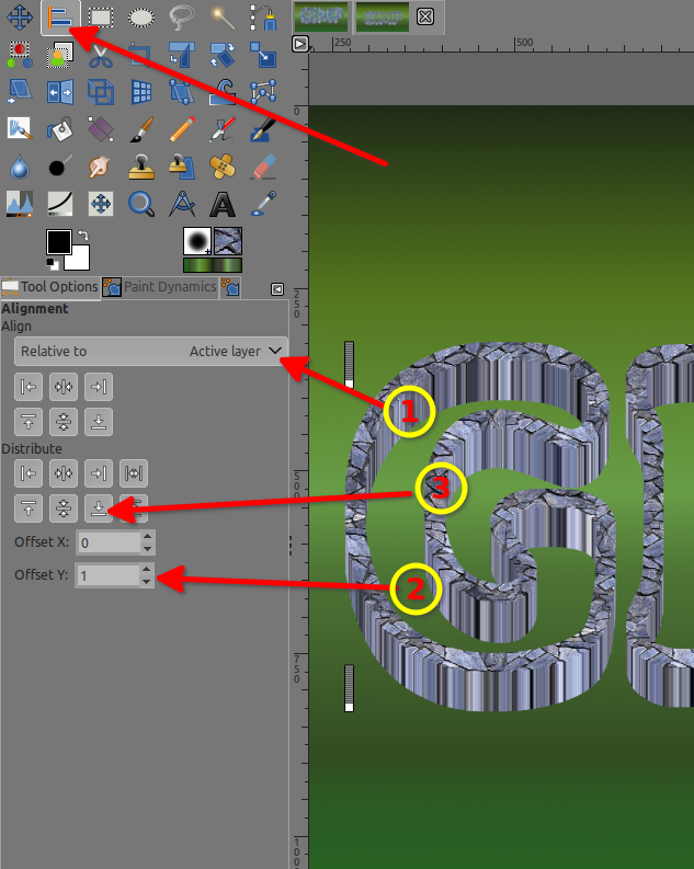
Duplicate that layer "edge" ~25 times by clicking on the "duplicate layer" icon at the bottom of the layer dock/dialog stack (see below)
(Don't do more than 25 times or keep a copy of the layer "edge" - name it "edge.bak" - un-tick the eye, for the future water level with a low extrusion)
Attachment:
 screenshot_20210825-150256.png [ 22.83 KiB | Viewed 2286 times ]
Alignment tool > with your mouse > Select (the same way as with the rectangle select tool) bigger than that layer but smaller than the whole image > You should see 4 squarred dots appearing
In the Alignment tool option > in that order:
Offset Y = 1
Relative to Active Layer
and only then you can click on that arrow down button in the "Distribute"
Hold the Shift key down and click once on the eye of the Layer
Group "bathtub" (now only the layers in that group are visible)
Right click on the layer group > Merge Visible Layers...
Result is now a layer named "bathtub"
Duplicate that layer
Select the layer > it become "bathtub copy" > then Click on the image in the
canvas, then use the
arrow up key on your keyboard to adjust the height to your liking (arrow down key if you went to far)
Duplicate that layer > it become "bathtub copy #1" > then Click on the image in the
canvas, then do like the above to align
Now you can activate the BackGround Layer and the layer named "bottom"
Yeaaah you got your pool/pond... but it's empty
3) Roof Top (swimming pool)
New Layer Group on top of the layer stack (name it "water")
New Layer inside this group, name it "blue" > fill with blue
Above the blue layer > New Layer name it "light" (still inside the "water" group)
Filters > Render > Noise > Solid noise...
Turbulent is checked
Detail is 0
Play with other sliders
Attachment:
 screenshot_20210825-124946.png [ 207.59 KiB | Viewed 2285 times ]
Then
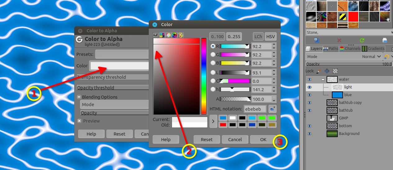
Colors > Invert
Then Ctrl+Shift+J (to have the full canvas view width)
Colors > Color to Alpha > click on that white (default color), a window opens (Color), Click in the middle of that big colored vertical rectangle and STAY clicked > drag to the left side and STAY clicked, then go up and down and look at your image at the same time > stop to your liking > then click ok/ok (below are my setting if you wish to use them)
later on, you can resize that layer to shrink it to have denser "reflective" lines.
Click/Select the Layer group "water"
4) The dive (masking water)
Select the layer "bathtub copy #1" > right click on it > Alpha to selection
Select > Save to Channel
Click on the layer group "water", then click on that "Add a mask" icon, a window opens > Select "Selection" > Invert Mask is checked > OK
Select > None
Ctrl+Alt+Click on that mask
Fuzzy Select Tool (addition mode) > Click outside of "GIMP" and inside the white in the letter P (of gimP)
Select > Grow (3 pixels)
Drag n' drop black color from the FG/BG
Ctrl+Alt+Click on that mask again (it's a toggle)
Click on the group "water" (to deselect the mask) and play with modes and opacity to your liking like > Normal/50-60% opacity, addition, overlay, screen, hard light, pin light, grain merge and so, > play opacity to your liking
If you want a higher water level, > New group > put that "edge.bak" layer inside > duplicate as needed like 10-15 > follow step 2) for extrusion and alignment > then for the mask use this one
Result
Attachment:
 pool.jpg [ 653.64 KiB | Viewed 2286 times ]
As always, If you are the OP of this text effect and did use a different method, please feel free to add it, it would be interesting to know how far or closed I was.
If someone has a faster, simpler, or just a different method, please share as well, it's always interesting to know that there are multiple ways.

To be Continued...