It all started with this thread viewtopic.php?f=11&t=18573
where there is some nice text effect, but the thread is not meant to "teach" how members did it, thus I was wondering how they did it and tried to do it as an exercise and as @sallyanne wrote when starting this thread (although the thread took a different direction)
sallyanne wrote:
...//..was just wondering if someone could pick out all the effects I used..//...
What I will do here, is to tell you how I think the OP (Original Poster) did it, or at least it will be how I did it.
If you are the OP and did use a different method, please feel free to add it, it would be interesting to know how far or closed I was.
If someone has a faster, simpler, or just a different method, please share as well, it's always interesting to know that there is multiple ways.
Without any further do, let's get started
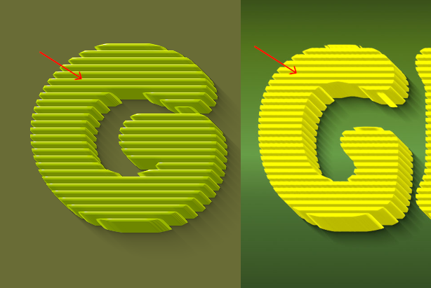
teapot's #207 was the very first text effects I wanted to try out, I told myself "wow, I need to know how to do it".

New Layer
Drag'n drop pattern "Warning!(20x20)"
Drag a guide down from the top
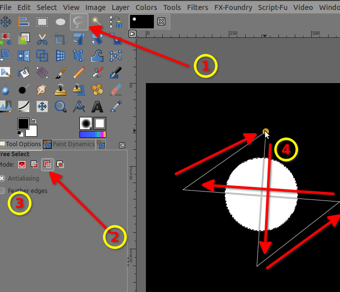
Unified Transform tool > Rotate to align to the guide horizontally > Once aligned stretch the layer on each side to cover most of the image with the same transform tool, then hit Enter
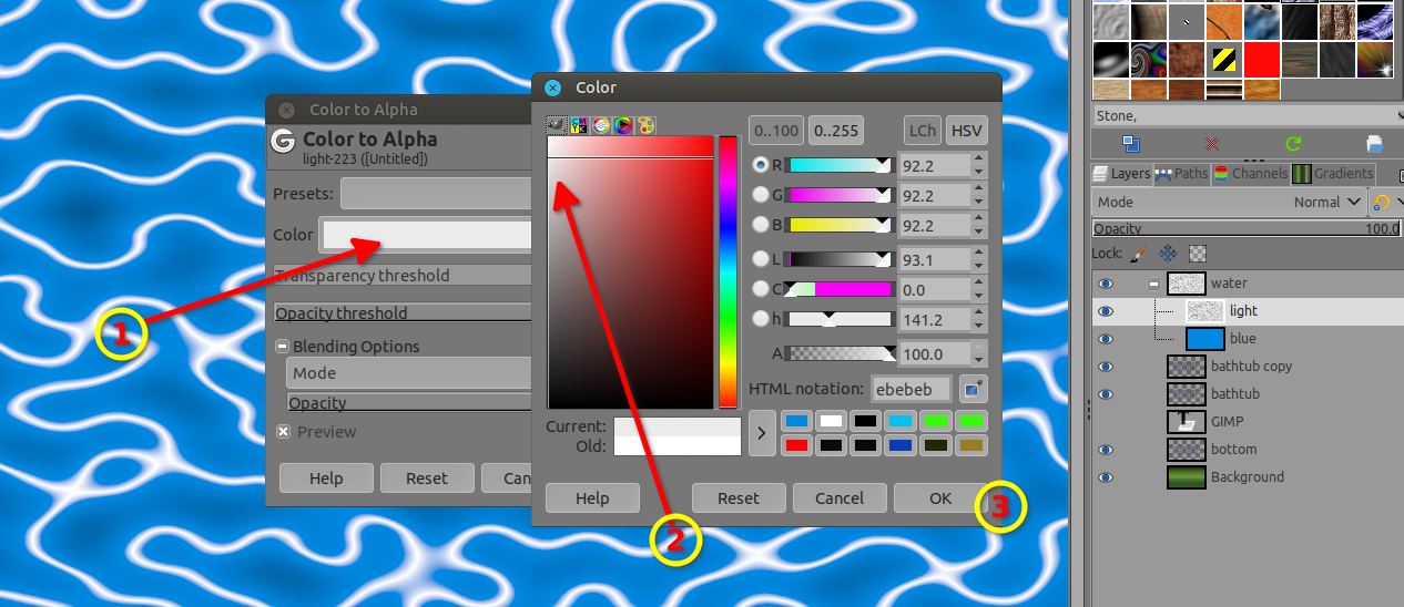
Filters > Color to Alpha > Select color black
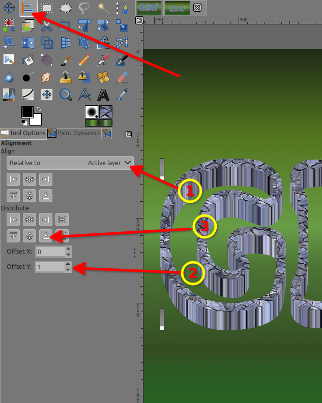
EDIT: See ofnuts solution at post #2 > Filters > Render > Pattern > Grid (Line width = 0)
New Layer
Text tool > GIMP
Alpha to selection
Select > grow (as you wish)
Select > selection to path or Channel (in case we need that selection later, it's always a good practice to back up your selections)
Select/Click on the layer with the pattern "Warning!" that you have stretched out
EDIT: ofnuts' solution at post #2 goes here > Filters > Render > Pattern > Grid (Line width = 0)
Select > Invert > hit that Delete key
Select > none
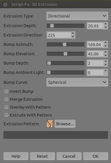
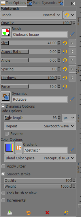
Filters > Render > 3D extrusion... (my settings which are different from @teapot)
Attachment:
screenshot_20210817-120728.png [ 45.71 KiB | Viewed 3558 times ]
Filters > Blur > Selective Gaussian Blur / or Mean curvature blur (optional and very low setting like 1 or 2, but it helps to smooth out the extrusion)
Filters > Light and shadow > Long shadow > Select "Fading fixed length"
In this Background, I did put a gradient called "Greens" in case you're interested
Final result
Attachment:
stripes.jpg [ 148.87 KiB | Viewed 3558 times ]
To Be Continued...