It is currently Tue May 14, 2024 4:18 am


All times are UTC - 5 hours [ DST ]


Post new topic Reply to topic  [ 30 posts ]  Go to page 1, 2  Next
Author Message
 Post subject: Re: Decoding your texts
PostPosted: Wed Aug 18, 2021 11:57 pm  (#11) 
Offline
GimpChat Member
User avatar

Joined: May 24, 2021
Posts: 778
Location: SEA - South East Asia
Trying to decode oldmangrumpy post #205

What intrigues me there, was those red outlined "tubes" on a white surface.
Looking closely we can see that there are also some black stripes on it and even some "white glow" on some of them on the left side of each letters and a green "gutter" below on the right ones and the top ones.

For the dark stripes (and may be the white "glow"), it appears to be a conjunction between those 2 settings (see image below).
Attachment:
screenshot_20210818-143758.png
screenshot_20210818-143758.png [ 78.81 KiB | Viewed 2321 times ]


Yes, the red dots have some black around and inside on the OMG's image, but they are inconsistent from 1 dot to another, the green gutter as well. Adding to that, the thin black line between red tubes around the edges... All of this is leading me to a "Bump map" or some sort.

I feel that after extrusion there was quite some processing like contrast/levels/filters/and so... which I will not try to decipher as my primary interest is those "tubes" edging the letters and I think it's a script which made these holes in the letters something like "chisel or carve", also there is a "glitch" inside the letter "e" which tells me that OMG might have used a mask/selection or erase something inside that letter "e".

Anyway, there is a lot of thing going on, on this one, and let's face it, I'm not able to decipher everything on that one, so for the sake of simplicity, I will keep it as simple as possible and just try to find out how could those red "tubes" have been made.

Without any further do, let's start

New doc:
First Prepare the brush:
PaintBrush "2. Hardness 075" (it's the default one) > Size 13-15 / Spacing ~200 / Hardness 90 / Force 90 /
Set the active ForeGround (FG) to white, and the active BackGround (BG) to red
Once it's done

Text tool > Write GIMP size around 400 (font used in this exercise is: Chancery Uralic Italic)
Right click on layer > Alpha to selection

New Layer (name it "base")
Drag 'n Drop the white FG inside the selection
Select > Selection to Path (we will use it later on)
Hit the X key to switch FG <-> BG

From here 2 ways (or "paths" if you prefer :hehe ) depending what you will see later on..

Solution 1)
Edit > Stroke selection > use the Paintbrush
If you see too much of these (see screenshot below, red dot "glued" together) -> Ctrl+Z and Adjust the brush Spacing +/- and re-do it, or go to solution 2)
Select > None
Attachment:
screenshot_20210819-135243.png
screenshot_20210819-135243.png [ 10.08 KiB | Viewed 2316 times ]


Solution 2)
Select > None
Edit > Stroke Path > use the Paintbrush, then like in solution 1) adjust the brush spacing if too much dots are glued together, but if solution 1) does not work well, here it should be way better.
Once it's done (you have red dots all around letters)
Duplicate that layer, name it "white bump"
Filter / Render / 3D extrusion
You might want to lower "Bump Azimuth", anyway do as you wish ;)
Image

After extrusion the layer #extrusion is automatically selected -> Re-select "White bump" just above.
Filter > Map > Bump Map > aux input itself (white bump), type linear, Invert is ticked (compensate and tiled are un-ticked), azimuth 135, elevation 45, depth 15, waterlevel 0.424, ambient lighting factor 0.579

Once the bump map is done:
Click on the FG color and change it to an orange one.

Select the layer "base" (duplicate if you wish) and > put it on top of the layer stack.
Fuzzy Select tool (in add mode or stay on the Shift key), feather edge =1 > select the white, then drag 'n drop the orange FG in the selection.
Select > None
Play with the different Layer blending modes > the burn part works well ("Luma darken only", "Burn", "Linear burn") , Grain merge, divide, HSV color, LCh Color...
Try what fits best for you ;)

Result
Attachment:
omg-text.jpg
omg-text.jpg [ 263.62 KiB | Viewed 2321 times ]


If you are the OP of this text effect and did use a different method, please feel free to add it, it would be interesting to know how far or closed I was.
If someone has a faster, simpler, or just a different method, please share as well, it's always interesting to know that there are multiple ways. :bigthup

To be Continued...

_________________
Patrice


Last edited by PixLab on Thu Aug 19, 2021 2:43 am, edited 9 times in total.

Top
 Post subject: Re: Decoding your texts
PostPosted: Thu Aug 19, 2021 12:26 am  (#12) 
Offline
Global Moderator
User avatar

Joined: Apr 01, 2012
Posts: 7730
Location: On the other side of this screen
Sorry Patrice. Mistook your 'OP'

_________________


Top
 Post subject: Re: Decoding your texts
PostPosted: Thu Aug 19, 2021 1:29 am  (#13) 
Offline
GimpChat Member
User avatar

Joined: May 24, 2021
Posts: 778
Location: SEA - South East Asia
sallyanne wrote:
Sorry Patrice. Mistook your 'OP'

I could have mistaken it as well, have no worries Sallyanne :bigthup

_________________
Patrice


Top
 Post subject: Re: Decoding your texts
PostPosted: Tue Aug 24, 2021 1:58 am  (#14) 
Offline
GimpChat Member
User avatar

Joined: May 24, 2021
Posts: 778
Location: SEA - South East Asia
Trying Decoding/reproducing Blitghty II #140

At first I thought it was a "rotative" brush stroke along a path, but the letters C, A, and N are not "similar", but exactly the same.
when you stroke a path you won't have the very-same start and ending colors placement like in this case, unless you duplicate them, but no... I don't think it was duplicated.

In the end I told myself, it might be a special font, script or plugin which I don't have, so I'll do it manually.
During my tests, I also discovered a bug certainly introduced in GIMP 2.10.<12 which add some black to the brush edge, but I did found a way to attenuate it. Not perfect but it seems to work.

Without any further do, let's get stated!

1) Create the brush (easy)

New Layer
Ellipse Select tool > Start to make a circle selection then hold the Shift key down for a perfect circle
Drag 'n Drop the white from the ForeGround(FG)/BackGround(BG) inside that selection
Then click on the FG and set it to red, Click on the BG and set it to green

New Layer
Click on the Free Select tool > Mode subtract and draw a selection like below
Image

Then > New Layer
Drag 'n drop the red from the FG
Then > New Layer
Drag 'n drop the green from the BG
Select > none
Free select tool on that last top layer, put it back in "normal" mode (replace) and draw a selection like below
Image

then Hit that delete button (Edit > Clear)
Select > None
Now you should see the future brush with 3 colors (white, red, and green)

Right click on layer and > New from Visible, or merge together those 3 layers (green > merge down > red merge down> white circle)

-a) Now right click on the finished draw "brush" Layer > Alpha to Selection (do not use any other type of selection tool like the ellipse > because of the bug)
-b) Select > Shrink (6 or more pixels, again to counter the bug)
-c) then Ctrl+C or Edit > Copy

When you Copy something in GIMP it goes to your clipboard > thus it's in your patterns and brushes
Select that brush (Clipboard Image) in your paintbrush tool option on top of the list

2) Create a new dynamic (very easy) to rotate the brush (4 clicks)

How to make a dynamic brush > viewtopic.php?f=23&t=7208&start=0 (it has 4 images easy to understand)

Click on the dynamic icon > A drop down menu opens
At the bottom right of this drop-down menu there is the same dynamic icon ("open the dynamic selection dialog") > Click on it
A new dialog opens (Paint Dynamics) > At the bottom there is 5 icons, click on the "+" (new), a new dialog opens
Name that dynamic "Rotative" and cross check the "Fade" with "Angle" like below
Attachment:
screenshot_20210824-133246.png
screenshot_20210824-133246.png [ 27.47 KiB | Viewed 2234 times ]

Done.

3) Paintbrush setting

First thing first: In the paintbrush option do not reduce the size more than 1/3 it's original (the bug... on a rotating brush it looks very bad)
If you want a smaller brush Reduce the layer size with the scale tool for example and re-do steps -a) to -c) and click on the "return arrow" in the brush "size" line to reset the size

Spacing is 1
Hardness 100 (if below... like 75 > it's very ugly > did I said there is a bug...)
Force 50 or below ( above 50-60 = getting worse with that bug)

Smooth stroke is checked, the 2 sliders are at full throttle (100)

Dynamic > "Rotative" brush is selected
Dynamic Options > Fade length ~90 (play with this one) / Repeat > "Sawtooth wave" is selected
Image

It might be long to read, but it takes less than 30 seconds to set the brush up ;)

4) Stroke the text

Text tool > Write "GIMP" or whatever you like Font size > 400 (font use for this exercise is "Noto Sans Symbols Thin")
Then right click on that layer > Text to Path
Click on the path tab (dialog), and activate the "eye" to see the path
You are seing that the path is all around each letter, which we don't want.
Click on the "Paths Tool"
Hold "Shift+Ctrl" (during all this operation) to remove the internal nodes and lines, we just keep the outside paths, Click on a node (control point) to remove it, click on a line to remove it
Result (I kept only the external paths)
Attachment:
screenshot_20210824-142726.png
screenshot_20210824-142726.png [ 175.62 KiB | Viewed 2234 times ]


Edit > Stroke path... (select the paintbrush)
Colors > Levels > move the slider (the one on the extrem right side) a bit to the left to remove those blackish dirty look stripes

Final Result
Attachment:
candy-brush.jpg
candy-brush.jpg [ 445.74 KiB | Viewed 2234 times ]


As always, If you are the OP of this text effect and did use a different method, please feel free to add it, it would be interesting to know how far or closed I was.
If someone has a faster, simpler, or just a different method, please share as well, it's always interesting to know that there are multiple ways. :bigthup


To be Continued...

_________________
Patrice


Top
 Post subject: Re: Decoding your texts
PostPosted: Tue Aug 24, 2021 3:19 am  (#15) 
Offline
GimpChat Member

Joined: Sep 23, 2016
Posts: 316
PixLab wrote:
At first I thought it was a "rotative" brush stroke along a path, but the letters C, A, and N are not "similar", but exactly the same.

It was made into a Gimp Custom Font.

See here:
https://www.dropbox.com/sh/sm3cxvh7mpu8 ... 0cNUa?dl=0


Top
 Post subject: Re: Decoding your texts
PostPosted: Tue Aug 24, 2021 5:34 am  (#16) 
Offline
GimpChat Member
User avatar

Joined: May 24, 2021
Posts: 778
Location: SEA - South East Asia
Blighty II wrote:
PixLab wrote:
At first I thought it was a "rotative" brush stroke along a path, but the letters C, A, and N are not "similar", but exactly the same.

It was made into a Gimp Custom Font.

See here:
https://www.dropbox.com/sh/sm3cxvh7mpu8 ... 0cNUa?dl=0

Yes :yes :coolthup
Thanks a lot Blighty II for your input and link :tyspin

_________________
Patrice


Top
 Post subject: Re: Decoding your texts
PostPosted: Tue Aug 24, 2021 8:33 am  (#17) 
Offline
GimpChat Member

Joined: Sep 23, 2016
Posts: 316
Gimp Custom Font can be found here:
https://gimplearn.net/viewtopic.php?f=4&p=1513#p1513
I use version 16. Later versions have additional features which slows it down substantially.

Gimp Custom Font on Path can be found here:
https://gimplearn.net/viewtopic.php/Cus ... ?f=3&t=449


Top
 Post subject: Re: Decoding your texts
PostPosted: Wed Aug 25, 2021 2:05 am  (#18) 
Offline
GimpChat Member
User avatar

Joined: May 24, 2021
Posts: 778
Location: SEA - South East Asia
Thank you Blighty II :coolthup

_________________
Patrice


Top
 Post subject: Re: Decoding your texts
PostPosted: Wed Aug 25, 2021 2:36 am  (#19) 
Offline
GimpChat Member
User avatar

Joined: May 24, 2021
Posts: 778
Location: SEA - South East Asia
Decoding/reproducing teapot's #204 "pool"

That's a nice one, I like the 3D that this effect gives as volume and container.
The extrusion is neat and I'm almost sure the water effect was 100% generated in GIMP without plugin.

If I think @teapot did the extrusion via the 3d-extrusion.scm plugin, I will not use it for this exercise.
Instead today, I'll show one method on how to do it without plugin, it's not the fastest method, but it's a very simple one and it has a lot of precision and more important > the result is very neat.
Plugins are nice, but let's not forget the basics ;)

Whithout any further do, let's get started

1) Basement
New Layer (name it "bottom")
Text Tool > Write GIMP > Font size ~550 (font used for this exercise is "Averia Libre Bold")
Right click on that text layer > Alpha to Selection
Select > Grow (~17 pixels)
Select > Save to Channel
Un-tick the eye of the text layer (no need anymore)
Click on the layer named "bottom" (not the BackGround)
From your dialog dock pattern, drag n' drop the pattern named "Stone (156x156)" in that selection
Select > Border... (~13 pixels)
Select > Save to Channel
Un-tick the eye of the layer "bottom" (to not disturb us for the moment)
Create a Layer Group (name it "bathtub"), it should be on top of the layer stack
Create a new layer (name it "edge") inside the "bathtub" folder
Drag 'n drop the Stone (156x156) pattern from the patterns dialog/dock inside the selection (which has border)
Select > None
Layer > Crop to content (very important before doing anything else)


2) Upper Ground (extrusion)
Duplicate that layer "edge" ~25 times by clicking on the "duplicate layer" icon at the bottom of the layer dock/dialog stack (see below)
(Don't do more than 25 times or keep a copy of the layer "edge" - name it "edge.bak" - un-tick the eye, for the future water level with a low extrusion)
Attachment:
screenshot_20210825-150256.png
screenshot_20210825-150256.png [ 22.83 KiB | Viewed 2150 times ]


Alignment tool > with your mouse > Select (the same way as with the rectangle select tool) bigger than that layer but smaller than the whole image > You should see 4 squarred dots appearing
In the Alignment tool option > in that order:
Offset Y = 1
Relative to Active Layer
and only then you can click on that arrow down button in the "Distribute"
Image
Hold the Shift key down and click once on the eye of the Layer Group "bathtub" (now only the layers in that group are visible)
Right click on the layer group > Merge Visible Layers...
Result is now a layer named "bathtub"
Duplicate that layer
Select the layer > it become "bathtub copy" > then Click on the image in the canvas, then use the arrow up key on your keyboard to adjust the height to your liking (arrow down key if you went to far)
Duplicate that layer > it become "bathtub copy #1" > then Click on the image in the canvas, then do like the above to align
Now you can activate the BackGround Layer and the layer named "bottom"

Yeaaah you got your pool/pond... but it's empty

3) Roof Top (swimming pool)
New Layer Group on top of the layer stack (name it "water")
New Layer inside this group, name it "blue" > fill with blue
Above the blue layer > New Layer name it "light" (still inside the "water" group)
Filters > Render > Noise > Solid noise...
Turbulent is checked
Detail is 0
Play with other sliders
Attachment:
screenshot_20210825-124946.png
screenshot_20210825-124946.png [ 207.59 KiB | Viewed 2149 times ]

Then
Colors > Invert
Then Ctrl+Shift+J (to have the full canvas view width)
Colors > Color to Alpha > click on that white (default color), a window opens (Color), Click in the middle of that big colored vertical rectangle and STAY clicked > drag to the left side and STAY clicked, then go up and down and look at your image at the same time > stop to your liking > then click ok/ok (below are my setting if you wish to use them)
later on, you can resize that layer to shrink it to have denser "reflective" lines.
Image

Click/Select the Layer group "water"

4) The dive (masking water)

Select the layer "bathtub copy #1" > right click on it > Alpha to selection
Select > Save to Channel
Click on the layer group "water", then click on that "Add a mask" icon, a window opens > Select "Selection" > Invert Mask is checked > OK
Select > None
Ctrl+Alt+Click on that mask
Fuzzy Select Tool (addition mode) > Click outside of "GIMP" and inside the white in the letter P (of gimP)
Select > Grow (3 pixels)
Drag n' drop black color from the FG/BG
Ctrl+Alt+Click on that mask again (it's a toggle)

Click on the group "water" (to deselect the mask) and play with modes and opacity to your liking like > Normal/50-60% opacity, addition, overlay, screen, hard light, pin light, grain merge and so, > play opacity to your liking

If you want a higher water level, > New group > put that "edge.bak" layer inside > duplicate as needed like 10-15 > follow step 2) for extrusion and alignment > then for the mask use this one

Result
Attachment:
pool.jpg
pool.jpg [ 653.64 KiB | Viewed 2150 times ]


As always, If you are the OP of this text effect and did use a different method, please feel free to add it, it would be interesting to know how far or closed I was.
If someone has a faster, simpler, or just a different method, please share as well, it's always interesting to know that there are multiple ways. :bigthup


To be Continued...

_________________
Patrice


Last edited by PixLab on Wed Aug 25, 2021 7:56 am, edited 4 times in total.

Top
 Post subject: Re: Decoding your texts
PostPosted: Wed Aug 25, 2021 2:44 am  (#20) 
Offline
Global Moderator
User avatar

Joined: Oct 02, 2014
Posts: 4446
Location: Sydney Australia
PixLab - ref your post #11 about my Gimp Text process. Well firstly, thanks for giving it your attention and I would love to give you some exact references on my method, however its a few months back now, I did not keep the XCF file and I'm an old guy whose memory is failing :roll: .

Basically it was stroking the path formed by the text and using increased spacing parameters for the standard brush Hardness 100. Then I used the 3D Extrusion filter to produce the tubes.

Good luck with your ongoing detective work.

_________________
Image

Respect should be offered freely but hard earned


Top
 Post subject: Re: Decoding your texts
PostPosted: Wed Aug 25, 2021 3:24 am  (#21) 
Offline
GimpChat Member
User avatar

Joined: May 24, 2021
Posts: 778
Location: SEA - South East Asia
oldmangrumpy wrote:
PixLab - ref your post #11 about my Gimp Text process. Well firstly, thanks for giving it your attention and I would love to give you some exact references on my method, however its a few months back now, I did not keep the XCF file and I'm an old guy whose memory is failing :roll: .

Basically it was stroking the path formed by the text and using increased spacing parameters for the standard brush Hardness 100. Then I used the 3D Extrusion filter to produce the tubes.

Good luck with your ongoing detective work.


Thank you very much for your input and nice word @oldmangrumpy :tyspin

_________________
Patrice


Top
 Post subject: Re: Decoding your texts
PostPosted: Thu Aug 26, 2021 11:45 pm  (#22) 
Offline
GimpChat Member
User avatar

Joined: Dec 09, 2018
Posts: 645
PixLab wrote:
Decoding/reproducing teapot's #204 "pool"

That's a nice one, I like the 3D that this effect gives as volume and container.
The extrusion is neat and I'm almost sure the water effect was 100% generated in GIMP without plugin.

If I think @teapot did the extrusion via the 3d-extrusion.scm plugin, I will not use it for this exercise.
Instead today, I'll show one method on how to do it without plugin, it's not the fastest method, but it's a very simple one and it has a lot of precision and more important > the result is very neat.
Plugins are nice, but let's not forget the basics ;)

Such is the versatility of gimp you've produced a similar result to mine but by different methods. I used a shorter route of a script for the extrusion and a pattern for the water. However I agree it's nice to do things from basis too.

The water pattern was posted by Draconian here.

As an alternative there are two ways of making water here.


Top
 Post subject: Re: Decoding your texts
PostPosted: Fri Aug 27, 2021 1:36 am  (#23) 
Offline
GimpChat Member
User avatar

Joined: May 24, 2021
Posts: 778
Location: SEA - South East Asia
teapot wrote:
Such is the versatility of gimp you've produced a similar result to mine but by different methods. I used a shorter route of a script for the extrusion and a pattern for the water. However I agree it's nice to do things from basis too.

The water pattern was posted by Draconian here.

As an alternative there are two ways of making water here.


I think this thread is going to slightly change its path as I will try to not use any plugins anymore(except G'MIC, but who does not have G'MIC :mrgreen: )
Why? It came to my mind that not every one might have the specific plugin for a specific effect, I'll take an example... me, before to sign-up in gimpchat, I was not aware about the 3D-extrusion.scm (yes, shame on me :oops: ), and new comers with GIMP (which usually do not have plugins) will be able to reproduce the effect as well.

In all case Thank you very much @teapot for your input and links, I very much appreciated :tyspin
To everyone reading, I recommend @teapot's link on how to render water, Ofnuts did a great tutorial :bigthup

_________________
Patrice


Top
 Post subject: Re: Decoding your texts
PostPosted: Fri Aug 27, 2021 11:28 am  (#24) 
Offline
GimpChat Member
User avatar

Joined: May 24, 2021
Posts: 778
Location: SEA - South East Asia
Decoding/Reproducing Sallyanne #332 "Wind dispersion"

I did like how the letters are "desintegrating" and their dust is spreading in a wind alike, and keep the rounded form of the letter at the bottom.

In the beginning, I thought it would be a piece of cake. Not so, as a matter of fact, I couldn't have been more wrong!

Sallyanne might have used a plugin for the text, the one with an emap (not sure, but it looks like), not having that map (if map there is) the effect on the text itself was quite difficult to reproduce, so I kind of passed on it as I did not want to use a plugin.
If you look closely, it seems that there is at least 3 types of shadow (a long one and 2 "normal" 1 dark and 1 white), plus the dark shadow is going in one way, they another way, giving this nice effect it's going out from the ground, but I told myself to keep it simple as it was already a long time that I was on it. The font is quite specific as well and if you got a font which is just a bit too thick, it won't work well (I did tried and meeh, it was not good), so I needed to search for a similar one.

Without any further do let's get started.

Prepare your ForeGround(FG) / BackGround(BG) colors, respectively #ee9592 / #7a2724 (colors are just indicative)

Drag n' drop the BG color on the background layer Then un-tick the eye of that layer
Text tool > Write "Gimp" (or whaterver you like) Font size ~550 -> Italic, color white from the floating text dialog to not change your FG color (font used for this exercise is "Chopin Script")
Then right click > Discard Text Information
Name that layer "text"
Filters > Light and Shadow > Drop Shadow (legacy)... (this is very important use the legacy!!) use default setting (4,4,15,60,x)
Now you have a new layer below "text" called "Drop Shadow"
Make sure the layer "text" is still selected
Then right click on it > Alpha to selection
Select the layer "Drop Shadow" > add mask > a window opens select "Selection" > OK
Select > None
Click on that "Drop Shadow" layer and put it above the layer "text"
Un-tick the eye of the BG layer > now your text is on a transparent BG (important step)
Then right click on that "Drop Shadow" layer > New from Visible
Now You have a new Layer which is called "Visible" -> Rename it "bumpmap"

you can tick the eye/visibility of the BG layer and un-tick layer "text" and layer "Drop Shadow" (we don't need those last 2 anymore)

Select layer "bumpmap"
Erasor Tool > Brush "Cell 01" > few Dabs on the writing to make holes and look a bit grungy
Right click > Alpha to Selection
Select > Save to Channel (we need for later)
Select > None
Then Duplicate that layer (new layer become "bumpmap Copy")

On layer "bumpmap Copy"
Filters > Light and Shadow > Long Shadow
Style -> Fading (Fixed Length),
Angle - (minus)-40,
Length ~400,
Midpoint ~175,
Composition -> Shadow Only
Image

Then
Put that layer in Mode "Dissolve"

Duplicate that Layer (it become "bumpmap Copy #1"),
Filters > Light and shadow > Drop Shadow... (the normal one this time)
Right click > Alpha to Selection > Add Mask (selection checked - Invert mask checked)
Then opacity of this layer at ~50%

Select Layer "bumpmap" (the one below the two pink shadows)
Put it Above (on top of the layer stack)
Then
Filters > Distorts > Emboss... (Emboss type -> bumpmap, Azimuth ~340, Elevation ~75, Depth ~25)
Image
Filters > G'MIC-Qt.. > Details > Tone Mapping > Increase smoothness to your liking (~1) > Output Mode - New Layer > Click "Apply" (not OK)
Still in G'MIC-Qt > Details > Tone Mapping [Fast] (it's just below) > Channels(s) -> YCbCr [Green Chrominance] > Output Mode - New Layer > Now Click OK
You got 2 new layers "bumpmap #1"(chrome alike) and "bumpmap #2" (pink), put "bumpmap #2" in Mode "LCh Color" 50% opacity

New Layer on top name it "map"
Gradient tool > FG to BG (RGB) > Shape "bi-linear" > From the center drag down to around 50 pixels before the edge
Warp transform tool > then make a mush like below (be carefull to not have transparent part => untick visibility of the background layer to be sure)
Image

Add mask Select/tick "Channel" (don't forget to un-tick "Invert Mask") > Put that Layer in LCH Color (opacity 100%)

Result
Attachment:
wind dispersion.jpg
wind dispersion.jpg [ 559.11 KiB | Viewed 4705 times ]


As always, If you are the OP of this text effect and did use a different method, please feel free to add it, it would be interesting to know how far or closed I was.
If someone has a faster, simpler, or just a different method, please share as well, it's always interesting to know that there are multiple ways. :bigthup


To be Continued...

_________________
Patrice


Top
 Post subject: Re: Decoding your texts
PostPosted: Sun Sep 05, 2021 5:25 pm  (#25) 
Offline
GimpChat Member
User avatar

Joined: Mar 08, 2021
Posts: 329
Location: NorthEast USA
Oh no - i posted my 204 trial in the text forum ..
PixLab - here is my attempt from your notes, and from links, and from OMG
first i had made one, not deep enough that i was trying to do
then i did make it deeper and i had used two extrusions which ended up not matching
So- finally since i now had the water in the right place in the middle, i just went back to
my initial 'wall' outline layer and did a single extrusion to the right size

(ps- can you tell me if the 'double-post was OK? or is it best to link the posts,
so that there are not double images?)


Attachments:
Water_GIMP_01b.png
Water_GIMP_01b.png [ 569.89 KiB | Viewed 4526 times ]

_________________
Image
-----------
GIMP 2.10.25 (AppImage) / G'mic-Qt for GIMP 2.8 Linux 64bits 2.9.8 / Linux Mint 19.3
(LeftyLeo/James)
Top
 Post subject: Re: Decoding your texts
PostPosted: Sun Sep 05, 2021 10:43 pm  (#26) 
Offline
GimpChat Member
User avatar

Joined: May 24, 2021
Posts: 778
Location: SEA - South East Asia
leftyleo wrote:
Oh no - i posted my 204 trial in the text forum ..
PixLab - here is my attempt from your notes, and from links, and from OMG
first i had made one, not deep enough that i was trying to do
then i did make it deeper and i had used two extrusions which ended up not matching
So- finally since i now had the water in the right place in the middle, i just went back to
my initial 'wall' outline layer and did a single extrusion to the right size


Nice to see how you did handle it :bigthup
That's a great job @leftyleo :clap


leftyleo wrote:
(ps- can you tell me if the 'double-post was OK? or is it best to link the posts,
so that there are not double images?)


No problem, that's very OK :bigthup

_________________
Patrice


Top
 Post subject: Re: Decoding your texts
PostPosted: Mon Sep 06, 2021 5:50 am  (#27) 
Offline
Global Moderator
User avatar

Joined: Apr 01, 2012
Posts: 7730
Location: On the other side of this screen
You did pretty good Patrice. I didn't even see the sand/dust dispersing. Was very similar to ones I have done before. I am glad you liked it enough :)
I did however use BRL as my starting point and I think that gives highlights and drop shadows as well.
The Font I used was Hawaii Lover which has a bit of disintegration in the font itself. I don't remember everything I did as I didn't keep an xcf of it. As usual I duplicated the text layer and worked on the background layers. I may have even duplicated this one a couple of times. For the background I would have selected the lowest text layer and run G'MIC's 'solidify' (This can also enhance any shadowing highlights, or make it seem like there are more.)
On the next layer I would have run long shadow, fading - fixed length, dissolve mode on it. I would have also made this layer lighter (probably with curves) so it showed up some against the background
On the top layer I left as is. Anything else is not in my forgettory.

_________________


Top
 Post subject: Re: Decoding your texts
PostPosted: Tue Sep 07, 2021 9:09 pm  (#28) 
Offline
GimpChat Member
User avatar

Joined: May 24, 2021
Posts: 778
Location: SEA - South East Asia
Thank you very much Sallyanne for your input and explanations :coolthup :tyspin
sallyanne wrote:
For the background I would have selected the lowest text layer and run G'MIC's 'solidify' (This can also enhance any shadowing highlights, or make it seem like there are more.)

Yeees!
G'MIC / Repair / Solidify => was the one I was searching for and I gave up, the shadows that I cannot understand ;) . That's a cool filter, thank you Sallyanne

_________________
Patrice


Top
 Post subject: Re: Decoding your texts
PostPosted: Thu Oct 14, 2021 7:14 am  (#29) 
Offline
GimpChat Member
User avatar

Joined: May 24, 2021
Posts: 778
Location: SEA - South East Asia
Decoding / Reproducing racer-x #70 wooden text

I like wood text, this one is what I call a "classic".
We can see that racer-x did use a home made texture, thus we will do our onw ;)
Extrusion was internal going toward the center of the text and there is a "bevel - emboss" on top of it (so we do need to make a map)
Racer-x said "I used Layer-FX and Extrude-3D", so we know how he did it (thank you), thus we will take a different approach as s/he used plugins...
I will use only native GIMP's tool like that every one will be able to do it (and yes it's super easy, reading this tuto will take way longer than doing it ;) )

Without any further do let's get started

New image...

1) Text
Text tool > Write "GIMP" (or whatever you like), Font size 550 > Colour White (font used for this exercise is "Roboto Heavy" from the free Google fonts)
Right click on the layer text > Alpha to Selection
Select > Save to Channel (important)
Un-tick the eye/visibility of that Text layer (no need any more)
Select the Layer below "Background" Name it "white text" > Fill selection with white color
Select > None

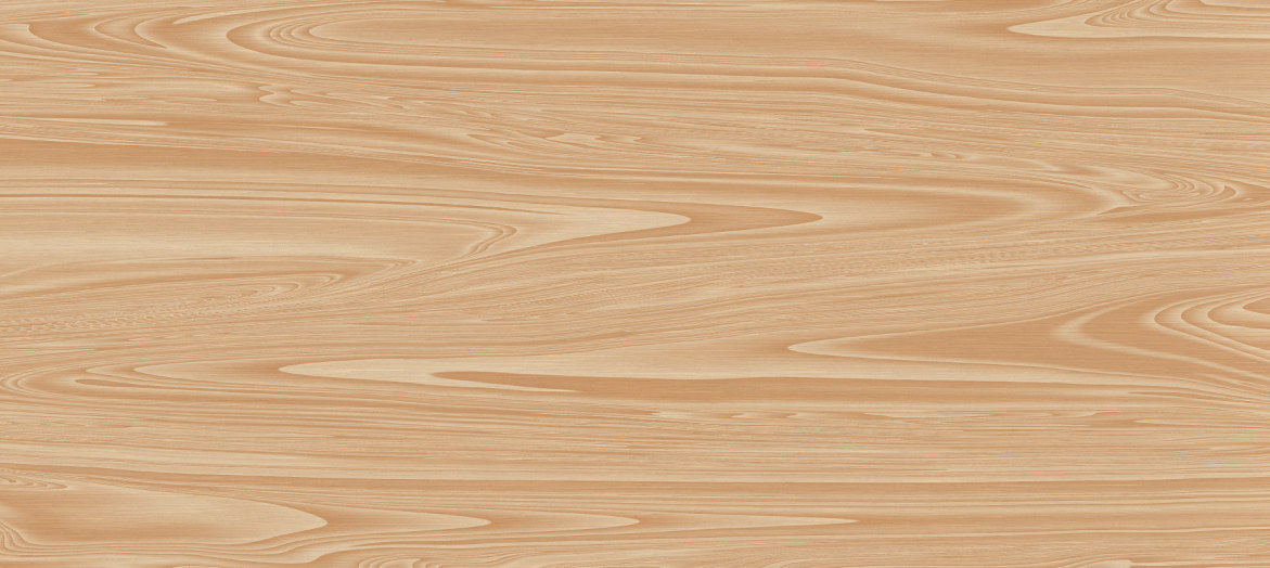
2) Texture (2 layers "fibers" and "plank")
This is how I do my quick textures, if you prefer your own, do your own now then go directly to > 3)
Prepare your colors NOW > ForeGround is "d1a07f" / BackGround is "7f5237"
New Layer name it "fibers" > fill with BG color
Then Filters / Noise / CIE lch Noise... Click Ok we just want some noise by default
Then Filters /Distorts/ Wind.. Strenght > Full throttle at max, then OK
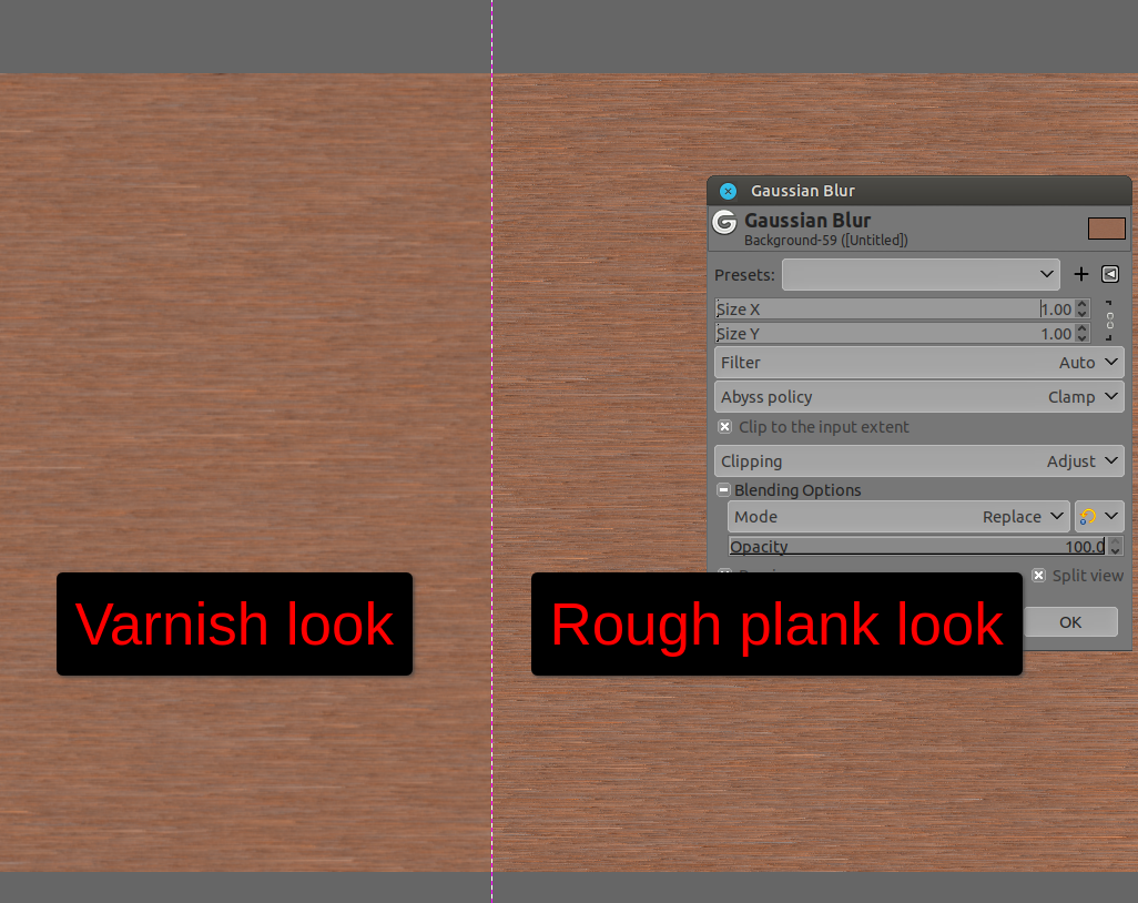
---------> [**] Then Filters / Blur / Median blur... > Radius = 1 (or don't blur now but after the next step as it will be more "visual" and you will "see" the "varnish" effect once layer "plank" is made)
Image

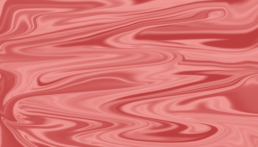
New Layer name it "plank"
(this layer is the base of many "quick" textures I'm processing, like stones, water, ice, metal, and so on)
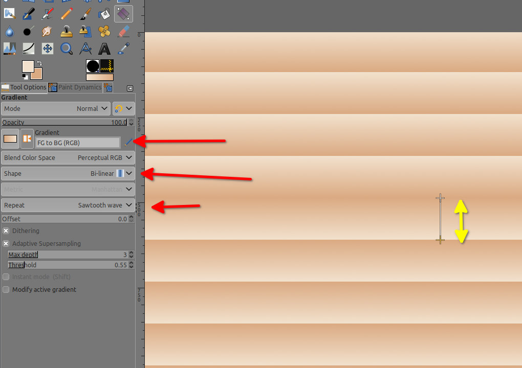
Gradient tool > FG to BG (RGB) > Shape Bi-linear > start from the ~center and drag down to the edge (stay at ~50 pixels from the edge)
Then Warp Transform Tool > size ~300-350 / Move Pixels mode / Interpolation > None (it goes way faster) Abyss policy > Clamp to not have transparent area inside!!!!
Make a mess, you can call your kids to do it, they will love it ;)
Once you've played enough, put the Warp tool on one side (near the top) and go straight to the over side, do the same just below but start by the opposite side, and so on (vice-versa), for two or three more time/row
You should have something like below as a result

Attachment:
screenshot_20210829-013030.png
screenshot_20210829-013030.png [ 724.04 KiB | Viewed 1711 times ]


Put this layer "plank" in mode "Overlay" at ~78% Opacity (you can play on it with Filters / Enhance / Sharpen (Unshap mask).. if you like a more rough wood)
--------->[**] If you did not blur the layer below this one ("fibers") before, do it now, or don't do it if you prefer a more rough textured fiber-ish wooden texture
Then
Right click on the layer "plank" > New from Visible, name that new layer "Visible" -> "texture"

3) Textured text
Now un-tick the eye/visibility of all the layer below "texture" (but not "texture")
Add Mask to layer "texture", window opens > Select from -> "Channel" - "Selection Mask Copy"
You should see the wooden text
Right click on the layer "texture" > New from visible > rename it "texture #1"
Un-tick Layer "texture"
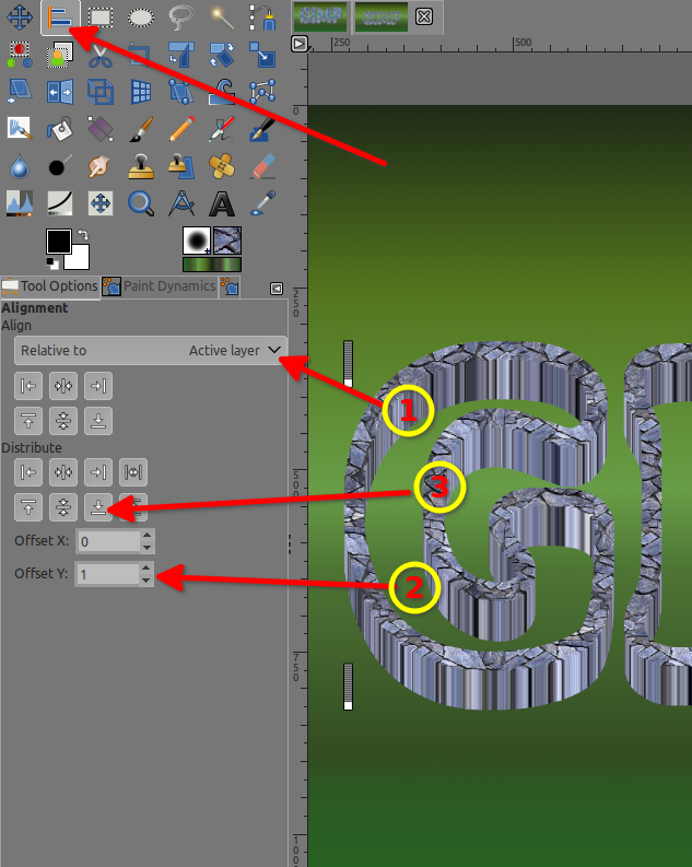
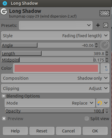
4) Bevel
---------> a) With native GIMP's tool (no plugin)
Select the layer "texture #1" Then > Layer / Layer to image size (important)
un-tick visibility of layer "texture #1"
New Layer name it "background" > Fill with black color > put it under the layer "white text"
Duplicate layer "background" and activate visibility of Layer "white text" above it
Right click on that layer "white text" > Merge down
Call than new merged layer "map"
Filters > Gaussian Blur > Size X and Y at 2.5
If you wish a more angular bevel angle (like on the racer-x original), after blur do: Channel to selection > Select / shrink 10 > Select /Feather 0 > Fill with white
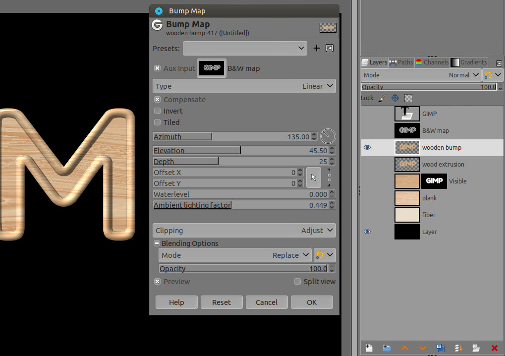
Un-tick the eye/visibility of layer "map" and tick the eye/visibility of layer "texture #1" and select "texture #1"
Filters / Map / Bump Map... > Aux input > the layer "map" > see other setting of "Bump Map..." below

Attachment:
more angular.png
more angular.png [ 227.02 KiB | Viewed 1682 times ]


Once it's done
Layer > Crop to content (important)

Now just Go to part 5) Extrusion
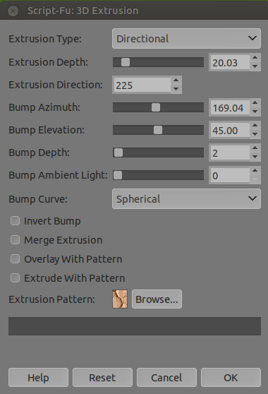
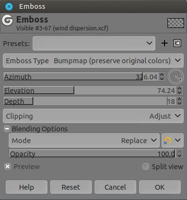
---------> B) For lazy people with the plugin Layer/ Layer Effects/ Bevel and Emboss...
Just take a look at the setting below ;)

Attachment:
layer-fx.png
layer-fx.png [ 60.46 KiB | Viewed 1711 times ]


Once it's done
Layer > Crop to content (important)

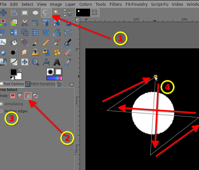
5) Extrusion toward center
Zoom in to the pixel level you can add a guide on top of the tallest letter at 2 pixels inside (here it's "G"), same with the bottom, same on the right side, same on the left
OR you can use the top and left ruler as reference to shrink 1 pixel > thus zoom in to see big pixels
(it might be better to un-tick temporarily the visibility of the black background layer to be able to see the shadow or you might shrink too much)
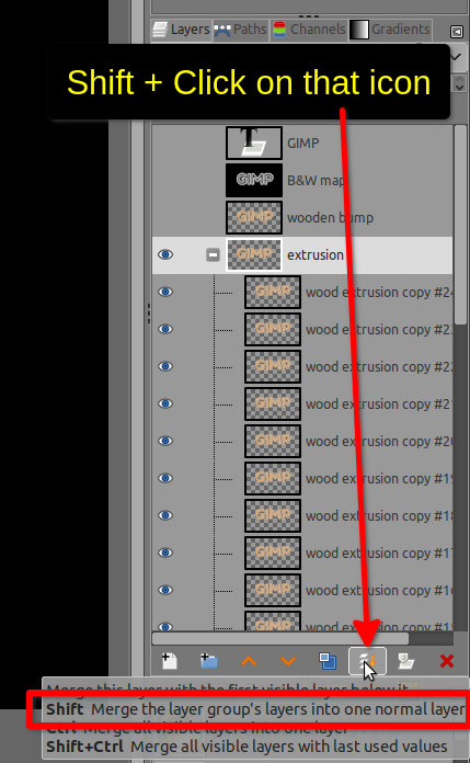
Filters / Map / Recursive transform... > Let it with the default setting (Iterations 3)!!! BUT, "Past below" is checked!!!
Use only the handle as in the screenshot below (you can use the corner's handle and it will be done in just 1 click, but if you're not sure use the 4 handles below)

Image

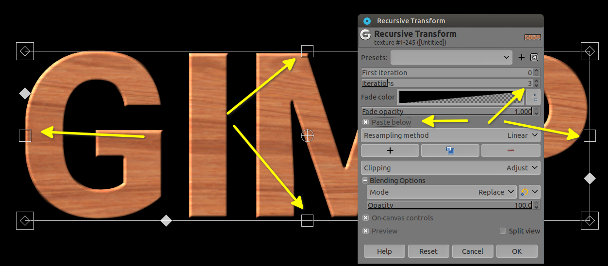
Move the 4 handles toward the center (inside) by 1 pixel, big max 2 pixels only, to the guides (or take reference to the top and left ruler), more you zoom-in more precise you will be! (when you zoom-in, you can hit the [Tab] key on your keyboard to get a bigger canvas space, just hit the [Tab] key again to get your tools back, [Tab] key act as a toggle switch)
Once you've move the 4 handles, don't click OK, yet > move the "Iterations" slider at full throttle = 20 > re-adjust handles if necessary to get a smooth extrusion, then click OK
You're Done!

Result
Image

As always, If you are the OP of this text effect and did use a different method, please feel free to add it, it would be interesting to know how far or closed I was.
If someone has a faster, simpler, or just a different method, please share as well, it's always interesting to know that there are multiple ways. :bigthup


To be Continued...

_________________
Patrice


Top
 Post subject: Re: Decoding your texts
PostPosted: Fri Dec 03, 2021 3:36 am  (#30) 
Offline
GimpChat Member
User avatar

Joined: May 24, 2021
Posts: 778
Location: SEA - South East Asia
No, no, no... I did not forget this thread :mrgreen:

Reproducing Issabella's #302 wooden text (with a slight variation).

Still in a wooden text mode, but this time the face is quite different from the previous post and there is more work and complexity on the text's face with the Issabella's wooden text.
We will need to do a "special" map for that "rounded" effect on the top and I hope you will enjoy the tiny trick I'll show you to do a "rounded map" (it's when I shrink 5 pixels).

Without any further do let's get started

New image...
Black Background layer

1) Create wood texture
Wood texture (2 layers named fiber and plank)
Prepare you FG/BG colors
FG = f2e1cd
BG = daaa82

New Layer (fiber)
Fill with FG color > Then Filters / Noise/ClE lch Noise.. > Then > Filters / Distorts > Wind... (strength 60+)
New Layer (plank)
Gradient FG to BG (RGB) > Bilinear > Repeat Sawthooth Wave
Image
Warp transform tool > Move Pixels > Size ~300 > Hardness/Strength ~78 > spacing 1 to 5 > Interpolation Linear > Abyss policy Clamp (to not have transparent areas in the image) >
make a mess by moving the warp tool everywhere
Then right to left and vice-versa (like my previous post) with the Warp transform tool.
Then put this layer in mode Multiply
Image

Right click > New from Visible
Un-tick "fiber" and "plank" (no need anymore)

2) Textured text:
Text tool > write GIMP > then right click > Alpha to selection
Select/Save to channel > Then un-tick visibility of this text layer and the black BG layer
Select the layer "Visible" > Add mask > window opens > Tick "Selection"
Right click on it in the layer stack > New from visible > rename that new layer "wood extrusion" >
Duplicate it > name the duplicate "wooden bump" > make sure it is just above layer "wood extrusion" (it shall be)
Then un-tick visibility of these 2 layers and tick back the black BG layer

Just to be sure you've followed this rightly until now: Selection is still active, and the layer "wooden bump" is still selected (even though you did un-tick the eyes!! )

3) Map:
Create New layer (name it B&W map) -> thus "B&W map" should be above "wooden bump"
Then > Select / Shrink... > 10 pixels
Select / Save to channel (name channel "shrink 10")
Then go back on the last layer > Select / Border... > 10 pixels
Select / Save to channel (name channel "border 10")

Go back to the "B&W map" layer > fill selection with white
then Select/Invert > Fill with black
Select / None
Then Filters/Blur/Gaussian blur X and Y at 5.50
Then go back to channel dialog > select "border 10" channel (don't tick the eye, just select it), then Channel to selection (button at the bottom of the channel's dialog or right click on the "border 10" channel)

Go back to the layer "B&W map"
Select/Invert
Select/Shrink 5 pixels > fill with black color
Select/None
Un-tick the visibility (we don't need it to be visible)
Now we have a nice map to render bumpy rounded effect
Attachment:
the final map.jpg
the final map.jpg [ 37.6 KiB | Viewed 1180 times ]


Go to layer "wooden bump" and make it visible
So by now, as visible layer you should have only the black backGround and this one (wooden bump) > select the later(wooden bump)
Filters/Map/Bump map... > Aux Input select the layer "B&W map"> Type Linear > Compensate is ticked > Azimuth 135 > elevation 45 > Depth 25 > Ambiant lithing factor 0.444
Image
Then un-tick its visibility

4) Extrusion
Go to the layer just below, it is called "wood extrusion" > Make it visible
Layer/ Crop to content (important, also now you should have ONLY this layer and the BG layer as visible!)
Creat a Layer Group name it "extrusion" > Mode "Passthrough"
put the layer "wood extrusion" inside the Layer group
Duplicate 25 times the layer "wood extrusion"
Alignment tool > Select the wooden word "GIMP" a bit larger than the "writing" > Relative to Active layer > Offset x 1 > Offset Y -1 > Then in "Distribute" click on the arrow pointing to the right > then the arrow pointing to the top
Merge those 25 layers by selecting the layer group and Shift+Click on the merge icon at the bottom of the layer stack (it will merge all the group in 1 layer)
Image

Extrusion is done
Select the layer above (wooden bump) and make it visible as well (align it if necessary to fit the top of the extrusion, but you should not need to do it)

Optional on the layer "wooden bump":
Filters/Light and shadow/Long shadow... > Style Finite > Angle -20 > Length ~2 > Opacity ~75

Change the color of the background layer / or put a gradient or a pattern to your liking
Optional 2: you can add a "Map displace..." of 1 pixel Horizontal/Vertical using the "B&W map" on the "wooden bump" layer and a drop shadow on the layer "wood extrusion"

5) Result:
Attachment:
wooden text 5 rounded bump map.jpg
wooden text 5 rounded bump map.jpg [ 246.17 KiB | Viewed 1180 times ]


As always, If you are the OP of this text effect and did use a different method, please feel free to add it, it would be interesting to know how far or closed I was.
If someone has a faster, simpler, or just a different method, please share as well, it's always interesting to know that there are multiple ways. :bigthup


To be Continued...

_________________
Patrice


Top
Post new topic Reply to topic  [ 30 posts ]  Go to page 1, 2  Next

All times are UTC - 5 hours [ DST ]


* Login  


Powered by phpBB3 © phpBB Group