[Filters/Colours] I feel like such a fool. Please help.
Thu Dec 31, 2020 2:30 am
GIMP Version: 2.10.22
Operating System: Windows
OS Version: Windows 10, updated
GIMP Experience: Basic Level
Hello! I realise this is a very silly question but I am at my wit's end, so please bear with me and help a struggler out.
I created a logo for my art business in GIMP. (I did struggle making the text outline show up, so in the end I made the background grey and called it a day. I followed the instructions on several tutorials but I believe they weren't up to date with the version I'm using.)
Foolishly, I didn't save the stages or remember how I did it. (Woe! Alas!) I don't even have the logo saved as xcf, somehow. I am fairly certain I did it in GIMP (although I do literally have a brain disorder so... it could have been fairies. But I doubt it.)
Of course, now I need variations on my logo. The only reasonable way to do it is to start from scratch.
I do have the barest beginning stage saved, which is handy as I remember that being a bit of a pain. Fortunately the whole logo creation wasn't terribly complicated- trying to recreate it is much worse.
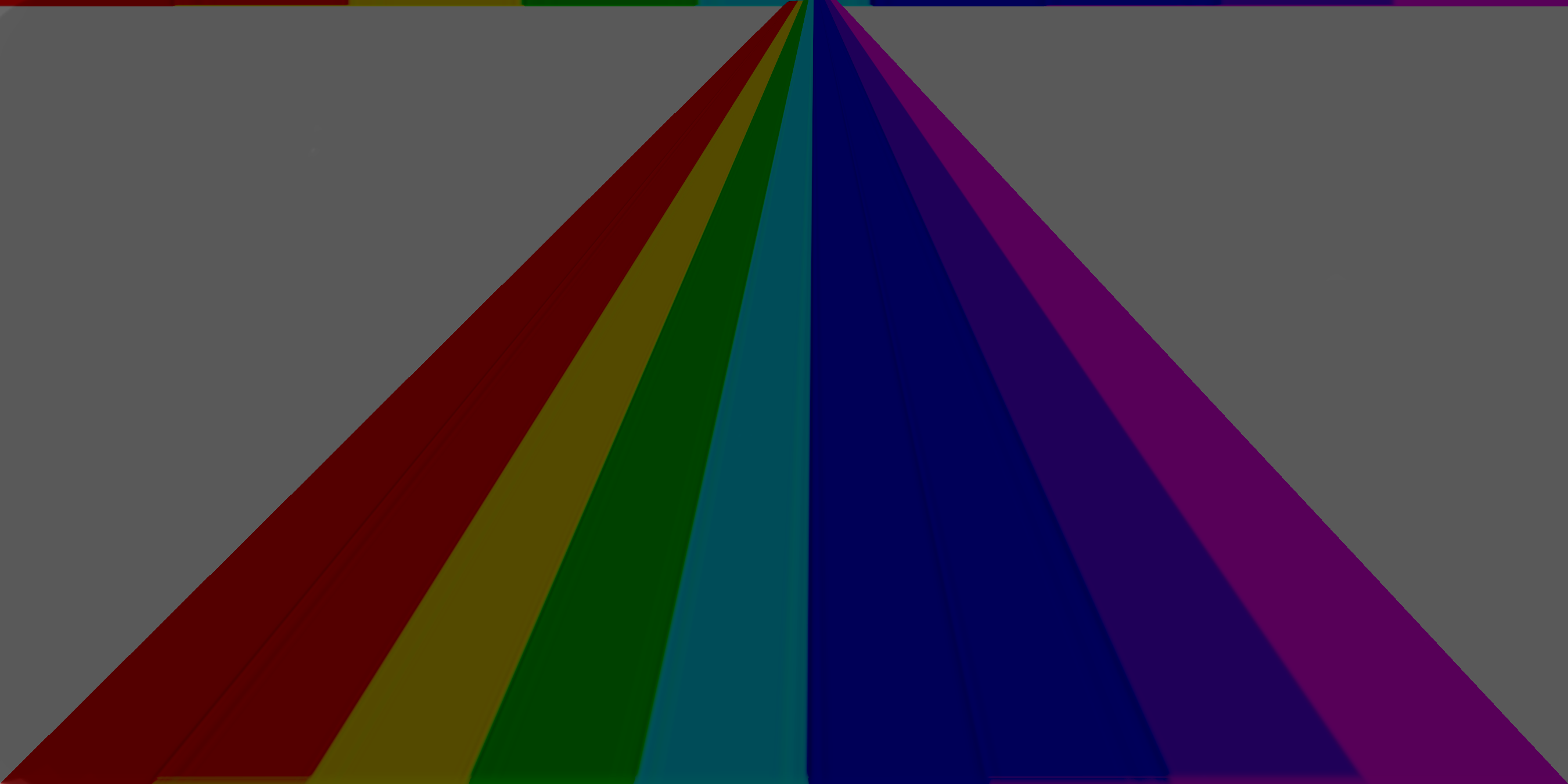
I include the logo and the stage I began with.
My questions are these: What filter(s) or colour settings could I possibly have used to get from "bright rainbow" to "dark rainbow with neon lines"? I distinctly remember mucking around with the filters and that until I found something that made me happy. I didn't change any parameters as I didn't know what I was doing. I definitely didn't use more than two, if I even used two.
Sadly, I do realise that GIMP is specifically designed to create infinite outcomes. So if no one has any bright ideas I understand. I was just hoping the old hands would see my error.
Of course, I'm also open to other suggestions to deal with this, like a way to remove the text from the original logo, etc.
Thank you so much!
Operating System: Windows
OS Version: Windows 10, updated
GIMP Experience: Basic Level
Hello! I realise this is a very silly question but I am at my wit's end, so please bear with me and help a struggler out.
I created a logo for my art business in GIMP. (I did struggle making the text outline show up, so in the end I made the background grey and called it a day. I followed the instructions on several tutorials but I believe they weren't up to date with the version I'm using.)
Foolishly, I didn't save the stages or remember how I did it. (Woe! Alas!) I don't even have the logo saved as xcf, somehow. I am fairly certain I did it in GIMP (although I do literally have a brain disorder so... it could have been fairies. But I doubt it.)
Of course, now I need variations on my logo. The only reasonable way to do it is to start from scratch.
I do have the barest beginning stage saved, which is handy as I remember that being a bit of a pain. Fortunately the whole logo creation wasn't terribly complicated- trying to recreate it is much worse.
I include the logo and the stage I began with.
My questions are these: What filter(s) or colour settings could I possibly have used to get from "bright rainbow" to "dark rainbow with neon lines"? I distinctly remember mucking around with the filters and that until I found something that made me happy. I didn't change any parameters as I didn't know what I was doing. I definitely didn't use more than two, if I even used two.
Sadly, I do realise that GIMP is specifically designed to create infinite outcomes. So if no one has any bright ideas I understand. I was just hoping the old hands would see my error.
Of course, I'm also open to other suggestions to deal with this, like a way to remove the text from the original logo, etc.
Thank you so much!
Re: [Filters/Colours] I feel like such a fool. Please help.
Thu Dec 31, 2020 3:18 am
I made another layer with the color 'HTML notation 595959' . The eyedropper tool next to that box will find the color.
Then I used 'Burn' for the layer mode above the layers and merged it down.
You still need to add the highlight lines.
Cheers.
Re: [Filters/Colours] I feel like such a fool. Please help.
Thu Dec 31, 2020 4:44 am
Hi tl_Art:
We've all done this when strarting out so no need to feel foolish about it!
My take is very similar to Taz:
I wondered if you began with an outline (white or light grey) of the rainbowed pyramid and then filled each section with your rainbow colours. That would have given you the basic effect. Perhaps you added the text layer next?
Then adding the grey filled layer below is probably what you did next.
Now if you somehow changed the mode of the logo layer to 'Multiply' (moving the mouse scroll wheel whilst over the Mode bar in the layers dock can do this) it would give the result that you ended up with - give or take a mouse whisker.
My mock-up uses the text grabbed from your original final logo overlaid onto your downloaded rainbow.
I added a layer for the (white) lines and set that mode to 'overlay' to achieve the neon look.
I added a grey filled layer as the bottom layer and changed the mode of the rainbow to 'multiply'.
Of course your original would have had only three layers; The text layer, the logo layer (white lines filled with colours) and the grey fill layer.
We've all done this when strarting out so no need to feel foolish about it!
My take is very similar to Taz:
I wondered if you began with an outline (white or light grey) of the rainbowed pyramid and then filled each section with your rainbow colours. That would have given you the basic effect. Perhaps you added the text layer next?
Then adding the grey filled layer below is probably what you did next.
Now if you somehow changed the mode of the logo layer to 'Multiply' (moving the mouse scroll wheel whilst over the Mode bar in the layers dock can do this) it would give the result that you ended up with - give or take a mouse whisker.
My mock-up uses the text grabbed from your original final logo overlaid onto your downloaded rainbow.
I added a layer for the (white) lines and set that mode to 'overlay' to achieve the neon look.
I added a grey filled layer as the bottom layer and changed the mode of the rainbow to 'multiply'.
- TLA_Layers.jpg (42.39 KiB) Viewed 1546 times
- TLA_Logo.jpg (259.72 KiB) Viewed 1546 times
Of course your original would have had only three layers; The text layer, the logo layer (white lines filled with colours) and the grey fill layer.
Re: [Filters/Colours] I feel like such a fool. Please help.
Thu Dec 31, 2020 5:36 am
Skinnyhouse wrote:Hi tl_Art:
We've all done this when strarting out so no need to feel foolish about it!
My take is very similar to Taz:
I wondered if you began with an outline (white or light grey) of the rainbowed pyramid and then filled each section with your rainbow colours. That would have given you the basic effect. Perhaps you added the text layer next?
Then adding the grey filled layer below is probably what you did next.
Now if you somehow changed the mode of the logo layer to 'Multiply' (moving the mouse scroll wheel whilst over the Mode bar in the layers dock can do this) it would give the result that you ended up with - give or take a mouse whisker.
My mock-up uses the text grabbed from your original final logo overlaid onto your downloaded rainbow.
I added a layer for the (white) lines and set that mode to 'overlay' to achieve the neon look.
I added a grey filled layer as the bottom layer and changed the mode of the rainbow to 'multiply'.
Of course your original would have had only three layers; The text layer, the logo layer (white lines filled with colours) and the grey fill layer.
I certainly could do this except that I don't know how to make outlines in GIMP. (Very embarrassing!) I've been using it for quite a long time but only for a few simple things that I'm very familiar with that other programs just can't handle. I shall go and muck about some more and pull in a tutorial or two!