GIMP Version: 2.10.12
Operating System: Windows
GIMP Experience: New User

I have a lot of fancy fonts but they are unusable with "text along a path".
How to choose a font to have a correct result?
| GIMP Chat http://gimpchat.com/ |
|
| [ solved] fonts's choice http://gimpchat.com/viewtopic.php?f=8&t=17576 |
Page 1 of 1 |
| Author: | level_0 [ Thu Jul 11, 2019 12:55 am ] |
| Post subject: | [ solved] fonts's choice |
GIMP Version: 2.10.12 Operating System: Windows GIMP Experience: New User I have a lot of fancy fonts but they are unusable with "text along a path". How to choose a font to have a correct result? |
|
| Author: | Konstantin [ Thu Jul 11, 2019 2:09 am ] |
| Post subject: | Re: fonts's choice |
define: fancy define: unusable (why ?) |
|
| Author: | Blighty II [ Thu Jul 11, 2019 2:13 am ] |
| Post subject: | Re: fonts's choice |
Could you attach one of the unusable fonts here. A free one, not a commercial one. |
|
| Author: | level_0 [ Thu Jul 11, 2019 2:44 am ] |
| Post subject: | Re: fonts's choice |
Konstantin wrote: define: fancy define: unusable (why ?) Konstantin,I will put some examples because not done screenshots yet because not easy to explain with words |
|
| Author: | level_0 [ Thu Jul 11, 2019 2:46 am ] |
| Post subject: | Re: fonts's choice |
Blighty II wrote: Could you attach one of the unusable fonts here. A free one, not a commercial one. Blighty,I only have free fonts. I'll put some in the day because now I'm going to leave |
|
| Author: | level_0 [ Thu Jul 11, 2019 4:42 am ] |
| Post subject: | Re: fonts's choice |
Some fonts: yesteryear https://fonts.google.com/?query=yesteryear Luckiest Guy: https://fonts.google.com/specimen/Luckiest+Guy LainieDaySH: https://fontzone.net/font-details/lainiedaysh KG Shake it Off Popped https://www.dafont.com/de/kg-shake-it-off.font KG Who Tells Your Story: https://www.dafont.com/fr/search.php?q= ... Your+Story Ink Free: https://www.cufonfonts.com/font/ink-free and the results with a very simple path and vary the spacing of the letters does not improve: 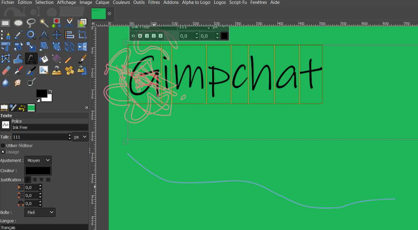 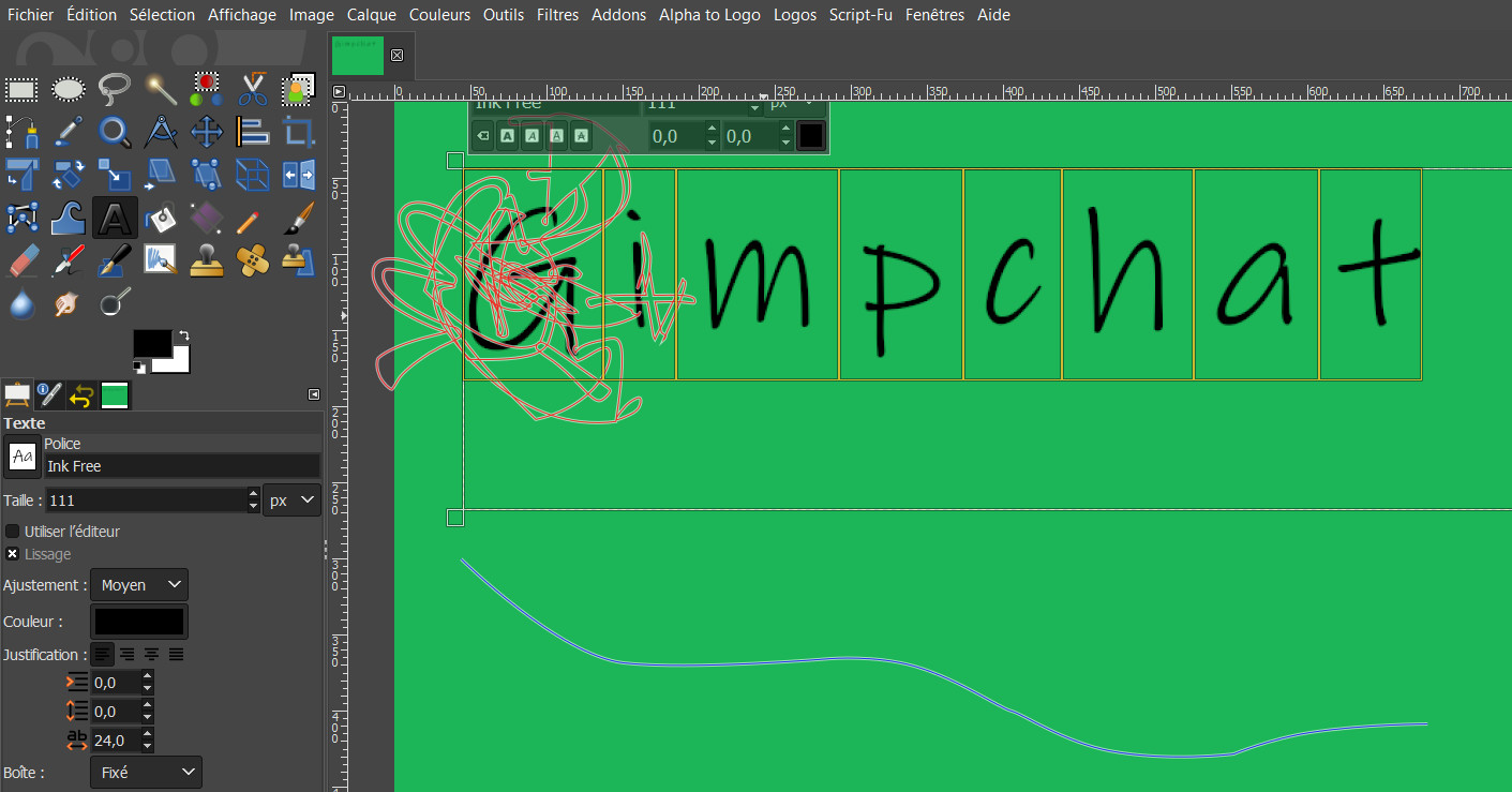 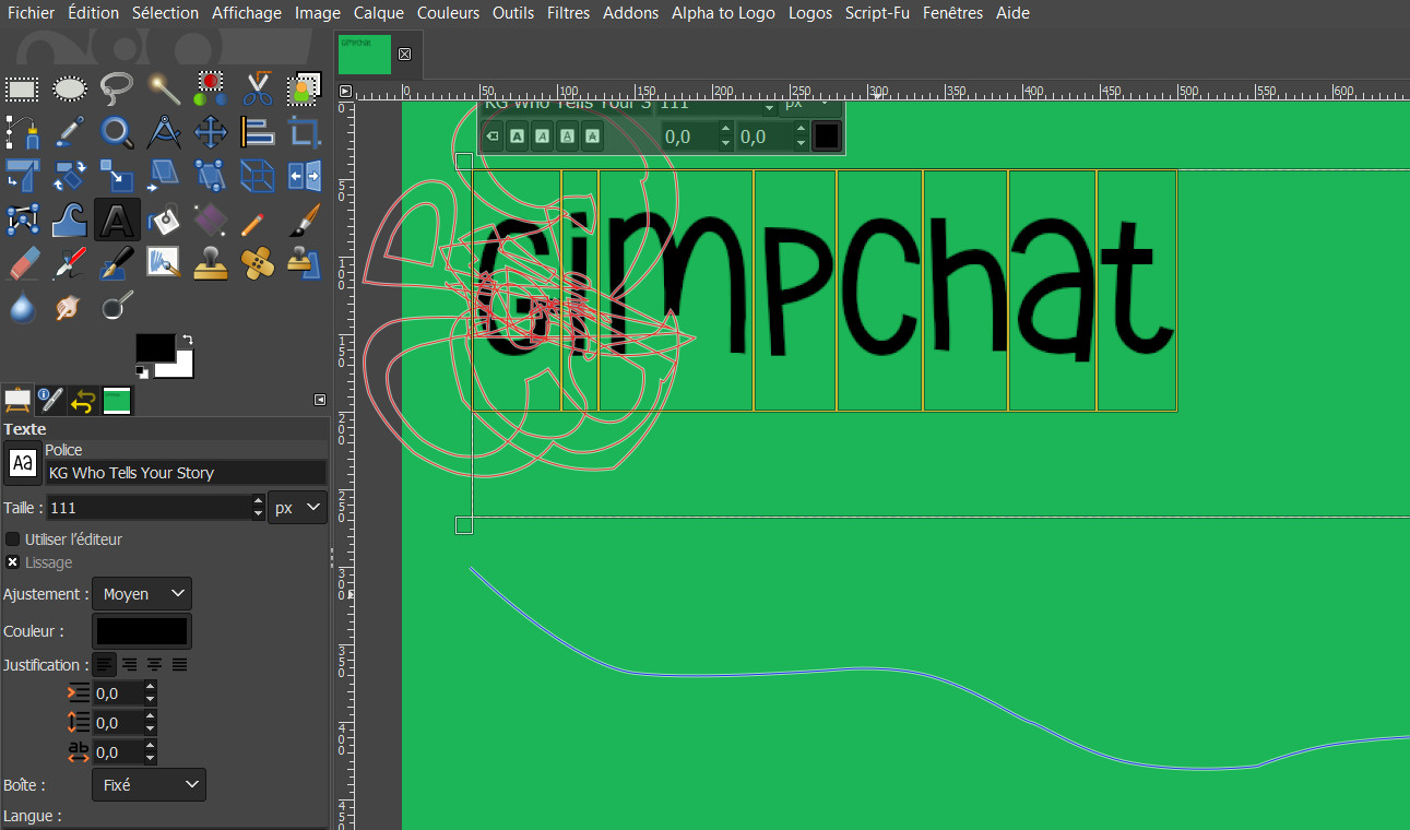 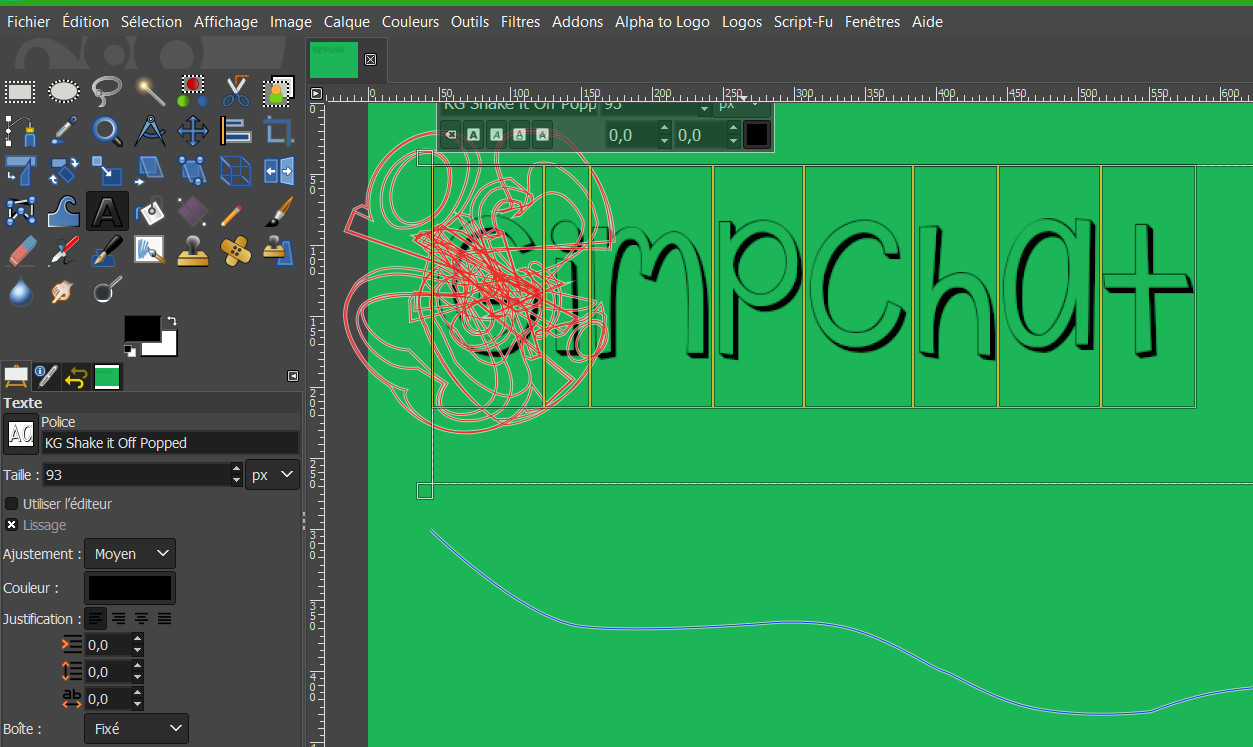 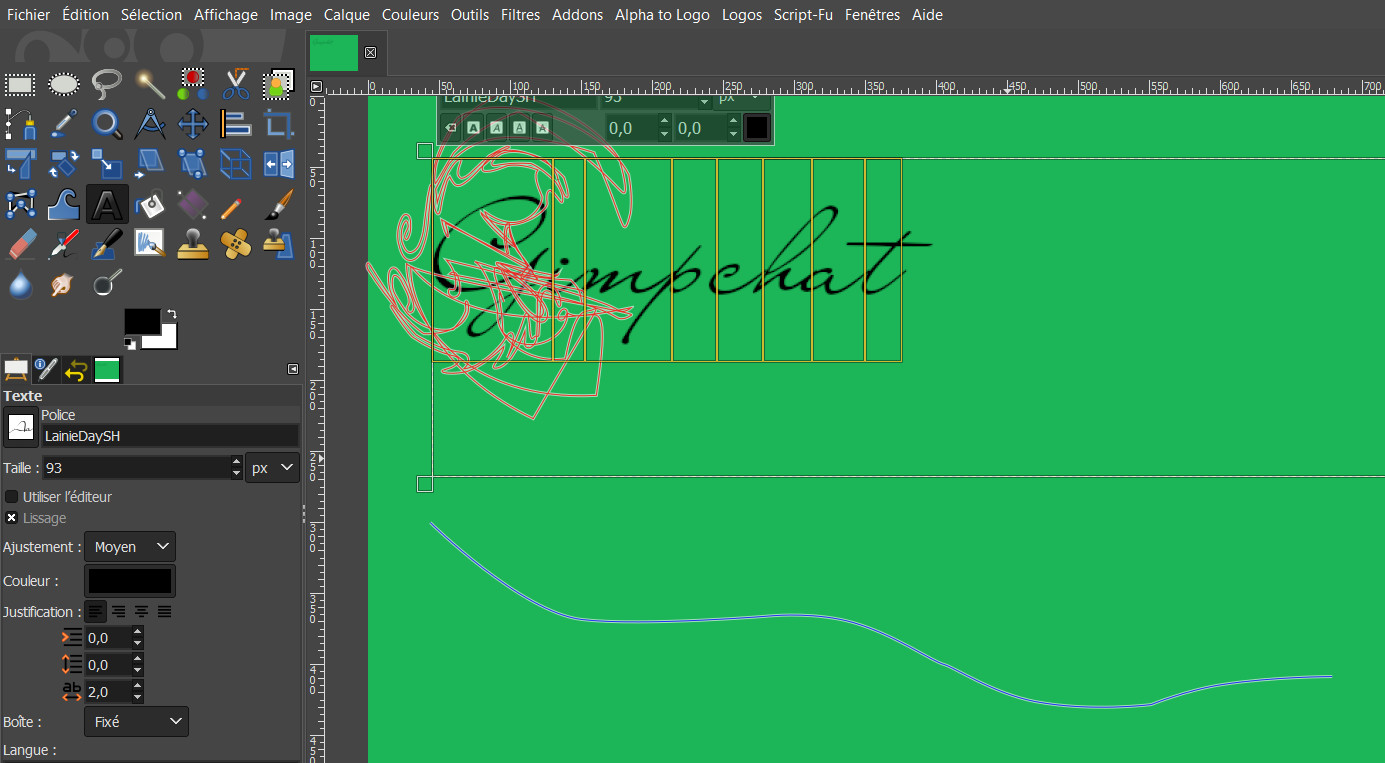 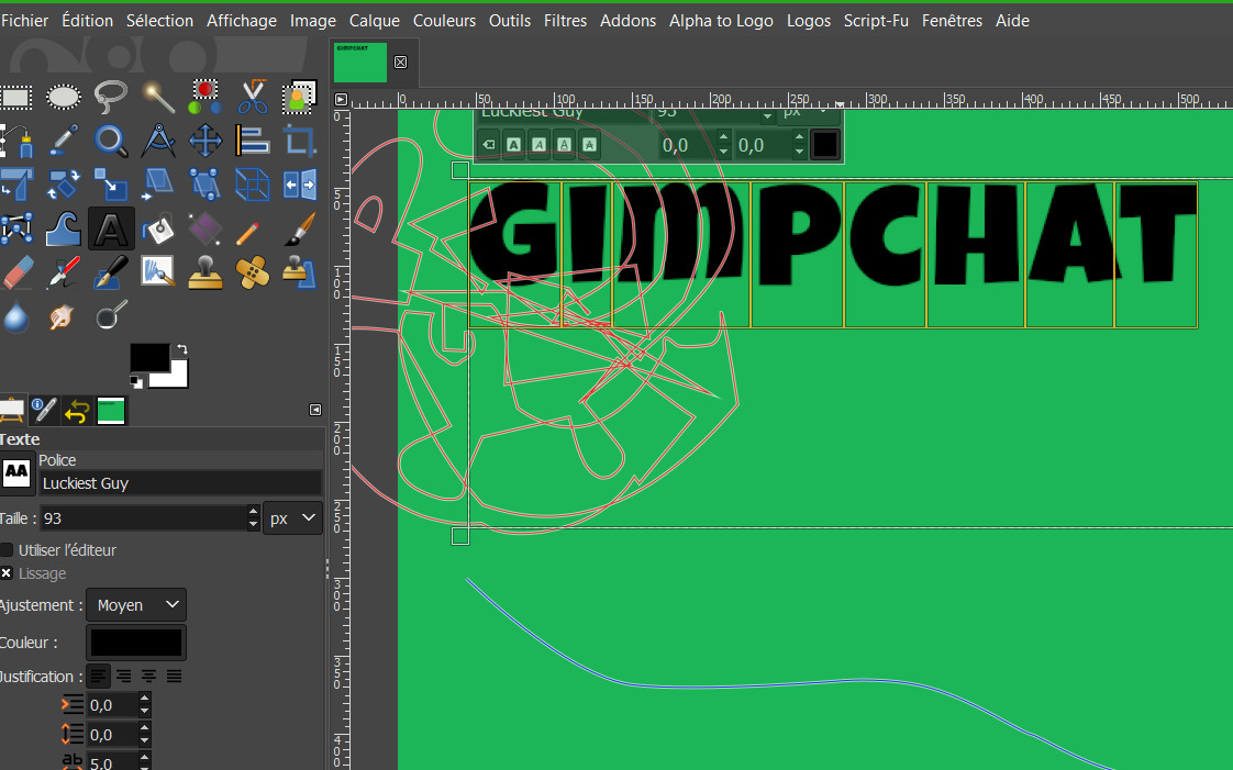 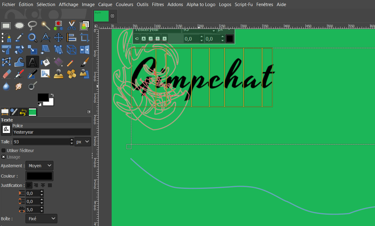
|
|
| Author: | Konstantin [ Thu Jul 11, 2019 5:25 am ] |
| Post subject: | Re: fonts's choice |
this is not expected behaviour and i don think its because of the font do you have more than one path in your paths-tab ? try making an elliptical selection, convert it into a path and put the text on the circle |
|
| Author: | Nidhogg [ Thu Jul 11, 2019 5:25 am ] |
| Post subject: | Re: fonts's choice |
Agree with Konstantin, Gimp 2.10.12 Windows10. Used the Inkfree font. Built-in Text along Path. 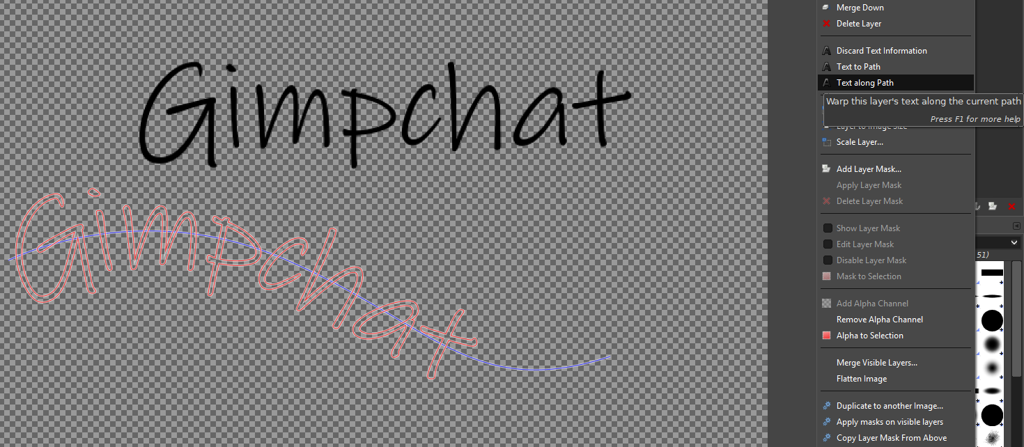 ofn-text-along-path.py 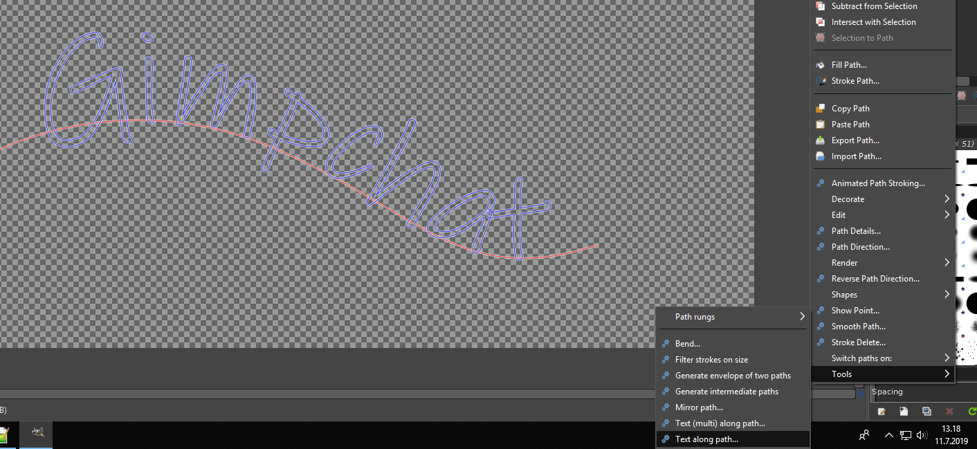
|
|
| Author: | rich2005 [ Thu Jul 11, 2019 6:56 am ] |
| Post subject: | Re: fonts's choice |
You really need the paths dialogue open to see what happens. Example: Attachment: 01-along.jpg [ 84.72 KiB | Viewed 2403 times ] Make some text (1) and an active path (2) The text along path produces a new path (3) Attachment: 02-along.jpg [ 73.25 KiB | Viewed 2403 times ] Some new text (or the same as before) (4) The active path (5) is now the path created from the previous text-along-path (or probably from a Text-to-Path) and the new text is rendered on that path (6) In this case trying to use a 'A' and 'L' You need to change the active path to something suitable. |
|
| Author: | ofnuts [ Thu Jul 11, 2019 7:19 am ] |
| Post subject: | Re: fonts's choice |
Your weird results come from your using the text path as the "path". In Text-Along-Path, you use the current text layer, and give the "guide" path (no need to do text-to-path first). |
|
| Author: | level_0 [ Thu Jul 11, 2019 11:34 am ] |
| Post subject: | Re: fonts's choice |
I think I had to make a mistake as indicated by ofnuts and although having only one path in the paths tab, it had to stay in memory. But now it's over 
|
|
| Page 1 of 1 | All times are UTC - 5 hours [ DST ] |
| Powered by phpBB © 2000, 2002, 2005, 2007 phpBB Group http://www.phpbb.com/ |
|