Hi tl_Art:
We've all done this when strarting out so no need to feel foolish about it!
My take is very similar to Taz:
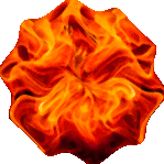
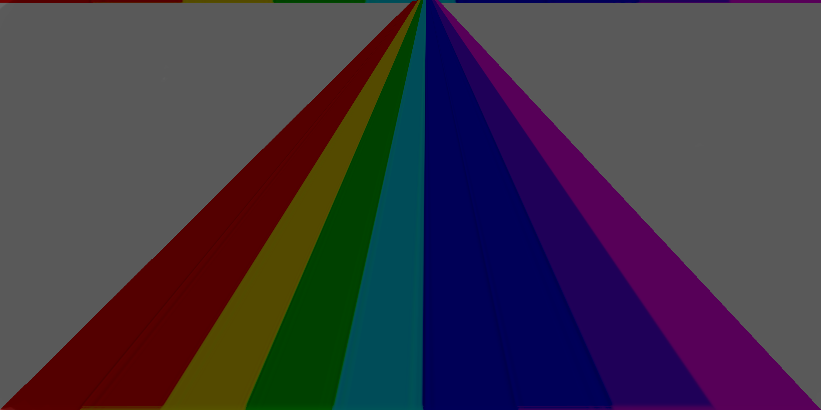
I wondered if you began with an outline (white or light grey) of the rainbowed pyramid and then filled each section with your rainbow colours. That would have given you the basic effect. Perhaps you added the text layer next?
Then adding the grey filled layer below is probably what you did next.
Now if you somehow changed the mode of the logo layer to 'Multiply' (moving the mouse scroll wheel whilst over the Mode bar in the layers dock can do this) it would give the result that you ended up with - give or take a mouse whisker.
My mock-up uses the text grabbed from your original final logo overlaid onto your downloaded rainbow.
I added a layer for the (white) lines and set that mode to 'overlay' to achieve the neon look.
I added a grey filled layer as the bottom layer and changed the mode of the rainbow to 'multiply'.
Attachment:
 TLA_Layers.jpg [ 42.39 KiB | Viewed 1548 times ]
Attachment:
 TLA_Logo.jpg [ 259.72 KiB | Viewed 1548 times ]
Of course your original would have had only three layers; The text layer, the logo layer (white lines filled with colours) and the grey fill layer.
_________________
"Let no one steal your dreams."
Paul Cookson
Latest plug-in update: Paragrapher v.1.4
Custom Font Links
Tools
Character Paths
White Bases