Quote:
Everyone says to upload 300 resolution covers to Kindle Direct Publishing. So was I supposed to lower the resolution for the 200X302 you referred to? And anyway, once Amazon has a cover (and I submit a 1838X2775 .jpg)
I see the blurb on requirements here
https://kdp.amazon.com/en_US/help/topic/G200645690 300dpi is correct
For size says
To ensure the best quality...the height...at least 2,500 pixels. Ideal dimensions for cover files are 2,560 x 1,600 pixels so at 1838 x 2775 pix you are ok for height.
Quote:
I have no say about resizing. (Kindle Direct Publishing does accept .png files. But I always think .jpgs are more flexible for re-sizing. Think it might be better to submit a .png?)
You have plenty of scope for exporting
Quote:
..Your cover image must be less than 50MB
File types mentioned are jpeg and tif. An uncompressed tif will be a lot larger than a jpeg maybe about 15 MB but if a png is acceptable, much preferable where text is involved than a jpeg and might be 1.5 MB-ish.
Amazon again
For the best results, upload your images with minimal compression A png while compressed is a lossless compression, do not worry about that.
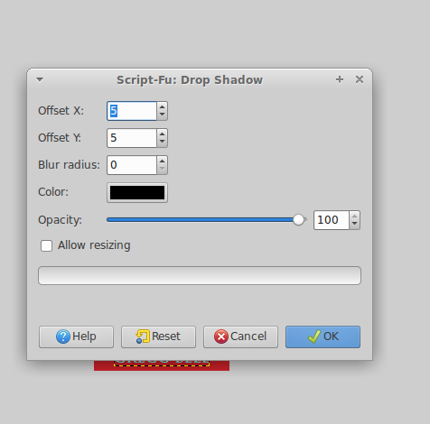
Quote:
And I was very careful about not over-resizing or over-exporting when I made the file. I have seen problems with red in other Amazon thumbnails. I really do think the problem is on their end. But I'll try Wallace's dropshadow suggestion and see if that helps.
Very careful not over-resizing is a dubious policy. Start off with correct size is better

Hope the tweaks work, best of luck