Oregonian, I am very glad to hear that you've got things working. I really appreciate everybody's help with this beta software. I realize how inconvenient it is to keep updating versions and how frustrating it can be when things don't work correctly. Many thanks to all.
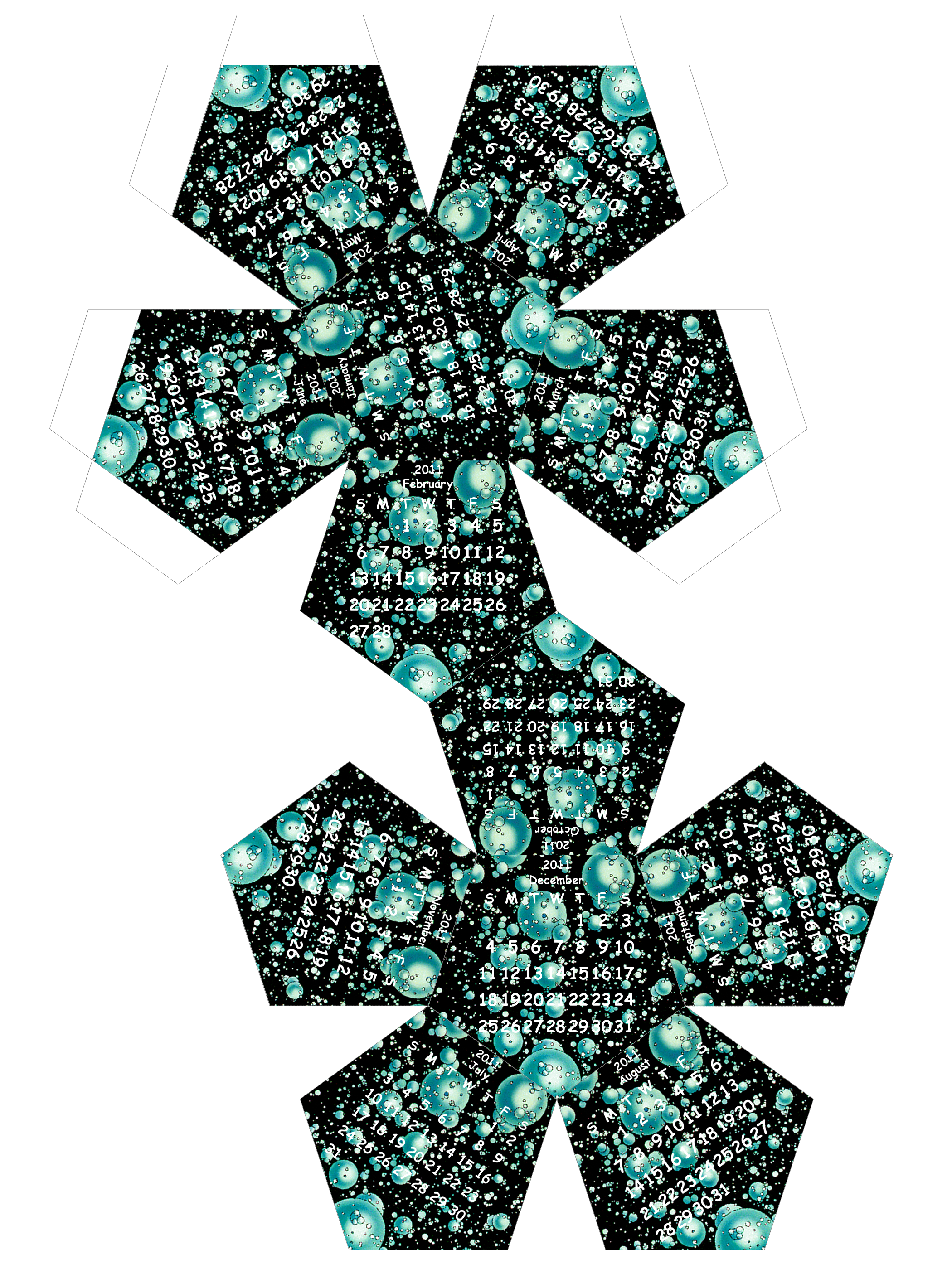
I have released a new version of the Platonic Calendar script with some minor changes. I fixed a memory leak and corrected the behavior of the facet image so that it uses the bottom twelve layers if there are more than twelve -- before it would incorrectly use the top twelve layers with the twelfth one from the top being January (this was not a problem if there were twelve or fewer layers).
The script also makes sure to ignore any selection that might exist in the facet image. I am thinking that maybe Oregonian's difficulty was caused by her having a selection present and this was messing up things as I copied the layers over. Anyway, now this should not cause problems.
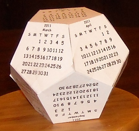
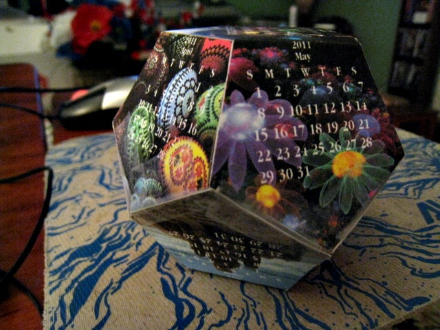
Mahvin, that is wonderful! I am more of an engineer than an artist so it is especially satisfying to me when I get to see the script used as I'd hoped, but lack the aesthetic mentality to accomplish myself. I would very much appreciate seeing a photo of your final meatspace result (perhaps with permission to post it on my wiki?).
Bob63, thank you for the information on paper sizes. I will try to figure out the correct dimensions to use this weekend. I will leave the script setting being specified in pixels, but will try to produce a table of various edge lengths and the corresponding paper size.
The script seems to be close to final. This weekend I will be tweaking the banner layout a bit (and perhaps add an option to place the month at the top and the year at the bottom), and I also want to change some of the internals so that the facet gets rendered at the same time as the month's calendar (this will eliminate a potential 1-pixel misalignment between the images and the folds). I also want to have the script create a selection from the alphas of all of the text layers. This will hopefully facilitate various schemes of providing contrast between the text and the images (such as outlining the text) or applying logo effects.
Here is a calendar I made using various historic GIMP splash screens. I used the alpha of the text layers as a selection mask to Value Invert the colors in the photos. The effect is not perfect, but it is better than having black text over a dark image. If I can figure out a good algorithm for ensuring high contrast for all backgrounds, I will probably add it as an option.


 and click on the calendar background area.