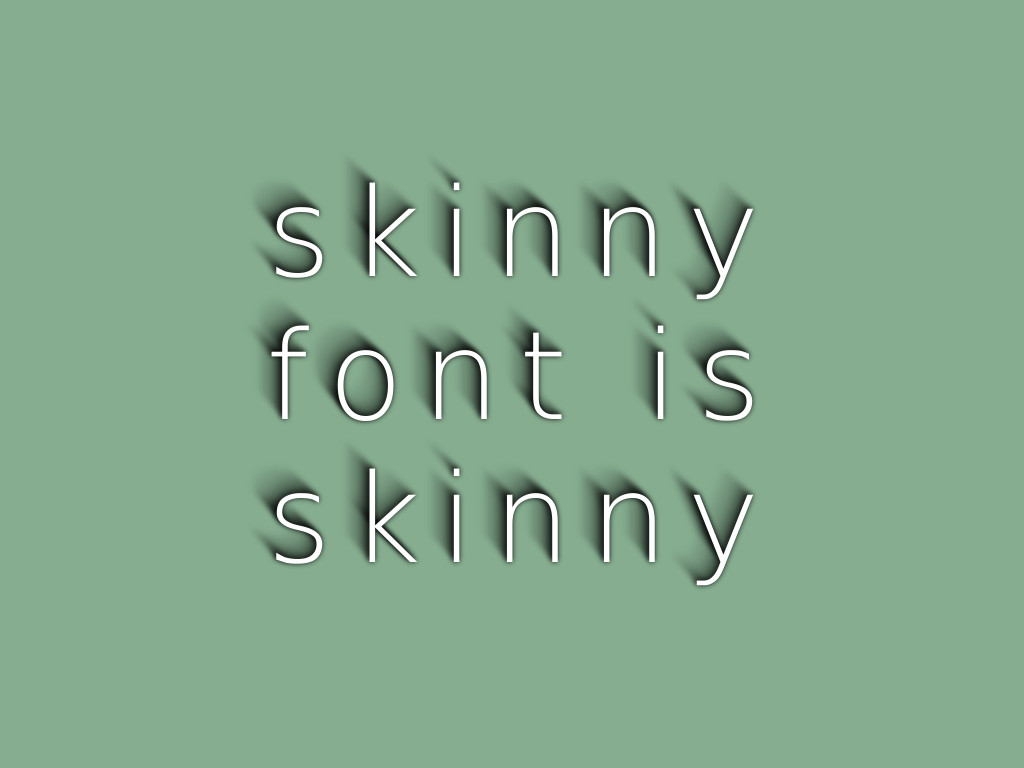
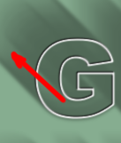
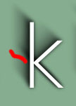
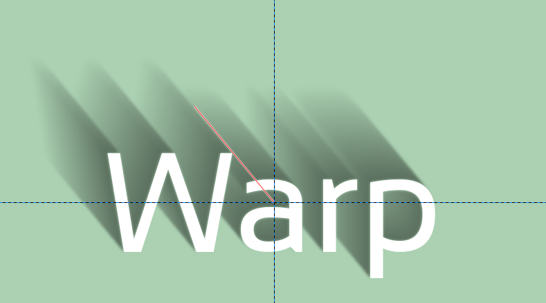
Not sure that will work with path-inbetweener alone... You will stroke things that aren't present in the shadow, you have to first edit the path to remove everything that can't cast a shadow, so if the shadow must extends towards the top left, you need to reduce the path to the red parts:
Attachment:
 PathForShadow.png [ 7.61 KiB | Viewed 3623 times ]
And while I was thinking about a way to algorithmically reduce that path, I found a possible other way to do this:
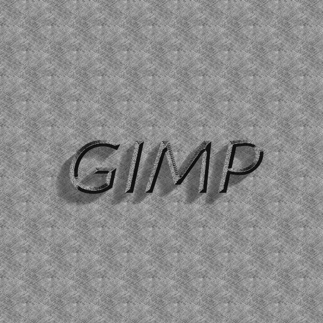
- set the text to white (temp layer), duplicate it and shift the duplicate in the direction of shadow
- set the top layer mode to difference: you get the outline of the text,only on the side of the shadow, while the rest of the text turns black
- add a layer mask, init to black and white copy of layer, and the black part become transparent, leaving you with just the outline.
- set alpha-lock and paint in black
- now the painful part: duplicate and shift this shadow several times, progressively reducing the opacity.
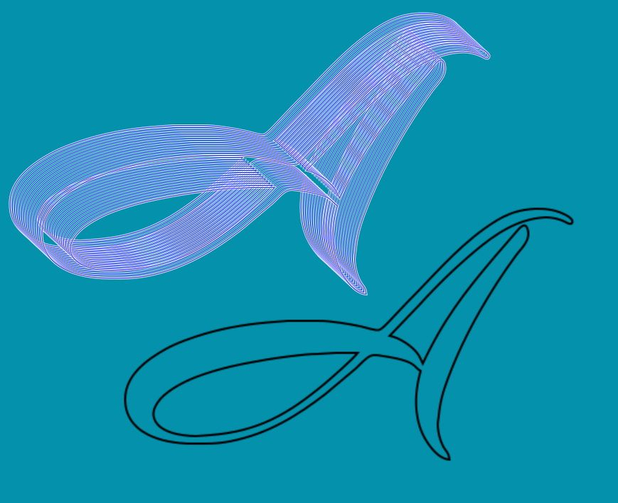
Sorry for the small demo, I continued on my example above:
Attachment:
 ShadowFromDifference.png [ 11.34 KiB | Viewed 3623 times ]