As abraess has asked about fonts, I'll include that in this part.
The gtkrc file controls the styling applied to GIMP. You first define a style, then apply it to the appropriate widgets (buttons, menus, rulers etc)
The gtkrc file I have made for Theme-Test looks like this so-far:
# pixmap_path "<dir 1>:<dir 2>:<dir 3>:..."
#
# include "rc-file"
#
# style <name> [= <name>]
# {
#   <option>
# }
#
# widget <widget_set> style <style_name>
# widget_class <widget_class_set> style <style_name>
# Here's a good reference to the pixmap engine: https://wiki.gnome.org/Attic/GnomeArt/Tutorials/GtkEngines/PixmapEngine
# GIMP Widgets: http://developer.gimp.org/api/2.0/libgimpwidgets/index.html
# Another guide to gtkrc: http://orford.org/gtk/

# Named colors from https://www.ncl.ucar.edu/Document/Graphics/named_colors.shtml
# colour control: https://wiki.gnome.org/Attic/GnomeArt/Tutorials/GtkThemes/SymbolicColors
gtk_color_scheme = "fg_color:midnightblue"
gtk_color_scheme = "bg_color:hotpink"
gtk_color_scheme = "base_color:cadetblue"
gtk_color_scheme = "text_color:palegreen"
gtk_color_scheme = "selected_bg_color:slateblue"
gtk_color_scheme = "selected_fg_color:sienna1"
gtk_color_scheme = "tooltip_bg_color:green"
gtk_color_scheme = "tooltip_fg_color:black"

# darker is equivalent to shade(0.7, colour)
# lighter is equivalent to shade(1.3, @bg_color)
style "gimp-default-style"
{
  # bg is the background
  bg[NORMAL]      = @bg_color
  bg[ACTIVE]      = shade (1.8, @bg_color)
  bg[PRELIGHT]      = lighter (@bg_color)
  bg[INSENSITIVE]   = lighter (@bg_color)
  bg[SELECTED]      = shade (1.8, @bg_color)

  # fg is foreground - i.e. font colour
  fg[NORMAL]      = @fg_color
  fg[ACTIVE]      = shade (1.8, @fg_color)
  fg[PRELIGHT]      = lighter (@fg_color)
  fg[INSENSITIVE]   = lighter (@fg_color)
  fg[SELECTED]      = shade (1.8, @fg_color)

  # base is the background for editable text
  base[NORMAL]      = @base_color
  base[ACTIVE]      = shade (1.8, @base_color)
  base[PRELIGHT]   = lighter (@base_color)
  base[INSENSITIVE]   = lighter (@base_color)
  base[SELECTED]   = darker (@base_color)

  # text is the font colour of editable text
  text[NORMAL]      = @text_color
  text[ACTIVE]      = shade (1.8, @text_color)
  text[PRELIGHT]   = lighter (@text_color)
  text[INSENSITIVE]   = lighter (@text_color)
  text[SELECTED]   = shade (1.8, @text_color)

#  bg_pixmap[NORMAL] = "bg.png"
  font_name = "Vladimir Script 14"
}
class "GtkWidget" style "gimp-default-style"  # style everything that derives from a GtkWidget with the default style

include "rc_buttons.rc"
class "GtkButton"               style "buttons"

include "rc_menu.rc"
widget_class "*GtkMenu*"      style:highest "menu"

include "rc_tabs.rc"
class "GtkNotebook"             style "tabs"
widget_class "*<GtkNotebook>"       style "tabs" # this gets the toolbox tabs styled

include "rc_scrollbars.rc"
widget_class "*Scrollbar*"      style "scrollbars"   # this hits the window scrollbar and not the range scrolls
Note that comments start with a #
It starts by defining the gtk_color_scheme with named colour variables (fg_color, bg_color etc) and in this instance named colour values (midnightblue, hotpink etc)
By using colour variables we can re-use the name and only have to define the colour value once.
Colour values can be specified using
named colours or by using Hexadecimal numbers: #F00 #FF0000.
So for instance you could define bg_colour as gtk_color_scheme = "bg_color:#FF0000" to make it red. (Hex values are Red Green Blue).
Now we move onto the first style, which here is named "gimp-default-style", but could be named anything you want.
Here we are defining the colours for the style
bg - which is the background colour for most things
fg - which is the foreground colour for text labels etc.
base - which is the background colour for editable text
text - which is the foreground colour (font colour) for editable text
These are not the only uses for these colours - the best way to find out where they are used is to experiment by altering the colours and seeing what changes.
Each colour has five states defined
NORMAL - The usual state
PRELIGHT - The state when the mouse pointer is hovered over the widget
ACTIVE - When the widget is active i.e. being clicked on
INSENSITIVE - When the widget is disabled
SELECTED - When a widget is selected
Not all of these are used for every widget.
For each of the colours, I have defined the NORMAL colour to be the colours in the gtk_color_scheme. i.e. fg[NORMAL] = fg_color just to be consistant. There is nothing to stop you defining fg[NORMAL] = base_color.
For the other states I have defined the colours relative to the NORMAL color by using the shade, lighter and darker functions. A value of greater than 1 passed to the shade function will lighten the colour and a value less than 1 will darken the colour. The lighter and darker functions are just shorter ways of passing 1.3 and 0.7 to the shade function. Again, experiment to see what happens.
Now we have a style defined, we need to apply it to our widgets:
class "GtkWidget" style "gimp-default-style"
This will apply our style to every widget that is based on a GtkWidget, which should be most things. By being more specific about which widgets to apply the style to we can control the look of GIMP to quite a fine degree.
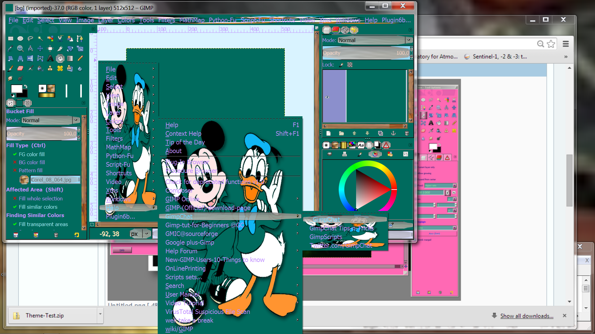
Now for abress, fonts.
If we add the following line to the gimp-default-style, then we will set the font for all of GIMP:
Alternatively with
font_name = "Vladimir Script 14"
I get this:
Attachment:
 gimp_fonts.png [ 217.62 KiB | Viewed 24799 times ]
Are there any questions?
Kevin
 Login
Login Register
 Tweets
 FAQ
FAQ Advanced Search


") Clearlooks Gimp 2.10 Color Hinted Themes
Clearlooks Gimp 2.10 Color Hinted Themes


 So now I've learned how the font descriptions work: