The ones from the first post look good. Maybe a little too soft, needs some harder edges here and there. But I'm probably wrong, grungy sigs are not really my thing.
Both the Hitman one and the Gears of War one are pretty cool and are good candidates for added depth. Put more focus on the focal by making the edges of the sig a bit darker and adding a light source (which I'm not very good at). You can also make the outer portions of the sig just a little blurry to make the focal appear sharper and to draw the eye to it.
I'm sorry if this is horribly offensive (or against the rules), let me know if you want it removed, but I took your GOW sig and added some of the elements I mentioned here:

Your name was a victim of blurring the background. Also cleaned up the color to make it less red/pink, made the fire brighter to take advantage of the "natural" light source, and added a border (the wrong border, but still).
I think this is the only one I noticed this in, but the text would have been better placed on the other side of the guy. There is a lot going on on the left side of the sig, but the right is fairly empty. You can balance out the flow by putting your name somewhere to the left of him. Do a search for "rule of thirds" and see if it gives you any ideas.
Hope this helps, you do a good job!


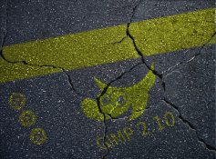
 New sig
 New one... Sorry for double posting, and I am really hopping for some comments on this.