|
| GimpChat Member |
Joined: Mar 08, 2011
Posts: 155
|
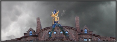
Brief intro: I only got into GIMP because I wanted to make awesome signatures like I've seen around the internet. I'm incapable of making awesome sigs, but they sometimes look okay. I started out doing GIMPtricks and GimpKnowHow's YouTube tutorials to familiarize myself with GIMP features, then dove right into making the sigs. I had this weird, self-indulgent idea of posting an "admire my work" thread somewhere on the world wide web when I had a lot of them made, but now that I have a lot, I feel weird for even thinking about posting them just so others can see. But what else am I going to do with them? I look at them all the time myself, I'm funny like that. However weird it might be, if anyone else wanted to take a peek, here we go and with commentary too! I can't help but to comment. I hope the table came out correctly: 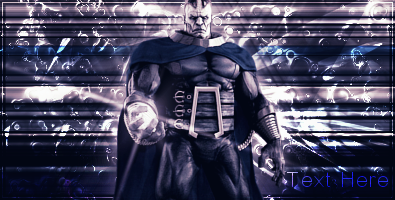 | One of my first "real" signatures, straight from a tutorial. Very plain and simple, but great practice. Learned some good stuff. | 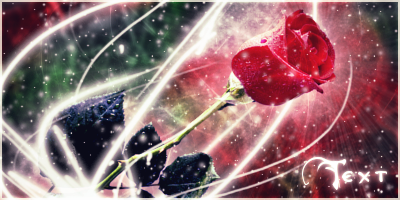 | Didn't turn out the way I'd pictured (they never do), but turned out well anyway. I wanted more glow around the rose, but if I'd done it right, it would have obscured the epic background. One of my favorites. | 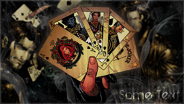 | Another throw-away sig, just for practice. It's enormous, and the Gambit on the right could have been moved over a bit, but it works. Finally put good use to the billions of smoke brushes I have! |  | Halloween sig made for a Signature of the Month contest in another forum. Simple sig but it won, I think because it was animated. Animated sigs appeal to my perfectionist and obsessive nature, lol. | 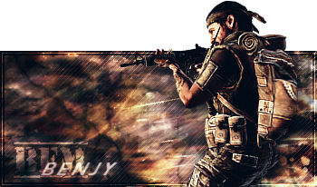 | The first person to request a sig from me. I hate this one. It's flat and brown and boring. And it's a pop-out sig, sigh. I warned him I was mostly experimenting and he says he likes it. Bleh. | 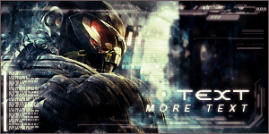 | Tiny sig made from a stock image rather than a render. Used a clipping mask that I can't seem to replicate. You can see it on the back of his head, his shoulder and the building by his face. Wish I could remember what brush I used, grrr. |  | Another SOTM contest, won this one too. Everyone hated the render. But this was a total fluke, I had no idea what to do and it just happened. They said the 2D-ness of it went with the render and think I'm good at making sigs for this. Ha! Another of my favorites though. | 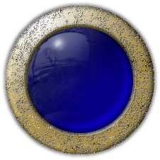 | Not a signature, but I love the "orbs" and the rusted metal was from a tutorial on the GUG site. Mine didn't turn out right, but still pretty cool. | 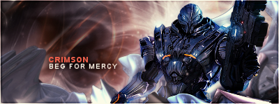 | Another sig request. I obsessed over ever imperfection in this one, and there are a lot. Technically, it's a terrible sig. Visually, it looks pretty clean and smooth. I'm okay with it  This was the first time I'd really done anything with depth in a signature. This was the first time I'd really done anything with depth in a signature. |  | Another SOTM sig. Didn't win this month, but got a few votes. Went overboard with the C4D images, looks like a tangled mess, but the lighting turned out well. More depth. | 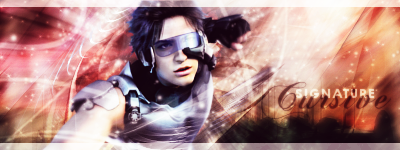 | Throw-away sig! Colors are nice and used a "space city" (google images) in the background. The city, which is that black blob, looks too blobby but it didn't look right when it was clear. | 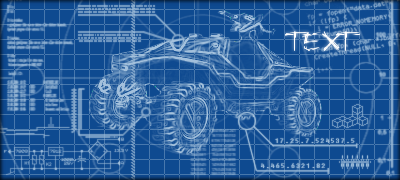 | Made from a jxtutorials video on YouTube. Went a little crazy with the tech brushes, but it adds to the chaotic blueprint feel. I think that's how people build things anyway, by cleaning up their chaotic ideas. | 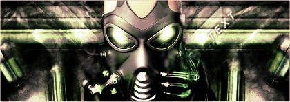 | I love this one. It's very simple and I'd planned on making it a tutorial for beginner sig makers, but it turns out tutorials are hard to make. But looks great for only using two brushes (a fuzzy brush and the vine brush, of all the silly things), two images and some effects. | 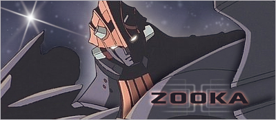 | Sig request from someone. He wanted a "Big O" signature, which is an animated show from like the 1800's. All the images were blurred and really bad quality, not really sig material. Had to clean up the jpegginess and and I didn't know what those gray things were, so I turned them into metal mountains. I think they're his arms... |  | And another SOTM sig and I won again, yay. This was a render contest, meaning we could only use the selected render and brushes, no other images. This one is really simple, the render sucked. | 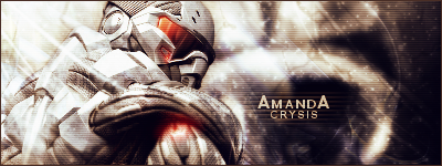 | And finally, my most recent sig, made for a sig contest here. And another Crysis sig, he's so dramatic looking over his shoulder like that! I did too many gradient map layers and it messed up the circle structure by his head. Yep, it was a circle before I got to it. And scan lines, haha. |
Thanks for looking!
|
|