merrak wrote:
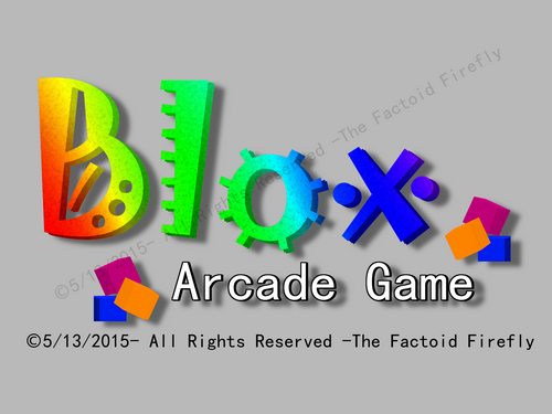
I think the updated version does a much better job showing what the game is. I don't think the 2-6 color rule needed here--although, I should have first asked what the purpose of the logo is. I imagined something like you would find on the front page of addictinggames.com.
Right now, making a splash screen isn't working so I might have to just use the logo, and I found-out that I can make the splash screen transparent SO just the logo might work.
Odinbc wrote:
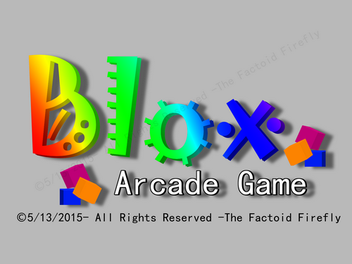
What I mean by limited palette; for a logo limit the palette to 2-6 colors max of the same shade. Gradients are fine but they should be primarily from the limited palette. A logo should also look good in grayscale. For logo layout try designing from the logo focal point out. For example (to test), if you set horizontal and vertical guides at the focal point expand a circle selection from centre to the outside edge to gauge symmetry or use a rectangle selection, either with rule of thirds guides (or one of the other selection guide options).
Oh. I never was good with rules.

Wasn't aware I had any. xD