This script was written more as a learning exercise and I'm dubious as to its general utility. However, the crowd here seems somewhat adventurous and exceedingly creative, so I figured I'd see if any of you might not like to experiment a little with it.
http://chiselapp.com/user/saulgoode/repository/script-fu/wiki?name=sg-warp-textThe script will warp text to fit inside a four-point "Bezier patch". The bezier patch is created with the Path Tool, by placing first the upper-left anchor point, then the upper-right, followed by the lower-right, and finally the lower-left. You will probably want to close the path after placing the fourth point so that you can see the left-side curve. Closing a path is accomplished by holding down the CTRL key while clicking on the path's first anchor point.
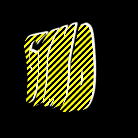
Attachment:
File comment: The path that describes the target region
 bezpatch.png [ 15.07 KiB | Viewed 22711 times ]
Once your patch is created, you can run the script (found under "Filters->Distorts->Warp Text...") on any text layer and eventually, after a good deal of huffing and puffing by the script, a new path will be created which is the outline of the text warped to fit within the patch. Basically, you are left just as you would be after doing a "Text along Path" in the Text tool Options dialog -- you are left to your own devices as to stroking the path, selecting from it and filling, etc. The dialog offers the option to warp any path, not just text; but I leave that for extra credit (perhap warping warped text?

).
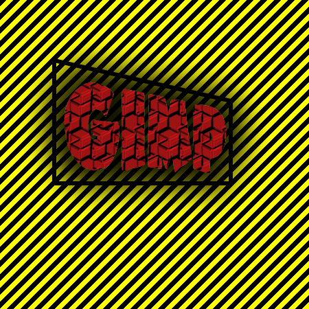
Attachment:
File comment: Text path after warping
 SSwarp.png [ 26.73 KiB | Viewed 22711 times ]
The fit is by no means perfect (usually mappings to Bezier surfaces entail additional control points inside the "patch"), but it may be useful for some situations. There is a "Padding" control which can be helpful in making sure the warped path doesn't fall outside the Bezier patch region (which is an unfortunate side effect of the shortcuts I took in my mapping algorithm). There is also a "Quality" setting which can range from below "10" (where letters are barely recognizable) to "250"; I don't notice much improvement above "100" and I set the default to "60" as speed versus quality compromise.
Let me know if you can find a use for it, if you find bugs, or if you can think of ways to improve it (I am considering allowing for more than four control points at some point, but that would require some slightly more sophisticated math).

EDIT: This script has now been submitted to the GIMP Plug-in Registry.


 I can see using it where you'd want an unusual text formation that can't be done using just text. Band banners where the script is fitted into a frame. Like some of the Grateful Dead Posters I've seen. Kind of on this order


 I will likely post more on this later and seek advice, but that enhancement is on the back burner for a while.
