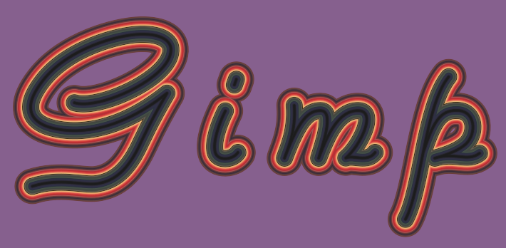
Accidentally came across a different way to make 3D Text. However there is a notable difference on effects depending on the style of font. Each work differently, so as hard as I tried, I could not make different font styles behave the same way in trying to obtain the same effect from another style of font. Experimentation may or may not enlighten you. Ofnut's technique (please donate beer money to him) is key to making this work, so check out what he says
here.
The only thing I did differently was after inverting the selection on the text, I moved the saved path slightly diagonal a centimeter or two (try any direction) and then of course run GAP from the right click menu on that path. Keep your gradient width at 50 or higher, choose "very fine" for precision, and miter limit at zero. My first result surprised me (I was like WHOA!):

Determined to repeat the results, I tried using the same font, different letters, and didn't quite get the same results, although I did change miter limit to 4:
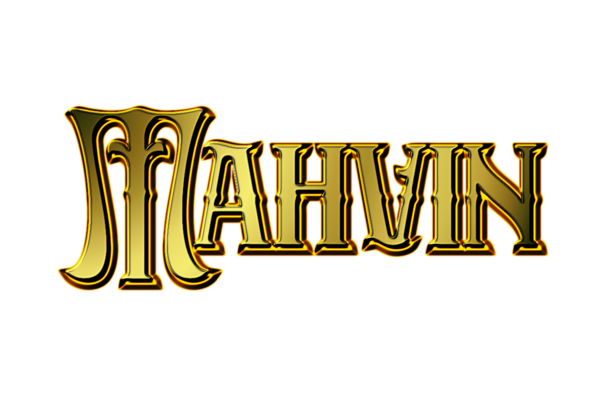
It was here I learned that lighting effects can be a serious PITA, so I moved over to Bump Map and started all over again, keeping the path intact, the same way in Ofnut's instructions, and got this result:
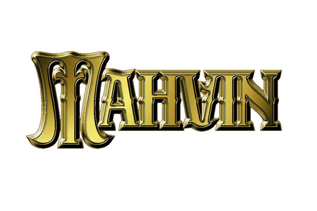
Just posting this in case you like what you see and want to give it a try, yourself.
_________________
"In order to attain the impossible, one must attempt the absurd."
~ Miguel de Cervantes