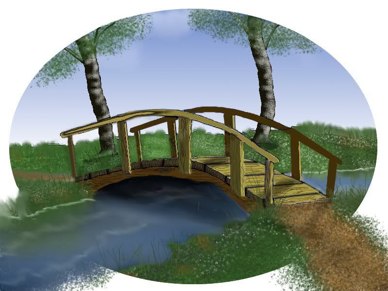
It is better than it was.
Just remember that light has to come from the source, Sun, Lamps etc. So everything in its path should be lighter. In the case of round objects like the moon, a ball etc, the light can spill around the outside of the ball but with sharp edges like boards or side of a building, it doesn't do that so all the parts that aren't in the path of the light will be in the shade, or shaded from the light. I think the tops of your railings should be light like the boards in your walkway, also the side of the uprights that the sun is hitting. the left sides of your boards should be all darker like the edges of you walkway boards.This isn't a very good explanation but you could get ideas by looking at some images, photos's etc.

Take a look at shadows of the the people in this picture, you can tell by the direction of the shadow where the light is coming from. so on the bridge it is hitting the same way, the light parts are in direct target of the light and the darker parts have a different angle where the light doesn't hit.