thanks everybody for the appreciation !!

its kind of odd when everybody thinks it looks good and i am the only one who thinks: oh, its only so so...

but then again i know that im overly critical all the time
i just cant help it
mostly i can appreciate my own work better, when some time has passed and i forgot of all the headache i had in the creation process
Odinbc wrote:
Symmetrically everything seems good except maybe you could try adding blades (top right, bottom left).
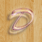
i think we have a misunderstanding here
this is a logo thing, not really a cover and i dont think its supposed to be a buzzsaw...i just called it like that, for lack of a better thread title
sorry if that confused everyone
i think the design has to do with those tribal tatoos that were all the rage some years ago...
this label was active around 2000, so that would make sense
the lack of symmetry referred to the original
at first i tried to replicate it by putting guides over it and then realized, its not symmetrical
not sure if it was drawn by hand or if there is distortion from the photographing process
Draconian wrote:
You mentioned the radial gradient for the red color and I threw this together. I just grabbed a pic of a saw blade from the internet. Is this what you were trying to get?
haha Drac, thats clever
pretty obvious, to look for a buzzsaw picture - i would never have thought of that, as i am again too obsessed with getting something as similar as possible to the original
how typical of me

the gradient problem goes like this:
there is a ring-like area that needs to be colored with a reddish gradient
so i would use my gradient tool, set it on radial and later delete the middle part
BUT my gradient needs to be from the inner circle to the outer circle, while the gradient tool goes from the middle of the circle to the outer edge
but GIMP distributes the colors evenly, which is not what i need, if that makes any sense
Attachment:
 gradient.png [ 91.12 KiB | Viewed 1181 times ]


 great job on this! i agree with the rest of the lot, it's much better than the original - except for the sawblade colours, which were better in the original. why couldn't you achieve that dark red with a circular gradient