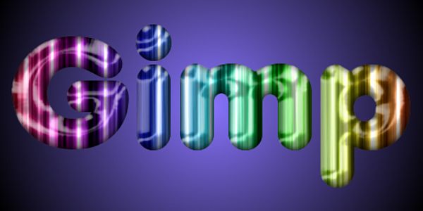
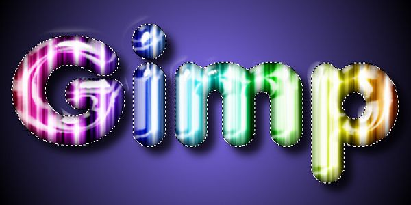
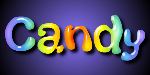
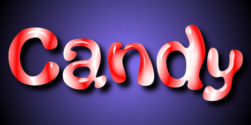
Christmas Candy Text Effect
When I think about Christmas, among my many wondrous childhood memories is that striped hard candy that inspired this effect. The Python based Layer Effects filter can be used in a very powerful way to achieve those eye popping effects that jump off the page.
I have incorporated some of the techniques found in the MSNBC Style Effect tutorial found here:
http://gimp-tutorials.net/gimp_msnbc_effect with a few minor tweaks.
You will need to have Python installed with the Python based Layer Effects filter, and the Glossy Stroke 3D filter. Here are the links.
Python -
http://www.python.org/ftp/python/2.6/python-2.6.msiInstalling Python -
viewtopic.php?f=23&t=2277Layer Effects -
http://gimpscripts.com/2011/10/gimp-layer-effects/Glossy Stroke 3D -
http://gimpscripts.com/2011/10/glossy-stroke-3d/Once you have Python installed successfully, place the Layer Effects Filter and the Glossy Stroke 3D filter in your Gimp ‘user’ Plugins folder. If Gimp is already open, go to Filters>Script-fu>Refresh scripts and you are ready to go.
Step 1.
Open a new image 500 x 250 and 72 ppi. Go to View>Zoom In to change your view setting to 150%.
Step 2.
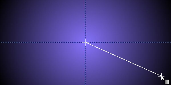
Place a Vertical guide in the center at 250 pixels and a horizontal guide at 125 pixels. Set your FG color to 8875FF and your BG color to black (000000). Select the Blend tool and in the tool dialog set the gradient to FG to BG and the Shape to Radial.
Place your cursor in the center of your image at the intersection of the two guides and stroke outward to one of the corners to apply the gradient.
Step 3.
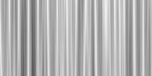
Go to View>Guides and uncheck the box next to Show Guides to turn them off. Create a new White layer and name it “Clouds”. Go to Filters>Render>Clouds>Difference Clouds and use the settings shown below. You can click on the ‘Seed’ button a few times if you like to get a more even distribution of light and dark areas. Or you can just enter the same number I used where it says Random Seed.
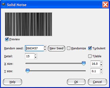
Unless you used the exact same seed that I used, the results will vary, but you should still get something like this.
Step 4.
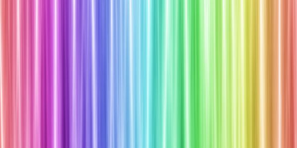
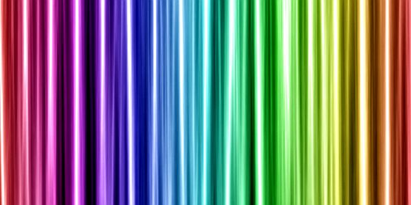
Create a new transparent layer above this one and call it “Gradient”. Select the Blend tool and in the tool dialog select the “Full saturation spectrum CW” gradient and set the Shape back to Linear.
With the Gradient layer selected, make a horizontal stroke from left to right using the control key to get it perfectly straight and horizontal. Set the layer Mode to Overlay and your image should now look like this.
Step 5.
We need to darken our image a bit for our purposes so select the Clouds layer and go to Colors>Levels and set the middle Output value to .50.
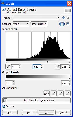
Now our image is a little darker and the colors more intense.
Step 6.
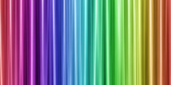
Go to Filters>Enhance>Unsharp Mask and use the settings shown below.
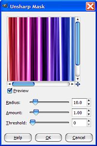
Now our image is really sharp and bright!
Step 7.
Right click on the Gradient layer and select Merge Down. Next, set your FG color to a medium gray like 919191. Select the text tool and in the tool dialog select a nice fat, rounded font. I’m using the Anja Eliaine font available at Dafont.com and other font sites.
Set the size to 180 pixels and type in some text. I’m using the word “GIMP” so if you use something with more characters you may have to reduce the size of the font to fit the image.

Step 8.
Move the text layer directly below the Clouds layer in the layers dialog, then right click on your text layer and choose Alpha to Selection. Go to Select>Invert then reselect the Clouds layer and hit the Delete key on your keyboard to remove everything outside the selection.
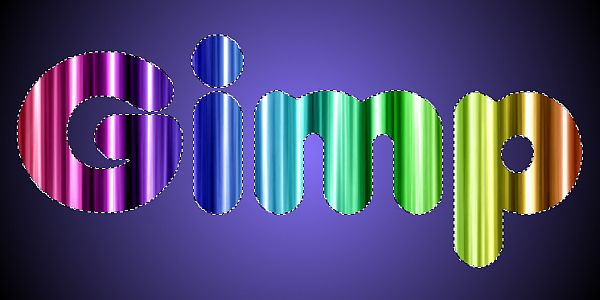
Go to Select>None to turn off the selection and now we can start to work some magic. It takes quite a while to really get to know all the filters included with Layer Effects but as you will see, the results are well worth the time and effort required.
Step 9.
First, let’s right click on the Clouds layer and select Merge Down. Now, go to Layer>Layer Effects>Inner Shadow and enter the settings shown below.
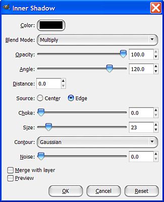
There are several values to enter so make sure to check them all carefully before you click OK.

Step 10.
Right click on the inner shadow layer and select Merge Down. Next, go to Layer>Layer Effects>Bevel and Emboss and enter the settings shown below.
Again, very carefully check to make sure you have everything exactly right before you click OK.
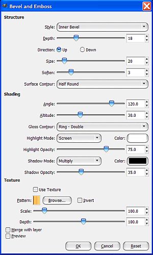
The filter will create two new layers for highlight and shadow. Select the shadow layer and go to Layer>Merge Down, then select the highlight layer and go to Layer>Merge Down.
Step 11.
Right click on the text layer and choose Alpha to Selection. Go to Filters>Light and Shadow>Glossy Stroke 3D and in the filter dialog, click on the color at the top and it will bring up the Color Picker dialog. Set the color to white (FFFFFF) and the Selection to Fill. You have the option for selecting a stroking brush but we’ll just use the default circle brush for our purposes. There are several other settings you can adjust but the only other things we will change is the 3D amount and the Light height. Set the 3D amount to 9 and .2 for the Light height. The light color should already be white by default, if not make it so.
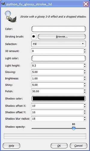
When you have everything set, click OK and the filter will create five new layers for you.
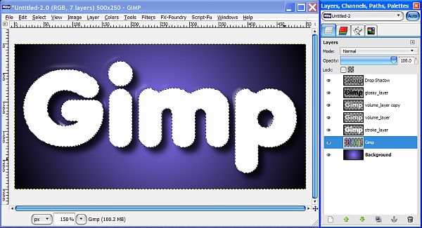
The first thing you will notice is that your text looks white and you can’t see all those beautiful layers we made. Not to worry. Turn off the visibility of the layer named “stroke-layer”, or just delete it altogether, and you’ll be able to see the results of the filter.
You will notice there are some residual artifacts or little white ghosts at the top around some of the letters. Since our selection is still active, go to Select>Invert and select the “glossy-layer” and hit your Delete key to remove the artifacts.
Step 12.
Turn off the selection (Select>None) and all we have left to do is make a few minor adjustments to our image. Since our background is rather dark, select the Drop Shadow layer and raise the Opacity to 100%, then go to Layer>Layer to Image Size. Move this layer down directly underneath the text layer in the layer stack.
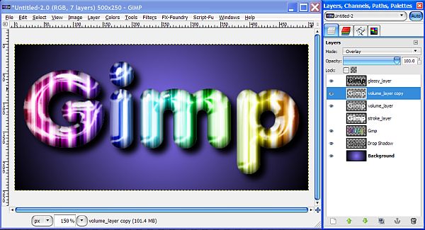
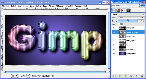
There is one last thing you may want to consider. There are two volume layers which are both set to Overlay. These layers add the blurred white center area that adds some additional gloss and brightens up the center area of the letters to make it appear to be glowing from the inside.
This is entirely up to you and whatever you think looks best, but you can change the Mode, Opacity or maybe just turn off one of the layers to see the different effects.
Whenever you decide which combination looks best to you, save your image, and I always save the xcf file as well just in case you want to change something later like increasing the inner shadow opacity for instance.
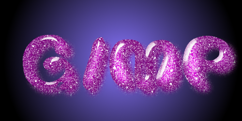
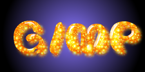
Now we can have a little fun. If you want see something cool, duplicate the text layer and lock the alpha channel. Fill it with your favorite color and watch what happens. Bingo! Plastic text.

Did I mention you can also fill it with your favorite texture?

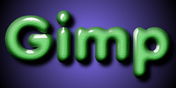
Maybe you want it to look like some shiny Green clay?
Oh and I almost forgot, has anyone ever hinted around to you that I like metal too……

I hope you enjoyed this tutorial. Explore the Layer Effects filter. You’ll be glad you did!


 i love all the results and the tutorial, i just spent a ridiculous amount of time playing with this effect and had so much fun in the process. a very versatile technique