steeno wrote:
Thank Odin, glad that the result be pleasant for you.
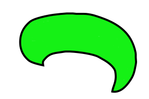
Thank EK22 for your contribution, unfortunately the colors are imposed, these are those of my company's department.
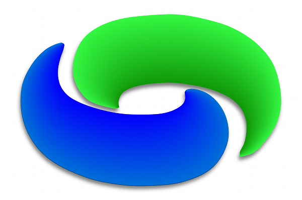
I like the shine effect that you have added, the volume effect is very interesting, could you explain to me how you do it ?
Put the whole logo on one layer, colors outline and all. On that layer do Alpha to Selection.
In the channels dialog, right click the field below the channels, initialize new channel, check from selection.
Select none.
Gaussian blur this channel by about 50, then again by about 25, then 10 and maybe even 5. You want a good blur.
click the eye icon to make this channel invisible.
Add a new layer over the top of your logo, fill it black.
Black layer selected, go to light and shadows, lighting effects. You'll point 2 light sources here, directional. One from above, one from below. In the bump map tab, use the blurred invisible channel as the bump map. This should give you highlights on the black layer.
Gaussian blur by about 5-10, depending when the highlights look smooth.
On the logo layer, Alpha to Selection, go to select, shrink selection by 1 and then invert it.
On the black highlights layer, delete the background around the selection. This should give you the logo outline in black, with white highlights.
Set the layer mode to screen and your highlights will appear on the logo.
Note, if you want to go more complicated with it, have both halves of the logo on separate layers and apply the steps here to each of those for independent shine to each.
I know this sounds complicated, but if you do it, it is really simple and an elegant way to add some highlights to just about any object.