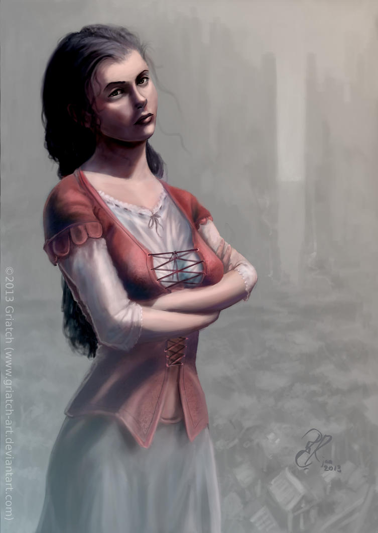
Thanks for the comments and feedback! I wanted the hand's fingers to splay indeed; I felt it gave some more dynamics to an otherwise static pose.
@ofnuts
Excellent feedback! Let me go through your points in turn.
She has rather long fingers, but the hand did come out a bit long. I shortened it ans also removed the spreading of the fingers a bit.
I fixed the right fingers a bit, the lighting was a bit confusing, making them look fatter than intended.
I think the breast's "upper edge" got a bit too sunken in during work with the hand, straightened and filled in the line after you pointed it out, I think that should fix the feeling of the breast starting too far down. The breast is otherwise resting on her arm and thus not in its normal hanging position.
The left side's sleeve was possible slanted a bit too little, tapering it differently may fix the feeling of them being different in length.
The bottom edges of the jacket are rather subtle given her pose and that her entire body is slightly tilted. Comparing back and forth I'm still not fully convinced they are really off, but I lengthened one side slightly.
The perspective is not a perspective, at least not relative to the character. As mentioned in the caption, the background is abstract, like you would imagine a book cover, where the background shows sceness from the story, not physically in the same place as the foreground character.
Uploaded the changes, take a peek, hopefully better now. Thanks again for the useful critique.

.
Griatch